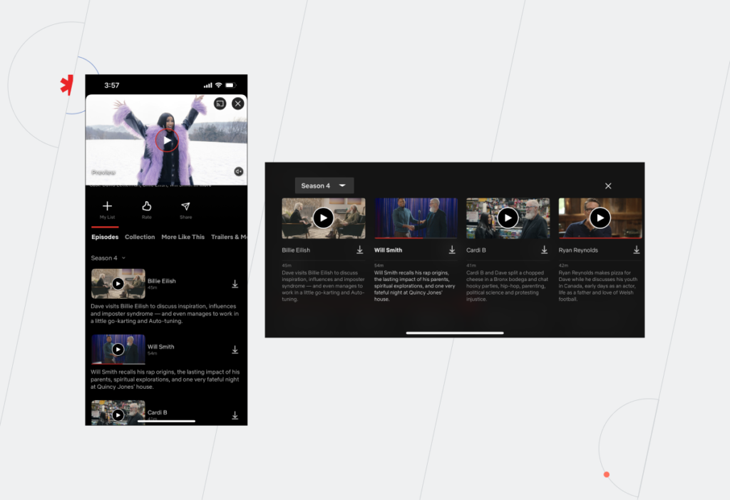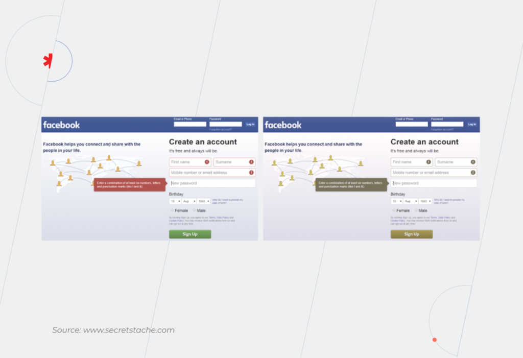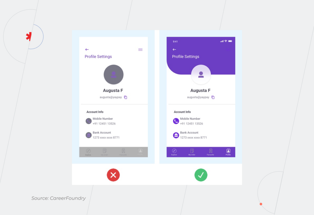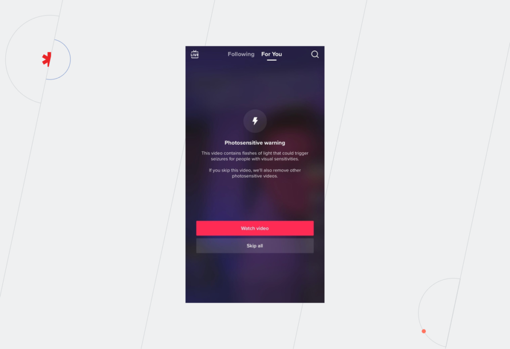
Ecommerce UX Best Practices in 2026: Design Your Way to the Customer’s Heart (And Wallet)

In ecommerce, where revenues shoot through the roof every year, it’s surprising how often user experience (UX) takes a backseat. Maze-like navigation, off-target layouts, and hour-long checkout processes shoo customers away, causing millions of ecommerce businesses to lose millions in revenue.

Growth isn’t just about pouring money into ads and chasing new traffic. To increase your store’s revenue with customers already in your corner, prioritize delivering exceptional user experiences built on the back of ecommerce UX best practices. But contrary to popular opinion, conversion-worthy ecommerce UX goes beyond visual frills.

40+ ecommerce projects later, *instinctools’ team has curated an extensive knowledge base of ecommerce UX dos and don’ts — and we’re laying it all out in this no-fluff guide. 

The value of smooth user experience and the price tag of poor UX in ecommerce

Your marketing team has done a titanic job getting potential customers to your site, all set to buy. But just seconds later, they give up halfway because things like complex navigation or sloth-like page loading drive them up the wall.

A survey shows that 78% of shoppers in the US and UK tend to ditch their carts if the process is too complicated or takes too long. And it’s not just a lost sale — it’s a lost customer. Friction-filled interactions lead to a huge 88% of users abandoning a site for good.

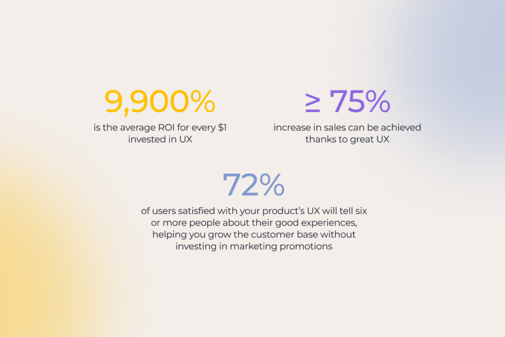
On the flip side, a smooth, seamless experience can work wonders. Every CX expert will tell you that every $1 spent on UX brings $100 in return, equating to 9,900% ROI. Even a single tweak to your UX can deliver up to a 400% jump in conversions.

Successful ecommerce sites know firsthand the power of user-friendly storefronts. Jeff Bezos invested 100X more into customer experience than ads during the early days of Amazon. Today, this ecommerce giant is known for exemplary conversion rates of around 10%.
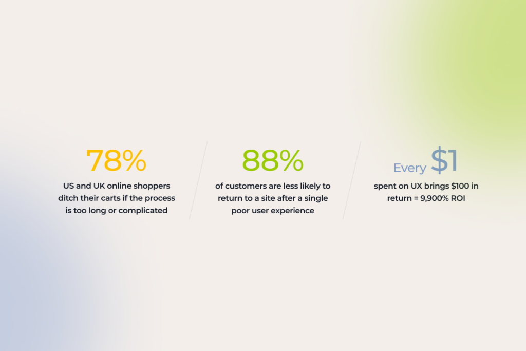
Ecommerce UX statistics 2025

UX best practices for ecommerce: dos and don’ts across the website customer journey

It’s no longer about buying a product, ecommerce shoppers are after the end-to-end experience of being a customer — from the initial interaction with a brand to the purchasing process and beyond. For an ecommerce business, it means an enjoyable shopping experience through and through, at every touch point of your customers’ journey.

It’s no secret that ecommerce interaction with your customer begins long before they land on your website. First impressions happen through Google Product feeds, Bing Shopping, a social media post, and even your email newsletters. So, if you care about capturing attention, you’ve got to build sales funnels that start off-site, not on your homepage. 

While we’ll dive into off-site UX best practices soon, today’s focus is all about crafting an exceptional on-site user experience.

1. First interaction with your website

They say that the UX of the homepage of an online store is critical for your business. But what about a shopping card? Or a product page? In reality, users can land anywhere on your site, that’s why prioritizing the UX of every page is crucial to sweep both first-time and regular users off their feet.

1.1 Make sure your website is optimized for mobile devices 

By 2027, mobile commerce is slated to surpass 49% of retail ecommerce sales in the US. Mobile friendly commerce sites with responsive design are no longer a “maybe later” option — unless you want to see your customers spending their dollars elsewhere. 

When it comes to mobile sites, mobile ecommerce UX best practices include:

  • Adapting your website to different screen sizes and orientations
  • Optimizing touch targets by adding finger-friendly, tappable elements 
  • Testing your website on real smartphones and tablets to validate its responsiveness
  • Prioritizing quick loading by optimizing image sizes and leveraging browser caching
  • Focusing on website content that is easily digestible on mobile devices

Here are the UX elements that can hurt mobile optimization:

  • Horizontal scrolling — some elements might be pushed out of the viewport.
  • Cluttered layouts — these can be hard to navigate on mobile devices.
  • Complex visual elements and heavy files — they can overload older and less powerful models. 
  • Formidable forms — typing is more challenging and error-prone on mobile.
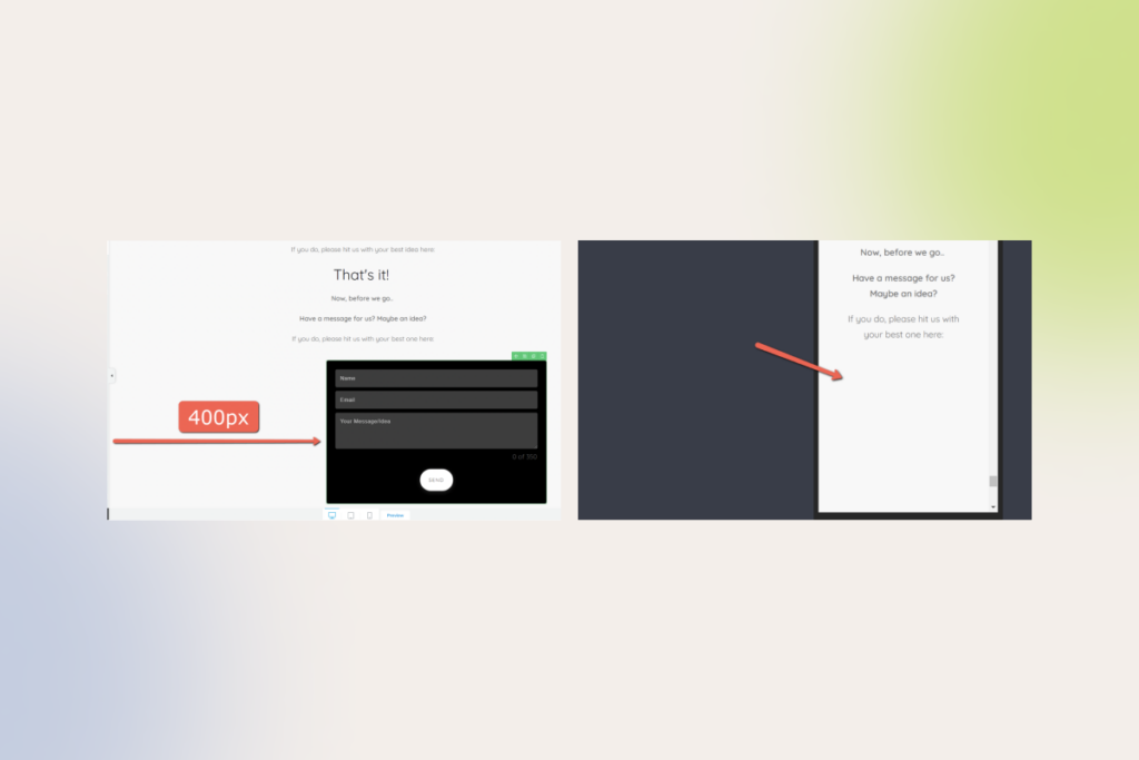
example of a contact form not optimized for mobile devices
Contact form is not visible on mobile

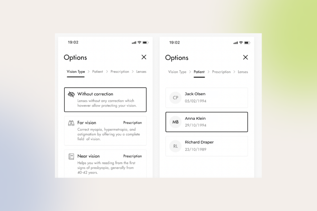
INSTINCTOOLS’ CASE IN POINT: When modernizing an ecommerce solution for one of our long-term clients — a contact lens seller — our UI/UX team spotted an unusual trend: on some product cards, many users were buying lenses only for one eye. Turned out, only the right tab was visible on mobile, which hindered navigation for mobile users and hurt sales. Once we fixed this issue, our client saw an upward trend in sales.

To make sure your website looks flawless on mobile, you can test it with Google’s free Mobile-Friendly Test. If there are any mobile UX flubs cropping up on smartphones, Google’s tool will show you what they are.

1.2 Get your online store navigation right

As many as 76% of ecommerce stores have mediocre-to-poor performance when it comes to category and homepage navigation. To buck this trend, make your online store navigation intuitive, simple, and customary, meaning it taps into familiar patterns and cues.

User-friendly navigation heuristics include:

  • Adopting clear, concise, and consistent labeling across all pages
  • Dividing categories and subcategories into manageable chunks
  • Making sure that categories are distinct and non-redundant to prevent confusion
  • Creating meaningful parent categories that accurately represent their subcategories
  • Implementing tiered navigation to improve findability for users and reduce the cognitive load  
  • Adding breadcrumbs to help users quickly understand where they have landed
  • Making sure your website has an intuitive search functionality (auto-suggestions, voice search)

a navigation menu requiring increased cognitive load
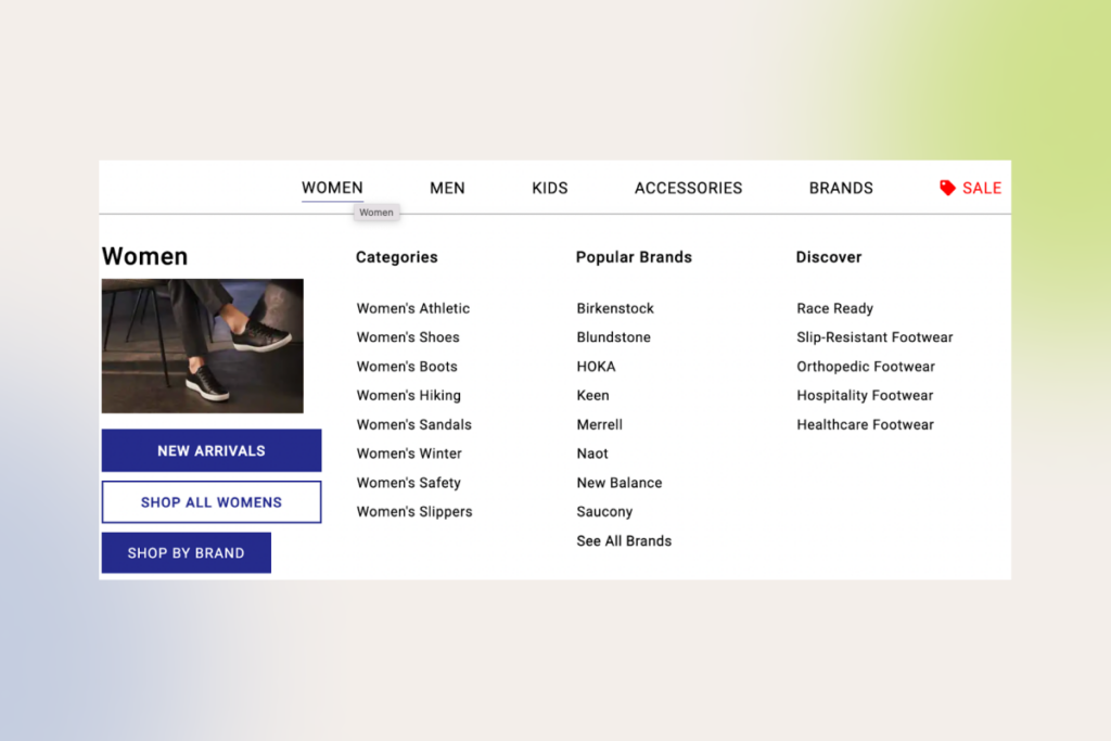
Tiered navigation menu where sub-categories are only exposed upon click
overly complex navigation menu
Mega menu

Conversely, overly complex navigation with hidden elements or inconsistent labeling can end the user journey without starting it.

1.3 Make your ecommerce site accessible to all users

According to the EU Accessibility Act (EAA), any ecommerce business (except for those with fewer than 10 employees and revenue below €2 million) with E.U. customers must ensure a fully inclusive experience starting with June 28, 2025. While compliance requirements vary by region, an ecommerce website must at minimum implement Website Content Accessibility Guidelines (WCAG) 2.1 AA to break down digital barriers.

According to our experience, most ecommerce websites have one or a few of the following accessibility issues:

  • Incompatibility with assistive technologies
  • Low-contrast text or poor color contrast
  • Difficult/poor keyword navigation (navigation is possible only with a mouse)
  • Lack of link styling (links blend into the surrounding text or the background)
  • Lack of visual or auditory signals (headings, labels, captions, and more)
  • Small touch targets
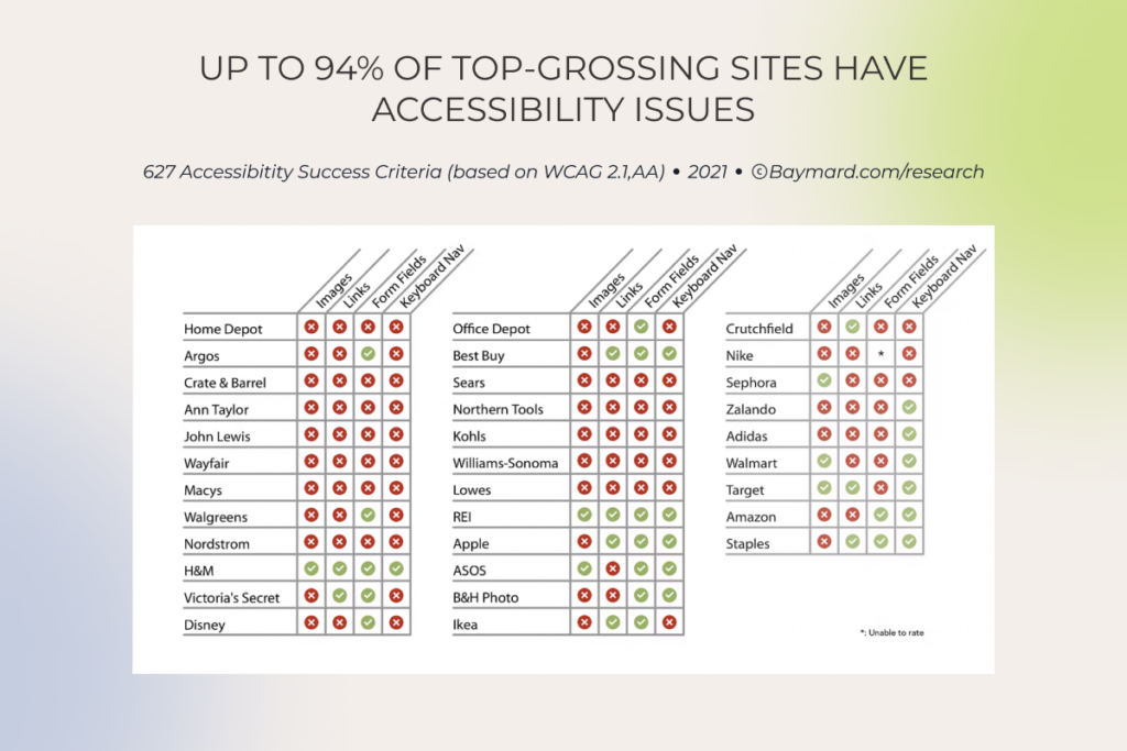
Accessibility issues of top-grossing sites, by type

Along with eliminating the issues we mentioned above, you should also adopt the following ecommerce UX design best practices to promote a better, more accessible experience for your consumers:

  • Allow users to resize any text up to 200% without assistive technology
  • Use simple, consistent terminology throughout the entire customer journey (your UX writer should collaborate with a UX designer to create consistent messaging)
  • Voice-enable your user interface to provide alternative input and search options
  • Keep the number of choices on each page to a minimum
  • Add extensive product information and make it available to AT users
  • Eliminate redundant hyperlinks and add descriptive link text 
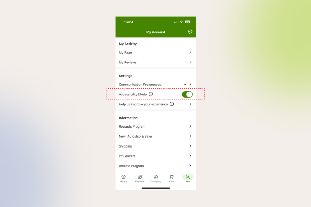
iHerb accessibility mode
iHerb allows users increase font size and use text to speech with its Accessibility mode on

1.4 Keep your ecommerce website lightning-fast

No matter how rad your ecommerce website design is, if your website takes forever to load, your customers will leave faster than a cheetah can sprint. In fact, if an ecommerce site is making $100,000 per day, a 1 second (!!) delay in website speed can result in $2.5 million in lost sales annually.

Keep in mind that a UX designer alone cannot ensure fast loading. However, they can at least prioritize quick loading times and ease of navigation in favor of static images over flashy elements like video backgrounds or interactive elements, which can hinder your website performance.

When an online shopper gets down to the brass tacks, a well-designed product search function will help them find the necessary items in a few clicks. There’s a lot that goes into designing an intuitive and efficient product search journey, that’s why we’ll keep it to the essentials.

2.1 Stick to easy search functionality

There are two types of customers that can pay a visit to your ecommerce store. The first cohort is in the market for something specific, while the other group includes those that came to browse without any direction. Make sure your ecommerce UX covers both groups of customers, helping them make buying choices through straightforward, on-the-nose search features.

Here’s what design elements your customers can benefit from on the quest for the perfect product:

  • Including a pop-up search screen to support one-screen search (one screen = one action)
  • Enabling search by image, barcode, and voice
  • Supporting searches that include one or more product attributes
  • Enabling abbreviation, symbol, and slang searches
  • Ensuring synonym and typo tolerance
  • Supporting problem-oriented keyword search
  • Placing trending queries, bestsellers, and promotions in a search bar 
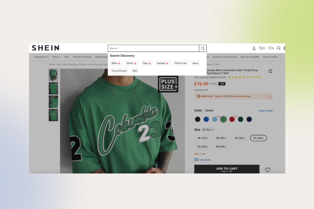
Shein's search bar with search suggestions for trending items
SHEIN’s search bar provides suggestions for trending items

You can also add an AI product finder that understands natural language queries to take the hassle out of the product search and make it easier for customers shopping online to stumble upon an ideal product.

Beyond the search bar, other product search best practices include:

  • Prioritizing exact matches at the top of search results
  • Displaying the total number of items in the product list
  • Replacing endless scrolling and pagination with “Load More” links
  • Including user rating averages and the number of ratings
  • Adding well-designed, visually appealing, and informative product cards that have just the right amount of information to nudge users to click on them

2.2 Ensure logical product categorization 

When it comes to product categories, you have to keep the right balance between overcategorization and the lack of granularity. To serve a top-notch ecommerce user experience, ecommerce sites should enable users to easily drill down on the products, without going to great lengths.

Here’s what product categorization best practices you can implement to support a hassle-free online shopping experience:

  • Implementing faceted search to organize large inventories
  • Adding visual cues (icons, images, or color-coding) to make filters and facets more intuitive for customers
  • Adopting a consistent visual hierarchy structure with clear levels, including categories, subcategories, and attributes
  • Providing “Sales” and “Deals” filters
  • Including user rating averages and the number of ratings
  • Providing checkboxes for filter options

The most common usability issues we spot on our clients’ commerce sites include:

  • Implementing “Sales” as a category instead of making it a filter (the category silos items, making it impossible to view the broader list of non-sale products).
  • Creating separate categories for product types with shared attributes.
  • Overusing nested categories with many levels.

a menu bar with categorization issues

At American Eagle, “Denim Dresses” are placed in a subcategory of “Dresses” — making it impossible for a user to see a combined list of both “Denim Dresses” and “Mini Dresses”
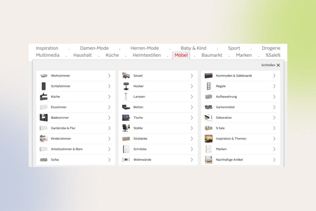
Otto's mega-dropdown: hover menu with complex navigation
Overcategorization in the “Furniture” category of the German site Otto makes the navigation hard for users. 

3. Home page and product page

As we said, a customer’s journey can commence anyplace. Whether it’s a homepage that will serve as the first point of contact or a product page — each of them should never fail to reel in a buyer.

3.1 Homepage

Besides being pretty, your online storefront should make for a convenient, easily scannable product catalog, pages, and collections to increase buying momentum right out of the gate. To achieve that effect, you should adhere to the following UX ecommerce best practices:

  • Making the search field obvious on the homepage
  • Featuring a broad range of product types on the homepage
  • Avoid auto-rotating carousels on mobile homepages (you can go for a hybrid approach and combine an active slider with static tile images of select categories and products like Amazon or iHerb does) 
  • Implementing country and language selection thoughtfully (prominent placement, default settings, local shipping and return options, and multilingual customer support)
  • Consolidating key information on the homepage such as delivery options, return policy, and other information
  • Including a link to the FAQs in your header or footer
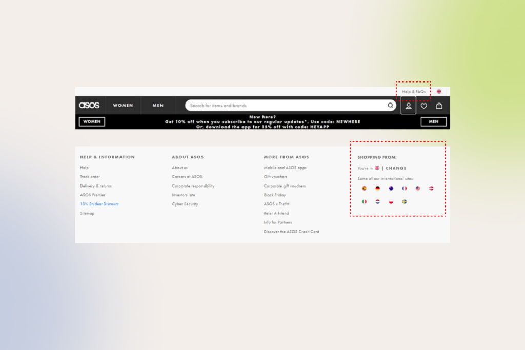
ASOS's header and footer as an example of clear ecommerce UX design
Link to the FAQs in header and clear country selection on ASOS

3.2 Product page

As your buyers cannot physically try out products, you need to do your best to make your products come alive via high quality images and graphics. Your ecommerce UX should also equip customers with all the necessary product details, thus improving customer satisfaction post-purchase as well.

Here are some good ecommerce UX practices that we’ve helped brands implement to improve product pages and boost conversions:

  • Displaying social proof and user generated content such as reviews, ratings, and customer photos to promote informed buying decisions
  • Communicating product availability
  • Suggesting related products to enhance cart value
  • Using vertically collapsed sections instead of horizontal tabs on product pages to improve discoverability
  • Featuring at least 3 to 5 product images
  • Using product videos or 360-degree photo slider to demonstrate products from every angle
  • Highlighting the primary “Add to Cart” with a prominent and unique design
  • Making return policies and delivery options explicit
  • Adding functionality to compare items and highlight differences in one place without making users jump across multiple pages
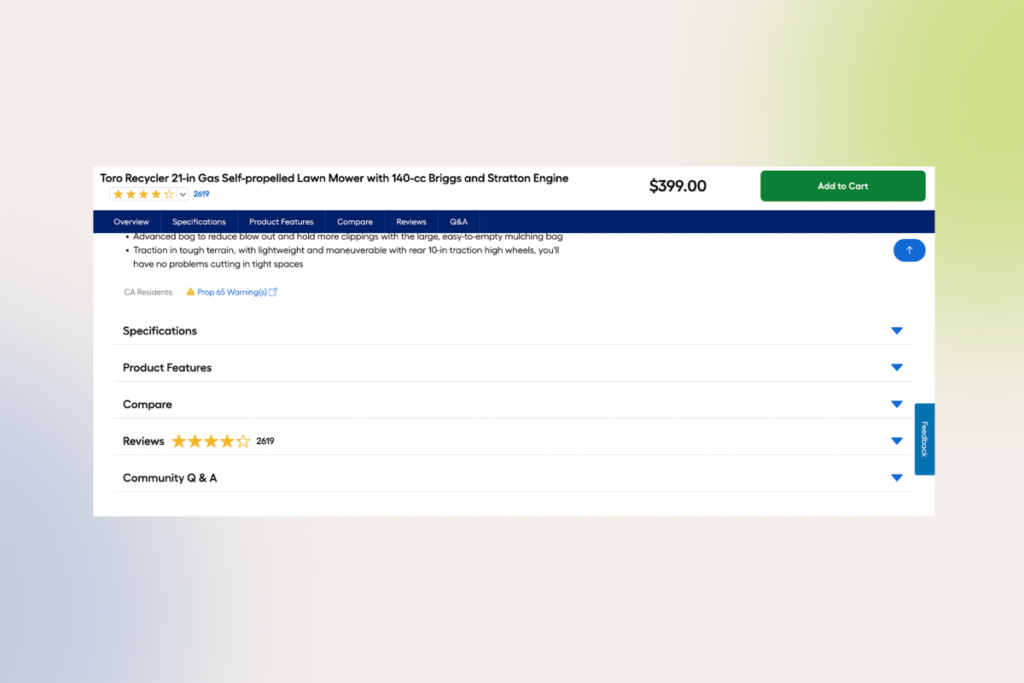
vertically collapsed sections on a product page
Vertically collapsed sections layouts on Lowe’s website

Incomplete or boring product descriptions, bland technical features with a “wall of text” appearance, or ambiguous info about product delivery or return policy can hurt online sales, averting potential customers. The same goes for hidden tabs and call-to-action buttons.
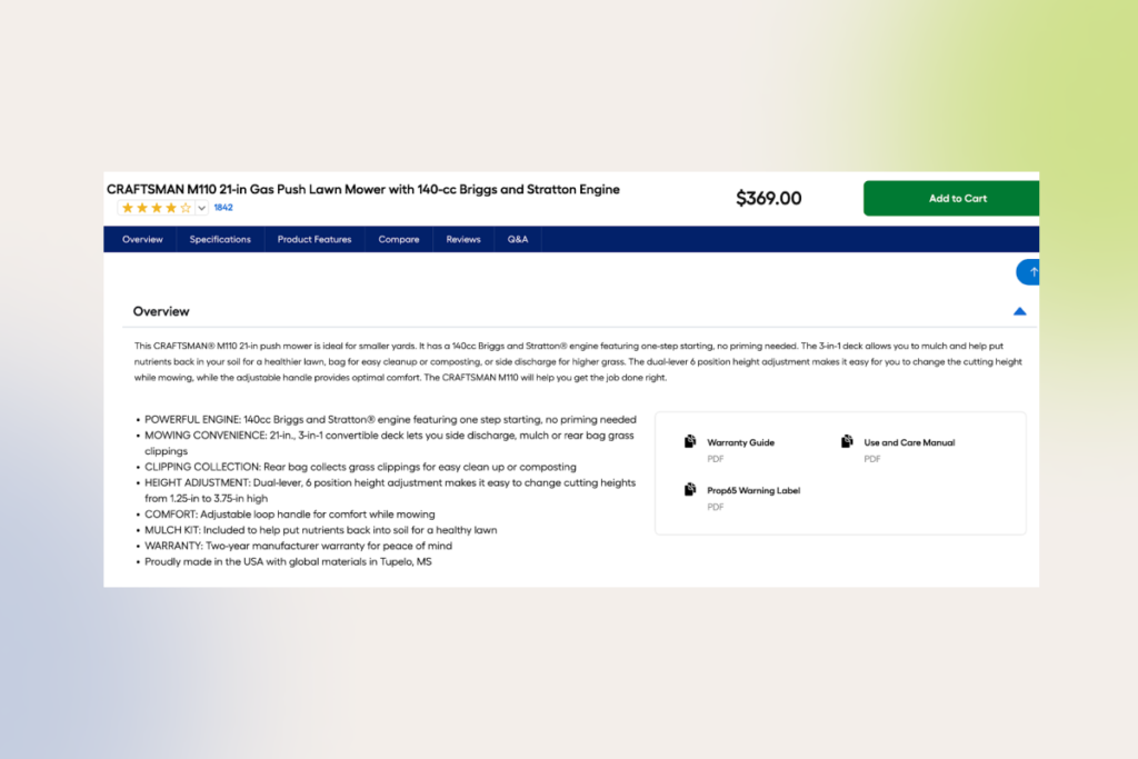
poorly laid out product description
This Lowe’s product detail page of a push lawn mower consists of feature bullet points only, which can cause customers to skip important product details.
step-by-step checkout process
To organize and simplify the buying process within our client’s online store, we’ve divided it into sequential steps.

4. Cart

According to research, the average cart abandonment rate is as high as 70% — and the majority of these lost customers can be attributed to subpar user experience. Almost the final stretch of any customer journey, your cart page design should become a bridge between customers and your business — with products put in the right place, with graphics of the right size, and with the right information.

Based on the hundreds of tests we’ve done for our ecommerce clients, here are the 

non-negotiable building blocks your cart needs to convert ready-to-buy customers: 

  • Cart modification options that allow users to adjust quantities or remove items from the cart
  • Visible cart summary that displays the number of products after moving them to the cart (both on desktop sites and mobile versions)
  • Clear feedback when a buyer adds new items to the cart
  • A consolidated, pared-down, itemized list of products (product names, product images, the quantity of the product, product’s price, estimated delivery dates, subtotal with taxes)
  • Security seals and reassuring elements, such as trust badges, accepted payment options, money-back guarantee to show the legitimacy of your website
  • Motivators to buy in the empty cart
  • Prominent “Checkout” or “Proceed to Checkout” button

Amazon's motivator to fill the cart with items
Amazon motivates users to fill their carts with items.
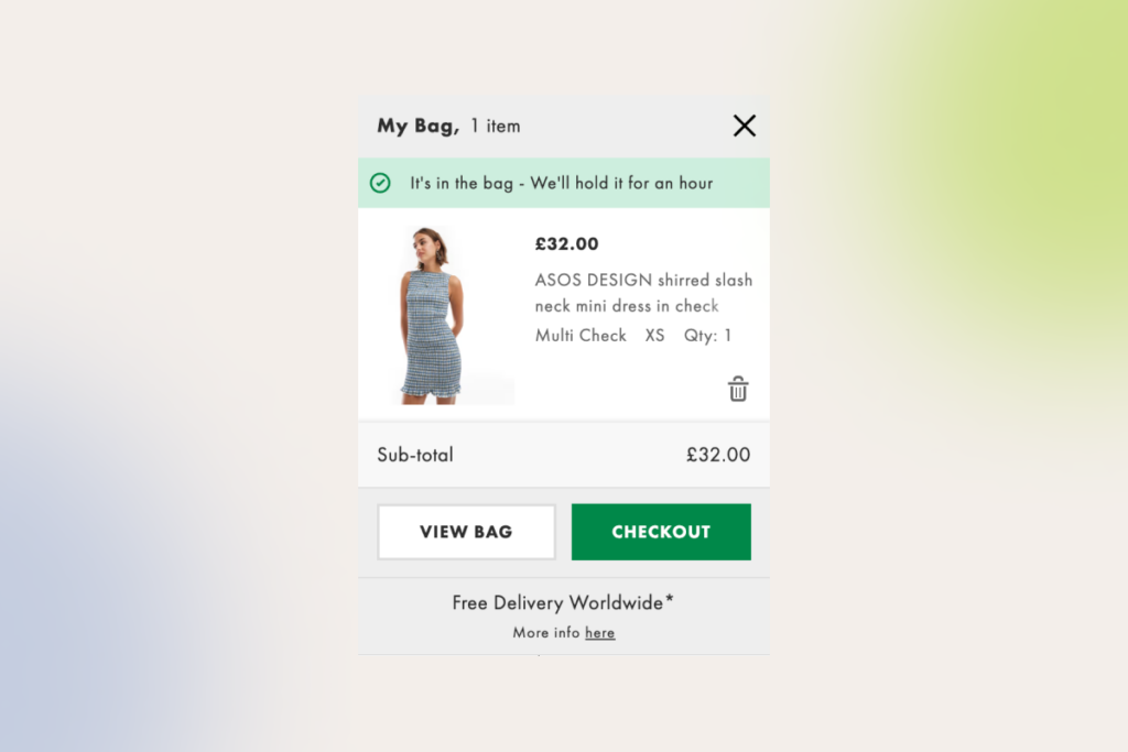
ASOS's Add to Cart popup
ASOS message when a user adds items to the cart

If your customers add a bunch of items to their cart, but then mysteriously evaporate, make sure your cart page is free from noisy popups and special offers. Incomplete information about shipping and delivery terms, lack of customer support options, and unclear thumbnail images might also drive away your customers.

INSTINCTOOLS’ CASE IN POINT: One of our clients, a premium jewelry seller from Switzerland, noticed their cart abandonment rates increasing. Our UX team analyzed the website’s flow and attributed this trend to an inconvenient checkout process (the website didn’t allow users to add multiple items to the cart). By redesigning the checkout flow and analyzing the metrics post-launch, we saw a 50% increase in conversions across both web and mobile, validating our hypothesis.

5. Checkout page

When your customer is a few clicks away from placing the order, your checkout page should aim to reduce the number of hoops to jump through. Otherwise, you risk losing up to 22% of online shoppers to an overly complicated checkout process.  

Here’s what a rudimentary checkout experience should look like: 

  • Guest checkout option — your website visitors should be able to shop and purchase without account creation
  • Progress indicators — the checkout process should consist of clearly demarcated steps (up to 4 steps)
  • Multiple payment options — offer flexible payment options, including buy now, pay later payment methods
  • Clear order summary — provide detailed summaries, including taxes and shipping
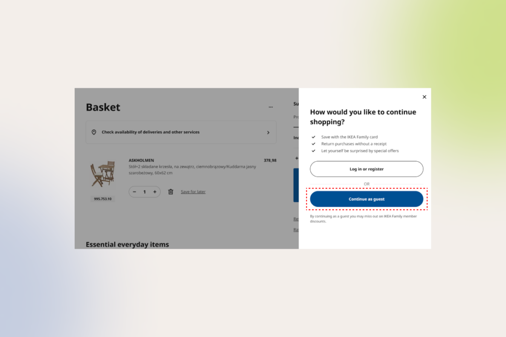
IKEA's checkout process is convenient for both registered and guest users
IKEA’s customers can make purchases without creating an account

We often see ecommerce brands inserting unexpected fees during the checkout process, providing ambiguous shipping information, or asking customers to sign up before placing an order. All these, including excessive checkout flows, can take a toll on your conversion rates and sales.

6. Confirmation

The customer journey does not end with the checkout, but a lot of companies seem to forget about this fact. After finalizing the order, your customers should clearly understand the next steps and how to handle issues post-purchase.

Here’s how you can produce a lasting positive effect on your customer after the purchase (and make the most out of it):

  • Provide a clear (and preferably personalized) confirmation/thank-you message or indicator post-purchase
  • Add cross-sell deals to the confirmation page and make sure your customers can snatch them without having to resubmit any payment data
  • Include informational resources related to the ordered products or services (timeline, courier contact method, order number, etc.)
  • Add customer support options
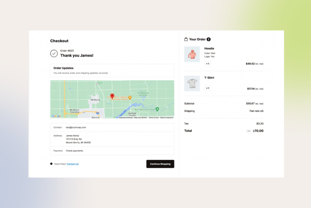
a well-designed confirmation page
An example of a well-designed confirmation page

However, avoid cluttering your confirmation page with details. Instead, include comprehensive information in an order confirmation email. 

Right all UX wrongs with our seasoned design team and boost your sales

Contact now

How to develop UX for your ecommerce website? Care for happy customers, and the money will follow

Even though we’ve exposed you to the UX best practices in ecommerce, you cannot blindly copy and paste those tips. Each ecommerce website is different and so is your user behavior.

Analyze your unique needs and requirements

At *instinctools, we always start with thorough business analysis where we work hand-in-hand with our ecommerce clients to identify their needs, pain points, and product vision. We also run stakeholder interviews to gather valuable business insights and understand technical constraints that can impact design decisions.

By conducting the initial dive-in, you’ll lay a solid foundation for the UX design project, making sure the final interfaces align with your business objectives.

Performing in-depth research and target audience analysis

To draw up a blueprint for further development, our product design team also consolidates market and competitors’ data to identify areas for improvement and determine competitive design features. By combining this data with thorough target audience analysis (and customer feedback, if possible), we can create a holistic, tailored UX strategy that meets your customer expectations. 

For existing commerce sites, our team peers into the relevant google analytics metrics, including your conversion rates, task completion rates, task success rates, user error rates, and user retention rates. This allows us to analyze the as-is state of the current user experience and put forward a hypothesis for informed design decisions.

At this stage, our UX design team also performs content inventory to visualize the information structure of your website and/or application. Whatever products you’re selling, you need to streamline the flow as much as possible to keep your selling platform user-friendly and conversion-worthy.

User flow mapping is another essential technique in website UX/UI development that allows designers to visualize the steps a user takes from initial awareness to post-purchase. By having the flow laid out, the UX/UI team can empathize with the user, spot gaps and pain points in the current design, and deliver a more efficient purchasing journey. 

Developing wireframes

Wireframing significantly reduces design revisions, enabling to create a user-friendly and efficient system on the first try.

There are two types of wireframes your UX design team can implement. Low-fidelity wireframes serve as skeletons for your future design, demonstrating the high-level logic of interfaces at the early design stages and explaining design concepts to stakeholders. High-fidelity prototypes, on the other hand, are more detailed, replicating the look and feel of the final solution down to subtle elements such as buttons, menus, and links. 

If you have an established design system or an existing website, you can start with high-fidelity wireframes. 

Transforming your wireframes into final designs

Once prototypes are validated, UX designers get down to creating the final screens of your ecommerce solution. Beyond the end points of a user journey, designers also craft screens for intermediate states, such as loading screens, error messages, and confirmation prompts. The final layouts are then handed over to the development team. 

Tip: We always insist on prioritizing user expectations instead of making bold redesign decisions. A sudden, drastic redesign can alienate existing customers, hindering user experience and impacting your sales. That’s why you have to optimize new designs iteratively, helping users absorb change.

User-testing and validating new designs

The only way you can find out whether your new design has hit the mark is by analyzing user behavior and other key metrics post-launch. Our team uses a combination of qualitative and quantitative validation methods, user testing and analytics tools that allow us to size up the impact of new interfaces and see which design aspects work.
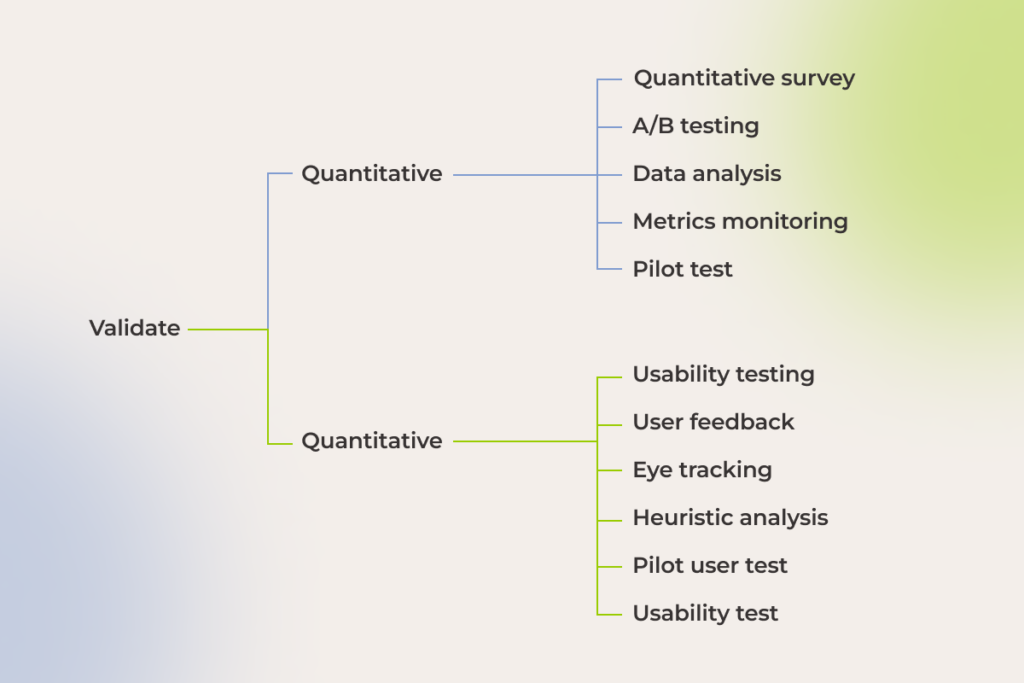
qualitative and quantitative designs validation methods

Ecommerce UX design can take a good product and multiply its value

Your ecommerce website is the only salesperson that builds up your brand recognition 24/7. Exceptional UX makes sure it does it effectively, no matter how far along your customers are in their shopping journey. A well-designed, selling website puts customers first, showcasing your brand while allowing for a seamless, enjoyable shopping experience.

The job of a perfect design is never done. To ensure a positive user experience, which stays aligned with your customers’ needs, you should continuously experiment, analyze results, and refine your store’s features according to customer feedback.

Have an ecommerce UX design challenge to tackle?

Contact our UX team
6 UX Best Practices: How to Build High-ROI Software Products

Any way you slice it, we can’t discuss the business success of digital products without bringing user experience (UX) into the equation, as it directly impacts customer experience (CX).

A single bad interaction – that’s what it takes to lose 88% of first-time users. Moreover, 46% of these unsatisfied customers will spread the word about their negative experience with your product, magnifying its failure. 

On the bright side, UX design excellence is within the grasp of every business, and, as we see in our work, 85% of churn cases can be foreseen and prevented. 

Which UX best practices can help you uncover unmet user needs, attract customers to your software product, and retain them? Check out our guide on how to reach high conversion and retention rates, ensure consistent user base growth, and increase customer loyalty and satisfaction — all with business-driven UX design.

Talking money and statistics: how good UX design grows your bottom line

Surveys by McKinsey, Forrester, and UX Planet leave no doubt that well-honed user experience can move the needle: 

statistics on the value of good UX design

The success of UX design-led companies, such as Apple, Netflix, Amazon Prime, etc., only proves this data. The best design performers increase their revenues at nearly twice the rate of their competitors.

Is your UX/UI design a hit or a miss? These metrics will tell

At *instinctools, we’ve polished our UX approach with hundreds of real-life projects and built a solid UX value framework to gauge the worth of the user experience design in a way that matters to businesses. Our framework combines both quantitative and qualitative metrics and ensures every design choice is perfectly calibrated against your business needs: 

  • Conversion rate is the percentage of users who have completed the desired action.
  • Customer satisfaction score shows the number of users who identified the product’s UX as fantastic.
  • Net promoter score unveils how many customers are likely to recommend your product to others.
  • Task completion rate reveals how long it takes users to complete a task successfully. 
  • Task success rate indicates the percentage of people who finished a task.
  • User error rate displays how many mistakes users make while completing an action. 
  • User retention rate highlights the number of customers who have engaged with your product again.
  • Real user feedback is always the primary driver of your UX design strategy. 

There’s no need to track all the metrics to assess the viability of your UX strategy. Monitoring several indicators that align with your project’s goals is enough to evaluate the outcomes. For example, a healthcare startup will likely focus on user retention and average session depth rate, while an ecommerce enterprise will track conversion rate, net promoter score, and industry-specific cart abandonment rate in the first place.  

6 UX best practices for 2025 and beyond

Our senior and lead UX designers listed vital UX best practices to match user-centric design and a business-driven approach to product development and help your software pack a punch. 

Put the user first

Releases of user-ignorant solutions aren’t rare – every fourth project fails because of market mismatch, with even some companies at the top of the Fortune 500 list not being spared from this fate.

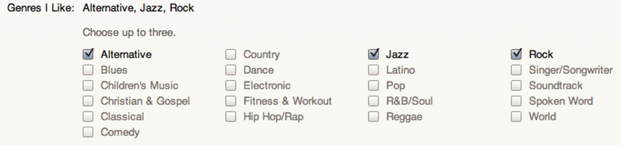
For instance, in 2010, Apple introduced iTunes Ping – a social network for finding people with similar music tastes. However, the service didn’t find support among users and was shut down two years later. It’s safe to say that UX limitations played their part in the project’s failure, making the minimum viable product not viable at all. For example, when creating an account, users could select only three favorite music genres from a very limited number of options. And that was, among other things, just one of the deal breakers that averted music lovers.

A music genre selection form with checkboxes. Alternative, Jazz, and Rock are checked. Other options, like Blues, Classical, Hip Hop/Rap, Pop, and more, are unchecked. Instructions above say, Choose up to three.
Choosing music genres in iTunes Ping

Sure thing, rolling out a software product isn’t a one-man show. However, there’s also no doubt that it was under-researching user expectations regarding UX that came back to bite the creators.

If an Apple-scale company can stay on the podium of a market leader even after a costly misstep, smaller companies are less likely to roll with such a punch and should build their products with a customer-centric culture in mind from the onset. 

To drive high user satisfaction scores for your product, double down on market research and analyze user behaviors, documenting findings in user personas and customer journey maps.

An in-depth investigation of user demands can help you spot friction points in the design patterns of currently available products and, thus, find your gold mine. Remember how Uber’s ride-sharing service disrupted the taxi industry? Showing upfront prices and driver ratings and enabling cashless payment was the ultimate step-up in user experience and competitive advantage over traditional taxi services. Thus, discovering and addressing the customers’ desires with a thought-out UX was a secret sauce that assured the startup’s smashing commercial success.  

Create a tailored design system for your product

A UX/UI design system is a collection of standards and reusable elements — ‘building blocks’ — that make designing your product smoother and more cohesive. Common examples of robust design systems you can look at for inspiration are Material Design for Android-targeted mobile apps and Human Interface Guidelines for iOS. It doesn’t mean though, you have to create something as massive as those systems. Your design system can be as simple (or complex) as your project needs.

Be aware of relying on an open-source design system. Although it might seem like a quick win at first, the initial boost often comes with a hidden cost down the line. As your project grows, open-source design systems tend to struggle with seamless scaling. Their code bases can age fast, and the frustrating part is, you’re stuck. You can’t just fix things easily, and you’ll end up creating workarounds that slow development and drive up costs.

Having a single design system improves overall UX/UI consistency and speeds up the development process, as front-end developers don’t have to craft interface components from scratch every single time. Faster time to market, simplified product scalability, and lower development cost in the long run also make a unified design system worth investing in. 

The fundamental elements of a decent design system include but are not limited to:

  • Component library with reusable chunks of code. These smallest atoms are the foundation of the product’s functional and visual elements and can be used alone or seamlessly combined to build more complex items. 
  • Pattern libraries represent the next – molecular – level of your design system. Each pattern is a set of components addressing common UX tasks, such as creating a login flow with buttons and input fields, notifications with progress bars, etc. 
  • Brand style guidelines specify rules related to typography, colors, buttons, images, logo placement, etc., to ensure a consistent look and feel of your brand.
  • Design principles are a searchable archive with all the documentation and libraries relevant to the project. Having one fast-tracks the onboarding of new designers and front-end developers and the entire process.

For one-off projects setting up a full-blown design system is superfluous and might actually slow down the design process. In such cases, having style guidelines and a pattern library is enough.

Nurture UX design consistency

Functional and visual consistency is a heavy hitter for ensuring a seamless user experience, especially if you offer several related products. We suggest utilizing familiarity and following common UX patterns users expect from specific platforms. For example, iPhone users aren’t familiar with the split screen feature typical for Android-based interfaces, and misusing this and other standards contributes to customer dissatisfaction.

There are plenty of design tasks where you don’t need to reinvent the wheel and should stick to the beaten path — not doing so may directly affect business ROI. Here’s a simple example. 

Let’s say you run an ecommerce business, and the goal you want your customers to achieve is a purchase. To make the CX hitch-free, you should follow shopping cart UX best practices and ensure the checkout process is straightforward and short-step. Otherwise, users may get lost halfway and leave the website, upping your cart abandonment rate.    

A lack of consistency can throw a wrench into the product development process. With a standard design system, you have a bunch of ready-to-use parts that developers can just plug in. This makes things a lot easier and faster. But if a designer goes out of the agreed standard to create something completely new, it’s gonna cost more and take longer. Developers have to build those new things from scratch, which can be a real pain. 

Keep navigation and functionality simple

Complex multi-click navigation makes users struggle to find what they need, causing frustration and affecting the software’s bounce rates. Therefore, intuitive navigation with a clear hierarchy and minimum clicks to reach the goal is a must if you want to attract and retain users.  

You can go the extra mile for a brand-new product and provide contextual in-app guidance to help users quickly grasp the unfamiliar interface and get to their goals faster.  

Also, don’t overload the product with fancy but misleading features. Remember the 80/20 ratio – 20% of functionality gets used 80% of the time, so make sure to provide these linchpin product functions. 

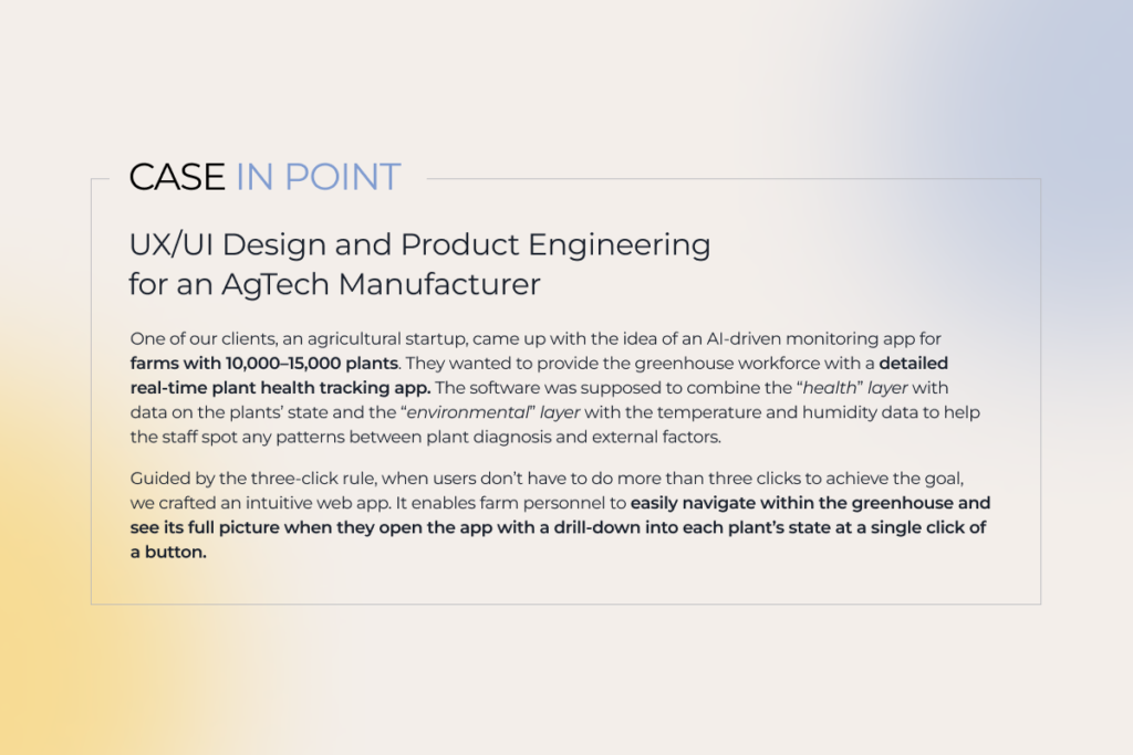
description of a UX/UI design project for an AgTech manufacturer
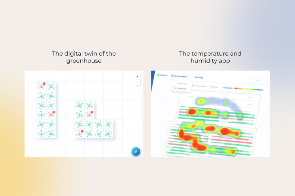
user interface of an agricultural app

Hone product accessibility

As of 2024, 16% of the world’s population have disabilities related to limited hearing, seeing, mobility, or complex mental or emotional conditions. WAI and WCAG standards establish accessibility requirements for mobile and web apps to make them user-friendly without boundaries. The conformance level is measured from the baseline “A” to the highest “AAA”.

The bar is so high that 88% of websites have at least minor accessibility compliance issues related to images, links, keyboard navigation, and form field markup. Even ecommerce top-grossing companies such as Amazon, Ikea, Walmart, and other big names are on the list.

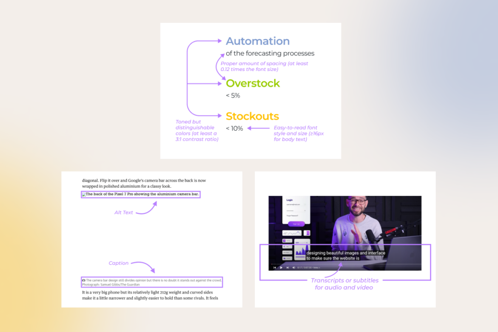
No one is immune to wrong design decisions and consequential accessibility issues. But it doesn’t mean that you should give up on trying to match expectations of the maximum number of potential users. Start by providing “A” accessibility and gradually level it up to “AA” or “AAA” if needed. The minimum requirements prescribe crafting a user-friendly design with: 

examples of user-friendly design requirements

The good thing is that with the current capabilities of generative AI tools, your designers don’t have to deal with accessibility-related tasks manually. Solutions like Stark, Userway, and others empower your UX/UI experts to wipe out design-rooted issues and accelerate overall product development. 

For instance, gen AI software brings the value: 

  • Throughout product design. AI assistants automatically scan Figma, Sketch, or Adobe files and proactively suggest changes to boost accessibility.
  • After a product rollout. AI tools can be trusted to run WGAG and ADA compliance checks to diagnose violations, scan them, fix minor problems, and report the major issues in detail to the team members in charge.  

Make your design responsive

Last but not least, ensure your software is displayed correctly on different devices. 

We usually move from larger to smaller — start with a desktop interface and proceed with a mobile one. However, in line with our UX design best practices, the project’s context comes first. For example, if a client needs a mobile-first solution, we start with it and then widen the responsive layout to a desktop version. 

Walking the talk: 3 UX moves for maximum business gains

As long as knowledge not followed by actions brings zero outcomes, our experts went beyond listing user experience best practices and highlighted three steps you should incorporate in your UX design process to increase the odds of hitting it big for your product. 

Prioritize prototyping and wireframing

86% of customers are willing to pay extra for a better user experience. So, instead of treating UX as an afterthought, which is fraught with extra expenses, broken deadlines, or worse, unmet users’ expectations, you can shape up your product in the right way from the earliest stages of the development process by emphasizing prototyping and wireframing.

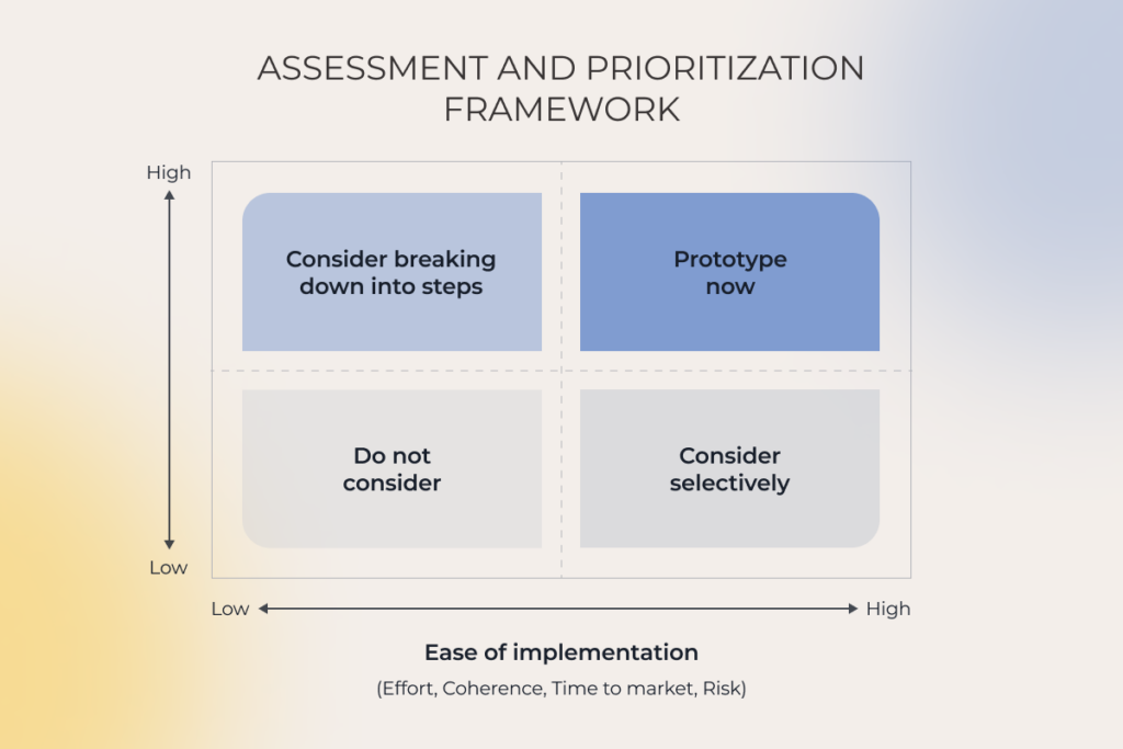
Prototyping and wireframing are also the name of the game in identifying 20% of the most used features. To prioritize functionality easily, align user motives with the ease of feature implementation and its value for the product’s success. 

We often face a situation when product owners aim to satisfy all the needs of all the users right away. Nevertheless, these good intentions can lead to a scenario in which the MVP’s scope bloats with features used by only 5% of users once in a while.

assessment and prioritization framework in UX/UI design
Source: PwC, Creating valuable customer experiences

The only time when you can skip the wireframing step is when the product is already in use and you have a stable design system to rely on while adding new features. In this case, you can jump straight into creating high-fidelity and interactive prototypes.

However, the reality faced by development teams can bring challenges, forcing UX designers to be more flexible and resourceful. But you can apply UX design best practices even to projects with burning deadlines and tight budgets when a client can’t afford full-scale prototyping. For instance, you can work on the product design concept and high-fidelity prototype in parallel to decide on the product look and feel faster.  

Run user acceptance testing (UAT) and let early adopters’ feedback guide you

“Keep calm and conduct user testing” should be your motto to seamlessly integrate the product into the real users’ worlds. Gathering early adopters’ feedback is also vital. That way, you can perfect user flow and finetune software functionality before releasing it for the early and late majority.

If the budget does not allow for a full-scale UAT, you can still play your cards right. At the very least, you can run hallway testing to evaluate the usability and clarity of clickable prototypes and overall user flow. 

Keep experimenting to match end user needs’ evolution

You can’t rest on laurels if your product has once gained success, as UX trends aren’t carved in stone and are driven by changes in customer behavior patterns. The best-performing companies continue listening and iterating their products, remaining invested in improving user experiences post-launch. So, if you want to at least maintain the same overall satisfaction rate, not to say raise it, you have to constantly monitor the software against new market data and customer expectations and shape up your product in line with them.  

Run a self-check: are you making the most of UX design?

Assessing your as-is state is mandatory to identify what should be done to achieve the desired outcome. You can start right now by answering the following questions. 

  1. Can you say you put yourself in the users’ shoes when working on the UX?
    A. We primarily rely on the product owner’s vision.
    B. We analyze competitors and create a similar product.
    C. We conduct in-depth market and user research to spot customers’ unmet needs and address them with our product.
  2. How do you speed up the overall development process with the help of UX design?
    A. We skip stages such as low-fidelity prototyping and user acceptance testing.
    B. We shorten the research and prototyping stages.
    C. We craft a single design system with reusable components to fast-track frontend development.
  3. Do you make your UX design accessible for all user personas?
    A. We don’t pay much attention to accessibility.
    B. We analyze target audience expectations regarding product accessibility level to keep up with it.
    C. We provide an AAA level of accessibility.
  4. What’s your prototyping workflow?
    A. We tend to skip early-stage wireframing to save money.
    B. We can work on the concept and prototype in parallel to speed up development.
    C. We start with wireframing and gradually proceed to high-fidelity prototypes to avoid costly edits at the pre-rollout stage.
  5. Is user acceptance testing (UAT) a mandatory part of your UX design workflow?
    A. We skip UAT for the sake of faster time to market.
    B. We perform UAT on the development team members.
    C. We test the product on the early adopters and finetune it based on their feedback before releasing it to a broader audience.
  6. Do you keep enhancing your product after rollout?
    A. We fix bugs as they crop up but nothing more.
    B. We add new features based on the product owner’s ideas.
    C. We analyze the market demand regularly and constantly gather user feedback to align new features with it.

The more “C” answers you’ve got, the more mature your UX framework is and the more chances you have to win and retain loyal customers. Nevertheless, even a low score isn’t the end of the world. Think of it as a starting point. The truth is that none of the companies that reached out to us for UX/UI design services has fully mastered all the UX best practices. So there’s room for improvement for everyone.   

Make UX work both for you and end users

Constantly navigating user experience and balancing it with business value may be draining, as you have to manage everything, from creating customer journey maps and a single design system to prototyping, running UAT, and strategizing product evolution.  

The good news is that you don’t have to bear with it alone. Cooperate with a reliable UX company to delegate design-related tasks and free your head for overall business strategy.

Partner with us to tackle your UX pain points and unlock UX excellence

Let’s discuss 

How to Sell More with Personalization in Ecommerce

Key highlights

  • Online retailers should double down on personalized customer service if they want to stay in the competition.
  • Well-designed ecommerce personalization expands selling opportunities and enables retail brands to grow their loyal customers’ base.
  • Customer’s interests come first  — your personalization efforts mustn’t compromise consumer privacy.

The imperative of delivering the right experiences to the right audience at the right time has modern ecommerce businesses in a chokehold. 

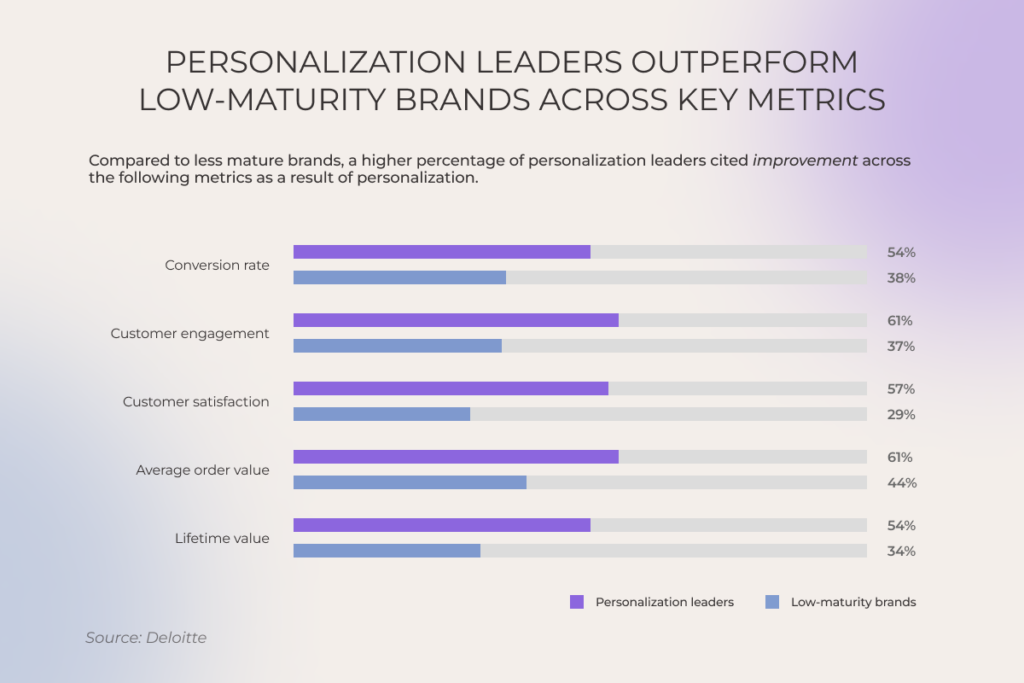
The impact of personalization across key metrics: personalization leaders vs. low maturity brands

With so many ready-made ecommerce personalization bundles available, it seems like any business can deliver granular online shopping experiences. So the real challenge lies in doing personalization efficiently, at a lower cost, and in a more ethical way than competitors.

What is ecommerce personalization?

Ecommerce personalization is the practice of delivering each customer a unique online browsing and shopping experience. Companies leverage users’ purchase data, browsing history, demographics, and psychographics to uncover consumers’ shopping patterns and individual preferences and provide personalized search results, product recommendations, discounts, loyalty programs, etc.  

Benefits of personalization in ecommerce: a match made in profits heaven

The importance of ecommerce personalization cannot be overstated. In fact, for 94% of high-maturity brands, personalized customer engagement is a high-to-critical priority, with plans for a 133% increase in related investments by 2027. The primary driver behind this boom is the promise of higher profits: customers spend 37% more with brands that deliver tailored interactions.

  • Personalization drives ongoing engagement and customer loyalty

According to statistics, 58% of shoppers become repeat customers after a personalized shopping experience with a brand. With numerous personal touchpoints at each stage of the customer journey and tailored loyalty programs, businesses can promote repeat purchases and establish long-term connections with their customers.

  • Personalization supports cross-selling and upselling initiatives

By introducing shoppers to relevant products that complement their initial purchases,  ecommerce sellers can significantly increase customer lifetime value (LTV) and the average order value (AOV). Higher AOV and LTV reduce the need for businesses to constantly reel in new customers and drive higher overall sales from the current customer base.

  • Personalized experiences tap into the untapped value of your VIPs

Almost every established ecommerce business can boast a small cohort of high-value customers, the golden goose of sales that demands special treatment. Personalized, next-level shopping experiences can pamper your VIPs, increasing their retention by up to 10%.  

How to turn browsers into buyers: ecommerce personalization examples

Below, our team has curated a list of the most high-performing examples of personalization in ecommerce, based on the success stories of our clients and analysis of 30+ retail brands.

Product recommendations

Even if your product pages incorporate related product recommendations, basing them on seller-side data and ignoring user context can render your ecommerce personalization ineffective. Supreme recommendation engines vacuum user-centered data, including preferences, demographics, and behavior — and blend this data with factors like time, location, and device for personalized recommendations.

Other best recommendation-related practices include:

  • Using deep learning to tackle the cold-start problem; 
  • Suggesting related higher-priced items;
  • Analyzing visitor’s in-session behavior to correlate shopping activities that span multiple sessions;
  • Highlighting popular products based on sales or customer reviews (e.g. you can create personalized bestseller lists);
  • Incorporating guided product selection quizzes to drill down into customer preferences and needs.
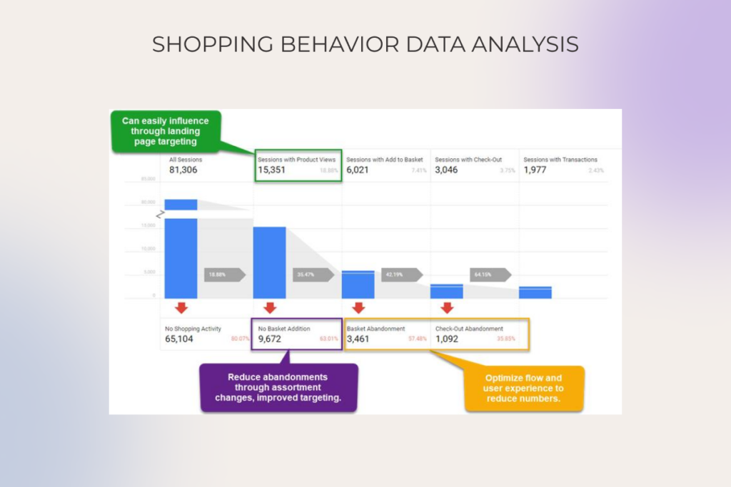
Shopping behavior data analysis

Here is a real-life example of one of our clients, a leading prescription eyewear retailer, who benefited from the analysis of in-session activity: 

  • Our team implemented an AI-augmented personalization solution that combines historical data with in-session activity to recommend the most relevant items.
  • This ecommerce personalization strategy led to a 73% increase in average revenue per user. 

Content and display

Another personalization tactic that can double the impact of the personalized ecommerce experience is fine-tuning content and media to individual preferences and behaviors. Ecommerce personalization trends targeted at creating more engaging experiences that boost sales include:

  • Personalized collections — lumping together product groups based on individual customer preferences, such as browsing history, style choices, or upcoming events, to offer tailored collections that resonate with each shopper.
  • Dynamic user-generated content — displaying user-submitted photos, videos, and reviews that align with the shopper’s persona, interests, or past purchases. For example, if a user is a 40-year-old female, the reviews shown will predominantly come from middle-aged women, enhancing relevance and fostering trust through personalized social proof.
  • Personalized product descriptions — adjusting the description in real-time to align it with the needs of a specific customer. 
  • Personalized shoppable posts in social media — analyzing user’s wishlists, previous interactions, or abandoned cart items, etc. to prioritize hyper-personalised sponsored posts in user’s feeds or stories.
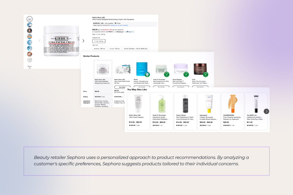
Sephora's personalized product recommendations

Engagement and retargeting

Re-engaging abandoned carts and activating the buying potential of existing customers is paramount for sustainable ecommerce business growth. Here’s how high-performing ecommerce brands use the triple power of artificial intelligence, predictive analytics, and seamless cross-channel integration:

  • Offering well-timed price incentives, such as exit pop-ups or cart abandonment emails, to recover potential sales.
  • Launching re-engagement campaigns at scale to win back past clients with special offers and tailored discounts.
  • Integrating user-specific pop-ups triggered by user actions such as shopping cart amounts or adapted to the unique behavior of an online customer.
  • Retargeting visitors on social media with personalized ads based on their previous interactions.
An example of a re-engagement campaign by Martha & Marley Spoon

Loyalty and sentiment analysis

To make customers heard and seen long after the initial purchase, online retailers double down on brand loyalty initiatives while also proactively monitoring customers’ reviews to spot areas of improvement. In particular, ecommerce brands can supplement their ecommerce personalization strategy with:

  • Tailored rewards for specific customer actions or special dates, further calibrating loyalty programs and offering tiered discounts.
  • Sentiment analysis of customer reviews that allows retail brands to scale responses and offset potentially negative online shopping experiences with tailored offerings.

Collaborate with our AI team to squeeze maximum value out of personalization and watch your ROI soar

Schedule a call

From ecommerce personalization to hyper-personalization with AI

Traditionally, personalization used to rely on historical consumer data along with insights on general customer segments to generate granular experiences. Although this ecommerce personalization strategy could effectively locate purchasing habits and other similarities between shoppers in a given category, it fell short of serving customized experiences to specific customers. Smart, omnichannel, and almost telepathic hyper-personalization fills this gap by tailoring companies’ marketing to individual customers throughout the entire shopping journey.

AI-driven hyper personalization throughout the customer journey

Why go the extra mile, you ask? BCG surveyed 5,000 global consumers, and over 80% of them don’t mind and actually want personalized experiences. Yet two-thirds (!) have dealt with ones that feel off-target, flat, and invasive.

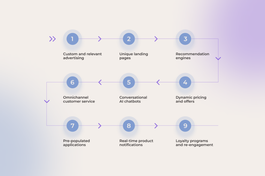
Hyper-personalized customer experiences meet a potential shopper or B2B buyer (if we’re talking about B2B ecommerce personalization) as early as the advertisement stage. By using data from various sources such as ecommerce site behavior, social media, and purchase history, machine learning algorithms help generate custom advertisements, where everything — from messaging to dynamic pricing — is tailor-made to match unique user’s demographics, preferences, and browsing behavior.

Some ecommerce companies can take it up a notch and implement an intelligent conversational interface on their websites and in mobile apps. By building on customer behavior and data, AI chatbots can provide assistance on par with human agents in real time.

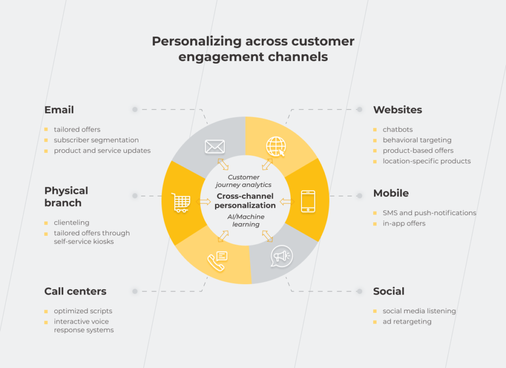
But keep in mind that to hit it big, hyper-personalization should be omnichannel, orchestrating a one-to-one experience to customers across all touchpoints, including online, in-store, and mobile.

Drive more revenue for your ecommerce business with AI-driven personalization

Let’s talk

Personalization challenges that can dilute your value

Not every ecommerce personalization platform can suffice the demands of modern customers. Some personalization solutions suffer from limited data handling capabilities, while others have a hard time delivering personalized shopping experiences in real time. So before investing in dedicated tools, run it by our checklist first. 

Interactions with anonymous users

According to statistics, a whopping 90% of ecommerce website visitors are anonymous. That’s why your personalization solution should know its way around tailoring interactions for both identified users and first time visitors with no fingerprints. Some personalization systems tackle this challenge by tapping into referral data and third-party insights that help create a welcoming experience for incognito shoppers.

AI-driven personalization tools pick up on users’ trails by analyzing a treasure trove of non-PII data anonymous visitors leave behind. By analyzing the subtle signals such as users’ network speed, browser extensions, time spent on site, and other clues, ML-powered solutions identify correlations, group anonymous users based on similar actions, and deliver relevant content based on inferred data points.

Automated segmentation tools

Another non-negotiable for your personalization platform is automated segmentation which allows the system to efficiently group customers based on various criteria and update customer segments in real time. To locate high-value customers, your personalization suite should also bank on automated RFM scoring that can automatically group shoppers based on their Recency, Frequency, and Monetary value. 

Support for omnichannel engagement

As we’ve mentioned earlier, personalization doesn’t work to its full potential unless it spans the entire customer journey. Your solution should provide a consistent, tailored customer experience across all devices and channels, based on integrated data and a unified personalization strategy. 

Data-driven approach

The more data, the merrier your offerings are. Your personalization tool should cast its nets wide, wielding a combination of historical and third-party data to peer into a customer’s past behavior along with analyzing additional context such as the customer’s location, weather data, and demographic information. By combining these data points, ecommerce businesses can generate highly customized experiences that strike a chord with customers.

Site layout personalization

The ability to serve dynamic content is another differentiator of top-notch personalized marketing. By incorporating generative AI, personalization tools churn out dynamic content at scale that automatically adjusts to individual user preferences and behaviors. For example, Shopify Plus users can virtually personalize the store for each customer with the Hypersonal tool that aligns headlines, reviews, product Q&As, and other content with the unique preferences and needs of every user — on the fly.

A blend of automation and manual controls

Full-on automation is neat and nice, but sometimes you need human oversight to refine personalization strategies according to specific requirements. Whether it’s A/B testing or product recommendations, your tool should allow for expert knowledge and human judgment, instead of monopolizing all customization capabilities.

Optimization flexibility and scalability

Customer behavior and markets are never static — and your personalization tools should go hand in hand with shifting buying patterns and market gyrations. By combining agility, continuous testing, and seamless integration capabilities, your tool can keep your personalization strategies up to date, no matter what. The ability of AI to learn from data helps with that, too.

Along the same line, the tool should be open to innovation facelifts without limiting you in adopting new technologies or industry-best personalization techniques, such as propensity models or predictive next-best-action algorithms.

System scalability

As your ecommerce business grows, your data processing needs follow suit, exposing your personalization tool to higher data volumes and user numbers. Scalability by design ensures that your system doesn’t crumble under the growing workloads and can deliver personalization in real time, no matter the number of customer interactions.

Microtargeting capability

Microtargeting is one way companies can send out targeted advertisements to specific individuals or small groups. Unlike broader targeting, microtargeting segments your audience based on highly specific criteria, including real-time data, to reach prospects with the highest conversion potential. Microtargeting and one-on-one interactions call for personalization tools that can dig into even the most subtle customer data.

Personalization challenges that can dilute your value

Over 60 percent of companies still struggle to get their one-to-one marketing initiatives right. Here are the common hurdles underperformers might face.

Scalability issues

A good personalization tactic is developed with scalability in mind: 

  1. Building your system upon cloud platforms enables you to automatically ramp up or down your processing resources to handle fluctuating resources and provision additional resources without investing in hardware. 
  2. Microservices architecture is another antidote against stiff and potentially disruptive scalability. As each microservice can be scaled independently, your platform can meet increasing needs without compromising performance.

Modular components run entirely on the server side can also pave the way for localization at-scale — and that’s exactly what we did for an established premium jewelry seller: 

  • The client had already mastered hyper-personalization but decided to up their game by introducing tailored navigation options and personalized homepages. 
  • Our team integrated modular architecture to help the client deliver dynamic content across multiple regions and brands from a single campaign.

Responsible personalization 

Over-personalization can hinder your marketing efforts and damage brand image. That’s why companies should ensure that personal data controls stay in customers’ hands and state explicitly what type of data is being collected and for what purpose. 

Data privacy and compliance can become a point of differentiation and competitive advantage when it comes to personal data collection. Those brands that adhere to a privacy-by-design approach, publicly commit to avoid data collection from third-party services or through questionable means, and comply with commonly accepted standards such as GDPR and CCPA are more likely to see their personalization initiatives pay off.

— Nick Astreika, CMO, *instinctools

Technical complexity 

Hyper-personalization is a technically demanding initiative. An effective personalized ecommerce experience can be compromised by: 

  • Limited integration capabilities of your personalization platform
  • Flimsy algorithms
  • The lack of low-latency processing

To head off this obstacle, make sure your system’s architecture can handle computationally intensive workloads, support real-time processing, and is powered by advanced, highly accurate algorithms for predicting customer preferences.

Customer data concerns

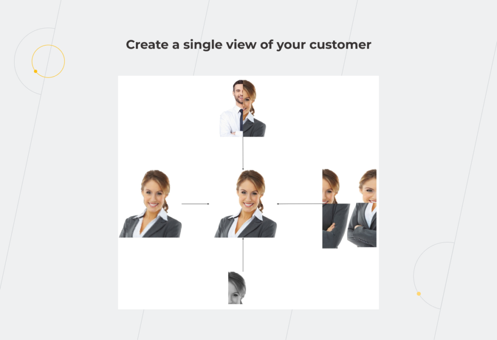
Hyper-personalization hinges on a granular view of the entire customer life cycle to cater to individual needs. To establish this elevated view, personalization systems demand access to a whole lot of data, including: 

  • Customer segments and microsegments
  • Behavioral and transactional data
  • Engagement trends

Integrating these data bits into a single puzzle requires companies to break down data barriers. With an AI-powered, unified consumer data platform, companies can set up a centralized customer database that has all the right types of data in a ready-to-use state.

Balancing ecommerce personalization and privacy policies: gather customer data with caution

While over 80% of consumers expect highly customized experiences, 30,1% are equally concerned about misuse of their personal data. As an ethical business with solid data privacy policies, where do you draw the line between tailoring online shopping services and respecting privacy?

Types of customer data to leverage in ecommerce

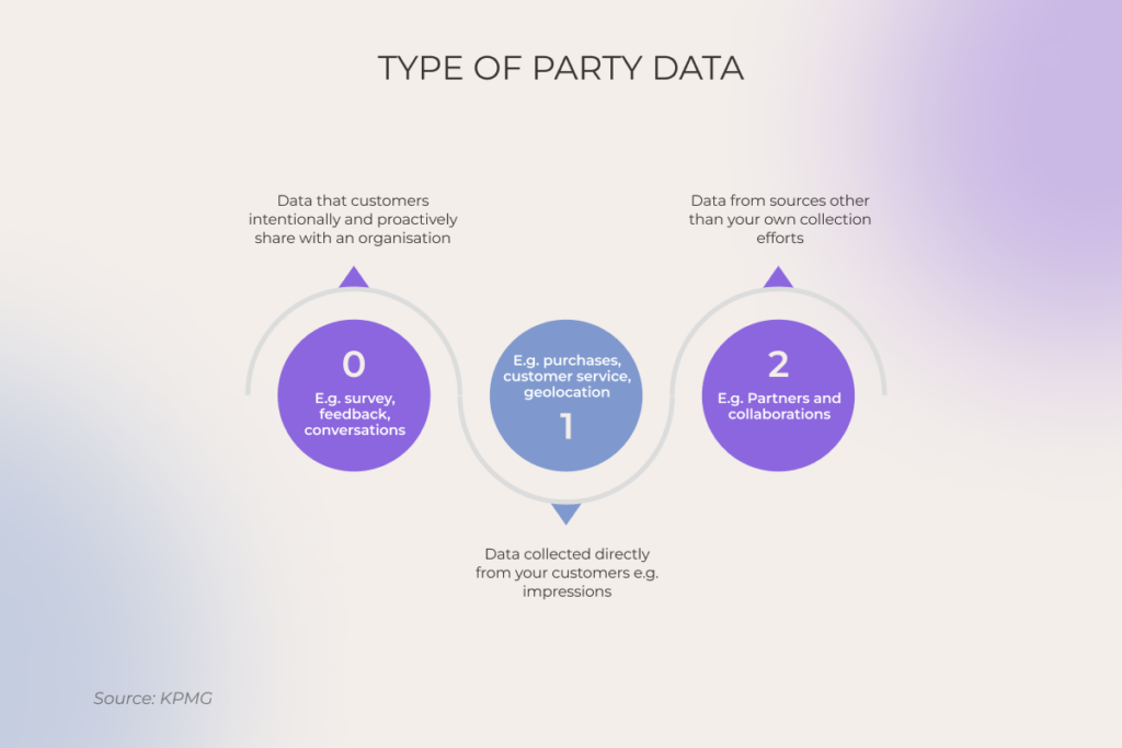
Zero-party data

Any insights that customers intentionally and proactively share with a company are classified as customer-provided.

Organizations can extract customer-provided data from surveys, account creation, first-hand feedback, and reviews. Consider explicitly asking users to share their data upon website entry in exchange for personalized offers or offering rewards like bonuses or promo codes to encourage users to provide personal information such as gender, age, and preferences.


CRM systems like Salesforce, HubSpot, or Zoho provide survey tools, feedback widgets, and chatbots that help companies gather and analyze customer communications and feedback.

First-party data

Compared with zero-party data, first-party data is considered to be more accurate, reliable, and insightful as it’s action-based, coming directly from customer interactions with your ecommerce store. First-party data includes past purchase history, search queries, category browsing habits, average spend amount, time of past purchases, and any demographics gathered through interactions. Geospatial data, obtained through services like Google Maps API and MaxMind GeoIP, also falls into this category. 

Speaking about location data, one of our clients whose business focuses on appliance merchandising is a vivid confirmation that localized promotions and loyalty programs can turn out to be a goldmine of insights: 

  • Our team implemented a custom AI-based microsegmentation solution to dive deep into purchase behaviors and geospatial data. 
  • The software enabled at-scale localized personalized experiences in 12 markets and increased the client’s direct-to-consumer revenue by 18%.

Third-party data

Online retailers can also join forces with partner systems as a part of a collaborative effort or business agreement. These include CRM providers, marketing automation platforms, data analytics platforms, and other partner systems whose data is highly relevant to the seller’s specific needs. 

As for the data itself, it can span demographic information, purchase, history, browsing behavior, and CRM data. There are two ways to get hold of this data:

  1. Leverage data integration tools like Zapier or Mulesoft to plug into data from partner systems. 
  2. Use partner-provided APIs and collaborative CRMs with shared access capabilities to access the databases of partner systems.

Personalize or perish: ecommerce personalization best practices in 2025

Mediocre personalization won’t cut it in 2025. Let’s go over the essentials for building a truly exceptional personalization engine.

Know where your customers are and meet them there

Serving customers in their channel of choice is the rule of thumb in the world of personalization, which mandates companies to establish a consistent, omnichannel customer experience across all online and offline touch points.

To replicate this approach, you need an experimental mindset and continuous testing to determine the optimum channel for each message and customer.

Set ambitious goals, take measured actions

In something as incremental as personalization, perfection isn’t essential, but continuous improvement is. So think big, acknowledge the complexity of this endeavor, and take small steps towards it, relying on the culture of experimentation. We recommend getting the following essentials in place to succeed in it:

  1. Develop a strategy — define and prioritize high-impact use cases where personalization can enhance the customer experience.
  2. Audit internal capabilities — analyze the skill sets and tech infrastructure you need to support personalization at scale.
  3. Define how you collect, store, and link customer data —  make sure you have a dedicated, centralized destination, such as a customer data platform (CDP), to orchestrate customer data. Prioritize first-party data ownership and management, focus on customer identity resolution and privacy-compliant data integration.
  4. Build, test, and scale your analytics and modeling capabilities — once your data is in order, leverage robust data analytics to determine what to share, when, and where. 

Marry your CMS with a personalization engine

Integrating your personalization engine with a CMS through data feeds, webhooks, API calls, or elsehow allows you to serve hyper-relevant content at scale and ensure cross-channel content consistency. By connecting the two systems, you can create dynamic content variations that trigger targeting conditions based on specific criteria. Advanced algorithms can then refine these variations over time, making sure each user receives content personalized to a tee.

Summary 

A truly exceptional online shopping experience feels effortless, like finding the perfect pair of jeans the moment you land on a website. To provide something of a comparable hyper-personalized experience and not bust their budgets, ecommerce brands require a triple power of data, AI technology, and personalized content — weaved into a broader strategy and a roadmap.  

Accelerate your ecommerce growth through hyper-personalized experiences

Talk to our team

FAQ

Why is ecommerce personalization important?

The importance of personalization in ecommerce boils down to 71% of consumers expecting personalized interactions and recommendations. If you want to attract and retain more potential consumers, personalization should be your top priority.

What are the 4 D’s of personalization?

Data, Decisioning, Design, and Distribution are the four D’s of personalization and the keys to successful personalization at scale for ecommerce businesses.

What are the differences between B2C and B2B personalization?

While B2C personalization addresses individual customer expectations with tailored content, B2B personalization targets business-level needs with industry-specific content.

What is the role of AI personalization in ecommerce growth?

AI-driven personalization efforts enable online retailers to capture even the subtle trails of anonymous site visitors and deliver tailored shopping experiences for everyone. ML-powered solutions analyze signals such as users’ network speed, browser extensions, time spent on site, and other clues to group anonymous users based on similar actions and display relevant products.

What is the difference between personalization and hyper-personalization?

The main difference between personalization and hyper-personalization is the data and analytics they rely on. Personalization is built on historical data and basic analytics covering the ‘what’ of customers’ behavior. Hyper-personalization leverages past and real-time data and relies on advanced analytics with AI and ML at its core to anticipate upcoming shifts in customer shopping patterns and act accordingly.

How does ecommerce personalization improve customer experience?

Ecommerce personalization empowers businesses to make it personal with every customer, providing a unique customer experience with customized content and tailored offers.

How much does personalization increase revenue?

Well-designed ecommerce personalization can up your revenue by 5–15% while reducing customer acquisition costs by up to 50%.

What impact does personalization have on customer loyalty?

Tailored content suggestions and product offers, personalized promotions and discounts fuel a deep, long-lasting connection with your consumers, 62% of whom are willing to stay and spend more if brands offer personalized experiences.

SaaS Product Development Process: Out-and-Out Guide for 2026 and Beyond

Making a foray into SaaS product development seems like a license to print money for both startups and established businesses. The rationale behind this craze is simple: according to Gartner, the global public cloud end-user spending is projected to surpass $850 billion in 2026, with SaaS remaining one of the largest segments alongside IaaS and PaaS.

Composability, flexibility, and 24/7 accessibility make SaaS products a mandate for businesses that want to thrive through disruption and prevent a headlong tumble into the red. So, if you want to benefit from the steady velocity of software-as-a-service, our comprehensive SaaS product development guide is here to answer all of your questions, from what SaaS product development is to how to build an AI-ready solution that can stand out and scaleI.

What is a SaaS product?

Software as a service refers to a software distribution model that is hosted centrally on the cloud and grants users instant access to an application, usually on a subscription or pay-per-use basis. Users can reach software as a service products from multiple devices at their convenience, provided devices have an internet connection. SaaS product development is what brings a SaaS product to life.

AI is rewriting the SaaS playbook

SaaS solutions have grown in demand, with their market size projected to reach $793.1 billion in 2029, but the nature of that demand has shifted.

While earlier SaaS products won customers with their cloud accessibility, composability, and automation, now it’s table stakes, and vendors have to up the ante with architectures that can seamlessly capitalize on AI capabilities and expand automation coverage.  

Pre-AI SaaS could streamline a process, but AI-powered SaaS can act on the user’s behalf, interpreting context, making judgment calls, and executing multi-step workflows that were previously beyond any software’s reach. Gartner predicts that 40% of enterprise applications will integrate task-specific AI agents by the end of 2026, up from under 5% just a year prior, signaling a new product category emerging in real time.

The market is already repricing around this shift. In February 2026, roughly $285 billion in market capitalization was erased from SaaS companies in a 48-hour window the financial press dubbed the “SaaSpocalypse” – a reckoning driven by agentic AI launches. 

While the doomsday narrative writes SaaS off entirely, it misses a practical reality: AI agents don’t operate in a vacuum. They need structured data, permission layers, and reliable process logic to act on. Sounds familiar, right? That’s what well-thought-out SaaS products provide, so the reality is more nuanced than the headlines put it: agents are changing who does the work inside SaaS products, setting a new SaaS solutions development agenda, where software-as-a-service is less of a tool to click through and more of a solid infrastructure for AI agents to operate within. And companies that go deep with tailored, AI-native solutions still have a once-in-a-lifetime opportunity to blaze a trail with tailored solutions.

SaaS development challenges may pave a bumpy road to success

Building a perfect SaaS product becomes less painful when you know what to expect. Below are the recurring challenges in SaaS-based product development across product, engineering, and operations.

Delivering value to customers

The SaaS industry grows exponentially and so do the customer’s expectations. No matter how innovative, feature-packed, or aesthetically pleasing your software solution is, misalignment with your target audience will take its toll.

To overcome this challenge, you should never skimp on conducting market research and analyzing your target users. These will allow for a deep dive into the customers’ requirements, goals, and expectations. A customer-first product SaaS product development strategy is what helps you stand out among competitors and paves the way for a value-packed SaaS product with long-term value.

Service mindset

It’s not enough for your solution to cover the needs of your customers. To strike it rich, your product has to create an impactful experience that develops long-term loyalty. A product-first, service-oriented mindset is what enables you to create that indelible imprint on the user’s mind.

A service-first mindset encourages your product team to thoroughly understand the specifics of the project, the limitations of your product, its current goals, and potential areas for improvement. Everything that can possibly impact the value of the solution should come into the equation.

Scaling

A SaaS product development process is a journey of evolution. As your solution gains traction, it grows an impressive customer base around it. To accommodate new users, your software requires a scalable, easily adjustable architecture.

Therefore, it’s crucial to build a strong foundation early on to handle larger volumes of business with less disruption and cost. Modularity, minimized latency, and system resilience will help you grow pain-free and with less cost.

Information security and privacy

Unlike traditional software, SaaS applications do not have a corporate-security perimeter of firewalls around them. They need a whole lot of security configurations, including encryption, access management, incident response, and more to keep hackers at bay. In 2026, the security surface has expanded further: AI-powered cyberattacks, prompt injection, data poisoning, and model exploitation are now front-and-center threats for any AI-enabled SaaS product. On the governance front, frameworks such as the EU AI Act impose new compliance obligations on how AI collects, processes, and acts on user data.

Also, as this software distribution model often targets a wide audience across geographies, the challenge of meeting local data regulations, industry-specific compliance requirements, and other data standards turn SaaS product development into a never-ending chase.

Knowing the security landscape of your target market and an enhanced focus on data security and AI governance from the get-go will prevent costly violations and keep the data of your users safe and sound.

Tech talent shortage

72% of employers globally report difficulty finding skilled talent, with AI literacy outranking traditional engineering skills on the hardest-to-fill capabilities list.

Due to the competitive and scarce hiring market, finding and employing a local product development team costs business owners time, money, and other valuable resources that a company may not have an abundance of or be willing to risk.

To ease the strain, many companies resort to SaaS outsourcing which offers more flexible models for building development teams. Along with larger talent pools, companies can tap into unique product expertise, including specialized AI and ML engineering skills, and accelerate time to market thanks to the high availability of outsourced talent.

Overcome the complexity of product development with us

Contact our team

4 surefire approaches to building a SaaS product

58% of business leaders are prioritizing new products or services as their top growth strategy for 2026, and software as a service products, among other revenue streams, can put companies on track to increased growth, provided you know how to wrap your arms around this venture. We’ve curated best practices for SaaS product development – pillars of a successful SaaS development methodology.

Rapid test-and-learn cycles

Customer feedback is often deemed to be an input that forms the basis for product requirements. It’s important to establish a deep understanding of customers’ pain points and make them the heart of your SaaS software development life cycle.

From ideation to post-MVP improvements, it’s crucial to iterate based on the voice of your customer before making a full-fledged product. This approach is 101 in Agile, allowing companies to test with real customers and learn what needs to be improved. This way, you build around knowledge, not tasks, and establish a continuous cycle of improvements. Rapid AI prototyping and vibe coding have sped up these cycles, empowering companies to test new products and features with real users in days and weeks instead of months.

Capitalizing on existing digital and data assets

If you’re an established company, chances are you already have all the necessary ingredients to build a value-packed product that targets the needs of your customers. By tapping into existing digital and data assets, you can uncover new opportunities based on customers’ previous interactions with your business and seize them to reduce your costs and effort of development.

To craft products on the back of the existing assets, SaaS companies need a complete and transparent data infrastructure where no silos can stand in the way of innovation. Once isolated, data points become the legacy of select departments and cannot be leveraged in full to create a comprehensive data view. Also, you might need to fill in the data gaps or enrich proprietary data with third-party resources to make it exhaustive for a new product.

This data groundwork is twice as important in the age of AI models and agentic systems that are only as good as the data they’re trained on and the context they can access.

Planning for scale

Easy, on-demand scalability is what makes SaaS platforms emerge from the pack. Building with scalability in mind requires a dynamic and detailed roadmap that matches the pace of changes and allows the team to pivot with ease. Unlike static SaaS product planning, dynamic roadmaps are designed to be adaptive, thriving on real-time feedback from users in order to innovate quickly.

From a tech standpoint, a growth-ready product should rely on flexible architecture based on microservices and APIs that allow for simple interfaces to data, algorithms, and processes. Decoupled architecture is what enables the team to deploy features independently and dynamically allocate resources to services as needed. In 2026, this also means designing your architecture to support autonomous AI agents that can be orchestrated, scaled, and governed independently, much like microservices themselves.

Being responsive to customers’ actual needs

Product development for SaaS is never final. To be successful, your SaaS solution should constantly evolve to match the shifting needs of your customers. Baking tracking and analytics into the software allows you to gain a better view of both high-value and low-value features, doubling down on what matters the most for your customers.

Tracking tools help your product team measure new releases in terms of performance and positive customer response, making your solution customer-first and value-packed.

Set up your product development for success

Schedule a discovery call

From thought to bought: navigating the stages of SaaS development

A typical, Agile-first development process encourages development teams to iteratively execute the product vision, breaking each challenge down into smaller, solvable problems. The SaaS development process – sometimes called the SaaS development life cycle or SaaS development workflow – moves through ten clear stages, from market research to maintenance. Following this lifecycle structure helps SaaS product developers avoid scope creep and deliver value at every stage.

SaaS

Market research

Everything starts with an idea, but not every idea is worth pursuing. So before you march forward, it’s important to estimate how your product idea aligns with customer needs, industry trends, and market demand. You should also understand how your future product stacks up against competitors and what makes it stand out in the saturated market. Consider involving a focus group of real customers in the research to gather qualitative data and in-depth insights that would reveal true customer demands and opinions.

During early-stage SaaS product development, this research also involves assessing where generative and agentic AI capabilities can do the heaviest lifting for the users.

Product ideation

With market data on hand, you can further shape your product idea through a prism of different stakeholders steeped in customer needs — from a SaaS product manager to a SaaS product developer to a product designer. An ideation cohort can provide their unique perspectives on how customer insights can be implemented into the product and help you adjust the prototypes correspondingly.

Ideally, participants should be diverse, with representatives from each department or business function to give their relevant experience. At this stage, you and your product team generate and filter out ideas, prioritize user insights to identify opportunities, and group ideas into distinct buckets that may end up in a future product roadmap.

Ideation sessions should also revolve around focus groups, user surveys, and customer interviews whose input can later be aggregated and analyzed. If you are building a SaaS product on top of an existing business, you should pull in user feedback from existing customers, including sales calls, marketing data, and data from other touchpoints. This helps you gain a baseline understanding of the real-world users and potential new customers.

Determining business requirements

Once you’ve gathered customer requirements, it’s time to think of how this software project can bring you closer to your business goals. Business requirements define the strategic path of the project and describe what a system or a solution should do and why. They give a high-level, yet detail-oriented understanding of the scope of your solution, its overriding goal, and project constraints.

Business requirements should be agreed upon and reflected in the Business Requirements Document. Keep in mind that requirements gathering is a dynamic process that can bring new variables into the picture. Therefore, make sure to make space for future requirements gathering early on in the SaaS development lifecycle to keep the scope of the project easily adaptable.

Defining the project scope

A well-defined project scope keeps the project on track and ensures all deliverables are turned in on time, within budget, and up to your expectations. The level of detail on your project scope statement is directly linked to the complexity of your project. Either way, it should consist of three major parts, including project justification, main deliverables, and project objectives.

A scope statement also provides a detailed outline of all aspects of a project, including timelines, key stakeholders, constraints, and other key elements of the SaaS development workflow.

Architecture design

A well-balanced SaaS system architecture is the backbone of a scalable and reliable software-as-a-service solution. Typically, this is dictated by your customer requirements and business goals. For example, a multi-tenant SaaS architecture is a great option for commercial software products as it’s maintenance-free for the customer and requires less upfront infrastructure procurement.

You can also base your solutions on a single-tenant or a mixed-tenant architecture that allows for more dedicated resources deployed for each customer. Overall, the tenancy model makes no difference for the functionality of an application, but it impacts other aspects, such as the number of concurrent customers and operational complexity.

Software as a Service

Mixing these models to cover the diversity of customer needs is on the list too. For example, the basic tier of the solution can run on a multi-tenant architecture, while customers with higher performance needs can be billed for a dedicated service tier based on a single-tenant delivery model.

Architecture decisions now also extend to the AI layer: how agentic workflows will be orchestrated, where context and memory will be stored, which LLM providers to integrate with, and how to design agent-to-agent communication patterns. This layer of SaaS product engineering requires a clear SaaS product development framework for architectural choices, from vector databases for context retrieval to orchestration frameworks that manage multi-agent collaboration.

Choosing tech stack

The tech stack for SaaS solutions development usually includes client-side technologies, server-side technologies, and cloud services. The right combination of tech will secure your product well into the future and enable it to evolve and scale with fewer costs. When choosing your IT stack, our team takes into account your existing IT suite, the complexity of your software, and maintenance requirements. For AI-enabled products, the stack should include LLM platforms, agent orchestration frameworks, vector databases, and observability tooling for monitoring agent behavior and token consumption.

Developing an MMP

Once we lay the groundwork for product development, our team proceeds with identifying high-value features and setting priorities for feature releases. Must-have features are then incorporated into a Minimum Marketable Product or MMP, an upgraded version of an MVP, a product version with minimum functionality that should still be enough to enter the market and gain traction among end users.

MMP development is also preceded by prototyping whereby our UX/UI design teams create a visual representation of your MMP and prepare the final layouts for further development. At this stage, each MMP feature is also thoroughly tested through continuous testing cycles, enabling our team to obtain critical feedback earlier and ensure faster deliveries. AI-assisted prototyping has made rapid SaaS development a reality at this stage, allowing teams to validate products with real users at a fraction of the time it used to take.

App development

Your SaaS product lifecycle follows through with an MMP release that will allow your team to collect valuable customer feedback and chalk out a roadmap for product enhancement. At this stage, your product teams add good-to-have functionalities into the SaaS offering, iterate on an MMP based on the user sentiments, and transform the application into a full-fledged solution ready to offer a plethora of features.

This stage also benefits from continuous integration and testing cycles that enable your team to evaluate the quality of each deliverable as part of a continuous delivery process, by testing early and often. This testing culture determines the quality of your releases, so make sure your team doesn’t skimp on this part.

Delivery and SaaS product commercialization

New features and updates are delivered continuously in small batches which allows your development team to easily troubleshoot issues and release as often as you need. Continuous delivery cycles also increase the speed to market as your team doesn’t have to pause development for releases. As a result, users can enjoy an uninterrupted stream of improvements, with daily enhancements and feature fixes.

Commercialization also involves choosing the right monetization model, as AI features can generate value in ways that don’t map neatly to traditional per-seat pricing. For instance, when a multi-agent system takes over a whole workflow, there’re fewer humans in the loop to apply per-seat pricing to, and usage-based or outcome-based models capture the value better.

Maintenance and upgrades

The development of SaaS products is never final. It’s a continuous engine of improvements delivered through an ongoing effort of your support team. Your product management SaaS unit should monitor customer behavior, unearth valuable insights, and communicate them to a support team that can then transform this feedback into a software upgrade plan.

Moreover, you need a dedicated team for maintaining your SaaS product, ensuring it delivers an impeccable experience to the users and can accommodate the growing workloads. For AI-powered SaaS, software upkeep also includes monitoring agent performance, fine-tuning models as user patterns evolve, managing context drift, and keeping up with the pace of LLM and framework updates.

Get your SaaS product driven from A to Z

Reach out

Hiring well isn’t enough, but building an effective SaaS development team is

To build a SaaS product with long-term potential, you need more than just a development team. A close-knit, autonomous squad of high performers with a business mindset and product vision is more likely to fit the bill, holistically growing and elevating your product idea. Here is what a well-balanced product team structure looks like.

Product manager

A SaaS product manager is in charge of the entire SaaS product management process, tackling product-related tasks and communicating product strategy to the engineering, design, and marketing teams. Together with product managers, SaaS product managers oversee the entire cycle of product development, making sure the final deliverables meet business and customer needs.

Project manager

SaaS project management differs from regular software development projects, but you still need a person with an all-seeing eye that can shepherd the project to completion. Project managers oversee the project from start to finish, keeping an eye on the budget, deadlines, and overall project progress. They are doers who maintain SaaS processes for changes in the project and coordinate complex project dependencies and team resources.

Business analyst

Business analysts are field workers who strategize your business idea, conduct market research, and participate in defining the scope of your project. Without thorough business analysis, it’s impossible to elicit project requirements and prepare detailed software documentation for the successful development and delivery of the product.

Solution architect

These specialists come on stage during large-scale projects and map the overall technical vision for your SaaS product. They bridge the chasm between business problems and technology solutions and match the solution with your corporate environment. For well-established companies, a solution architect can pinpoint areas where a SaaS solution can support business goals.

UI/UX designers

A user-centered experience remains a top purchase driver, and your UI/UX team is who makes that happen. From a smooth onboarding process to the ease of use, SaaS product design should cover all touchpoints, mimicking the workflow of your users.
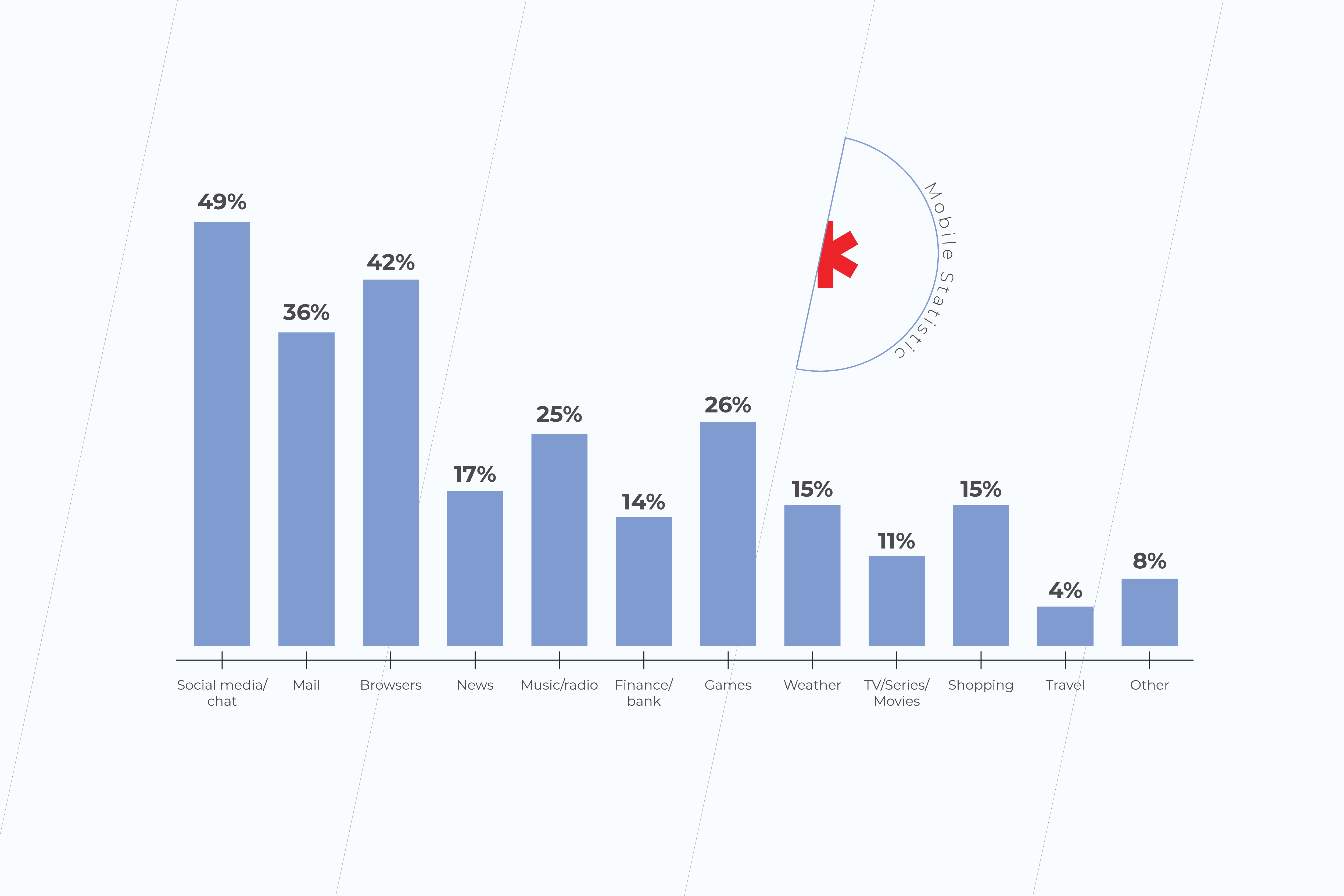
Designers map that workflow, tap into the minds of your users, and create other foundations of the successful design process. Based on the user data, they then create a fully clickable prototype, test it with end-users, and send the final layouts into development.

Software engineers

Software developers are the ones who roll up their sleeves and put your business vision into practice. They set up the front end of your solution, its server-side and backend storage. Software engineers also weigh into creating and maintaining project documentation as well as weed out the bugs in the existing code. The number of software developers and their specialty is directly linked to your project requirements and scope.

AI engineers

With AI now embedded in the majority of new SaaS products, dedicated AI and ML engineers have become essential members of the product team. They handle model selection and fine-tuning, prompt engineering, design agentic workflows, engineer context hierarchies, and ensure AI features perform reliably in production. Depending on the scope, this role may also cover RAG pipeline development and AI governance implementation.

QA

Quality assurance engineers are vigilant gatekeepers of bug-free, user-centered, and business-led software experiences. They check and validate each aspect of your product, running it through multiple functional and non-functional kinds of tests. QAs, worth their salt, run and design automated tests as early as possible and then consistently throughout the entire development process. For AI-enabled features, QA specialists now also include evaluating agent behavior, testing for hallucinations and context drift, and validating that AI outputs meet accuracy and safety thresholds.

DevOps

Faster releases and delivery cycles cannot happen without the hands-on participation of a DevOps team. They design and implement continuous integration and continuous deployment strategies, automate builds and releases as well as take the silos out of your development team. The result of DevOps enablement is a nimble, adaptable, and friction-free development cycle guided by the real needs of users.

Delivery manager

A delivery manager is the ultimate middleman who works closely both with the product and the technology team. While a project manager keeps tabs on the progress of the project, a delivery manager oversees the project team. They keep everyone on the same page, ensure common priorities, participate in project planning, and update stakeholders on the status of product development.

5 reasons to outsource SaaS product development

For many companies, the call to outsource SaaS product development comes after the first hire-and-burn cycle. These five reasons cover what an outsourced SaaS development project actually delivers beyond just headcount.

Faster time to market

The ability to bring a product or service to market quickly and efficiently can give a company a significant competitive advantage. And outsourcing is an excellent catalyst for product development. From faster hiring cycles to 24/7 availability of developer talent, outsourcing gives you a head start on product development and helps snatch leadership in the market by being first. Having a strategic outsourcing partner with a team at the ready also allows you to respond to market demand faster, avoiding fragmentation in releases.

This advantage compounds when your outsourcing partner brings proprietary AI tooling to the table. For example, at Instinctools, we use GENiE, our very own agentic AI accelerator with pre-built context engineering, orchestration patterns, and cost optimization mechanisms that enable us to compress the timeline for AI-powered SaaS solutions development to 6-8 weeks.

Slashed development costs

In most geographies, the cost of hiring an in-house developer can reach twice the size of the base salary with employee costs added up. Not to mention the upfront investment in equipment and infrastructure required to develop a software product.

Outsourcing vendors are usually based in low-cost locations with accessible developer rates. Also, as the outsourced team is on a vendor’s payroll, you don’t have to cover benefits and other administrative costs, but pay exactly for the job done. Office space, infrastructure, software licensing, and other expenditure items are on the vendor as well.

Technological and methodological flexibility

Outsourced IT services give organizations the flexibility they need to deliver a trail-blazing solution based on the custom stack of technologies. Companies that outsource are not locked into limited in-house expertise and can land niche skills to solve problems and create new opportunities. Methodology- and technology-agnostic vendors can also help companies choose the tools and processes that suit the unique requirements of their projects. It becomes a critical advantage for companies building AI-native SaaS, where the landscape of frameworks, models, and orchestration tools shifts rapidly.

Compliance with industry best practices

Partnering with external software engineering companies lets you unleash expertise in a particular business domain or area, such as healthcare or automotive. Experienced technology partners have a time-tested arsenal of practices and workflows that come as a bonus to technological proficiency. You don’t have to delve into regulatory compliance, standards in data sharing, data security requirements, and more — your vendor has got it covered. In the age of AI, this extends to AI governance, responsible AI implementation, and compliance with frameworks like the EU AI Act.

Customer-centricity

The culture of customer-centricity doesn’t just appear out of nowhere, you need years to perfect and hone it. From calibrated market research to high-value features to user-driven design, customer-centricity stems from a batch of competencies that should live in your company. An outsourcing partner already has the skills and talent to focus on customer research and use the data gathered to build products/features your customers want.

Kick-start your SaaS development project

The SaaS model is only going to keep gaining prominence. As exciting as this opportunity is, you need much more than a business idea to gain your footing in the market. Lack of available talent, unfit solution architecture, subpar user experience, and other prerequisites could stand in the way of launching your SaaS business. Instinctools is a leading SaaS product development company with an end-to-end approach, deep AI and agentic expertise, and an exclusive GENiE accelerator that will get you on the track to a successful SaaS product.

Start your SaaS-powered journey to innovation

Book a meeting

FAQ

What is a SaaS product?

It is a business model that consists of software, hosted by the vendor, which is sold to customers. SaaS products don’t have to be downloaded and installed on devices. Instead, they offer instant access to users.

What is SaaS product development?

SaaS product development is the full cycle of designing, building, and improving a cloud-hosted software product. It covers market research, SaaS product planning, architecture design, AI integration, and post-launch iteration.

What is considered a SaaS product?

All SaaS products are hosted by a central provider and delivered to end users through the Internet. Multi-tenancy architecture, subscription-based billing, and elastic infrastructure are also commonly associated with these solutions.

What is SaaS development?

It is the process of designing and developing a complete software solution that can then be sold to customers at scale. Customers buy the right to use the software as a service instead of owning it outright.

What is SaaS product development?

It is an end-to-end process for launching a new SaaS product that requires not only technological expertise but also the knowledge of product development. Here, your team has their eyes on the value of the product, rather than focusing solely on deliverables.
How long does it take to build a SaaS product?

Timelines for developing a SaaS product vary significantly based on complexity, team size, and whether AI capabilities are involved. A focused MVP can be ready for market testing in 3-4 months with an experienced team. Full-featured SaaS products typically take 6-8 months to reach production readiness. AI-powered features may add time for data preparation, model tuning, and agent orchestration, though proprietary accelerators and SaaS product development frameworks, such as Insticntools’ GENiE, can compress these timelines considerably.
What kind of developers are needed to build a SaaS product?

A typical SaaS team includes frontend and backend engineers, a solution architect, UI/UX designers, QA engineers, and DevOps. For AI-powered products, add AI/ML engineers who handle model selection, agentic workflow design, and context engineering. The exact mix depends on your product’s scope. When outsourcing SaaS product development, you can always scale the team up or down to match the project’s needs.

What are the stages of SaaS development?

The process to create a SaaS product starts with meticulous market analysis and user research. Derived insights will allow you to ideate your product, select core features, and distill the unique value of your future product. From there, your development team elicits business and product requirements, plans the development process, and gets down to high-level design. They then develop a Minimum Marketable Product, release it into the wild, and collect feedback for further iterations. Post-release maintenance and support are also essential to guarantee a friction-free user experience and resilient growth.

What gives a SaaS product lasting competitive advantage?

Long-term advantage in SaaS comes from a combination of deep domain expertise, unique data assets, and responsible use of AI capabilities that compound over time. Products built around vertical workflows with domain-specific models and rich operational context are significantly harder to displace than generic horizontal tools.

Acquire and Retain: How To Nail Personalization In Banking and Build Customer Loyalty

When personalization feels baked into every scroll and click on platforms like Netflix or Amazon, customers no longer see tailored treatment as a premium perk. What once felt like a VIP touch is now simply the baseline across all areas of life, banking included.

Interestingly enough, the demand for personalized banking cuts across generations. 74% of respondents, including Gen Z, Millennials, Gen X, and Baby Boomers, want banking services that feel made-just-for-them.

Ironically, banking institutions remain the last bastion of personalization with 94% of financial institutions acknowledging their inability to provide the kind of hyper-personalization customers desire.

Every day, banks generate a huge amount of customer data that can be turned into competitive advantages through delivering unique offers. Yet, it often remains untapped.

So what’s the problem? Why don’t banks use their abundant data assets to the fullest? Let’s uncover the main challenges of personalization in banking and how to overcome them to attract and retain more clients.

What is personalization in banking?

Banking personalization is the use of data collected from customer financial transactions, behaviors, preferences, customer feedback, and life events to identify needs, predict intents, segment dynamically, and deliver timely, relevant products, offers, and advice across channels.

For example, if the bank detects a new parent, it might recommend education savings plans or family insurance. Frequent online shoppers can see cashback rewards and real-time fraud alerts. A customer saving for a home might get personalized mortgage options tailored to their budget and timeline.

Benefits of financial services personalization

Nearly 92% of banking executives are ramping up investments in personalization efforts, betting it’s the key to reach customer satisfaction from the very first interaction through to long-term loyalty.

  • More effective customer acquisition

Offering the right product at the right time improves engagement and conversions, all while reducing customer acquisition costs (CAC).

For example, a Brazilian bank’s dynamic, personalized online banking menu drove a 56% surge in monthly loan applications and a 30% higher conversion rate. Similarly, the U.S. Bank’s tailored marketing campaigns, powered by a real-time customer data platform, resulted in a 127% increase in annual booked accounts. Moreover, as stated by Mastercard, leveraging available data in a right way to deliver personalized customer experiences from the very first page view helps banks optimize acquisition ROI and reduce CAC.

  • Higher customer retention

Today, 72% of banking customers prefer to stay with banks that anticipate their needs even before they’re articulated. When every interaction feels genuinely relevant and helpful, account holders remain loyal to such a level of care. Conversely, even the slightest hiccup in the way a bank develops its sales and marketing communication with a customer can drive churn.

We helped one of our clients, a prominent Czech bank, enrich their new conversational AI chatbot with a personalized virtual financial advisor. Pattern recognition under its hood allows the bot to anticipate customer needs and spot keywords, such as “pay”, “send”, “transfer”, etc. to give users faster access to relevant financial products.

By analyzing customer data, the chatbot provides tailored insights, proactively helping users reach their financial goals. A trial pre-subscription run of an AI-powered solution exceeded expectations, helping increase 30-day user retention by 7%. Read the full case study >>

Czech bank upgraded its chatbot with AI-powered personalization capabilities. Customers felt the difference
  • Revenue growth

By building personalized relationships with clients, banks get an additional revenue stream through up- and cross-selling their financial products, thus increasing customer lifetime value. In fact, banks excelling at personalization generate 40% more revenue from marketing activities compared to their peers, who rely on generic campaigns and broad segmentation. 

Reel in more customers, foster loyalty, and keep them engaged with smart banking personalization

Get started now

Challenges on the way to a personalized banking experience

A deep understanding of customer persona and customer expectations across all touchpoints of the customer journey is what leads to a seamless and personalized experience in financial services. As more and more customers want their bank to be as personalized as Amazon, financial institutions need to step up and deliver.

However, obtaining it isn’t easy as granular offerings are often hampered by common limitations present in the banking sector.

Legacy software

According to Deloitte, outdated technologies are considered the main bottleneck on the road to deeper personalization. Tech debt, the absence of real-time advanced analytics, and inflexible customer databases leave customers’ behavior unmotivated to finance organizations. As a result, companies lack strong cross-channel offerings, revenue growth, and, most importantly, a holistic vision of their customers.

Moreover, the lack of consistent data analytics stops banks from leveraging customer data as a competitive advantage. This means that banking institutions are unable to compete with tech-savvy banks by default, thus losing profit and potential regulars.

Organizational silos

Siloed data and isolated departments also hobble the successful adoption of a customer-first mindset and big data analytics. Silo mentality is detrimental to both internal and external policies since it limits data flows to a specific branch or employee. As a result, no uniform data governance approach is possible, making personalization and advanced analytics unviable at all stages of customer journey.

Typically, organizational silos refer to incompatible tech systems that cannot programmatically interact with each other. As a result, data is fixed in one department and segregated from other parts of the system architecture. Therefore, before implementing a new setup, companies can either update their whole infrastructure or connect legacy systems to the new infrastructure component.

Neglected customer needs

All too often, the banking industry focuses on products and financial solutions rather than customer needs. However, profound customer needs research is intrinsic to top-selling initiatives in digital banking. Without good customer experience, it is impossible to sell effectively and achieve business growth.

A well-shaped customer vision lays the ground for:

  • Competitive customer service
  • Smart digital banking
  • Relevant fees on banking accounts
  • Convenient branch locations
  • In-demand types of services
  • Positive brand image
  • Stronger customer relationships
  • Well-defined interest rates
  • Branch sales productivity

Luckily, the challenges above can be eliminated. Tech companies solve these problems by helping banks create and implement robust personalization strategies by putting all their existing data in place, analyzing it and offering personalized solutions at the right time and place.

Five secrets of acquiring and retaining customers through personalization in digital banking

The good news is that personalization in banking is attainable. By implementing advanced tech tools and digital-savvy approaches, financial institutions can tap into the hearts and minds of their customers and deliver initiatives polished to a tee. Here’s your secret sauce that will help you reel in clients and drive more value.

Establish a single source of truth

Some financial businesses have their customer data siloed across departments, which makes it isolated from the rest of the organization. As a result, the customer journey and personas are incomplete if created at all.

Clean, relevant, and accessible data is key to discerning the stimuli, preferences, and financial behavior of your customers. To create a single view of the client, financial services companies should unify and activate the miscellany of the operational data at hand. 

However, data unification and activation require the elimination of organizational silos and system modernization. Data lakes and warehouses contribute to delivering a 360° customer view and promote interoperability and immutability of data. Within them, data is drawn from multiple locations across departments, with all input being analyzed by specific criteria. 

Once the analysis results are ready for use, custom or platform-based Business Intelligence tools visualize the insights and prepare new reports so that businesses can monitor and compare crucial metrics and KPIs. For example, a loan department can source specific transaction data from a huge data repository to amplify loan decision-making at any time.

Moreover, comprehensive data governance policies will maximize the use of big data and align data collection and classification across organizational boundaries. Data governance also connects the data points in a cohesive whole and standardizes them across warehouses, lakes, cloud storage, and databases.

To better understand a customer, banking leaders also enrich their data collection through external APIs. This increases access to additional customer insights premised in enterprise and accounting systems as well as partner and public datasets such as PSD2 account information.

personalization

Tap into generative AI capabilities

Follow the lead of forward-thinking banks doubling down on generative AI across multiple use cases to freshen up customer experience, cut out tedious tasks, and stay competitive with digital-first challengers.

  • Personalized experiences on a frontline

Old-school, rule-based banking chatbots are frustratingly limited and rarely solve problems on the first try. The architecture of these solutions fundamentally prevents personalization. In contrast, virtual assistants with robust NLP under the hood are a whole different ball game when it comes to providing customers with effective, individualized care. Rather than just repeating scripted answers, they understand context, detect intent, and anticipate needs. Beyond hyper-personalized customer service, your banking app can also be boosted with features like:

  1. Instant account updates (“Show me last month’s dining expenses”)
  2. Proactive push notifications (“You’re nearing your budget limit. Want to adjust?”)
  3. Personalized financial advice (“Based on your spending, you could save $200/month by refinancing.”) 
  • Personalized marketing content at scale

When you let deep neural networks and machine learning algorithms process structured and unstructured data, say, customers’ transaction history, social media activity, or demographic info, you dig into the very fabric of personalized messaging across your marketing collateral.

Not only does the quality level up, but the quantity does too, thanks to LLMs’ powerful natural language generation capabilities. Accenture shared how a retail bank they worked with managed to produce 30x more high-converting marketing content with no delay in turnaround.

  • Risk assessment

Traditionally, evaluating a borrower’s creditworthiness involved manual reviews, gut instincts, and incomplete data. Mistakes were costly, either in the form of bad loans or missed opportunities.

Generative AI changes that. By analyzing vast datasets including spending patterns, market trends, and even subtle behavioral signals, machine learning models can predict risk with startling accuracy and generate further informed guidance in a couple of seconds. That way, banks approve loans faster, with fewer defaults, while customers benefit from fairer, more tailored terms.

Build lookalike audiences with ML

Since it’s really hard to yield tailored experiences for each client, financial institutions often implement look-alike models. This classification technique helps identify customer groups that share similar segment-specific data, be it spending habits or age ranges. 

By analyzing a wide array of metrics, ML-based look-alike models produce evolving customer profiles. Accurate segmentation, in turn, allows banks to predict the clients who are most likely to respond to particular financial services. In simple terms, finance companies get a smart opportunity index that allows them to create accurate marketing strategies and build a personalized banking experience that drive true value to clients.

Integrate life-event data

Customer profiling can never be too deep. Therefore, any bit of valuable information contributes to more awareness about customers’ behavior. On this line, event data, which describes actions performed by a client, can yield measurable or otherwise analyzable insights. As a result, finance firms can immediately react to new customer interactions and offer personalized services.

Companies from the financial services industry can leverage data from third-party events to hunt for new customers. These may include communication tools, social media data, and other third party financial apps. To enable automated processes and real-time data tracking, finance institutions must have this data integrated with in-house tools.

However, as third-party data sharing practices are tightening, integration approaches are subject to a wide range of regulatory acts that include GDPR, Dodd-Frank, MiFID II, and others.

Alternatively, banks can collect and integrate in-house event data to retain loyalty. On-site financial infrastructure with event-based architecture and event streaming are already awash in data coming from corporate sources. That being so, by sharing events across the company, finance businesses have an event data set ready for analysis. If we combine historical data with real-time insights, this further adds predictive capability to event streams.

Moreover, event data on its own can help create contextualized customer engagement opportunities in real-time. It means that when the client decides to choose new banking products when checking their account balances, for example, and leaves the application form unfilled, the system will notify the bank of the lost opportunity. This, in turn, allows banks to re-engage the client right away.

Another example of well-done event data management in digital banking includes real-time spending categorization. When a client makes a purchase at a grocery shop or gets gas, the bank’s money monitoring tools notify the client of the spending type and budget portfolio, keeping the client aware of their spending pattern. This nice touch on a customer’s financial well being nurtures brand connection even with no real interaction with the client.

Be where your customers are

70% of banking customers expect consistent interactions across all digital channels. Therefore, omnichannel excellence isn’t just one of the buzzword industry trends, but a necessity. Digital-first finance companies should deliver uniform experience and service to clients across multiple digital channels simultaneously. This, in turn, intertwines all client touchpoints and allows organizations to target the user with bespoke offerings based on previous customer interactions with the company’s platforms.

For example, customers can be served with granular ads on social media or ad-friendly websites after browsing information on a certain bank credit card or loan offers. Also, interrupted application processes can be remediated with personalized mobile notifications if a client has a banking app on their smartphone.

cross-chanel personalization

Major banks are already following the omnichannel principle. For instance, U.S. Bank has created a unified customer information database to ensure an omnichannel experience for users across 3,000+ branches in 25 states.

To ease the strain on the marketing department, banks can resort to marketing automation. The latter takes over multifunctional marketing efforts and facilitates sending personalized offers across the channels, whether it’s a mortgage loan or a retirement plan. Businesses that leverage marketing automation tend to land +451% of qualified leads.

From a tech standpoint, marketing automated tools lean on cross-channel data, feeding on email, website, app, and other interactions. The software then streams segmentation and targeting processes to group the right audiences and calibrate messaging to each customer automatically based on their profile. Being a competitive asset, marketing automation reaches customers on a personalized level, no matter the audience size.

Reimagine customer experience through personalized banking services

Banks of all kinds – traditional financial institutions and digital challengers alike – are realizing big gains by treating customers as individuals. By putting customer data to work (safely and ethically) to generate personalized financial advice, alerts and offers, banks can measurably raise retention rates, increase cross-selling/up-selling, and establish stronger account holder relationships.

To enable personalized banking initiatives, financial institutions need to establish an updated data infrastructure that allows for real-time analysis, exhaustive data collection, and intelligent capabilities. A concise data governance strategy will glue all components of your setup and initiate a data flywheel to get continuous valuable insights.

Design a robust personalization program and build new capabilities for managing the data-to-decisions value chain 

Get in touch

Accessibility For Apps: Guidelines, Examples, and Best Practices of How to Care About the User

According to the WHO, 15% of the world’s population experiences some form of disability. In most cases, aware societies strive to balance health disparity so that this population cohort doesn’t feel any barriers to an acknowledged quality of life. And it works just fine until a person with a disability faces a situation when something is out of their reach because of poor mobile app accessibility. 

Our developers and UX/UI designers will walk you through what can be done to increase the accessibility of your mobile app and provide time-tested tips on simplifying the task with the help of generative AI.

Why does mobile accessibility matter?

Making your applications inclusive isn’t a matter of social responsibility only. Along with diversity cultivation, accessible mobile applications unlock an additional revenue stream, give your company competitive tailwinds and help meet compliance regulations.

Empathy

As we age, we all face some limitations, be it impaired hearing, lowered sense of vision, or motor impairment. Moreover, situational and temporary disabilities can put all of us into similar settings that individuals with a long-term disability have. Therefore, mobile accessibility is a long-term investment that, among other things, helps us take care of the older generation, our older selves, and those struggling with the temporary condition.

Assistive technology is also an important strategy to better integrate people who face additional challenges into the modern world and online communities.

Competitive advantage

According to statistics, one in six people has a disability. By making your solution inclusive, you cover an additional 61 million users, which expands the user reach of your application. 

Besides, tech inclusion is commercially interesting. The buying power of people with disabilities is around $13 trillion. Considering the number of inaccessible apps, your app and mobile device accessibility can reel in this additional revenue stream.

Mobile phone accessibility also reduces the operational costs of your business. A Dutch SNS Bank reduced the number of call center calls and associated expenses by over 15%. The savings are associated with mobile web accessibility changes the bank made earlier.

Accessibility makes better tech for everyone

Tech inclusion is essential to some, but useful for all. Closed captions, virtual assistants, and speech recognition software are the go-to features for all users, including people with disabilities. Voice route directions, for example, are both an accessibility feature and a hand-free option for drivers. Therefore, making your solution all-in will benefit everyone.

Compliance with standards and regulations 

In many cases, mobile app accessibility standards are required by law. The Americans with Disabilities Act Standards for Accessible Design, or ADA, mandates the inclusion of all people, in all areas of public life, including web-based businesses and their applications.

The ADA law also works alongside the Web Content Accessibility Guidelines (WCAG) which documents a single shared standard for web content accessibility. The current WCAG version 2.2 was published in October 2023.

By 2025, all EU-based companies must also optimize their services and products for accessibility to comply with the European mobile app accessibility guidelines.

Better brand image

Finally, digital accessibility benefits your brand and creates more opportunities for brand advocates, as up to 73% of customers believe that a company should take a clear stand on social issues.

How to ensure mobile app accessibility?

As of today, Web Content Accessibility Guidelines, or WCAG, are considered to be the benchmark for website accessibility. The guidelines also feature WCAG for mobile, which outlines mobile accessibility best practices. Below, we’ll talk about what your application should be like to be truly accessible according to WCAG.

Keep in mind that each principle includes three levels of conformance, where A is the minimum level and AAA stands for full conformance. Most organizations strive to score AA as a golden mean. 

Perceivable

Making your solution perceivable means that users must be able to perceive it with one or a few senses. In simple words, if your app’s content is geared towards a visual experience, it should have an alternative that involves auditory perception or any other sensory modality.

What can be the problem here?

  • No text alternatives 

Some solutions may fail to offer text alternatives for non-text content featured on screen, be it controls or images, in a way that is perceivable by the screen’s reader. It inherently makes the app unreadable for TalkBack or VoiceOver, which are default screen readers on Android and iOS respectively. 

On the contrary, speech descriptions make all non-text data accessible for the blind or people with low or weak vision. Facebook, for example, has rolled out automatic ALT text to describe visual content for screen readers.

an example of automatic ALT text describing visual content on Facebook
  • No adaptability

A mobile solution overlooks accessibility when its structure isn’t readily adjustable to different content presentation structures and orientations. In particular, an inclusive product can switch to both landscape and portrait without sacrificing content or elements just like the example below.

an example of an adaptable user interface

Native mobile app accessibility guidelines also require your product to mark up information, structure, and hierarchy between elements. This way, headings, tables, and lists will remain intact when the presentation changes, keeping your layouts simple and consistent.

Adaptability is essential for people with motor impairments, screen reader users, as well as people with learning difficulties and cognitive fatigue.

  • No distinguishing features

Inadequate contrast, a poor choice of colors, or the absence of text resizing take a toll on users’ perception. For instance, people with color perception issues struggle to distinguish between certain colors. Therefore, colors shouldn’t be the only way to convey differences or prompt action. Instead, combine color and text or character cues to convey information.

a juxtaposition of two illustrations highlighting the importance of text and character cues for interface accessibility
a juxtaposition of two illustrations highlighting the importance of a right choice of colors

Loss of content or functionality is another common accessibility issue that typically occurs when a visually impaired user zooms the text. Your mobile accessibility settings must allow for increasing by up to 200% while retaining all content and elements.

Operable

This principle necessitates your application to include fully-operable interface and navigation elements so that the user can make use of every feature regardless of impairments or disabilities.

What can be the problem here?

  • Lack of time

Given the diversity among people, it’s difficult to predict how much time it takes to browse through the app or find a specific section. Most banking applications, for example, have a maximum session time as a security measure. However, time limits or time-sensitive content makes it inconvenient for a screen reader or an elderly user to process information.

Flexible time limits or the turn-off option, on the contrary, make your application more friendly to seniors, sight-impaired persons, or foreign speakers.

  • Flashing content 

Blinking content is a red flag for inclusive applications as it can provoke seizures or other undesirable effects. Thus, individuals who have photosensitive seizure disorders simply cannot look at flashing lights or contrasting visual patterns without having an adverse physical reaction triggered by them. That’s why it’s important to avoid content that flashes over 3 times in 1 second and limit the area of flashing to a small portion of a smartphone’s screen.

an example of a flashing content warning
  • Navigation

Navigation that is neither programmatically tagged nor structured can also prevent a user from consuming the content. It holds especially true for visually disabled users that can only navigate your application with assistive technology as well as people with cognitive and motor disabilities.

Landmark regions, descriptive headers, unique screen titles, and labeled controls enable both users and screen readers to locate the needed section quickly and with fewer keystrokes. The application can also be coded to skip graphics and navigation links when consuming the content with a screen reader.

Tastemade, for instance, is a great example of full-screen navigation at work, while the example on the right sacrificed discoverability for a sleek design.

an illustration pointing the importance of a full-screen navigation

Understandable 

According to this accessibility principle, all information and your entire user interface must be easy to grasp for any person regardless of their health status. Simply put, the more intuitive and straightforward your application is, the more chances it has to score the AAA conformance level.

What can be the problem here?

  • Predictability

Some applications prefer to hide design elements behind sophisticated icons or employ futuristic user flows. While such designs are admirable works of art, they lack clarity. 

Hamburger menus, for example, are a widely accepted standard for mobile app development that simplifies menus for compact screens. However, they are neither navigable nor predictable for people with visual disabilities, cognitive limitations, motor impairments, and reduced dexterity. The desktop version of Telegram, for example, has a hamburger menu button.

Hamburger menu vs bottom menu

The overriding objective of predictable design is to set accurate expectations about what will happen next through consistent design patterns, standard semantic elements, and ordered information structure. An accessible application should also have all elements easily discoverable on the screen to give an accurate understanding of where the user is now. Bottom navigation, vertical sidebar, or sticky menus play it right.

  • Input assistance

Some users with lower quality vision, and with reading and intellectual disabilities may find it challenging to enter the information error-free or differentiate between mandatory and optional fields. To provide assistance, an application interface can include cues in the fields to reinforce important information.

The cues may range from labeled attributes for screen readers to select states and rounded corners. 

examples of bad and good design in terms of input assistance
  • Error prevention

On the same note, typical error indication methods may not work for individuals with low or impaired vision or color-blind people. Likewise, users with reading or motor disabilities have a higher chance of entering the wrong input, which can lead to serious consequences, including financial liabilities. Therefore, if the application doesn’t provide user-controllable data, it is not accessible.

Reversible submissions, order confirmation, deleting a record, or unsending a message are some examples of safeguards that will keep users from making a mistake.

Robust

Accessibility features should be seamlessly delivered across platforms and devices, including different versions of screen readers, braille terminals, or text magnification software. In simple words, robust design is immune to coding errors that can distort the content or functions in a web-enabled device or assistive technology. 

What can be the problem here?

  • Poor coding

If the HTML code behind your application lacks complete start and end tags, the app’s content may display differently across devices, not display at all, or be unreadable to assistive technologies. Well-formed HTML code that conforms to all markup language specifications makes sure that the accessible content structure will remain as intended across all platforms and devices.

Can cross-platform development provide a proper level of accessibility?

Cross-platform development is a Swiss army knife that accelerates time to market and kills two platforms with a one-code base. However, the accessibility potential of cross-platform development lags behind native applications. Therefore, cross-platform technologies are a tradeoff between accessibility and cost reduction, which can still guarantee at least a basic level of mobile accessibility on Android and iOS. 

Thus, Flutter app development is committed to making apps more accessible and includes built-in support for accessibility combined with the same capabilities of the operating system. Flutter can help you implement such accessibility features as large fonts, screen reader compatibility, sufficient contrast, and more. 

But keep in mind that mobile accessibility is a collective result of your whole development team, including Flutter developers. While UX/UI designers are dedicated to building inclusive interfaces, QA specialists make sure your final app version passes accessibility testing. 

Trust gen AI tools to review your app for accessibility issues

In the pre-AI era, accessibility excellence required intensive research and know-how from the development team. Tuning together inclusive features and a crispy interface may still be tricky, but the rise of AI-powered tools has fast-tracked resolving accessibility-related issues. 

For instance, UX/UI designers don’t have to manually review apps’ interfaces to spot accessibility defects. Software such as Stark, Userway, and Google’s Accessibility Scanner can automate the task. 

These tools are indispensable at the product design stage, where they scan Figma, Adobe, or Sketch files for compliance with WGAG and ADA requirements, fix minor issues, and highlight violations that require the UX designer’s input. 

There’s no need to decide between accessibility and design

Equal access to technology allows all people to actively participate in society and leverage tech comforts. Along with compliance conformity, mobile accessibility also contributes to a larger user base and competitive edge of your company. 

If you struggle to strike a balance between accessibility and design, our company knows how to score on both. Based on your unique requirements and accessibility standards, we seamlessly integrate inclusivity into a top-notch app design. Drop us a line to create a top-grade mobile solution that caters to all. 

Web App vs Mobile App: Which One is Best for Your Business?

Creating an application is the next step after your business has gained leverage online. When your customer buys from you once a year or you are a governmental organization, a web page would normally be enough. However, when frequent client engagement is demanded, the necessity for an app occurs organically. 

There are two ways of engaging with a customer with the assistance of current technology: either by means of a Web App or through a Mobile Application.

It’s a known indisputable fact that mobile applications have helped many companies increase their sales dramatically. Yet, in some cases, mobile applications aren’t needed, and businesses are absolutely thriving with progressive web apps. Some companies have both web apps and mobile apps ready for their users. In the end, the selection of technology is about meeting customer expectations and staying in your lane.

There’s no secret that the most important distinction between web apps and mobile applications lies in their development costs. So as to work out which of the present technologies is going to become the best investment for your specific business needs, we would look deep into the purposes these applications serve.

Want to discuss the business objectives of a mobile app or a web app for your company?

Web Application vs Mobile Application

Pros and Cons of Web Apps

+ A Progressive Web Application, or a Web App, is a website adapted for mobile. This is often one of the foremost progressive technologies nowadays. It imitates a mobile application and is viewable in most browsers on desktops and mobile phones. It costs less to build a web app than a website.

– An existent web app signifies that a corporation has already gained trust among its audience. However, there’s no requirement for constant involvement with an app. Maximum retention and time spent in the application have zero effect on a webpage and brand awareness. 

Pros and Cons of Mobile Apps

+ A mobile application or sometimes it’s called Native Application is a great marketing and sales tool for a variety of consumer-based companies. It involves constant engagement with the product through continuous interactions. Mobile apps collect as much information as possible, studying habits and analyzing user behavior and patterns. 

– A mobile app is a more expensive technology as compared to a web app or a website. Its budget is mostly dictated by the availability and price of skilled mobile developers for Android and iOS. While Hybrid applications are also available as a part of the cross-platform solutions, their updates are less frequent.

Web Apps vs Mobile Apps from a User’s Perspective

Web Application vs Mobile Application

Both web apps and mobile apps signify the trust level users have for the company. The main difference between them is the quantity and frequency of interactions. Native Apps also offer a more robust personalization. The communication is customized to users, supporting their interests, location, behavior, and more.

People download mobile applications after they use web apps on a regular basis. They do that once they get acquainted with a company’s website and social media. If they like how the application is made, they will stick with it. However, many users prefer PWAs, since they are faster and don’t require memory on their devices. Plus it only takes a few lines of code to make usability amendments in a PWA.

– Volha Marskaya, Sales Specialist

Mobile App vs Web App from a Business Standpoint

The common practice for a lot of companies is in building a website, a PWA, and a mobile application as they expand. The latter is a logical step toward broader market outreach. It is a method of business growth and it drives sales. 

There are, however, ways in which it can be cost-effective to work out a novel approach for specific user engagement while also saving on development and maintenance with no effect on sales. 

There are general recommendations for many B2Bs to own a branded application. At the same time eCommerce has shown relevant proof for PWAs, which are made to more easily compare goods in a browser.

What are the main criteria that allow the choice between PWA and Mobile Apps?

When choosing between web and mobile applications, it all depends on the goals and technical requirements for the interaction with the API, like accessing user location.

A website adapted for mobile would be sufficient when its purpose is solely the acquaintance and PR of the product with no requirement of further interaction with a client. Speaking of a short-term interaction once a week or a month, a web app would be enough. When one or two basic functions are solved, a mobile application is not needed.

– Eduard Beleninik, Lead of Mobile Development Unit

World Statistics. PWA and Mobile Applications in the Long Run

Web Application vs Mobile Application

Mobile applications’ downloads have increased in recent years to 218 billion. According to Statista, in 2023 mobile apps will generate more than 935 billion U.S. dollars in revenues through paid downloads and in-app advertising. And word-of-mouth is a very strong factor when deciding what applications to download. Finance, travel, and shopping apps are among those that mobile users in the United States spend the most time on.

Web Application vs Mobile Application

A study has shown that PWAs have 36% higher conversion rates than native apps. The average conversion rate for progressive web apps is higher because mobile traffic and consumer time on mobile is much higher than on the desktop. Many businesses report increased revenue thanks to mobile traffic. For example, the Starbucks PWA has doubled daily active users. And orders on the desktop are nearly the same rate as mobile.

The number of origins with PWAs has grown 170% in 2020. According to the Chrome team, there are tens of millions of installations of WebAPK only on Chrome for Android. However, PWAs are less accessible for Safari and iOS users because of Apple’s policy on a more private web, and more strictly regulated App Store. Following Apple, Mozilla claims deprioritizing progressive web applications soon.

Check other articles on our blog. Subscribe to our social media and get insider information on making your business ready for digital. If you have any questions, get in touch with our expert team or fill in the form below to have your project estimated by progressive web application development company.

What .NET Threads Are. Part 1

Ways Of Creating Multithreaded Applications In .NET (Part 1). What .NET Threads Are

With the advent of multi-core processors, multithreading has become almost indispensable in the development of applications. It is multi-threading that gives significant performance gain when using multiple processor cores.

However, multithreading comes with a lot of hidden pitfalls that are very unpleasant for inexperienced developers. Therefore, we have decided to make a series of articles devoted to multithreading methods in .NET applications using the C# language as an example.

In the first part, we’ll talk about multitasking and multithreading, we’ll consider the architecture of multi-core processors and how processor cores are arranged in an operating system. We’ll also review operating system tools for creating multithreaded applications, and we’ll take a closer look at the Thread class.

What is multitasking and multithreading?

Multitasking has become quite a natural phenomenon in modern operating systems. When several applications are running at the same time, the operating system can quickly switch between them, giving them CPU processing resources in turns. This creates the illusion that several programs are running simultaneously. This separation seems inconspicuous since neither the person nor the fastest Internet connection can work at the speeds with which modern processors process information.

Multithreading is the same thing as multitasking but within one application. The operating system switches between different parts of the same application quickly, thus creating the illusion that it is executing them simultaneously.

If you’re interested in more, read Microsoft Roslyn – using the compiler as a service

Architecture of modern computers

In the 2000s, when the CPU clock speeds grew rapidly, it seemed that nothing could stop this growth. Some experts predicted that the 10 GHz mark will be exceeded by 2010. This growth was proportional to reduction in the size of processor transistors, while an increase in processor power in those times was significantly ahead of Gordon Moore’s predictions (see Moore’s law).

However, before long, engineers encountered problems – substantial increase in heat release and fundamental limitations on transistor size. As a result, further increase in performance by improving CPU clock speed became practically impossible, and the clock speed remained at the 3-5 GHz mark today.

Engineers had to look for other ways of improving CPU performance. They found such an effective solution in multiprocessor information processing. If you cannot make the processor faster, why not add one more processor? In this case, you don’t need to create such a processor in the form of a separate device. The easiest way is to create such processors within one module so that they all have equal access to shared memory. Such processors were called physical processor cores.

Logical processor cores and hyper-threading

Operating systems operate on logical processor cores, sharing the time resources of each of the processor cores between processes and threads. A logical processor core may not always match with a physical processor.

In 2002, the Intel Pentium 4 processor introduced the Hyper-Threading technology for execution of commands. Hyper-Threading involves execution of multiple command threads by one physical processor core. In this case, the operating system sees each thread as a separate logical core. Dual-threaded hyper-threading works by adding another set of registers, an instruction pointer, and an interrupt controller into the physical core of the processor. Here, the number and set of execution units in the core remains unchanged.

Hyper-threading appeared as a solution to the problem of frequent downtime of the computational pipeline of Intel Pentium 4 processor, associated with excessive increase in the number of information processing stages in this pipeline.

The reasons for such downtime were:

  • The branching instruction was incorrectly predicted when executing conditional and unconditional branches.
  • There was a miss when accessing the processor’s cache and data needed to be loaded into the cache from the RAM.
  • The result of the previous instruction, which is still executing, is needed to execute the next instruction.

It should be understood that hyper-threading threads are not full-fledged physical processor cores, so they do not give multiple increase in performance. On average, the performance gain from hyper-threading is 1-30%, depending on the task being solved. In some tasks, there can be no performance increase at all. Nevertheless, hyper-threading is used in processors to this day, for example, in Intel Core i3, Core i7, Atom, Pentium, AMD Ryzen, and others.

If you’re interested in more, read .NET Core Framework Complete Review

Processes and threads in operating systems

The operating system works with logical processor cores, not knowing about their physical implementation. It sees the physical processor cores and hyper-threading threads as the same. A clear example of this is a screenshot of Windows Task Manager for a quad-core (4 physical cores + 4 hyper-threading threads) of the Intel Core i7-4770K processor in Windows 7 (Fig. 1).

Fig. 1 – Screenshot of the Windows Task Manager for Core i7-4770K.

The main program object of an operating system is the process. A process is an executable instance of an application that owns system resources (for example, RAM resources or I/O threads).

Each process can have one or more threads. Each thread executes part of the process code and has its own stack and registers. Threads can only access process resources and share them among themselves. The structure of a multithreaded program is shown in Fig. 2.

Fig. 2 – Structure of a single-threaded and multithreaded program.

At the same time, it is much faster to switch between threads than between processes during execution. Therefore, in terms of computing resources, it’s more profitable working with threads than working with processes. In addition, threads are supported by most operating systems and software platforms, for example:

  • WIN32 API Threads (Windows)
  • Cocoa Threads (iOS)
  • Multiprocessing Services (iOS)
  • Java Threads (Android)
  • POSIX Threads (GNU/Linux)
  • C Runtime Library (C)
  • OpenMP (C++, Fortran)
  • Intel Threading Building Blocks (C++, Fortran)

We will consider the technology for working with threads in .NET using C# as an example.

Thread class

The System.Threading namespace contains all the tools for low-level thread creation and management. First, we add this namespace to the project.

using System.Threading;

If threads have not yet been created, then at least one thread is already executing in the application. Let’s call it Main. To create another thread, we need to create a new Thread object.

Thread t1 = new Thread(GetThreadld);

In this case, the constructor of this object must pass the name of the function whose code will be executed in this thread. Here, it is the GetThreadId function. This function is passed as an object (in other words, a delegate) to the constructor’s argument. In this case, a function represented as a delegate has neither parameters nor return value. However, we can get out of this situation. For example, we can give a command to start a thread and simultaneously pass function parameters.

t1.Start("1");

Until the Start command is given, the thread will not start execution. In this case, the GetThreadId function can pass only an object as a parameter. The GetThreadId itself is declared as:

static void GetThreadld(object data)

A thread can be assigned a priority – both before its start and during execution.

t1.Priority = ThreadPriority.Lowest;
t2.Priority = ThreadPriority.BelowNormal;
t3.Priority = ThreadPriority.Normal;
t4.Priority = ThreadPriority.Highest;

ThreadPriority is a listed type here.

After all the threads have started, you need to call a function that is waiting for completion of their work. This is the Join function. Once the Join for all threads is executed, the threads will be terminated and destroyed. .NET automatically frees any resources that were occupied by these threads.

//waiting for all threads to finish executing
t1.Join();
t2.Join();
t3.Join();
t4.Join();

After the threads have finished executing, the main thread will again take over code execution completely.

Example of how the Thread class works

The following example displays 1000 messages from different threads with different priorities. Threads write their numbers to the console 1000 times each.

using System;
using System.Collections.Generic;
using System.Linq;
using System.Text;
using System.Threading;

namespace ConsoleApplication1
{
class Program
{
static void GetThreadld(object data)
{
// now the Main thread will display the received string (its number) one thousand times
for(int i = 0; i <= 1000; i++)
Console.Write(data);
}

static void Main(string[] args)
{
// we create 4 threads, we transfer as parameter the name of the function executed by the thread
Thread t1 = new Thread(GetThreadld);
Thread t2 = new Thread(GetThreadld);
Thread t3 = new Thread(GetThreadld);
Thread t4 = new Thread(GetThreadld);

// we assign priorities to threads
t1.Priority = ThreadPriority.Lowest; // lowest
t2.Priority = ThreadPriority.BelowNormal; // below normal
t3.Priority = ThreadPriority.Normal; // normal
t4.Priority = ThreadPriority.Highest; // highest

// we run each thread and pass the thread number as a parameter
t1.Start("1");
t2.Start("2");
t3.Start("3");
t4.Start("4");

Console.WriteLine("all threads have started");
// waiting for all threads to finish executing
t1.Join();
t2.Join();
t3.Join();
t4.Join();

Console.ReadKey(); // Until the user presses the key, the program will not end (so that you will have time to view the result)
}
}
}

The program execution result is shown in Fig. 3.

Fig. 3 – Visual illustration of the work of threads with different priorities on a quad-core processor.

The example in Fig. 3 shows three facts:

  1. Creation of threads is a fairly time-consuming operation. First, thread 1 with the lowest priority was created and immediately launched for execution. Then the other threads were created and launched in turns.
  2. Threads are terminated according to their priority: the thread with the highest priority (4) ended earlier than the other threads.
  3. If a multithreaded program is running on a multi-core processor, the priority of threads becomes less significant here than on single-core processors, since threads will be allocated among all the processor cores.

Background and foreground threads

Threads can be foreground and background. The difference between foreground threads is that the program does not end until all the foreground threads have been executed. Background threads do not hinder the completion of a program and are terminated together with it, even if the process that the background threads were executing have not yet been run.

To find out whether a thread is a background or foreground thread, use the IsBackground property.

bool bg = Thread.CurrentThread.IsBackground;

where CurrentThread is a static method of the Thread class, which returns a link to the thread that is currently an active thread.

By default, all threads are created by foreground threads. But anywhere in the program code, you can make the thread to become background and vice versa.

t2.IsBackground = true;

Possible errors when working with the Thread class

Despite the simplicity of working with the Thread class, many novice developers make gross errors when creating multi-threaded applications.

Error 1

The most common mistake made by inexperienced developers is that they try to catch exceptions that occur in child threads, using the try { } catch block to wrap its call from the parent thread. The point is that in this case, all exceptions in the parent thread will be processed, while exceptions in child threads will remain unprocessed and lead to immediate termination of the application. The listing below shows how not to catch exceptions in multithreaded applications.

try
{ // This code is incorrect
t1.Start("1" );
t2.Start("2" );
t3.Start("3" );
t4.Start("4" );
t2.IsBackground = true;
t3.IsBackground = true;
t4.IsBackground = true;
Console.WriteLine(" all threads have started ");
//waiting for all threads to finish executing
t1.Join();
t2.Join();
t3.Join();
t4.Join();
} catch (Exception e)
{ // only exceptions in the parent thread will be processed here
Console.WriteLine(e.ToString());
} // exceptions in child threads will not be processed and they will stop the application

To catch all exceptions in child threads, the try {} catch block must be located inside the function that will be passed to the child thread for execution, as in the listing below:

static void threadID(object data)
{
try
{
// now the thread will display the received string (its number) one thousand times
for (int i = 0; i <= 1000; i++)
Console.Write(data);
}
catch (Exception e)
{
Console.WriteLine(e.ToString());
}
}

Error 2

The second error is the attempt to access the application interface from the child thread. When developing applications with a graphical user interface (for example, WinForms or WPF applications), there is always a main thread that monitors the state of the GUI elements. Only this thread can change the state of the interface elements. Any other thread, when accessing these elements, will immediately throw an exception.

In WinForms applications, the compiler will mark as erroneous the code that accessed the controls from another thread. In additional information, the following will be written about this error:

“Additional information: Cross-thread operation not valid: Control ‘textBox1’ accessed from a thread other than the thread it was created on”.

In WPF applications, the situation is even worse. This will throw up an InvalidOperationException exception during execution of the application with the description “The calling thread cannot access this object because its owner is another thread” (Fig. 4).

Fig. 4 – An example of an exception when accessing the elements of the WPF application interface from another thread.

If there is still a need to change the interface elements, there are fairly simple solutions in this case. If you need to access the interface in a WinForms application, you will need to first perform a check by calling the InvokeRequired method from the interface element. If the InvokeRequired condition is true, then execute the Invoke method (see the listing below). If Invoke has already worked, then the interface element can be accessed directly.

void ControlAccess()
{
if(textBox1.InvokeRequired)
textBox1.Invoke(ControlAccess);
else
textBox1.Text = "test";
}

Calling Invoke without InvokeRequired check will also throw an exception.

In WPF applications, special object Dispatcher is used to access interface objects from other threads. To organize a call, you need to connect the following System.Windows.Threading space.

using System.Windows.Threading;

Next, we need to wrap the application interface from another thread with the static Invoke method of the Dispatcher class.

this.Dispatcher.Invoke(DispatcherPriority.Normal, (ThreadStart)delegate() { Cons.Text = "Industrial";});

Here “this” is a pointer to the current window whose interface elements are accessed. DispatcherPriority is an enumerated type that is responsible for interface access priority. Type gradation is exactly the same as when creating threads.

With the delegate() function, we declare an anonymous function and pass code to it with direct access to the interface elements. After declaring the anonymous function, it must be cast to the ThreadStart type (casting to a type is indicated in parentheses before the variable or function). In this case, accessing the interface will not throw any exceptions in the WPF application.

Error 3

A fairly common mistake is the lack of control over the completion of threads. The point is that the .NET Common Language Runtime (CLR) environment does not know if the thread will continue to perform any actions after it has completed all the work. Therefore, all responsibilities for completing the work of threads and their destruction lie on the shoulders of the developer.

The developer is obliged to ensure correct completion of all application threads in case the application was closed (including abnormally). If this is not done, the application’s parent thread will be terminated, while the child threads will continue to execute (even when the application window is already closed). At the same time, they will consume system resources, and after closing the application window, you can stop them only through the task manager.

This can lead to amusing situations. For example, the author of this article used to study the multimedia capabilities of WPF and worked with the MediaPlayer class, which can open and play *.mp3 files. He did this in a separate thread. If you don’t take care of the ending of the thread that plays music, then even after closing the application window, the music will continue playing.

Conclusion

Modern multi-core processors are designed such as to execute a large number of processes and threads at the same time. Nevertheless, this operation is quite resource-intensive.

Despite all the simplicity and efficiency of working with the Thread class, multithreaded programming is fraught with a lot of dirty tricks, and the developer risks running into unexpected program behavior if he/she doesn’t know about the tricks.

In the following parts of this article, a thread pool that saves significantly on the computing cost of creating threads will be considered. Methods of thread synchronization, multi-sequencing of cycles and database queries will also be considered.

How To Design A Landing Page That CONVERTS

Simple steps to increase conversion rate

Technically speaking, a landing page is a HTML document that contains CSS, text, pictures, videos, and sometimes scripts. This page is not that much different from the normal websites. But from the business point of view, certain expectations are placed on a landing page – it must convert. An end user should be able to quickly get all the information he needs about a product and take an informed decision to buy or not to buy on the landing page.

Landing pages work most efficiently when you need to compel users to register on the site or leave their contact information. There is no better solution if your task is to compel users to download a software product.

When it comes to sales, landing pages fully justify any investments, when you need to sell a particular product or service in a particular situation – a promo offer, clearance sale, and entry into a new market.

Structure of a high converting landing page

The structure of a landing page is simple and linear. Let’s consider three parts: the first screen, the body of the page and the last screen. The classical first screen includes a background image, contact information, logo, headline and a button.
A product can be effectively used on the first screen as the main image. Background images on the first screen make a great impression on users. No wonder Apple uses such approach – see Fig. 1.

Fig. 1 – An iPhone used as a background image on the first screen. Source: www.apple.com

After you engage the user in studying your page, you need to provoke his trust and push him to buy. The following typical blocks are targeted at this.

Team. If you provide services, it is important for the customer to know exactly with whom to communicate if he decides to contact you, and who will handle his inquiries. The best way to gain the trust of a potential customer is to introduce yourself and tell him about your team.

Fig. 2 – Photos of team members with links leading to their portfolio. An excellent demonstration of professionalism. Source: http://islreview.com/

Text description of a product. You can use text blocks to describe the advantages your product have over competitors. An important rule here is that the blocks should be placed closer to the end of the page in order not to influence the first impression (a lot of text in the beginning may seem boring), but also not on the last screen.

Fig. 3 – Detailed description of what is included in the ticket price. Source: www.valiocon.com

Video. Placing video clips as the background of a landing page could be both useful and extremely harmful. Here’s what you need to understand: the video should not interfere with perception of other information, neither should it slow down the loading of the page. Besides, you should think in advance how you would compel the visitor to watch the video, because he would need good reasons to do so.

Fig. 4 – The atmosphere of the video ideally repeats the emotions that are evoked by the product. Source: www.getrest.co

Reviews. Positive reviews from satisfied customers – if the authenticity of such reviews is in no doubt – lead to stronger sales. The problem is that no one reads these reviews if presented in a mediocre and unattractive manner. Ensure that blocks featuring the opinions and reviews of satisfied customers or prominent people arouse interest and trust.

Fig. 5 – Stylish and brief quotes help to gain trust.

The final screen of the landing page is designed to summarize all your advantages and encourage the visitor to become a buyer – via a treasured button with a call to action.

Call to action

Each element of the landing page directs the user to the mouth of the conversion funnel, but only one call to action is needed. Several calls to action ruin the conversion rate ruthlessly. Suggest to users to make one unique and concrete action – is it not for this reason that the landing page was developed? Let’s examine this element in more detail.

A call to action should highlight the real benefit to the customer in a language that he understands. The client should be able to get the said benefit immediately after clicking on the button.

The action should be extremely simple: if the goal of the landing page is to collect phone numbers, then no other field should be included in the form. You only need to ask the user what his name is in addition to collecting his phone number. If the aim of the landing page is to distribute a software product, then the call-to-action button should initiate a download to the computer.

Fig. 6 – Having one field for email address and one button is a great example of how to avoid asking the user for unnecessary information. Source: www.monkop.com

There is one more rule – the more complex a product is, the simpler the action should be. It is ineffective to accompany complex products with calls for immediate purchase. If you are selling heating equipment, then simply ask the visitor to leave his phone number, and not try to sell an expensive device straight away through one web page.

Fig. 7 – You shouldn’t try to sell a camera worth $5,995 and its accessories in one page. It’s better to collect contacts from that user. Source: www.blackmagicdesign.com/products/blackmagicursaminipro

If you make your call to action different from those offered by competitors by adhering to the above simple rules, then the number of your leads would grow substantially.

Fig. 8 – A great call to action in the footnote. You can immediately see the price on the button.

AIDA and PMHS

AIDA is an acronym that stands for:

  • Attention
  • Interest
  • Desire
  • Action

It is a marketing model that describes a person’s decision to buy. This model works flawlessly. Implementing it into the structure of a landing page is very simple.

Blocks that capture attention are located on the first screen (headline, attractive background image). They are followed by those that arouse interest (display of the product and its advantages). You generate desire with discounts and time-limited actions, while buttons and forms lead to action.

PMHS stands for:

  • Pain
  • More pain
  • Hope
  • Solution

It is a design scheme for promotional materials, which helps to create a converting page structure. This scheme migrated to the Internet from infomercial (teleshopping).

First, the pain of a potential customer is described. If you sell toothpaste, then tooth problem is your customers’ pain. Then the pain intensifies, the consequences of these problems are described. In the end, there is a ray of hope in the form of your paste and a solution – mail delivery for $25. Remember, PMHS is a negative motivation that does not suit all companies and products.

You can use both tools to create a landing page structure and compose blocks on the page for maximum effect.

How to write high-converting headlines

Headline is a key element of a landing page. Before you sell your products, try to grab attention and spark interest. Only after reading a strong headline that a person would continue to study the page.

4 U’s – technique for writing high-converting headlines.

The technique highlights the four features of a strong headline. For an example, we shall use the phrase “Buy tires” and modify it with four elements: Useful, Urgent, Unique and Ultra-specific.

Usefulness
Demonstrate the benefits and point out the solution to the problem. Buying quality tires is beneficial in terms of safety on the road. The original headline “Buy tires” is therefore replaced with “Improve safety on the road”.

Urgency
Create a sense of urgency by adding a time parameter. People value their time. Show them that you can save their time. If it would take half an hour to replace the tires, then write: “Improve safety on the road in 30 minutes”.

Ultra-specificity

Speak clearly and use numbers. Be specific so that the buyer would know what he is paying for. Show the benefits using numbers: “Improve safety on the road by 25% in 30 minutes”.

Uniqueness
Tell why the product is unique. Let the reader understand how the benefits are achieved. The sentence should not look magical. “Improve safety on the road in 30 minutes with Japanese rubber”.

The main thing is to convey the value of the product to the reader. This technique serves as a farewell speech, and not a strict rule. It is not always necessary to use all the four U’s – sometimes you can do with three or even two. If the headline turns out to be cumbersome, you can put some of the information into a sub-headline.

Fig. 9 – An example of a strong headline with an informative sub-headline. Source: www.close.io
Fig. 10 – An example of a weak headline. The reader can understand the features of the product, but not the benefits from the beginning of its use right away. Source: www.sensortower.com

Some tips to increase conversion rate

1. Contextual advertising is the most common source of traffic for landing pages. The headline of a landing page, which welcomes visitors, should create the same impression as the advertising text that brought the user. This would make the user understand that he moved exactly where he wanted. Never allow the advertising text and the headline to create different impressions – this could lead to many visitors coming and leaving immediately.

2. Do not use stock images that can be found on many other sites. This is fraught with the fact that your landing page may get lost in a great lot of other headlines of potential customers. But even the uniqueness of the image is not enough – it should reflect or highlight the essence of your product.

Fig. 11 – Background image with people, though friendly, but uninteresting, boring, and does not reflect the essence of the page.

3. Even such a trifle as usual spelling errors can seriously damage the image of a company in the eyes of a potential client. Watch for both the grammar and the style of the text.

4. Landing page – a short and concise dialogue with a potential client. Using minimum number of blocks, you need to quickly make a person take the target action. If he gets distracted for even a moment, you can lose him. Therefore, all the elements of the page should serve a single purpose; there must be a reason for placing anything on the page.

5. If you don’t know why you need this or that block or element, safely remove it. Conduct tests to determine which elements of the page are not good enough and are negatively interfering with conversion rate.

6. Use social networking sites. Unobtrusively invite visitors to share your page and don’t hesitate to brag about the number of Likes you have on Facebook.

The main thing is to be honest with the visitor. If you undermine confidence, then your landing page won’t be able to restore your reputation. Do not lie or place unreliable or unverified information. Inconsistency between the real and declared price on the site is a common reason for refusal after a call.

Have a success in your sales!

Microsoft Roslyn – using the compiler as a service

.NET Compiler Platform from A to Z

One could encounter different situations where it becomes necessary to write one’s own code compiler, interpreter or analyzer for a programming language. Creation of compilers and interpreters is believed to be an “aerobatics” in programming, whilst the creation process itself is seen as very complicated and time consuming. However, the .NET platform has had tools existing quite for a long time, which greatly simplify this task.

What we had before Roslyn came

The .NET Framework can compile a source code without Visual Studio installed on the machine. The .NET Framework (starting with version 2.0) includes command line compilers csc.exe and vbc.exe. These compilers can be used to build .NET applications from any text file containing C# or Visual Basic source code. The compilers are run from the command line. The command line compiler parameters enable you to:

  • Set the name of the compiled file (/out);
  • Collect console applications (/target:exe);
  • Collect applications with graphical interface without using a console (/target:winexe);
  • Collect dynamically linked libraries (/target:library);
  • Add references to external assemblies (/r);
  • Write command-line arguments for the *.rsp file and specify the name of the rsp file as the command-line argument (@file.rsp).

The csc and vbc parameters perfectly handle the task of compiling a source code contained in one file. But MSBuild is used for the more complex tasks of compiling and assembling projects. Moreover, Visual Studio files *.csproj, *.vbproj and *.vcxproj serve as XML codes for MSBuild. Visual Studio uses MSBuild to build projects. In addition, MSBuild can be called from the command line or from a .NET application code via APIs.

It is also possible to generate a low-level MSIL code using System.Reflection.Emit. You can also go for dynamic code generation for .NET programming languages using CodeDOM, and then compile the generated code with the help of code providers (for example, CSharpCodeProvider, which is an add-in over the csc compiler).

All the approaches listed above were being used for code generation before the emergence of the .NET Compiler Platform, better known as Roslyn.

Roslyn is a collection of open-source compilers, code analysis and refactoring tools which work with C# and Visual Basic source codes. This set of compilers and tools can be used to create full-fledged compilers, including, first and foremost, source code analysis tools.

The History of Roslyn

The name “Roslyn”, the new platform for compiling a source code, was first written by Eric Lippert, a former Microsoft employee, when he started to recruit developers for a new project. Lippert named the compiler in honor of Roslyn, a suburb in Washington.

The first version of Roslyn was released in October 2011 as a part of Community Technology Preview (CTP) – an extension for Visual Studio 2010 SP1. The update of CTP in September 2012, despite the large scale, was not very successful. It had the so-called “breaking changes” – changes in Roslyn components, which could potentially crash other components. Besides, not all the features of the CTP APIs were implemented for C# and Visual Basic languages.

At its Build conference in April 2014, Microsoft announced Roslyn as an open source project, and also implemented a way to integrate Roslyn in Visual Studio 2013. Since then, Roslyn has been distributed under the Apache 2.0 license. However, even by then, not all Roslyn features were implemented – there were plans for deployment in C# 6.0 and Visual Basic 14.0.

Starting with 2015 version, Visual Studio uses Roslyn to compile and build its own projects. However, to date, Roslyn only supports two languages – C# and Visual Basic.

In January 2015, Microsoft moved Roslyn source code to GitHub.

Installing Roslyn

To date, Roslyn has remained a part of Visual Studio 2015 and is installed together with it. Roslyn is a part of Visual Studio 2017 as well. It has been released in March 2017.

However, Roslyn is not included in the .NET Framework. Even in the .NET Framework 4.6 version, the traditional csc.exe and vbc.exe compilers are included. This is done for it to be compatible with previous .NET Framework versions.

To install Roslyn compilers without installing Visual Studio, you need to download and install Microsoft Build Tools. Roslyn can also be downloaded from Github, then you can compile and get binary files csc.exe and vbc.exe, which can be accessed from the command line.

APIs for Roslyn compilers

Most of the existing traditional compilers come as “black boxes”, which “magically” convert the source code into an executable file or library. Unlike them, Roslyn allows you to access each stage of the code compilation and application creation process via its own APIs.

Together with compilers, other “black boxes” are often supplied – integrated development environments (IDEs) that can enable you to increase the development speed with convenient tools, such as code highlighting, Intellisense, refactoring tools, performance analysis tools (profilers) and other complex tools. Roslyn takes over these features and also provides an API to them. Moreover, with Roslyn, the developer can work with the compiler from his own application, using the compiler as a service to:

  • Generate code in C# and Visual Basic (like CodeDOM);
  • Analyze code;
  • Refactor code;
  • Use C# and Visual Basic as script languages, interpreting instead of compiling the code. Roslyn APIs are represented by three sets (Figure 1).
Fig. 1 – Roslyn APIs

The compiler APIs allow you to get an object model of processes that occur at each stage of the compilation process, regardless of the Visual Studio components installed (Figure 2).

Fig. 2. Compiler APIs

The Roslyn compiler pipeline is represented by four phases, each of which has its own object representation:

  1. The parser displays information in the form of a syntax tree;
  2. The symbol declaration phase displays a hierarchical symbol table;
  3. The binding phase returns information in the form of semantic analysis results;
  4. The emitting phase provides APIs for generating low-level code in MSIL language (similar to what System.Reflection.Emit does).

Language services use these APIs to perform their own functions. For example, code highlighting uses a syntax tree, while an object browser uses a hierarchical symbol table.

Roslyn diagnostic APIs allow you to handle errors and warnings that occur at all the compilation stages. Roslyn also allows you to process errors through analysis tools written by the user.

Scripting APIs allow executing C# or Visual Basic code without compilation – something similar to the REPL interactive environment in Perl, Python, Haskell, Erlang, and others.

Workspace APIs gives direct access to the application’s object model in the compiler without parsing the source code files for the second time. The APIs also allow for projects tuning, management of project dependencies, source code generation without using Visual Studio components.

Syntax trees

The syntax tree is the basic structure used by Roslyn for compilation, code analysis, binding, refactoring, code generation and other operations. Roslyn syntax trees have three key properties:

  1. They contain all the source information, such as grammatical constructs, tokens, directives, comments and even whitespaces – all this information is contained in the syntax tree;
  2. The syntax tree or its part can be converted back to the source code – you can build syntax trees and generate code from them, you can edit the syntax tree and it will generate a corrected code;
  3. They are thread-safe and protected from changes. This means that you will not be able to directly change the data in the syntax tree. The tree completely reflects the state of the source code at the time of construction.

These three important attributes of the trees allow you to work with the syntactic structure of the source code, including in custom projects, accessing it through APIs. These properties have also greatly simplified complex refactoring operations, and this happens naturally without direct code editing but only by editing the syntax tree. Each syntax tree consists of the following elements:

  • Syntax Nodes – they represent complex syntactic constructs, such as declarations or expressions;
  • Syntax Tokens – they represent the simplest constructs for constructing syntax nodes. Syntax tokens consist of, for example, an identifier or operator;
  • Syntax Trivia – it represents parts of the source text that are mainly insignificant for the compiler, such as comments, directives or whitespace;
  • Spans display positions within the source text of each node, token or trivia, and its length;
  • Kinds identify the syntax unit in the tree;
  • Errors are processed in the syntax tree in two ways: either by inserting the expected token, or by adding a token that is unknown to the compiler as a trivia.

Semantic model and Workspace APIs

Unlike syntax trees that represent the structure of source code, semantics is the logic in the source code and all its constructs. It includes declarations of variables, classes, objects, fields, methods, function calls and passing parameters to them, types of operands and operation results, and operator priorities. Semantic analysis of source code checks the code (or syntax tree in Roslyn) for compliance with the rules of the language. Semantic model provides the following information about the source code:

  • Semantic symbols: source elements or elements imported from libraries (types, methods, properties, fields, events, etc.);
  • Resulting type of expression;
  • Diagnostic data: errors, warnings, exceptions, etc.

Workspace APIs represent the object model of solutions, projects in solutions and documents in projects. All the objects and methods listed above can be called from any .NET application working with Roslyn as a service and using Roslyn APIs.

Working with Roslyn: samples

There are so many examples of working with Roslyn. Here are some of them:

Future development of Roslyn

Roslyn will be developed further in two important areas: creation of new features and improving existing algorithms. The following are expected among the qualitative improvements of algorithms:

  • Increasing the performance and speed of algorithms in the compiler platform;
  • Creating a new implementation of PDB Writer with big parallelism when writing text to a PDB file;
  • Increasing the test coverage with the help of new testing tools;
  • Eliminating Roslyn’s dependence on the full version of .NET Framework so that Roslyn could be deployed, for example, on WinRT.

Some of the features of Roslyn compilers are still considered experimental and are being tested publicly. Others that have already been implemented can be improved – performance, speed and quality of work can be enhanced. Still others associated with the new functionality require a decision by Microsoft and the .NET Foundation community to be taken first before intensive development and implementation could start. Here are some of the ways to improve the following versions of Roslyn compilers:

  1. New features for programming languages ​​C# 6.0 and Visual Basic 14.0 (more);
  2. APIs for creating XML documentation from code comments;
  3. Improvement of diagnostic APIs for synchronous code analysis in the process of writing it. For example – identifying and indicating errors and warnings while writing code without running it for compilation;
  4. Increasing the performance of code analyzers via Roslyn APIs;
  5. Increasing the number of rules for static code analysis tool FxCop;
  6. Creating APIs for writing custom static code analyzers;
  7. Modifying the semantics of some expressions for scripting languages ​​(C# Script and VB Script);
  8. Improving REPL interface – interactive environment windows for programming within command line interface tools;
  9. Improving APIs for working with scripting languages ​​(C# Script and VB Script);
  10. Increasing the performance of FindAllReferences operation;
  11. Improving the algorithms for finding conflicts when renaming.

Some more piece about Roslyn

Despite the large number of flaws, the Microsoft’s new compiler platform Roslyn is gaining popularity, and it’s no accident. Roslyn is one of the few compilers that give you the opportunity to observe all the compilation and assembly stages, access any intermediate results and internal compiler constructs, as well as use various language services of the compiler, refactoring and diagnostics tools. Due to the wide interpretation options inherent in Roslyn, the C# and Visual Basic have become scripting languages. Despite its relatively small history, Roslyn is already being used in large projects, such as IDE Visual Studio 2015, static code analyzer PVS-Studio, and cross-platform framework .NET Core. It is also used as an alternative to script system Windows PowerShell. In the future, the number of such projects will only increase.

Some life hacks on the use of Roslyn

Roslyn provides a huge set of tools for building your own compilers, code analyzers, interpreters and scripting languages. A significant shortcoming of Roslyn is that it only works with two programming languages: C# and Visual Basic. However, Roslyn makes it easier to create your own language on the .NET platform. In this case, you only need to translate the code into C# or Visual Basic, or create a syntax tree, and then use Roslyn compiler APIs to build a full-fledged application on the .NET platform. Another option is to run the generated code for execution (interpretation) as a script. If you need to generate and compile a source code using C# as a scripting language, then the best solution is to use Roslyn compiler APIs. If you do not like the source code analyzers built into Visual Studio, then Roslyn APIs could enable you to create your own. You can even create your own IDE, using the features of this compiler platform and connecting it as a service to your project.

Roslyn is not just another Microsoft compiler – it is an off-the-shelf framework, which you can use to create your own source code tools. Roslyn gives .NET developers many new features. It is a great tool that helps you to write your own compiler, interpreter or analyzer for a programming language. We advise you to study how the compiler works for it would simplify your tasks. We are interested in Roslyn because it can be used to create your own programming language on the .NET platform.

Anna Vasilevskaya
AI modified real photo
Anna Vasilevskaya
Account Executive

Get in touch

Drop us a line about your project at
[email protected] or via the contact
form below, and we will contact you soon.