How to Make Use of Financial Business Intelligence? (Non-) Obvious Benefits Revealed

What finance departments certainly have an abundance of is data. It comes from everywhere: spreadsheets, invoices, journal entries, and whatnot. A real treasure, right? Unfortunately, a lot of data by itself does not guarantee that you will be able to unlock all its hidden potential without sacrificing operational efficiency. Forrester reports that up to 73% of enterprise data goes unused for analytics. So what can be done to change the status quo and leverage data from heterogeneous data sources for getting actionable insights and your business growth? Financial Business intelligence addresses finance leaders’ needs for dynamic modeling, holistic data analysis, and accurate planning.

What is so wrong with spreadsheets?

Many CFOs are still not ready to trade Excel for BI tools in finance, guided by the logic of not touching a system that already works. But does it? Spreadsheets have been used for keeping records and conducting data analysis for so long that it’s not even questioned whether or not they are worth it.

However, there are plenty of rationales why you should no longer rely on moss-grown solutions for financial reporting and consider tapping into new alternatives, such as business intelligence software.

One of the main reasons for this is susceptibility to human errors. According to various studies, 9 out of 10 spreadsheets contain mistakes, This is not surprising at all, given manual data entry. Even something as small as a misplaced decimal point can lead to huge accounting distortions. 

Another problem with spreadsheets is that they provide a static view of historical data, so putting them to work across complex and dynamic processes is quite a useless idea. A holistic business vision cannot fit into dry financial statements and end-month reports – translating them into actionable insights is a painful undertaking.

The constant changes in the financial landscape leave businesses with no choice but to quickly assess these alterations and act on them. In these conditions, ignoring a wealth of data stored in your enterprise systems is not just unwise but can be devastating. The question is can you take advantage of the raw data locked in spreadsheets? Skimming through hundreds of pages of traditional reports is hardly a good way to gain control over your numbers.

In addition, manual number crunching takes too much time, which, along with taking up your employees’ precious time, leads to the inability to make informed decisions quickly.

Employees might spend 3-5 days a month filling out some crazy Excel spreadsheets. And then, there’s versioning, which, after changing a single digit or moving working files to other shared folders, or after sharing a final presentation file with some links to the working files, involves running through a dozen other files to make sure everything fits. But what if the specifics of your business require you to make well-informed decisions more often than on a monthly or even weekly basis? At the same time, no one is immune to force majeure, which is not scheduled and calls for immediate actions.

Finally, spreadsheets do not correlate with the financial planning process making it hard for the finance office to get a clear perspective of the current situation and to take forward-looking actions.

Conducting plan vs actual analysis, calculating variance, extrapolating data – all this is very challenging to do in Excel. It’s enough to change the slightest detail for the whole thing to collapse instantly. In addition, it’s incredibly inconvenient. If you use Pivot tables, they tend to overlap, so it’s hard to imagine what they will look like in fact. No wonder adding data for new analysis or reporting periods in Excel files and fine tuning all Pivot tables and charts become utterly discouraging.

The explanations above as to why spreadsheets hinder the work of the finance department are already sufficient to lean toward BI in finance. This technology is capable of outstanding things. Keep reading to find out more about how it drives finance and accounting tasks and what exactly makes Business Intelligence so attractive for financial services.

Behind the pretty pictures: a detailed look at the benefits of financial Business Intelligence

There’s an opinion that BI is first and foremost a way to present data. Yet, outstanding data visualization is far from everything financial Business Intelligence tools can offer. To put it clearly, the visuals are just a nice-to-have feature in comparison to another kind of new opportunities and value this technology brings to your organization. 

If it was just a matter of visualization, it wouldn’t be the sticking point at all. For example, Excel’s modeling capabilities allow presenting charts and graphs too. However, compared to Business Intelligence applications in finance, its limits, such as data size restrictions, poor collaborative functions, and others, are quite significant.

What finance departments cry out for is something faster, something ‘click-of-a-button’ to get updates and predictive analytics in next to no time, something like BI tools for finance. When you implement technology using a thoughtful strategy, what can you expect to gain?

1. Deep stakeholder engagement

The incomparable advantage of BI financial services is that they provide a genuine stakeholder involvement in the “process”, namely long-term financial planning, budgeting, forecasting, and comparison with reality. For instance, if a branch manager has a clear understanding between an input (certain indices, plans for sales volumes, etc.) and an output, it allows for more effective conversations within the department. With self-service BI tools, like Power BI, Tableau, or Qlik, that Gartner mentions among the leaders in the field of data analytics, questions that arise in meetings are addressed and answered immediately. There is no need to go back to the analysts to prepare another report and postpone the discussion until the next time. 

Moreover, access to BI solutions via mobile devices and tablets also boosts the business leaders engagement – making financial data analysis more accessible; anytime, anyplace.

2. Time saved. A lot of it

Long gone the time when companies had no other alternatives than to use several Excel files, matching and filtering them manually to get a comprehensive picture of data. Now, the alternative is here and it’s Business Intelligence in finance, which provides incomparably faster report preparation and, thus, operational efficiency. Instead of almost a week to compile the data, it takes no longer than a leisurely cup of coffee and frees up several full days for intellectual work.

Couple that with the fact that there are some businesses where you can’t afford to wait until the end of the month to make a decision. For example, if you’re dealing with fast-moving consumer goods, to survive, you have to keep your finger on the pulse and an eye on your competitors. Otherwise, your analytics are pointless.

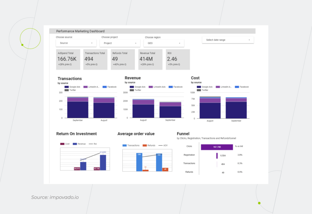
BI allows you to see and quickly grasp operational data such as, let’s say, the results of marketing campaigns. The contribution turned out to be twice as much as the investment? Perfect! All you have to do is to analyze exactly what caused this and move forward in the same direction. Whereas an in-the-red campaign serves as an obvious sign to change the strategy or, at least, make some adjustments. There are also such things as tracking bad-selling items, or low-margin ones. It’s difficult to do this in Excel, especially if you have many product lines and ten, fifteen, twenty thousand positions in the assortment.
Financial Business Intelligence

3. Consolidated location for your data

Imagine, how much more value a finance department can bring by analyzing the data and offering solutions, rather than spending eons on scrambling for the information on operations, supply chain, HR, procurement, sales and, well, you name it. Thanks to a full-scale BI system, financial data from all over the company and beyond – speaking of Big Data – is gathered in one place.

There are companies that have to pull raw data from a whole set of disparate systems, which in itself is a pain, not to mention that some of these systems might be outdated. Complete re-engineering of legacy software will take years and cost millions. So working with data is handled in any way possible: somebody uses FTP to transfer files, others upload CSV files into certain folders… But what if the folder is changed or the IT team rebooted the server? No wonder the output is messed up. Meanwhile, a well-designed, full-fledged BI system helps to organize this data correctly with a data warehouse or data lake and an ETL process in one place.

With Business Intelligence for a finance department, employees get the capability to quickly incorporate new data into the data warehouse and interact with all the necessary information in one location without having to search for additional data. Imagine, you can have all your data sources such as the web, SQL Server, Excel, and flat files funneled into a pre-configured solution, where this data is stored, processed, and visualized.

There’s no longer a need to juggle dozens of open tabs and separate reports to tell a story. Whatever data you want to put together, finance business intelligence software allows you to do it without a hitch. For more details, it’s just enough to drill down into the source report.

4. Self-sufficiency

The problem might not even be bringing data from different sources together. You may have a data warehouse and an in-house development team dedicated to helping users with managerial reporting. But that still won’t keep you out of going through all the circles of corporate IT hell while drawing up the terms of reference as many times as it takes for your needs to be understood, and you may still end up with something that doesn’t fully work. BI in finance, on the other hand, helps you unlock the full potential of your data – the kind you never knew you had – without involving the IT department.

5. Effective financial management

By providing robust financial business analytics wrapped in dashboards, the BI tool makes financial management more efficient on all fronts.

  • Cash flow management

Cash flow is crucial in non-ideal conditions in which current business has to function – when one crisis is followed by another. Some clients ask for extended terms, and others just slow down payments… With finance business intelligence, you will have visibility into your cash flow and make accurate forecasts to improve its health.

Oftentimes, companies go bankrupt not because they are unprofitable, but because they have a cash deficit. Cash flow management is the top priority for any CFO. In this way, all businesses that work to order and where the production cycle is long enough are unlikely to be able to do without BI financial services.

For example, with the Cash Overview report in Power BI, you’ll get a grasp of inflows and outflows in system currency, total bank balance and balance by legal entity, today’s actual vs forecasted balance, and more. Meanwhile, cash flow forecasting itself allows you to go into more detail and get daily forecast summaries and actionable data insights.   

  • Revenue management

The mission-critical questions like what, when, and who to sell as well as what price to set can be answered more easily and accurately when the data is collected, interpreted, and visualized by a financial BI system. 

Finance business intelligence offers a 360-degree analysis of pricing, inventory, promotional campaigns, and product launches. BI-driven revenue management helps businesses from a wide array of industries keep the lights on and reach target profitability. Take, for instance, hotel chains that use finance BI software to determine optimal room rates, forecast reservation, staffing needs, inventory levels, and other resources to avoid problems with procurement and staffing during off-seasons and peak seasons.

  • Expense management

For any organization that wants to stay in the business, it’s important to pay the bills on time, which can’t be done without proper expense management. But what makes it so? BI, among other things, is designed to keep track of the company’s expenses. It enables businesses to replace piles of receipts and spreadsheets with insightful dashboards to gain a holistic view of staff spending, ensure compliance with expense policies, and track T&E trends.

The decision to use special software for managing company’s costs and strategic planning is getting even more effective when bolstered with scheduled dashboards and reports email delivery. These tactics help managers keep an eye on their employees, set up alerts and notifications to manage expenses in a timely manner, and connect BI tools to your organization’s expense, billing and online travel reservation systems.

6. Accurate forecasting

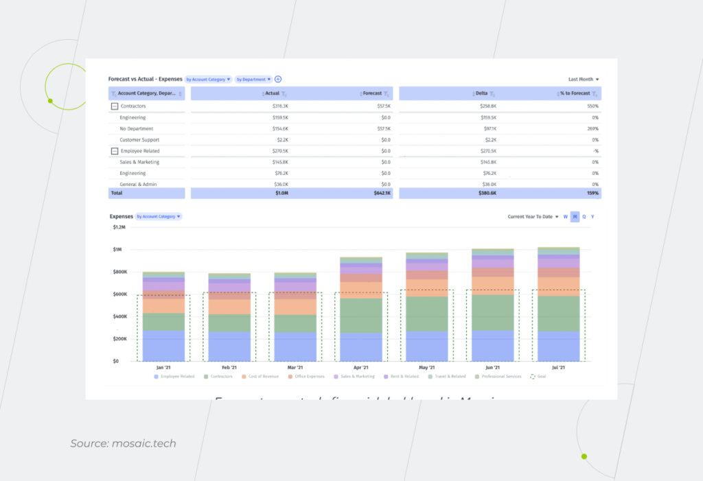
Thanks to Business Intelligence applications in finance, you can bring the plan and the fact together on one level of business logic, in a single tool. And if this tool is also able to show what a fact consists of and why it is like that; it’s priceless. 

Let’s say you set up a business unit, so you had to buy extra SAP licenses, or a new production site was added, which entailed additional infrastructure. After a while, it all becomes forgotten – you can, of course, dig up the budget presentation for the required period, but it’s much more convenient, reliable, and faster just to click on the cell with the number, where there’ll be a note with the name of the person who added it and the date when it was done.

If the plan differs from the fact, you can do a drill-down to see what the discrepancies are due to. The data becomes available: you can do both synthesis and analysis without having to look for some emails, going through the tables, or calling a controller.
Forecasting

7. Faultless reporting

The thoughtless manual task of copying and pasting numbers is error-prone and can undermine trust in your financial data. Fortunately, all this heavy lifting can be done for you by financial Business Intelligence. Utilizing BI software for direct data access and report automation saves you time, money, and, most importantly, reputation as a specialist, which “takes decades to build and five minutes to lose”. 

Besides, BI brings more credibility to data by differentiating between good and bad data. Proper analysis is only possible when data is of decent quality. That’s why it’s not enough to simply gather information. The ETL process, which lies in the core of BI systems, is designed to ensure good quality of data in the warehouse through standardization and removing duplicates.

In addition, data health can be maintained by conducting regular audits or working with reliable data experts who know exactly which steps to take to optimize data quality.

8. Visibility of entire organization

What a CFO needs most is a one-stop-shop for all financial information. Armed with calibrated dashboards tracking financial data across the entire company, C-suites can drill down into the reporting to find answers to any financial-related questions. How do the costs of producing similar units at different enterprises compare? Are our production volumes different compared to the same period last year? What are the drivers of the variances? How does our performance correspond to forecast and budget? What are the slow-moving items that should be cut out of the supply chain? Speaking of which, BI does a great job covering that part of the business. 

Now, answering these questions is child’s play. And, on top of that, it has become much easier to explain the correlation between the numbers to non-financial workers.

9. Consumable data

Financial business analytics has never been as crystal-clear as BI technology has made it. Hidden patterns and trends, non-obvious connections, unnoticed opportunities, and underestimated threats – all come to the surface instantly when reflected on a dashboard. In addition to presenting complex concepts in a digestible format, robust data visualization democratizes data and communicates insights throughout the organization by determining why it is performing in a certain way and what you can do to improve numbers.

This way, BI tools for finance are an indispensable constituent of any modern company for analyzing financial KPIs against business performance and presenting a dynamic view of market trends, product interest and customer sentiment to highlight future strategic opportunities.

How does Business Intelligence for a finance department look? An overview of a dashboard example

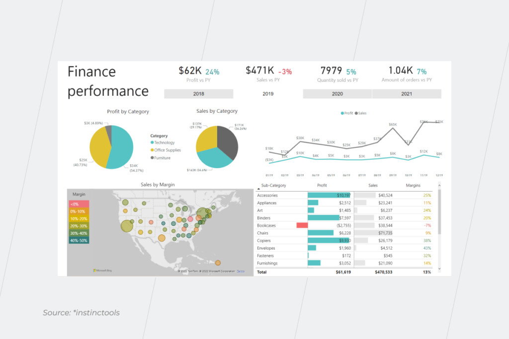
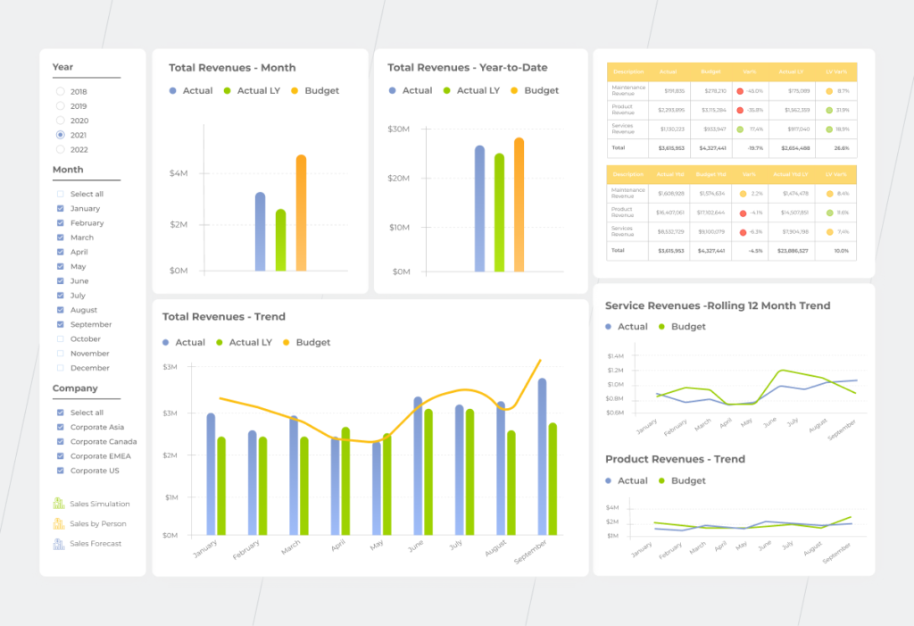
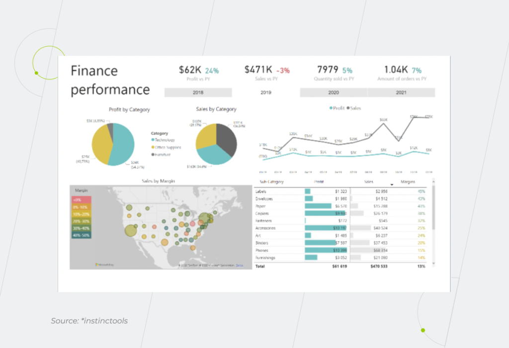
After having undergone the transformations, the data can be grouped according to the custom pre-built finance report packages, such as CFO dashboard, Event briefing, Benchmarking, etc. Below we’ve prepared an example of the Finance performance dashboard, that summarizes the 10 most relevant KPIs on a single screen.

The top row shows profit, sales, quantity sold, and the number of orders in the current year against the previous year. The second row illustrates profits and sales by category, while the third one displays sales by margin, as well as the profits and margins of various subcategories of goods.
Financial Business Intelligence

To have a closer look and to gain a better understanding, users can drill down on data by clicking the relevant areas, such as sales. This action brings up a specific report that shows the granular details for the KPIs and drivers. The report opens right away and provides a root-cause analysis of the information shown in the dashboard.

It’s not only the head of finance that can benefit from these dashboards. Other specialists with the finance department (e.g. financial controllers) can utilize them to gain insights in their focus areas. 

The BI solution can be also supplemented with Artificial Intelligence (AI) and Machine Learning (ML) technologies to further analyze data and succeed at prescriptive analysis.

Get a head start with BI financial services

All the benefits that financial Business Intelligence brings to organizations, in fact, can be combined into one – a competitive advantage. Being able to automate number crunching, store, and process data in a singular place, and present it in a format understandable to all stakeholders, you save a huge amount of time on deep and holistic analysis and ensure decision-making is driven by data rather than by gut feelings. And this will certainly allow you to feel more comfortable in the market and act confidently, while those who are reluctant to embrace the power of business intelligence software will be flying blind.

Take your business to the new level of awareness with financial BI

Plan your next move
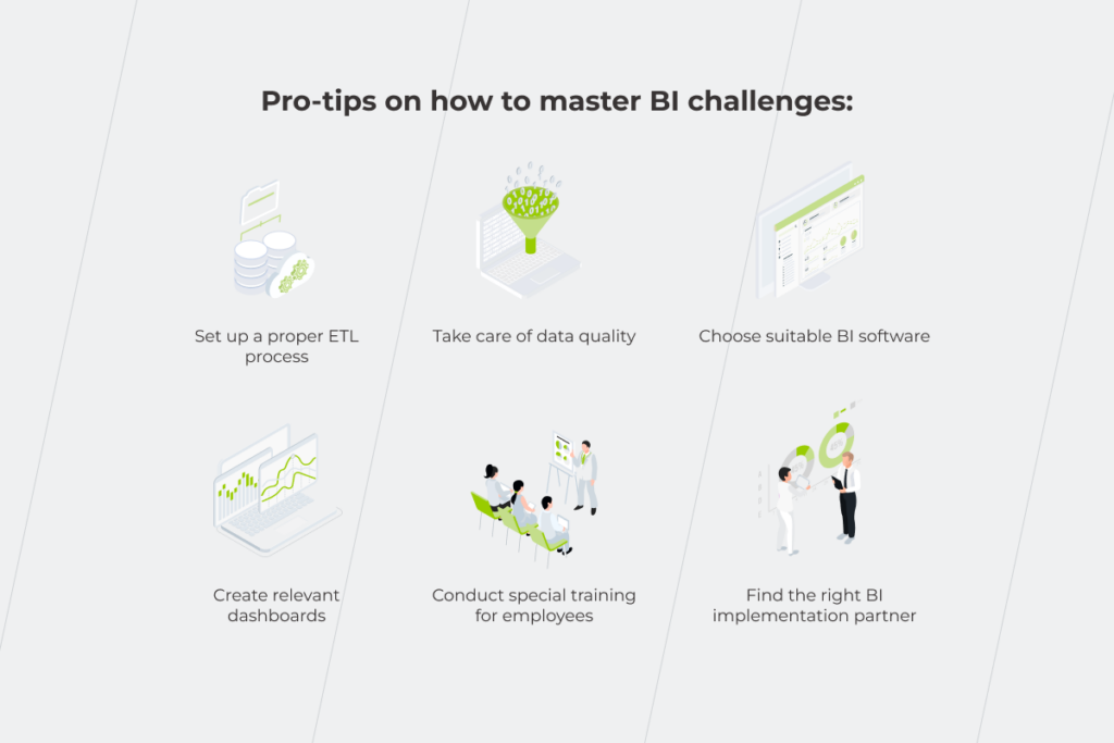
Business Intelligence Challenges Our Experts Faced… and Overcame

The importance of BI solutions is becoming indisputable. Statistics show that 26% of all companies have already adopted BI, and around 33% will do it this year. However, despite the fast growth of the trend, the path from getting started to leveraging its full potential still has some bumps along the way. A great number of business intelligence challenges stem from a system’s limitations, intricate business requirements, human factors, and whatnot. 
How to make BI software work for your organization? Our in-depth understanding of incorporating BI solutions into different industries and corporate levels enables us to articulate business intelligence issues and give practical advice on their resolution.

Stepping into the age of action comes with certain BI challenges

Business intelligence isn’t confined to the big guys anymore. Companies of all sizes can now turn disparate data into a plan of action. However, action-oriented data analytics is premised on multiple precursors, each being a potential challenge for early BI adopters.

dashboard example on finance performance

1. Integrating data from different source systems

BI only makes sense when it can collate and analyze data from multiple sources to present the end user with some solid ground for insights. Otherwise, what’s the point? However, the numerous data sources BI software has to connect to — from a plethora of databases and business apps to big data systems — increase the risk of telling the wrong story.

From the start, it might not seem to be a problem as long as in-built ETL processes allow ready-made BI platforms to directly connect to various data sources and transform data for their own use. As fast and attractive as it sounds, the built-in ETL is not omnivorous. Although some specialized connectors are constantly being finalized for new source systems, a medium to a large organization will at some point face scaling, performance, and maintenance issues if they exclusively use Power BI Data Flows as the ETL tool and DWH storage. 

First, working with raw, unstructured data increases the complexity and number of datasets which makes reporting more time-consuming. If the report integrates data from different sources, the same logic cannot be easily applied to another dataset. Secondly, with multiple versions of the truth across different datasets, the odds of discrepancies across the reporting system are high. Third, if your data amounts to millions of rows, the built-in ETL won’t be able to handle it, leading to slow report responsiveness.

The most rational solution in this situation seems to be the setup of a single repository, where data would be pre-aggregated and stored in a structured way — a data warehouse. By eliminating the confusion within your data, it contributes to the creation of a single version of the truth. Among other significant benefits central repositories bring is the possibility of historical data analysis and faster report preparation. Data warehouse technology allows dealing with an ever-growing amount of data sources without making you spend more on your BI tool maintenance.

Learn how to consolidate all your data under one roof for more reliable insights

Book a free consultation

2. Data quality issues

Data quality is one of the major challenges of business intelligence and stumbling blocks to achieving BI goals, namely, making the right, valuable decisions. Human errors, duplicated and invalid data, and inconsistent data formats do not allow you to acquire any worthwhile insights and can provoke wrongheaded actions on top of it.

A proper data management strategy helps tackle data quality issues. To put it into a nutshell, it deals with the data collected or generated by the company to ensure better decision-making.

Data architecture is a crucial data management component that plays a vital part in delivering high-quality information. Let’s say, a company has multiple sales channels, it’s a nice idea to merge all the information generated by them at the data warehouse level, from which it can be further distributed to different reports, after passing certain clearance algorithms defined by the business rules.

Data modeling is another thing you can’t neglect while trying to make your data eligible for analysis. For example, a visitor to your website, a participant in a survey you’ve conducted, and your client can be one person. However, you might have them presented in different roles in different systems, even if it’s the same entity. That’s why, to avoid data redundancy it should be decided which system (CRM, ERP, etc.) to assign this entity to.

Data management strategy is largely an administrative activity. At the same time, the technical part of building a proper, well-thought-out solution architecture must not be discounted. Work on the strategy should begin with a diagram of all the company’s data flows. Determine the source systems you have, where data is generated and consumed, what entities you have and where they are stored, and then decide on how to implement it technically.

Don’t let poor data quality stand in the way of your decision-making

Consult an expert now

3. Lack of data talent

Skill shortage is among other common business intelligence problems that impede data analytics efforts. In 2020, the United States faced a scarcity of data science talent — companies failed to fill around 250,000 positions. The 2022 Tech Hiring Survey also defined data science as a skill for which demand far outstrips supply. 

It is exacerbated by the looming talent crisis across the entire hiring market, changing demographics, and the ‘Great Resignation’, compacted by what could be another recession. Without dedicated skills, companies fail to make effective use of BI analytics, set up data warehouses for baseline information, or establish the required level of data literacy in general. 

To grapple with the talent crunch, companies tend to leverage outsourced expertise. A dedicated BI team makes up for an entire suite of in-house data experts and helps businesses validate their data initiatives fast and with no hiring hassle.

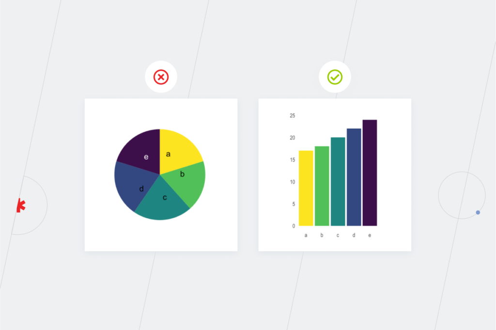
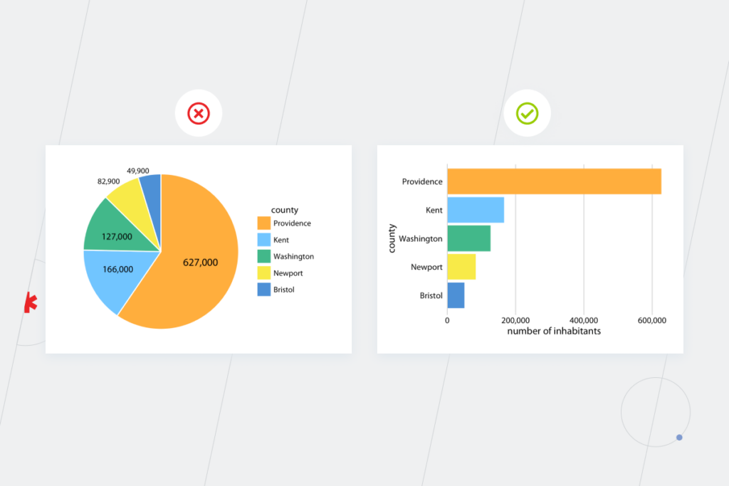
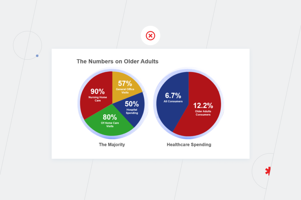
4. Bad data visualization

The quality of your data and analytics processes tends to steal all the glory. However, the design of your BI dashboards is just as important to communicate complex data to the decision-makers and turning critical insights into action.

If data isn’t presented and argued in a compelling way, it is ignored, or trumped by opinion. The value of having an argument and crafting a story component should never be underestimated.

Lack of interactivity, the inability to pull near real-time data, rigid templates, and even the wrong choice of color may lead to potential challenges in implementing the dashboard. To emphasize proper data values, companies should employ highly customizable dashboards with broad personalization capabilities to meet the unique needs of the organization. 

The right choice of dashboard type can also whip your BI management in shape. Analytical dashboards provide a comprehensive overview of crucial data, while operational dashboards include real-time updates relevant to a specific department. The strategic type delivers a rundown on the essential KPIs to the executives.

dashboard example on finance performance

5. Choosing the right software

Selecting the right BI tool is half the battle when it comes to tackling business intelligence implementation challenges. According to TrustRadius, Tableau, Qlik Sense, and Microsoft Power BI are the leading business intelligence platforms with the largest market shares. But which one clicks with your unique needs? Let’s touch on the main difference between the three.

CriteriaPower BITableauQlik Sense
Popularity (users)Over 5 million usersOver 220,000 data scientists38,000+ customers
Data sources130+ data sourcesConnects to nearly any data repository100+ data connectors 
Data visualizationCustom dashboards, embedded analytics, extensive data visualization toolsCustom visualizations, rich and interactive dashboards, embedded analyticsUnique “associative” data engine, custom visualizations
Cloud compatibilityAWS cloudAWS, Google Cloud Platform, Microsoft Azure, Alibaba CloudAmazon (S3, EC2, RDS, Redshift, EMR), Azure, and Google. 
Customer supportIncluded for Power BI Pro customersFreeFree
Advanced featuresNatural Language Processing, Machine Learning integration, predictive analysisEnhanced data visualization functions, predictive analysis and forecast, augmented analyticsSmart visualizations and analytics, AI and machine learning analytics

As you see from the table, choosing between those three tools is like choosing between Audi, BMW, and Mercedes, about the same quality packed into a slightly different exterior. 

However, in the case of a large-scale adoption, even subtle differences begin to play a role. License type, roles and permissions, discount allocation, and other factors have to be taken into account to optimize your BI experience.

Moreover, generic commercial solutions may not always suffice your visualization needs. For example, B2C startups are better off with open-source BI solutions due to the high analytical needs and the absence of licensing burdens. In some cases, companies opt for a custom BI tool for branded design.

Struggling to choose your BI option?

Contact us

6. Low adoption levels of BI among employees

After all the money, time, and effort you’ve invested in your analytics software, it still might not work because users won’t accept it. Low adoption levels within organizations remain one of the leading BI problems. If you want a freshly deployed BI tool to be used not only by analysts or data scientists, make sure it is user-friendly, and not intimidating. 

Besides, employees frequently show justifiable — from their standpoint — resistance to new software. Such a BI aversion is entirely understandable as people whose main task has been to manually bring together the company’s analytics are afraid that reporting automation will put them out of the job. That’s why they need to be convinced otherwise. Employees who can embrace business intelligence challenges and opportunities will become more valuable assets to the company as they won’t longer have to waste tons of time on number crunching or worry about the risk of making a mistake. Instead, they will analyze the information from top to bottom and communicate the result of this analysis to their managers. 

The subtle art of dealing with managerial issues related to BI implementation and mindset transformational practices requires even more precision when it comes to Excel. People’s loyalty to this tool should not be ignored. Numbers tend to speak louder than words. Use them to show your employees how beneficial a BI tool can be in terms of saving their time. For instance, it takes financial controllers one or two days to handle ad-hoc requests, three-five days to prepare for monthly meetings, and around three weeks to summarize the year’s results. With the BI system, all reporting is done automatically, at a click of a button.

The main goal is to show a person how to use the dashboard to answer their questions and explore the available data quickly and efficiently. Trends are way easier to spot when data is adequately visualized rather than scattered across spreadsheets.

Yes, we know that Excel is not just about tables, and you can build charts in it, too, but you won’t be able to interact with them on the spot. In a dashboard, you can click on a single segment and see the information you need right away, while in Excel it will take you more time to do the same thing.

An efficient way to deal with business intelligence implementation challenges and an essential component of proper change management designed to soothe users’ pain is staff training. That’s why users shouldn’t be left in the lurch after the system’s deployment. Find BI implementation partners who will prepare the documentation on the new processes and arrange wide-scope training aimed not only at teaching how to work with the software but also at increasing general tech literacy. 

We explore the needs of each stakeholder to deliver tangible results

Let’s talk!

Navigating the path of business intelligence

Failure rates for data science projects loom large at 87%. It attests to the fact that a solid data analysis and visualization architecture cannot be strategized on a hunch unless you want to end up with sporadic and incomplete insights. Awareness, planning, and expertise will help you avoid most BI problems. Below, we’ll touch upon the three pillars of a successful business intelligence strategy.

Define what problem you want to solve

The application area of business intelligence is immense and spans virtually every business operation. Therefore, you should start small by identifying the scope of analysis and linking it with correlating metrics and reports. The reports, in turn, should revolve around a specific selection of KPIs, internal or external, to measure and analyze an organization’s data and improve on it. A BI consulting partner can advise you on the relevant metrics and validate your scope of analysis.

Transform the organization’s mindset with proper change management

As users segue from fragmented tools to an integrated BI system, you should have the correct transformational methods in place to eliminate inertia and promote system acceptance. Establish stable and transparent communication flows, bring leaders from different lines together, and run workshops and training to cultivate collaborative data flows and seamless knowledge sharing for accurate business insights.

Choose a reliable consulting partner

A single unified data warehouse and consistent data strategy lay the ground for fast and accurate data analysis. Without these precursors, your insights will be isolated in data silos, locked within departments as missed opportunities. To avoid data failures, secure an experienced BI consulting team to establish a robust data infrastructure, manage data governance, and connect your data warehouse with the right BI tool.

Hit pay dirt with business intelligence

Data-driven decision-making is no longer an option; it’s a mandate for business longevity and competitiveness. Business intelligence is what nurtures a data-fuelled approach and allows companies to turn their data into action.

BI-enabled vigilance is a collective result of the right data strategy, a unified IT architecture, and a consistent adoption cadence. If even one piece is missing from your BI puzzle, your company will be short-sighted when it comes to data, failing to make the right decision. Enlisting the support of data and BI professionals will help you put your puzzle together and overcome common business intelligence challenges.

Looking for a trusted Business Intelligence partner?

Reach out

When Data Goes Bad: How To Improve Data Quality?

There’s a clear connection between the quality of your data and the efficacy of organizational decisions. The idea of ‘garbage in, garbage out’ is relevant here. When companies fail to understand how to improve data quality (DQ), it can backfire in a huge way. Fixing issues caused by bad data can take away up to 25% of their annual revenue. Furthermore, it can disrupt their progress toward digital transformation.

How to turn this loss into a profit and leverage data quality as a competitive advantage that will reshape your position among rivals and boost your data analytics? We’ve listed common issues you may face while dealing with data and outlined a data quality strategy.

Six possible issues you may face on your way to improve data quality

Data has particular quality characteristics – completeness, validity, uniqueness, consistency, timeliness, and accuracy. There are a number of issues related to them. Bad DQ results in:

  • Data silos. According to McKinsey, multiple data lakes and warehouses with no common data model are one of the top challenges at the enterprise level. Even if you have only one warehouse, analyzing data becomes troublesome when your data is scattered across multiple enterprise systems.
  • Human errors. When customers or employees make typos such as writing “Minesota” instead of “Minnesota” when entering information manually, you get data that doesn’t represent reality.
  • Duplicated data. When one employee enters customer data into your CRM, and another records the same customer data into another system, you end up with duplicates. If they are not completely identical, then there is a problem: which one is reliable? 
  • Invalid data. The analysis doesn’t make sense if you get just any data instead of the data you need. An example of this error is when the name field is filled with surnames. Imagine yourself having a whole table of Smiths when you need to determine which of your regulars deserves a personal discount. 
  • Missing values. If you want to build a data-driven culture, missing data is unacceptable for statistical procedures. If some obligatory fields aren’t filled out, you can’t analyze the data and take action. For instance, if you are collecting data on the age and gender of your buyers in a customer satisfaction survey, some of them might not reveal their gender if only “female” and “male” options are offered. This may be related to young people identifying themselves as non-binary, queer, etc. 
  • Inconsistent data formats. You may feel like you’re going through hell when having to handle dates entered in European and US styles. 

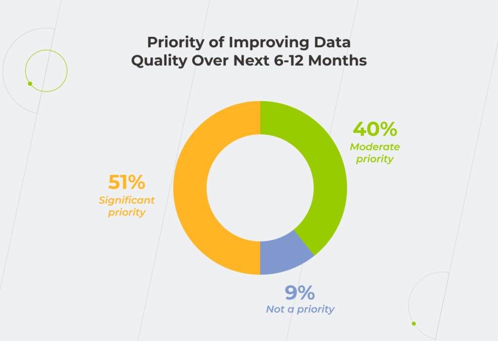
High-quality data makes data governance easier. And if you can confidently manage data, you can confidently manage the whole company. That’s why raising DQ is one of the top priorities for the next 6-12 months for 91% of organizations. If you are still undecided about how soon you should start fixing your DQ, this is your sign to not put it off until tomorrow.

data quality

How to mitigate data quality issues: embrace state-of-the-art technologies 

Before answering the question: how to improve data quality, you need to figure out how to improve data management first. Focus your attention and budget on the adoption of new technologies. There are at least two possibilities to facilitate your data quality enhancement journey:

  • Take advantage of automation to eliminate human errors. For instance, adopting robotic process automation (RPA) frees your employees from monotonous, repetitive operations, erases the possibility of human error, and lowers the cost of processing data by up to 80%. For example, with RPA, you can simplify data entry, data profiling, etc. The technology allows you easily convert all dates into one format, verify the absence or presence of the data, its actuality, as all these actions can be reduced to a clear algorithm performed by a bot. Besides, in highly regulated industries such as healthcare, automation improves compliance with numerous protocols (HIPAA, PSQIA, GDPR, etc.) and, thus, helps to create a better customer experience.
  • Leverage Business Intelligence (BI) to have a comprehensive view of the quality of your data. You have to regularly evaluate your data to ensure that the information is still reliable for business operations. 

Cooperation with experienced BI analysts is key. They help you figure out which questions you need to answer, what story you want to tell with your data, and create a custom dashboard based on that information.

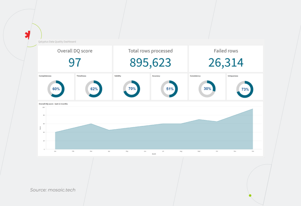
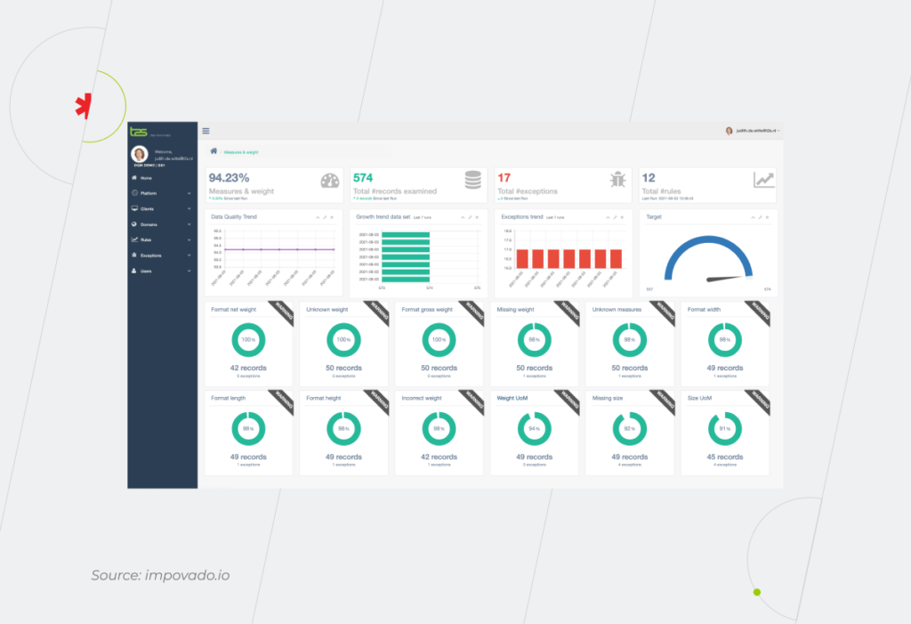
A generic dashboard can show the extent to which the data meets data quality requirements. According to Gartner, tracking data quality metrics helps improve them by 60%. 

Data Quality

You can also provide your data scientists and engineers with more granular dashboards that visualize the stories of issues underlying major data quality problems.

Data Quality

Use BI consulting services to decide where to start your data quality improvement journey and identify appropriate technologies to help you along the way. 

How to develop a robust data quality improvement strategy

One-off initiatives and ad-hoc actions treat the symptoms, not the disease. You need long-term strategic adjustments to empower your staff with advanced analytics at all organization levels. That’s why, before jumping into a DQ initiative create a data quality strategy (DQS). We’ve listed six vital elements of it.

1. Do an inventory of your data and describe the issues

Developing a common vision of data quality for employees from different departments is essential. To achieve it, answer basic questions such as: How much data do you have? What types of data do you collect and store? How many errors are there in the data? What kind of errors are these? 

2. Develop your requirements and objectives 

At this stage, you should identify the stakeholders of the future data quality improvement process. The more experts that can evaluate the data from different perspectives, the more accurately you can define the DQ requirements and aspirations for your organization and the best practices to improve data quality. 

It may turn out that your company needs dedicated employees who will assess the quality of data according to key parameters – the data stewards. They are responsible for what data you keep in your organization, enforce internal rules on how data can be used and track the movement of the data inside the company. A data steward’s mission is to coordinate all the business processes and decisions that arise from your DQS.

Don’t forget to set an approximate timeline for implementing a data quality improvement plan, as it depends on the scale of your organization.

3. Set priorities for different data sets

Working on the quality of customer data and the company’s internal data simultaneously is great. But if your budget is limited, you need to choose the improvement of which data is the priority for your business success and growth. By enhancing the quality of the data related to the customers’ personal information, you can personalize their experience and increase customer experience and satisfaction. However, revamping the organization’s internal data can bring you just as much benefit. Having high-quality data about your staff, you can fully reveal the potential and talents of your employees and uncover how to optimize the processes within a company.

4. Select technologies and tools to improve data quality

Given the sheer number of offerings for data collection, data cleansing, etc. on the market, it turns out to be time-consuming and tricky to compare their features, licensing costs, payment options, etc. Consider that if you are burdened with outdated software, the task gets more complicated as you may need to modernize it.

Adoption of new technologies and tools may require more inside-out knowledge than was initially expected, so choose tech partners who are an old hand at handling data issues.

5. Identify the roles and responsibilities for stakeholders

At this stage, you settle on the tasks assigned to the data stewards, data engineers, business analysts, executives, etc. For the boat of your data quality improvement strategy to sail smoothly, you need many hands rowing in the same direction. A data steward can track data quality standards across the organization and in particular projects, business analysts prioritize tasks from the perspective of business benefits, and C-suite members make final decisions about what actions should be taken.  

6. Set KPIs to evaluate the progress

What degree of data quality do you want to achieve in six months, in a year? How much time can it take your employees to correct errors of different types? To what extent do you expect to reduce them? An experienced business analyst can help you determine the realistic KPIs for your organization.

When the time period you’ve designated as a benchmark has passed, analyze achieved results, review your data quality improvement strategy, and modify it if necessary. 

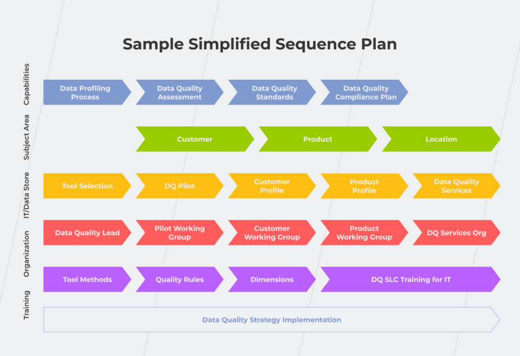
The draft of your data quality improvement plan may look like this.

Data Quality

Clean up the way for accurate data analysis and genuine insights

The quality of the data you process determines how valuable the insights will be. In some way, without advanced analytics, an organization is deprived of the future, at least one, that is bright and prosperous. 

You can partially and temporarily solve burning data quality issues by adopting modern technologies and best practices. But it’s like putting out a fire in one room when an entire building is engulfed in flames. Creating a data quality improvement plan is a surefire way to pinpoint what to do with your data to enhance its quality, how to do it, who is in charge of the process, and track the progress to analyze when you can achieve an expected outcome.

Want us to tackle your data quality issues and outline the roadmap to success?

Reach out

FAQ

Why is it important to improve data quality (DQ)?

“No money, no honey,” they say. This rule also works for the information – you can’t expect more than run-of-the-mile insights if your raw data is of low quality. Improving DQ should be a top priority for any organization as data is a competitive advantage that can influence your position among competitors.

How can we improve poor data quality?

You should evaluate the data from different perspectives to outline the ways to improve data quality. Start with the basic characteristics such as completeness, validity, uniqueness, consistency, timeliness, and accuracy. Involve employees from different departments to ensure that the initial data quality analysis and future expectations related to it are the same for all stakeholders.

What are the steps for improving data quality?

To solve the problem in a holistic way, you need to develop a data quality improvement strategy. It includes analyzing and describing your actual DQ issues, developing your requirements and objectives, setting priorities for different data sets, choosing technologies and tools to improve data quality, identifying the roles and responsibilities for stakeholders, and setting KPIs to evaluate the progress.

What is a data quality strategy?

Data quality improvement strategy is your plan on who, what, how you interact with your data to enhance its quality and when you can expect the results. It’s also an indirect way to promote a data culture in your organization since employees from different departments are engaged in the strategy’s development.

Whenever, Wherever: Keep On Top of Your Data With Mobile BI

From tech-heavy reporting projects to dedicated analytics tools, business intelligence has come a long way to becoming an industry standard among companies. However, despite the present proliferation of BI, businesses still struggle to seek out analytics excellence. The isolation of traditional BI tools continues to pose challenges, resulting in a mere 24% of data-driven organizations.

But why limit business intelligence to a desktop version, when your employees can leverage advanced analytics literally in the palm of their hand? Just like fitness or financial trackers, mobile business intelligence can seamlessly support existing data pathways and produce actionable insights on the go.

What is mobile business intelligence?

Mobile BI is software that extends desktop business intelligence applications and makes analytics accessible on a mobile device. Mobile BI software allows users to access and evaluate business metrics, and reports from smartphones and tablets.

Stepping into the age of action: ultimate benefits of mobile BI

Driven by increasing Bring-Your-Own-Device workplace practices and mobile computing, mobile business intelligence has experienced unbelievable growth over the last few years. In 2021, the mobile BI market size stood at over $11 billion. By 2030, it is expected to rack up over $38 billion. Let’s see which advantages of mobile business intelligence have secured their pride of place among adopters.

Real-time data access on the go

Traditional business intelligence solutions tie BI users to tools that are specifically allocated to corporate environments. When away, decision-makers cannot access valuable data, which hampers proactive response. Conversely, mobile BI provides the ability to make fast, well-informed decisions even when you are away from your desk, which is especially vital in industries such as finance and healthcare.

Offline access to data is among other differentiating mobile business intelligence benefits. Since mobile devices have wide in-memory caching capabilities, all data visualizations can be explored with no internet connection provided it’s a native mobile app.

Increased team collaboration

Since mobile BI directly reaches the hands of BI users, it ensures easier knowledge-sharing. On-the-go data analytics also matches well with growing remote practices, making sure each employee is in sync with other remote team members. 

Mobile BI also allows for permanent, intermediary, or temporary access, which keeps your controls on par with desktop enterprise software.

Rich user experience

Supreme user experience is among other core benefits of mobile business intelligence. While smartphones come with inherent constraints such as small screens, tablets can pick up the slack as user-friendly mobile business intelligence solutions. Tablets make the best of both mobile design and desktop design, offering portable, always-on, and touch-capable analytics.

Compared to static desktop reports, portable BI solutions also usher in more interactivity, allowing the user to zoom, pinch, and swipe their way through insights. Moreover, native mobile applications can tap into device-specific features such as GPS, calendar integration, and QR-code scanning to expand analytical capabilities.

Maximized value of BI adoption

According to mobile business intelligence trends, CEOs that make data-driven decisions are 77% more likely to cultivate a company’s success. Cloud and big data mobile business intelligence confers accurate governing capabilities to other levels of the business hierarchy.

It means that a larger number of employees can have access to high-quality data, which facilitates the digital transformation of the company, gives the whole organization a vantage point, and increases operational efficiency.

Don't miss out on the benefits of mobile BI

Reach out

Who can benefit from mobile BI the most?

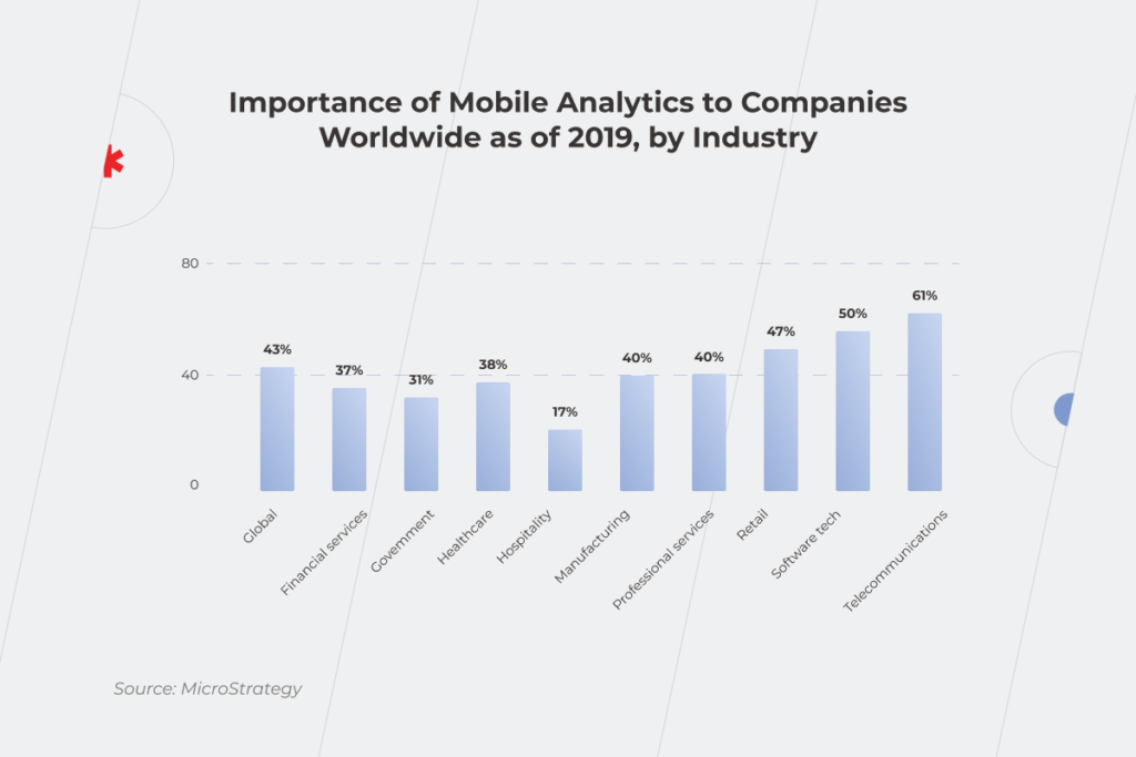
Businesses of all types and sizes can benefit from mobile business intelligence applications. However, according to the Mordor Intelligence report, the telecommunications and the software tech industries stand to gain the most benefits due to the presence of large corporations like Apple, Facebook, IBM, and Google.

Beyond the software market, retail, healthcare, and manufacturing are among other major players in the world of portable BI. Around 47% of retail respondents attest to the growing importance of mobile BI applications with 38% of healthcare providers sharing the enthusiasm. High adoption rates of mobile BI apps in these industries stem from increased demand for rapid data processing and high volumes of operational data.

 Statistics that shows importance of mobile business intelligence by industry

For example, retailers can use mobile augmented data analytics for on-the-move warehouse management, customer profiling, or store layout optimization. Healthcare providers use data analytics to support clinical decision-making, provide more personalized treatments, and increase healthcare accessibility for rural areas. Ultimately, a mobile BI strategy can both support the bottom line and boost customer satisfaction.
On a broader level, mobile analytics can support the following application matrix:

  • Fraud and security management;
  • Sales and marketing optimization;
  • Predictive asset maintenance;
  • Risk and compliance management;
  • Customer relationship management;
  • Supply chain analytics, and others. 

Which roles are among those likely to be adopters of mobile BI solutions?

As for corporate levels, each employee — from decision makers to employees — can leverage all the necessary data without the hassle of corporate back and forth.

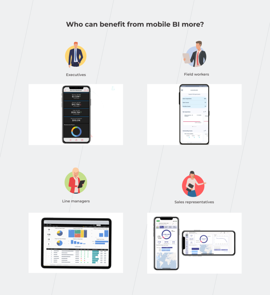
  • Executives

Executives and senior-level managers spend a lot of time either in meetings or traveling for business, away from their desks and enterprise software. Having mission-critical information always on hand helps upper management explore data on business performance from any part of the world and make data-driven decisions, be it high-level forecasts or current business operations.

  • Field workers

Field engineers and technicians have lots of projects on their plates — from company infrastructures such as railways and utility stations to customer sites. On-demand and on-the-go access to unified data analytics from all facilities helps field workers better prioritize tasks and keep an eye on prospective and current customers. Moreover, mobile analytics can be amplified with sensor and GPS data to schedule predictive maintenance activities or optimize routes.

  • Line managers

Supervisors and team leaders can benefit from mobile data visualizations to get handy insights about staff, production lines, and ongoing operational activities. Lightweight visibility also helps first-line managers to respond proactively to any emergency and make important decisions faster and smarter.

  • Sales representatives

Equipped with decision management and predictive analytics capabilities, a mobile BI tool can provide the latest sales information such as deal status or prospects to help salespeople prepare for the meeting or run analyses in any setting. All-in-one business intelligence mobile can also give salespeople a head start in customer data before any sales call. 

Sales representatives in the retail sector, for example, can rely on a portable BI solution to predict the profitability of a new store without close supervision from the head management. In this case, the salesperson can calculate and select the correct location for new stores on the go, based on various parameters, including geography, demand, and others. If the input parameters meet the predefined benchmark, the BI solution greenlights the new location. Otherwise, the solution notifies the salesperson of the low profitability of the new sales point.

Executives, field workers, line managers, and sales representative using mobile BI to make well-informed decisions on the go

Any flies in the ointment? Yes, several. But they can be extracted.

Just like any technology, mobile business intelligence has a flip side. In this case, the core challenges of deploying portable analytics resonate with desktop BI. This is why accurate forecasting, data governance, and reporting need to be balanced against data security and quality followed by end-user training and cultural shifts.

However, mobile business intelligence software also poses some specific challenges that arise from the portable nature of analytics and mobile devices. With the right tech expertise though, you can make mobile work to your advantage and overcome general BI constraints.

Security issues

The smaller your device is, the easier it gets to misplace or forget it. Mobile devices also tend to get stolen or hacked, which increases the risk of a data breach. On average, hackers get their hands on 6.85 million accounts every day.

When away, mobile users can also expose their devices to data leaks through non-secure channels such as public Wi-Fi.

To keep hackers at bay, companies should embed robust data encryption, two-factor authentication, and biometrics-based access into portable enterprise devices. Mobile hardware should also meet both industry and internal security standards to ensure a consistent security policy on all company-owned devices.

Poor design

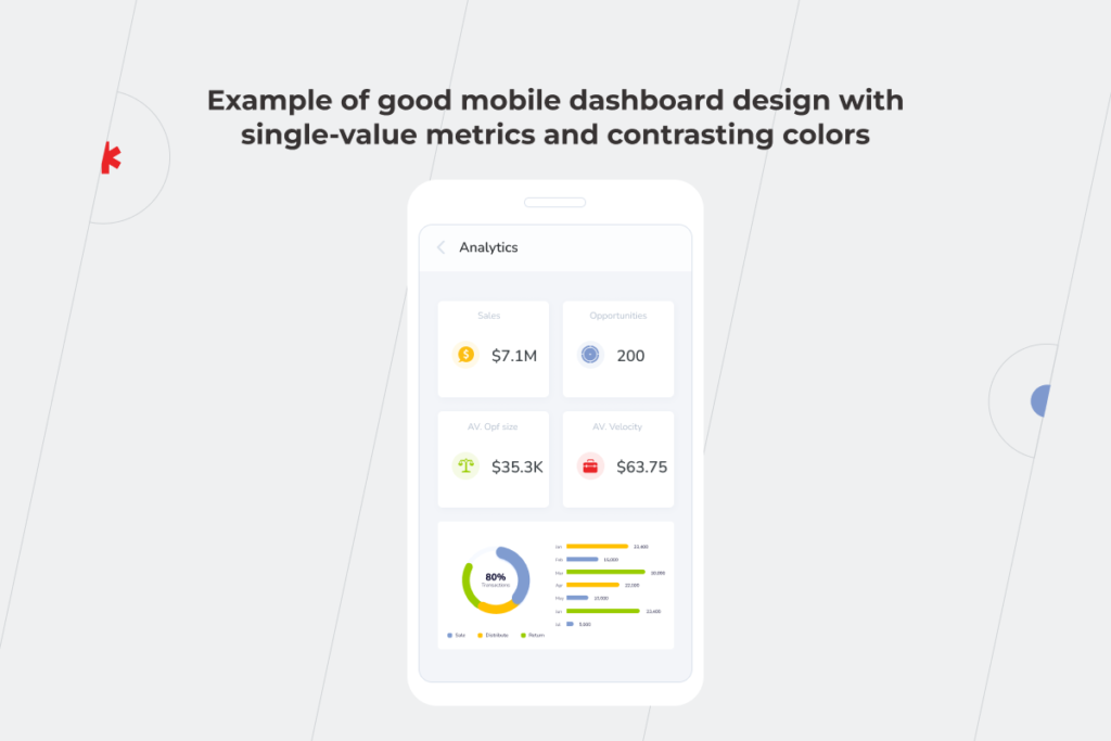
Although mobile BI is a natural extension of your desktop analytics software, a mobile version shouldn’t blindly replicate the desktop experience. You can keep the user experience consistent on both platforms, but wrap your solution into a mobile-focused experience.

Example of good mobile dashboard design with single-value metrics and contrasting colors

To recreate a typical mobile user flow, we recommend:

  • Including app notifications and alerts;
  • Employing voice recognition to access certain options hands-free;
  • Equipping your applications with in-app guidance prompts;
  • Tapping into native touch controls, including swiping, pinching, zooming, and others.
  • Integrating the application with other communication channels to boost team collaboration;
  • Embedding in-app analytics for further enhancements.

It might seem that achieving this kind of native-like user experience is a costly undertaking. However, a mobile BI version for a specific platform doesn’t require many resources compared to a standalone solution with multi-platform compatibility.

Neglecting the needs of your audience

By default, hand-held devices and desktop applications cannot deliver the same level of functionality. Therefore, you should adjust your mobile application according to the screen size and mobile constraints. While the main BI solution can provide visibility into data-rich charts and detailed reports, the portable solution should be optimized to display key metrics and alerts as well as share data via messages and emails.

Mobile BI apps: the power of BI, as and when it’s needed

As the world is quickly moving towards mobile, enterprise software also steps in to deliver better access and data visibility through mobile business intelligence. Mobile BI applications combine the analytical capabilities of desktop data processing and portability of mobile devices to equip companies with on-the-go data usage, risk management, and forecasting.

Although mobile business intelligence brings unique advantages to the table, its flexibility can play against you if handled irresponsibly. You should pay due diligence to necessary safeguards and user interfaces to eliminate risks and maximize mobile benefits.

Want us to take care of your mobile BI application? Get in touch.

Deal Closed: How to Take Advantage of Business Intelligence in M&A

Second to its people, data is one of the most powerful assets any company has, and this point becomes even more evident in merger and acquisition (M&A) deals. If you are running an organization and planning to undertake an M&A, how would you cope with it on the data level? You can struggle for accurate and reliable analytics in your organization, and this issue comes to the forefront when handling data from the two companies during an M&A deal. Complete integration often takes months or even years to accomplish, and you must take care of proper data integration throughout this period. 

Business Intelligence is one of the technologies that can help you handle tremendous amounts of information and turn it into fact-based business insights. We’ve talked to a financial expert who has been involved in M&A deals and knows the true value of BI in making them happen efficiently.

See the story behind the numbers

More than eight in ten directors or higher executives at firms with at least 10 million dollars in revenue see data analytics as becoming increasingly important to M&As in the coming years. How can technology-driven data change deal-making? Instead of raw monotonous Excel tables with numbers, you get easy-to-read visualizations based on these tables and gain deeper insights into the company’s real story. 

For starters, whether you are buying or selling a company, you need to know its fair price. To do this, you have to consider a number of indicators that are pretty tricky to get right, such as P/E Ratio, EV/Sales, DCF (Discounted Cash Flow), Replacement cost, etc. High-quality merger and acquisition data analytics, enabled by a BI solution, empowers you with a business vision that eventually impacts the value of a deal. The influence of the technology will only increase in the coming future, so hop on the BI train before your competitors leave you behind.

Pre-deal stage

One of the crucial functions of BI in M&A is the mitigation of risks, such as overpaying or, even, being deceived by fraud. In the pre-deal stage, you investigate companies that might be a good fit for you. However, at this point, you only have access to the public data of the target company. 

By building revenue growth trends, analyzing profit margins, and identifying profit and loss outliers for the company you’re interested in against the overall industry situation over the past few years, you can identify whether the data is true. Such visualizations help bring to the surface what is easy to miss behind endless rows of numbers and uncover cases when someone cooks the books. You can identify whether the company’s financial reports reflect a fair view of its actual financial and operational situation as well as measure the company’s earnings quality.

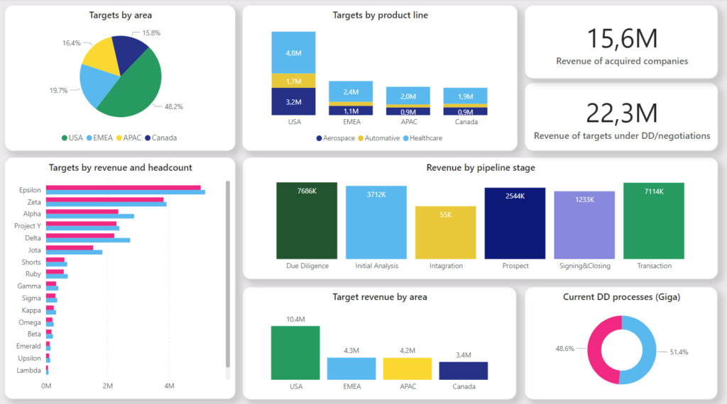
Business Intelligence in M&A dashboard

The pre-deal stage includes due diligence and negotiations phases. Let’s investigate them in detail to see how Business Intelligence can provide comprehensive and valuable analytics for acquisitions or mergers.

Due diligence 

When organizations are just stepping into the M&A process, there’s the Chinese wall between them — both parties have access only to public data. But still, with a BI solution you can: 

  • Compare targeted companies and the profitability of deals regarding what new market segments or markets you can enter. 
  • Gather and analyze actual targeted companies’ employees’ skills to identify the most beneficial option for merging in terms of social capital.

Negotiations 

At this stage, the Chinese wall is no longer as impregnable as it used to be at the due diligence phase. You can ask the targeted company for data that isn’t publicly available to protect yourself from a bubble deal. For instance, when you buy a company, you can request to see an aged receivables report and visualize this information with Power BI, Tableau, etc. to simplify and streamline its analysis. Knowing which payments are overdue (30/60/180, etc. days) is crucial as the more overdue the receivables are, the less chance of getting the money from the targeted company’s debtors is. In expert hands, BI helps to identify inconsistencies and cases related to data falsification.

Another example where a BI tool can be of much help is in identifying reversals of the sales revenue transactions registered in the previous financial periods.

 Business Intelligence In M&A

Beyond that, Business Intelligence for mergers and acquisitions allows you to analyze which employees you might lose. For instance, an automated BI solution can gather the information from the LinkedIn profiles of a targeted company’s employees. A dashboard graph based on such data can illustrate how many of them have recently updated their work experience and skills section or set an “open to work” status — most likely, these employees will leave the company. By combining information from profiles with KPI data on the dashboard, you’ll be able to identify key employees and monitor their readiness to leave the organization or stay. 

Armed with the right data, you can leverage the social capital inherited from another company to the fullest. Yes, there can’t be two CFOs in a company. But if the CFO from a targeted organization is one of the key employees who creates real value for the deal, you should consider how you can retain the talent.

 Business Intelligence In M&A

Deal stage

For all the merits of Business Intelligence, it needs to clearly state what it is and what it isn’t. BI is definitely not an almighty tool that will do the job for you. People are paramount. However, with BI, your employees can fully reveal their potential in choosing what’s best for your business. The technology helps to:

  • Identify the ways of increasing the asset effectiveness of a merged company. You can analyze the equipment’s performance to minimize the risk of downtime. When you check the condition of the targeted company’s equipment and choose the criteria by which you’ll track its wear and tear, you’ll be able to predict its possible failure in the initial stage and the length of its service life.
  • Determine the highest-priority products to launch and how much effort you can devote to developing new products. For example, you’ve absorbed a company that makes products similar to yours. In this case, a BI solution will help identify high-margin products to manufacture. This is crucial because as a result of the merging production facilities, the capacities of both companies may not be enough to produce all the goods you want. So until the merger or acquisition is over, the technology will help you reach a compromise.

With Business Intelligence, you can significantly facilitate data processing, especially if you are entering into international deal-making.

Don’t take a rain check on implementing BI solutions

Reach out

Post-deal stage

It may seem that when the most tricky part of the deal is settled, you can finally breathe out. But in reality, you still have to take care of post-deal integration as, at this stage, you get access to the Big Data of the target company. 

Big Data acquisitions are especially complex in highly regulated spheres such as finance and healthcare due to big data security concerns. For instance, if a pharmaceutical organization acquires a startup, the former receives data from laboratory studies. When it comes to medication research, the amount of information is genuinely overwhelming and the thing is that it can be manipulated. If you get tons of lab results in Excel, you have to be no less than a genius to uncover discrepancies. Business Intelligence in mergers and acquisitions makes such unusual points visible and trackable.

One of the undoubted advantages of using BI tools in M&A is the ability to rapidly amend data processing in order to absorb new units in your business framework smoothly.

Above all, at the post-deal stage, BI helps you analyze the corporate cultures of both organizations to blend them appropriately. It’s not referred though to some abstract culture but as particular manifestations of it. Business Intelligence allows you to unveil the difference in pay rates or perks systems between the two companies, and thanks to the visualization, evaluate the impact of these parameters on employees.
You can gain even more by combining BI for mergers and acquisitions and machine learning. The last one allows for reducing the workload for the employees of both organizations by automating processes or even helps to cover a staff shortage. According to KPMG, there will be mass adoption of AI in M&A is coming in the next five years, so it’s up to be at the forefront of your industry in the nearest future. 
Business Intelligence in M&A
Source: KPMG, Data Analytics in M&A

Discover the value you couldn’t even think of

Advanced data analytics fully reveals the professional potential of your employees and provides them with eloquent insights that can significantly impact your business during its M&A journey. Business Intelligence increases your confidence in the deal and influences its cost by giving you a deeper understanding of risk factors and points that drive valuations.

Book a call with our experts to determine how to create a custom BI solution that’ll speed up data processing throughout your M&A initiative.

FAQ

What is M&A intelligence?

Business Intelligence in mergers and acquisitions is your opportunity to back up your business hunches with facts. The technology protects you from the risk of merging with an untrustworthy organization, entering into an unprofitable deal, and experiencing a post-deal disaster by providing easy-to-grasp dashboards with targeted companies’ relevant KPIs. 

How is data analytics used in mergers and acquisitions?

Data is used at all the stages of the M&A process: pre-deal, deal, and post-deal. The thing is what information about a company you can access at each stage. At the pre-deal, you can load into your BI system only publicly available data about the targeted companies. During the deal phase, you can ask for some internal company reports to confirm the accuracy of public data. And at the final post-deal stage, you get access to the company’s Big Data.

How to Leverage Business Intelligence in Supply Chain Management: Find Real Meaning in Your Sea of Data

Can you drive if your car has problems with the engine, battery, brakes…? It’s unlikely and even if you do, there will be problems along the way. Moreover, ignoring signs of trouble might not only cost you a fortune but also put you at risk of an accident. Supply chain management, in some ways, is similar to this process, only instead of car parts, you are dealing with procurement, logistics, operations management, software, and you need to keep them running smoothly. But the reams of disparate data and the inability to process it in time is one of the reasons why your vehicle is not working in the way it’s supposed to.

As the supply chain is one of the core areas you should concentrate on during the digital transformation (DT), its intelligence can put your business on the fast track to success. Implementation of Business Intelligence in Supply Chain Management (SCM) is one of the ways to handle the mind-boggling amounts of data and turn it into meaningful information. With this technology at your fingertips, you can automatically track main KPIs such as cash to cycle time, fill rates, days of supply, inventory velocity, turnover, customer order cycle time, etc., and investigate this data in more detail to uncover some not-so-obvious details.

In this article, we dive deeper into the levels of supply chain management, uncover how BI solutions can improve your business outcomes, and provide you with a supply chain intelligence PDF checklist so that you can rate your company’s intelligence level by yourself. 

Use Business Intelligence in supply chain management to identify weak points in time

Providing you with the visibility of all your data and turning it into valuable information that you can check at any moment is the key benefit of Business Intelligence solutions for SCM.   

Imagine that you need to connect a plethora of indicators of freight traffic, rail transport, and the leading rail operators. Generating the graphical representations of them in Excel doesn’t sound too challenging, until you need to make changes to the data and, consequently, to the charts. In this case, business analysts have to correct the information in the spreadsheets manually. It gets even more puzzling if the organization doesn’t have a common data warehouse and the data that each employee works with can only be accessed by themselves. 

With Business Intelligence in the supply chain, such a situation doesn’t happen. Graphic representations of indicators of freight traffic, rail transport, and the leading rail operators are connected automatically and presented in easy-to-grasp real-time dashboards available in just one click. 

Moreover, BI empowers you with prescriptive analytics that enables you to predict future events and take action to achieve or prevent them. McKinsey reveals that prescriptive analytics can increase supply chain throughput by up to 15 percent in the short term and reduce costs by 10 percent in the long term.

Implementation of the technology can greatly impact the effectiveness and profits of your organization at all the levels of SCM – from strategic to tactical and operational. 

Business Intelligence for supply chain management: strategic level

The strategic level is about keeping track of market trends and overall planning of how your supply chain will function according to your organization’s goals, customers’ needs, suppliers’ demands, etc. It’s the cornerstone of successful supply chain management.

Changes at the lower levels without a common understanding of the company’s long-term BI strategy will be ineffective. It’s like trying to renovate a house after rain damage without realizing that the leaky roof needs to be repaired first. Here are strategic activities where BI solution implementation will be helpful:

1. Identifying priority areas of production

At the strategic level, using Business Intelligence in supply chain management helps you decide on your company’s global approach: will you focus on producing large volumes of low-margin goods solely or will it be more profitable for you to combine high- and low-margin goods? If you choose the latter option, what is the ideal ratio of production capacity for their production? BI helps you determine the optimal balance based on all the input data.

Selling items with low margins but high volumes that load your production line is like offering vanilla ice cream – it’s the most standard but sought-after product. And here’s the question to ask yourself: if your company can handle high-margin made-to-order products, how profitable is it for you to continue producing vanilla items?  

If you are planning to develop new products or modernize existing ones on a regular basis, BI technology can help you efficiently allocate the production workload. Take, for example, a manufacturer, who wants to reorient the company’s production based on trends for the new season. BI helps to identify low-margin items that should be dropped from production and the capacity needed to produce new items. In theory, it can all be done in Excel, but with BI it’s much faster and easier.

2. Allocating manufacturing facilities correctly

Where is it more beneficial to locate the factories? Countries such as Malaysia, Taiwan, China, and India may seem the best options at first sight. But if you consider other parameters, such as quality of labor, risks, infrastructure, etc., your choice won’t be as straightforward. 

If you distribute goods for various markets, another question arises. Which option is more profitable for you: manufacturing in one of the countries and delivering to others, or having a factory in each country to save on logistics and speed it up? There’s no one-size-fits-all solution, and Business Intelligence for supply chain management can confirm what your business sense tells you or prove it wrong with up-to-date and accurate data. 

Business Intelligence

Business Intelligence solutions for supply chain management: tactical level

When you’ve set the organization’s overall priorities, it’s time to dive deeper into your medium- and short-term activities in SCM. Which specific manufacturing processes should you identify to reach your big-picture goals? How do you minimize risks and control costs in practice? At this stage, you determine the means of achieving key deliverables – production efficiency at a balanced cost and high customer satisfaction. If your production facilities are located in different countries, tactical activities may differ, as you should take into account local resources, taxes, etc.

BI solutions help with:

1. Choosing the most beneficial transportation and warehousing solutions

Identifying if logistics should be managed in-house or by a third party is one of the top priorities on the tactical level of SCM that BI can help with.

What about warehousing? Poor SCM can lead to a lack of materials and products and, in turn, failure to fulfill orders on time. On the other hand, every piece of inventory you store costs you money. The price will be exceptionally high if the storage space is located in a country with high cost of industrial rent, like the United Kingdom, Norway, or Ireland.

Supply Chain Management

2. Finding a balance between the discounts that different suppliers offer and their level of service

For example, you buy many components for products from different suppliers at the best prices. This may seem the most profitable solution as the cost of the final product is minimal. On the flip side, you need to coordinate your deliveries so that the production doesn’t stand idle while one of the components is being delivered. How important is the speed of production over the price? Can you sacrifice greater productivity and faster outcomes to save on costs or risk losing customers? That’s where the role of Business Intelligence in Supply Chain Management comes into play– the software enables quick visualization and comparisons of proposals from various suppliers. 

3. Creating schedules for suppliers and employees

How many urgent and non-urgent orders do you have? Such information is usually kept in mind of people, on paper, or in Outlook at best. But if you produce various types of one product, you should track the production run for each type as you first have to produce one type of goods, stop the line, reconfigure it to make another type of goods, and restart the line. It’s challenging to manage such a complex process efficiently without real-time data visibility. It’s one of the points where you can benefit most from the Supply chain management and business intelligence duo. Schedules for all employees who can track their actual status are the key to the timely execution of tasks.

4. Building an integrated and scalable KPI tracking system

Without a proper analysis of your supply chain performance, it is impossible to understand whether you’re moving toward your goals and at what speed. And BI helps you conduct this task. Take advantage of creating a custom dashboard that contains both common KPIs, such as days of supply, fill rates, inventory velocity, turnover, etc., and your specific KPIs based on your organization’s areas of focus. 

For example, what if you’re concerned about data on the number of negative product reviews and returns? In this case, you can add the information on the number of defect cases to this data and create a unique KPI to track product quality. Moreover, the BI solution allows you to collect the information from different sources, both external (outside research, customers’ feedback, social media, etc.) and internal (ERP, IoT devices, logistics and transportation management systems, etc.) to get results.

Business Intelligence

Business Intelligence support for supply chain management: operational level

This level of SCM includes your daily routine tasks such as monitoring logistics, production scheduling, ensuring enough materials are available for production, etc. In the supply chain, you need to correlate the sales and procurement plan with production capabilities and maintenance service. You can plan everything… in theory. But what if there’s a shutdown at the factory? What is your plan B? How do you correctly relocate capacity to meet obligations to the customer on time?

Consider implementing Business Intelligence in supply chain management for:

1. Monitoring logistics activity

There’s no company with a 100% on-time delivery rate. At the same time, this indicator is of major importance for buyers – 73% of them are ready to cut off relations with suppliers if delivery problems take place. That’s why it’s no wonder that all organizations want to improve their service. In this case, Business Intelligence logistics can make it possible to determine the routes on which delays occur more often and uncover their possible causes. The technology helps to identify bottlenecks and minimize unnecessary delays and holdups.

 Business Intelligence

2. Managing incoming and outgoing materials and products

You should be ready to deal with unexpected issues that require a quick reaction at an operational level. For example, if you receive raw materials of poor quality, you have to settle the loss with the supplier and find another partner who can deliver you the materials of the desired quality. With BI, you have a dispatch console – a part of your real-time dashboard that shows available suppliers. The technology also provides you with other actionable information that helps answer a bunch of questions such as: Do you have enough raw materials? How many loads are supposed to be picked up tomorrow but haven’t been assigned yet? If you don’t have a tool to track this information, you can face the risks such as raw material shortages, cargo theft, failure to deliver products on time, etc. Leverage Business Intelligence for improving supply chain risk management. 

Supply Chain KPI

New legal requirements for the supply chain were introduced in 2022 in the EU. According to them, companies are obliged to check their suppliers for human rights violations, trade of conflict minerals, etc. Without a BI solution, the fulfillment of these conditions is time-consuming and almost impossible. Business Intelligence technology forms a digital twin of the chain, so you can easily check any supplier at any moment.

Following strict compliance requirements is especially important when dealing with dual-used substances. For example, precursors that can be used for producing paints as well as explosives. Registration of such substances is a prerequisite for their production. 

Where and for which product you’ve requested approvals, what stage you are at, and what documents still need to be prepared? You can spend tremendously long time running a table in Excel for such data, and naively believe that you’ll never make a mistake. Or you can create a database and leverage the BI system that provides access to the portals where there is information about the release of new precursors, and automatically sends you notifications about new or updated requirements for the paints you produce. 

Fuel your supply chain management with embedded BI to get through the digital transformation journey easier

The implementation of BI in supply chain management is an integral part of the DT, without which the normal functioning of a modern enterprise is not possible. 

One of the great things about BI solutions for supply chain management is that they are integrated into your everyday applications. Your employees can gain insights within their well-known app without changing their workflow. BI implementation in the SCM allows you to manage risks by raising transparency.

Get in touch with our BI experts to leverage your business data in supply chain management and get a robust Business Intelligence foundation.

Business Intelligence In Education: School Edition

Schools generate more data than they can handle and can effectively use. Surrounded by all this information, they are still starved for insights though. And it’s no wonder – manually dealing with tons of paper documents or, at best, Excel spreadsheets is a dubious pleasure that requires eons of already limited time.

Fortunately, today’s technology allows educational institutions to make a considerable shift in the way they work. At the same time, neglecting the EdTech trends results in lots of missed opportunities. While some schools are drowning in huge amounts of data, others navigate these waters easily thanks to Business Intelligence (BI). In this article, we investigate how exactly BI helps school administrators, teachers, students, and parents. 

Schools have a lot on their plates:

  • Allocation of available financial resources. Funding depends on a plethora of factors. The number of students and class sizes, student attendance and academic results, program offerings, and more — all this matters to sponsors. In a situation where schools have to do more with less, they’d better have a clear view of what they actually have. 
  • Limited resources of teachers. Preparing various learning materials, tracking students’ progress, meeting with parents, filling out reports, – it seems teachers need a time-turner to perform all these tasks. Coupled with the shortage of professionals, such a volume of work is impossible to be handled without the help of technology. Schools need technological support to monitor allocated workloads and provide teachers with a balanced work schedule and sufficient classes size.
 Business Intelligence In Education
  • Massive amounts of paperwork. McKinsey’s research uncovers that automation of 20-40% of teachers’ paper activities will result in freeing 13 hours per week. It would help reduce the teachers’ workload to a normal level, as it now stands at least at 50 hours per week. School administrators will also breathe easier after BI implementation because the technology simplifies administrative management and helps meet reporting requirements faster.
  • Standardization of the student experience. A one-size-fits-all approach demotivates students and negatively affects their engagement. It leads to poor performance and makes the school rating worse. Also, parents dissatisfied with their childs’ grades may think that the teachers are to blame and the relationship between them will become tense.
  • Parents’ insufficient involvement in the educational process. It’s not surprising, especially if both parents work and the time of the meetings with teachers doesn’t coincide with their free time. 
  • Lack of school data visibility for sponsors. When people invest in improvements, they obviously want to see where their money goes and how effectively the school is performing.

How is BI technology changing the performance of administrative tasks?

Application of Business Intelligence in education provides school administration with:

1) All the necessary data gathered at one place 

All the information is organized in a warehouse so that the school administration doesn’t have to pull data from multiple sources. At the last stages of data processing, the data is visualized in the form of intuitive and easy-to-analyze dashboards within special BI tools such as Power BI, Tableau, Qlik, etc. Let’s take the situation with grants as an example. Schools have to look for funding, but it’s too time-consuming to manually keep track of the grants your school can apply for. Thanks to BI all the information about them can be automatically gathered, analyzed, and then presented to the stakeholders.

2) Streamlined activities

Processes such as managing budgets, ordering resources, paying invoices, handling scheduling, ensuring the school’s compatibility with relevant laws and regulations, hiring staff, and others are time-consuming. Take scheduling, for example. It’s one of the most demanding administration tasks which is almost impossible to put into an algorithm. The planning is always done by a person – BI software won’t automatically create a schedule, but it’ll highlight gaps in a human-generated one. For instance, the Business Intelligence solution will focus your attention on the timetable lapses when the teacher has only the first and fourth lessons, and you’ll be able to manage your employees’ time more appropriately and effectively.

3) Simplified reporting with enhanced visibility of the processes

With BI, data for different kinds of reports, along with the key information for the sponsors is gathered automatically. Instead of numerous tables with text and numbers, it’s wrapped in easy-to-understand data visualizations. When reporting is based on the clear visibility of school processes, the administration can not just grasp information, but get truly valuable insights from it. The analysis of properly organized and presented data helps find new ways of saving money for the school. 

4) Ability to predict future changes

BI in education married with Machine Learning (ML) can be used to review where you’ll end up if you decide to make changes or stay on the current track. For example, the technology will help you monitor student enrollment and class size for resource planning and calculating state funding requirements and payments. It works the same way with extracurricular activities such as sporting events, cleaning, security, guest lectures, etc. BI solutions collect the data about them and, based on the spending in previous years, make assumptions about future spending so that you can allocate your budget wisely.

5) Employee visibility

The math teacher’s contract is up next month, the music teacher is going on maternity leave in two months… How many situations like these do you need to keep in mind in order to make decisions about contract extensions or hiring new teachers in time? BI will help you keep track of these dates. Also, Business Intelligence in education can be viewed as a possibility to monitor teachers’ state and workload to prevent their burnout. NEA survey revealed that 55% of teachers in the US are planning to leave education because of burnout. With BI, you’ll be able to notice if some teachers’ schedules are overloaded and reallocate the workload. If you avoid staff turnover, it’ll be an additional value for parents and students as no one is happy when teachers are constantly changing. 

6) Easy identification of risky behavior among students 

The technology also helps notice, collect, and analyze students’ behavior to conduct risk assessments. Such an approach contributes to making school a safer space. For instance, in a dashboard, teachers can leave notes about students’ behavior. BI solution will visualize the frequency of these comments and the degree of their importance. Using it, the school administration is able to highlight when an individual student’s behavior is disruptive to others, and take measures to prevent these risky behaviors from transforming into major accidents.

7) Increased sponsors’ involvement

Simple, clear analytics helps attract sponsors and keep them engaged in the school initiatives. There’s a long shot they will dig into spreadsheet reports, while informative, convenient dashboards have a higher chance of catching their attention. 

Moreover, Business Intelligence in education allows you to generate visuals for sponsors automatically. Without BI software, administration staff usually spend 2-3 weeks to gather and prepare all the necessary information. 

BI in education

How does BI influence the educational landscape for teachers?

Teachers’ tasks are the ones that can be significantly changed for the better with BI solutions. Application of Business Intelligence in education helps:

1) Reduce time and effort spent on a paperwork

Full-time teachers work 51-57 hours per week and spend more than half of this time on non-teaching activities. It’s no wonder the level of depression among education professionals is much higher than among the general population – 32% vs. 19%. At the same time, almost half of the teachers don’t share their mental health issues with anyone at work as they are afraid of the stigmatization.

 Business Intelligence In Education

The application of Business Intelligence in education can save teachers from burning the midnight oil and minimize the negative impact on their mental and physical health. Along with taking proper care of your employees’ wellbeing, you can leverage the BI solution to free up teachers’ time so that they are able to catch up with underperforming students or improve their qualifications.

2) Track students’ progress in real-time and swiftly correct it

Having data on students’ performance practically on a silver platter allows teachers to assess their progress, spot talents in time, or identify problems and quickly find the ways to fix them. BI solution helps teachers track students’ learning path continuously instead of a post-factum analysis at the end of the term. 

Teachers may have a gut feeling about which students need more attention at some points, but BI software backs up this professional hunch with actual data in an easy-to-understand form. Building spreadsheets to analyze performance and attendance data is time-consuming even for one student, not to mention that the analysis has to be done for an average of 25+ students per class. 

Now, imagine that a teacher wants to add a third factor for analysis, for instance, welfare data or family factors such as divorce, single parents, violence, etc., that indicates that a student needs a little more help. This would usually mean the teacher has to start building a new spreadsheet, and it may look like she/he has to give up on their weekend plans to finish the project. 

Taking advantage of BI in education, you use teachers’ time more effectively by keeping them busy only analyzing automatically processed information. 

3) Involve parents in the educational process with meaningful information on their kids

Organized and structured data is also convenient to be shared with others. It saves teachers’ time to prepare for their meetings with the students’ parents. The freed-up time can be spent on a deeper and more thoughtful analysis of the automatically-collected information. 

Here’s an example of a dashboard where classroom teachers can monitor their students’ engagement scores in different subjects, attendance, and performance level in all the disciplines and review these parameters in detail for particular students and subjects.

Business Intelligence In Education
 Business Intelligence In Education

Subject teachers can leave feedback to make it easier for classroom teachers and parents to fully understand students’ success in learning particular topics or the subject in general.

 Business Intelligence In Education
 Business Intelligence In Education

How Business Intelligence in the education sector is helping parents?

As children spend a significant part of their time studying, it’s naturally important for parents to be informed about their kid’s educational activities and wellbeing at school. BI solutions provide parents with:

1) Real-time visibility of their children’s progress and possibility to stay in contact with teachers

The most widespread reason why parents don’t attend school meetings is that they simply can’t do it because of their working schedule. In the US, the percentage of families with children under age 18 and with both parents working full-time is 59.8%, among the European countries the average rate is 61% but in some Scandinavian countries, it exceeds 80%. Technology that simplifies and speeds up conversations between teachers and parents is increasingly valuable in these circumstances.

BI technology allows parents to access data related to what their child is learning. It encourages them to connect with their child’s teacher and download learning materials if the student should do extra tasks to enhance their grades. Thanks to straightforward dashboards, parents can see the actual performance level of their children. The functionality of more complex dashboards gives parents the opportunity to ask teachers questions about the learning process and get their answers or advice. 

2) Keeping in close touch with their children

It’s usually easy to ask your elementary school children about how things are going at school – they tend to share how their day went. But getting an answer to the same question from teenagers may be quite tricky. This is where the BI solution can be of much help. By reviewing teachers’ comments in your child’s dashboard, you can better understand their interests and issues, and find the topics to discuss during breakfast or dinner. Such small talks aren’t a small thing. An OECD survey has investigated the relations between student performance and parental involvement in the educational process and showed that only 52% of parents worldwide discuss their children’s wellbeing at school every day or almost every day. Meanwhile, students whose parents do this at least once a week are more likely to declare a high level of life satisfaction and get higher scores.

So, for parents, BI in education makes their child’s school life just a click of a button away. 

3) Being aware of the non-academic aspects of children’s school life

Tracking the learning progress of children is essential, but there are also other things parents are interested in, for instance, school meals. With a BI solution, parents can see the breakfast and lunch menu for the month ahead and choose between alternative options such as meat or a vegetarian dish, fruit juice instead of milk, if the student has lactose intolerance. This is especially important for elementary school pupils who, because of their age, cannot always identify whether they can eat certain dishes. And when parents are given the opportunity to decide on a menu in advance, they can avoid the worry that their child will eat something wrong or not eat at all. 

If the school cafeteria supports wristband payment technology, parents can also monitor what their children buy and put a limit on the amount of purchases.

 Business Intelligence In Education

How does BI technology support students?

BI implementation in the education sector ensures better a studying experience, helps students develop their talents, and also creates a safe space for them. The technology offers students:

1) Personalized learning experience

As teachers are able to constantly track the individual performance of each student, they can advise additional materials and personalized worksheets based on the topics the student is stuck with. RAND research shows that students who started below the national norm and then get a chance to leverage personalization in learning reached these norms by the academic year’s end and surpassed them in two years.

“Learners thrive on doing work that’s challenging but possible, and therefore rewarding when it clicks,” shared Brian Galvin, Chief Academic Officer at Varsity Tutors.

 Business Intelligence In Education

2) Confidence in secure psychological support available at any time

Many schools have a psychologist or counselor available, but just having one is not enough for students to seek help if they need it as they can’t be sure that their private data will be secure. Schools should give students the possibility to both ask for advice or help anonymously and provide them with an opportunity of a personal meeting with the specialist based on their consent. What does this have to do with BI in education? Business Intelligence software allows psychologists to collect the student’s requests and match them with the data about his/her attendance level for a deeper understanding of the situation if the student would like to disclose his/her identity. Such an approach helps schools take better care of the students’ psychological state, the emotional climate in the classes and, for instance, notice bullying cases at early stages.

3) Career planning in high school

Imagine how much easier it can be for students to choose their future profession if the data about their performance in different subjects is collected automatically throughout their whole school life and then presented in a clear dashboard. This way, students get full-fledged digital portraits of themselves reflecting all their strengths and weaknesses. Besides, these dashboards can show the most suitable colleges and universities for admission according to the student’s interests and scores analysis. It’s also possible to highlight subjects or areas where improvement is needed if the student wants to enroll in a particular uni and choose a specific major.

 Business Intelligence In Education

If we put together all the stakeholders whom BI helps in the educational process, we’ll get such a mindmap.

BI in education

Maximize your opportunities to analyze the data

The possibilities that come with the application of Business Intelligence in education are countless. However, it’s not without a fly in the ointment either. There is so much data to be collected and analyzed, that you may experience paralysis and data fatigue before even starting your Business Intelligence initiative. Therefore, it’s critical to develop a well-thought-out, incremental strategy for implementing BI software – to be determined about what you need is already half the battle. Finding the right technology partner, who can develop and implement either some BI components or a full-fledged solution, should be integral to your project planning. BI specialists with relevant industry experience will help identify all the possible pitfalls in advance and achieve the desired goals in the most efficient way, so that you only have to enjoy how Business Intelligence is changing the way you work for the better.

To find out what to start with, book a consultation with our BI experts.

FAQ

How is Business Intelligence used in education?

Just like in any other industry, Business Intelligence in the education sector helps provide all stakeholders with relevant data in an easy-to-understand form even for non-technical users. The specifics of BI in education are that there are many stakeholders in the educational process, so the technology helps them all at once to stay connected. At the elementary and secondary education levels, there are school administrators, teachers, students, and their parents who can leverage BI to collaborate, putting the child at the center of the education process.

When Data Fails To Tell a Story: Data Visualization Mistakes

A chart should clarify, not confuse. Yet data visualization errors slip into dashboards and reports more often than most teams realize, quietly steering decisions off course. You’ve seen examples of bad data visualization firsthand: truncated axes that dramatize trivial changes, pie charts with too many slices, or color choices obscuring the very patterns they should reveal.

Most of these blunders are preventable, and our data experts are here to share practice-proven tips on how to avoid common pitfalls of data visualization.

Key highlights

  • Real-world data visualization mistakes examples range from the ​​wrong chart type to overloaded graphs to deceptive color schemes and other subtler flaws that are easier to miss but just as damaging.
  • GenAI can produce charts fast, but without a human in the loop it only adds to data visualization errors.
  • Misleading visualizations quietly erode stakeholder trust and undermine informed decision-making across the organization.

What is bad data visualization?

In short, poor data visualization is any graphic that violates core visualization principles, turning data into noise instead of insight.

  • Unclear. Overcrowded visual elements without clear labels make the chart hard to read at a glance.
  • Inaccurate or deceptive. Manipulated scales or omitted context mislead viewers and produce invalid conclusions.
  • Inconsistent. Shifting baselines or clashing color schemes undermine comparison across data points.
  • Overloaded. Trying to cram too much information into a single visualization, overwhelming viewers instead of guiding them to key insights.

What price does your business pay for bad data visualizations?

The thing with bad graphical representation of data is that you can’t say it’s bad until you fail to get anywhere using it. Such a situation is risky: with all these pie charts scattered all over your reports and tons of descriptive text, you may have an illusion that you’ve successfully handled the ever-growing amount of data, whereas, in reality, this data fails to tell the story. Whether you rely on Power BI dashboards or simple spreadsheet charts, the consequences of bad data visualization impact your business routine and decision-making processes in several ways. 

Can’t tell a clear story with your data 

Imagine you’re in a sales meeting, expecting a clear visualization showing revenue across your company’s top five markets so you can decide where to invest. But you get a line chart with all the markets where your company is present instead. It’s virtually impossible to compare data at a glance and quickly get high-level insights when you see 20+ lines. A single chart trying to show everything at once buries the key message instead of revealing it.

You may say that at least some kind of visualization is better than no visualization at all. Not really. Unclear visualization doesn’t carry out its functions, so you still have to dive into the spreadsheets to connect important data points and make sense of your raw data. 

Get invalid insights that lead to wrong decisions

Say you’ve tested several new markets and one region’s profits jumped significantly. Does that make it the best pick? Not necessarily. What about advertising costs there — were they the highest too? Did they pay off? Without factoring in ROI, you’re flying blind. How many customers came through ads versus other channels? If your chart shows revenue but ignores advertising costs, the picture is lopsided. You might pour a huge budget into a region that only looks profitable on the surface, while a cheaper market with better returns gets overlooked.

Still, there’re times when a couple of graphs aren’t enough to get a good grasp of a situation. To make a well-informed decision, you might need as much as a custom dashboard to seamlessly track multiple data metrics in one place and understand trendsover time.  

— Andrei Haurylau, UI/UX Designer, Instinctools

Fail to uncover hidden correlations between different data sets 

Weaknesses to improve, anomalies to correct, unobvious interrelationships won’t be revealed with bad visualizations. For organizations, this means the loss of potential revenue and the inability to change the perspective to see new possibilities for development and growth. With misleading data, you won’t be able to define the room for improvement and notice probable pitfalls. For example, you might overlook ineffective marketing campaigns and keep spending your budget on them. Experienced data analysts know that surfacing these hidden patterns in complex data is one of the core reasons visualization exists in the first place.

Check our list of common misleading data visualization examples that our data visualization specialists have prepared if your relationship with translating data into images is kind of “continually-trying-to-figure-things-out.”

8 examples of common mistakes in data visualization, fixed 

It’s unlikely that you’ll make flawless decisions 100% of the time unless you are The Sorting Hat from “Harry Potter”. But it’s possible to minimize the risk of your data being misleading. Below are the worst data visualizations patterns we see again and again, along with practical fixes.

1. Choosing the wrong visualization method 

There are two tricky moments here. We’ll show them using pie charts as an example:

  • Viewers can’t see the difference between slice sizes and, thus, compare them. When the numbers don’t vary much, it’s better to visualize them in a bar chart.
  • Viewers can’t get the real dependencies between the objects of correlation. Pie charts are usually used for the comparison of the different parts of a whole. They are suitable for survey results or budget breakdowns (the same pie). But if you use them to compare separate datasets (different pies), you get a bad chart, and data becomes misleading. 

For instance, a pie chart isn’t a bright idea for comparing the number of inhabitants in different areas. It’s better to use a bar plot because human perception primarily judges distances and not areas.

The rule of thumb is to choose a visualization technique according to the data’s nature: quantitative data requires charts or histograms, while qualitative information is better presented in pie charts or bar graphs. And make sure the sectors add up to 100% because otherwise viewers will get a math stroke from your visualization.

— Andrei Haurylau, Lead UI/UX Designer, Instinctools

2. Overloading viewers with data

The human brain processes images 6x-600x faster than words. Given the fact that during the next three years, the amount of human-made information is going to triple, the role of a good visualization is only becoming more important. Presenting data in graphics and charts allows us to process huge amounts of information, understand it better, and get insights faster. 

But the processing capacity of our conscious mind is still only 10 bits per second. “And what does it have to do with bad graphs?” you may ask. Such a limit for data traffic means that we can’t properly concentrate on the highly-detailed visualizations for a long time. In the case of charts, if there are too many variables, choose 5-6 more essential ones. Graph views with more than 15 items distract attention and may be as frightening as an Excel table with dozens of rows.

3. Selecting unconventional colors

This mistake comes in three forms.

  • Absolute vs. relative coloring 

The function of color is to add extra meaning or dimension. Going for absolute colors, you may miss meaningful nuances. 

In US presidential elections, maps use red for states won by Republicans and blue for states won by Democrats. Such an approach results in maps like the one on the left. It gives an impression of an unquestionable victory of the Republicans, ignoring the fact that in one state people voted for representatives of both parties. 

Relative coloring allows the viewers to see a more detailed picture. Looking at the map on the right you can see the proportion of the counties that voted for the Republicans or Democrats against the total number of votes in each county. That way, the situation no longer seems so straightforward.

  • Unusual colors 

Green commonly means something positive, while red is used for negative cases. So if you use them in the reverse way, it may become an example of misleading data visualization. 

Check out these two flood hazard maps. The one on the left uses a green palette to show risk zones along a river. At a glance, the area looks harmless since green reads as “safe.” The map on the right shows the same data in shades of blue. The danger zones register immediately, and the darker the shade, the higher the risk.

Map charts usually leverage different shades of one color family: the lighter the shade, the smaller the number, and vice-versa. A solution with different colors instead may confuse the viewers. And take into consideration the chance that viewers may be colorblind, so don’t use misleading colors.

— Andrei Haurylau, Lead UI/UX Designer, Instinctools

  • Invisible color on a white/black background. Don’t choose yellow for crucial metrics in a line graph, as it’s easy to miss them on a white screen. The same is true for the picture on the right, where you can’t properly see the borders of the black area on the gray background.

4. Using uncertain scales

It’s challenging to compare figures with different scales straight away. Inconsistent scale can mislead and confuse viewers. For instance, the visualization on the left is an example of a bad graph because with it, you aren’t able to assess the scope, it’s not immediately obvious that one figure is four times bigger than another. You should look at the Y-axis and count, whereas good visualization should exempt you from unnecessary calculations.

5. Omitting data

Excluding some information, you miss the context. Such an attitude can affect data interpretation. Look at these two graphs: in one case, information is tracked every second year, in another, each year. The left scatter plot is a perfect example of a bad graph because it gives the impression of stable growth, while in reality there’re dips and spikes.

6. Truncating Y-axis

This type of misleading data visualization occurs when the Y-axis doesn’t start from 0. The result of the scale compression is an increasing difference between bars. That way, small variations may look paramount. 

7. Operating 3D graphics in an improper way

3D data visualizations are entertaining and fascinating but the creating them might not be worth the effort. It’s nearly impossible to follow the height of each bar to the correct Y-value on a multidimensional bar chart below. Moreover, you can’t see the values of the bars hidden behind more prominent columns. If these indicators aren’t necessary, exclude them from the data visualization. If they are crucial, use a simple bar chart instead of a 3D one. 

3D donut charts and pie charts are also more like “hmm” than “hooray” solutions for data visualization. Here is an example of a useless pie chart in 3D. Tilting the pie distorts the image of transparent slices. You can’t define the borders of slices and see how each slice relates to the others and the whole. Additionally, you can’t read labels and figure out which one goes with which slice. 

Honestly, if Bear Grylls hosted “Running Wild” in the business analytics world, transcribing this pie chart would be in one of the episodes. But you can benefit from the assistance of seasoned BI experts to beat misleading data visualization and create charts that matter. 

Three-dimensional graphics are rare in visualization since not everyone can easily think in volumes. Such graphs appear mainly in finance, where bubble charts show correlations between funds, stocks, or a stock and the broader market. Financial data often involves more than two data series, calling for a third axis to display additional information.

Since the task is more complex, be especially aware of common data visualization mistakes. Otherwise, you risk ending up with an unreadable bubble chart where it’s difficult to understand if a sphere is larger according to the S-axis or if it seems more prominent because it is closer to the viewers on the Z-axis.

8. Generating visualizations with AI and no human oversight  

GenAI’s ability to produce charts in seconds comes with a caveat – low reproducibility, as taming LLM’s probabilistic nature remains one of the top AI adoption challenges. Even identical prompts can yield different colors, label placements, odd cropping, etc., making it tough to standardize visuals across reports and dashboards. 

A human-in-the-loop approach is essential to engineer the right context for the model, craft precise prompts to keep outputs consistent, and review every final chart before it reaches stakeholders. 

— Pavel Klapatsiuk, AI Lead Engineer, Instinctools

Data visualization best practices checklist

Before publishing any chart or dashboard, run through these questions. They map directly to the mistakes we’ve described and will help you catch problems before your audience does.

  • Does the visualization use the right chart type for the data’s nature (for example, bar chart for comparisons, line chart to understand trends)?
  • Is the chart focused on one key message, or is it trying to show too many things at once?
  • Are the axes consistent, clearly labeled, and starting from an appropriate baseline?
  • Do the colors follow conventional meaning (for example, red for negative, green for positive) with enough color contrast for accessibility?
  • Have you included all relevant time periods and data points without omitting context?
  • Is the visualization free of unnecessary 3D effects that could distort perception?
  • Can a viewer grasp the main takeaway within a few seconds, without diving back into raw data?
  • Does every element on the chart serve a purpose, or can you remove anything without losing meaning?
  • If the chart was generated by AI, has someone reviewed it for reproducibility and visual consistency with your other dashboards?

Fix your charts before they break your decision making

Being aware of widespread mistakes can’t level up your business decision-making power all by itself. But just as good visualization accelerates your organization’s growth, poor charts can quietly derail it. Bad graphs aren’t the kind of failure you learn from; they simply lead to wrong decisions you never see coming. If your calls keep missing the mark, check whether you’re using the right techniques for presenting your data. 

With the right data visualized the right way, you can digest large volumes of data fast, track changes in real time, and gain a fresh perspective on growing your business.

Have difficulties with getting actionable insights from your data?

Drop us a line

FAQ

Which factors can result in a poor data visualization?

Bad data visualization is usually a consequence of avoidable design choices, such as wrong chart types, cluttered layouts, misleading axes, weak labeling, and colors that hide or distort the pattern the chart is supposed to reveal. Among less obvious issues teams tend to overlook is poor data quality due to the lack of attention to data preparation. In other words, what shows up on the dashboard might only be the visible edge of a deeper data problem.

How can data visualization be misleading?

Whether data gives incorrect insights or is just hard to understand, it results in poor business decisions that affect your company’s revenue. Visualizations are bad if they don’t tell a clear story and don’t give the opportunity to uncover unobvious patterns between data sets.

What is the most common data visualization mistake?

Choosing the wrong chart type is one of the most common mistakes to avoid in data visualization. Pie charts used for comparisons across separate datasets, line charts packed with 20+ variables, 3D effects that obscure values are the bad chart examples teams run into most often.

Are misleading charts always unethical?

Not necessarily. Most examples of misleading data visualization stem from inexperience rather than intent. Someone picks a green palette for negative-coded data or skips a few years on the X-axis without realizing the impression it creates. This results in flawed decisions and eroded trust.

Why are truncated axes so problematic?

When the Y-axis doesn’t start at zero, small differences between bars look enormous. A 2% variance can appear as a dramatic gap, leading viewers to misread the scale of change. It’s a classic entry in any list of misleading graph examples. If truncation is genuinely needed for detail, call it out with a clear axis break so viewers aren’t deceived.

How can I tell if a chart is misleading?

Start with the basics: check the axis scales, look for omitted time periods, and see if colors follow conventional meanings. If the chart feels dramatic or too clean, dig into the underlying numbers. The common mistakes to avoid in data visualization, like overloaded visuals, inconsistent scales, and missing context, are also the quickest red flags to scan for.

Speeding Up Time to Insight: Dashboards, Data Visualization Techniques and Tools

According to Statista, from 2018 up to 2020, the percentage of worldwide organizations implementing data-driven decision-making grew from 38% to 50%. Despite a substantial increase, it becomes clear that half of the respondents still make decisions based on personal opinions and gut feelings rather than facts. Thus, if you start using business intelligence solutions to encourage data-driven decision-making, you’ll be able to outperform a significant part of your competitors.

We’ve already discussed the importance of data preparation and a robust data infrastructure for accurate analysis, but are they enough to provide moments of genuine insight? To navigate in an uncharted world of boundless data, you need to visualize the information you have. 

Visual analytics play off the idea that the brain is more attracted to process dynamic images than long lists of numbers. But data visualization is not just a colorful alternative for traditional text reports and another way of presenting the information. It is about wrapping large volumes of data in a way that helps you know exactly how to act to help your business thrive. 

Why is data visualization important?

Do you struggle to understand what is hidden behind your reports due to tons of confusing, indigestible numbers they’re flooded with? If the answer is yes, then it’s time to make use of data visualization techniques and tools, which help to bring advanced analytics to non-technical users in an approachable format. Customized dashboards could save your employees from manual monitoring and analyzing the data flow. Instead, the process is automated, and the results are presented in easy-to-understand visual models quickly and efficiently. 

  • Grasping large volumes of data in the blink of an eye

From 2010 to 2020, the volume of data worldwide increased by more than 32 times. In the next five years, it’ll triple. It’s getting tougher not to drown in this enormous amount of information and define which data is overriding and valuable for a particular business, and which can be left behind. With well-thought-out dashboards and appropriate techniques for data visualization, a single graph can perfectly illustrate a complex data set.

data vizualization

If you want to benefit from big data, make sure that your employees can work with basic visualization models for one/two-dimensional information and complex solutions for multidimensional data.

  • Real-time reporting

There is no need to wait for a monthly or quarterly report to check how things are going on a project or in the company’s departments. You can monitor multiple organizational metrics using real-time analytics techniques to analyze and visualize streaming data. Such transparency enables almost instant decision-making capacity. The faster you understand your data, the quicker you can act and succeed from it.

  • Encouraging communication and collaboration 

Do reports in a raw tabular format appeal to all the stakeholders on your project? The answer is probably no. Visual methods of data presentation will help you be more persuasive, engage all the team members in discussion, and make the viewers feel comfortable speaking and acting. 

  • Improving and accelerating decision-making

Imagine that you are testing a new market with an application and planning to profit from it over a certain period of time. There is no need to wait to understand whether the project is worth continuing to invest in. Using visualization techniques, you can track data changes in near real time and uncover trends and patterns. 

It’s also far easier to analyze dependencies and determine risks at every project stage, even with basic data visualization techniques. You don’t need to waste your time looking through numerous reports with specific categories but, instead, can combine them into one report. Above all, thanks to multidimensional data visualization techniques, you’ll be able to create visualizations of various possibilities and select which one will work for your business. 

  • Uncovering hidden patterns that could be barely deciphered from numerical data

Data in a visual format speaks louder than alternatives. Unobvious interrelationships, weaknesses that need to improve, and anomalies to correct — everything that used to be hidden behind tons of Excel rows becomes crystal clear when visualized in the right way.

What are data visualization techniques and how to choose the right ones?

There are more than 160 types of data visualization techniques out there. The only way not to get lost in such diversity is to know exactly what you are looking for. To choose a data visualization model that fits your requirements and expectations, first, you need to decide on the type of dashboard. 

Types of dashboards: correct choice helps to upswing the effectiveness of each department and employee

Operational, Analytical, Strategic — these are three types of dashboards that can be identified according to a decision-making level. But how do you know which is the best fit for you?

  • Operational dashboards

Employees from different departments within an organization use operational dashboards to track a present state of a project, manage their current activities, etc. Such tasks require detailed visualizations that update in near real-time. E.g., a help desk dashboard can contain the number of tickets for the day, the number of resolved issues, and the percentage of requests by type and channel.

data visualization
  • Analytical dashboards

Analytical dashboards supply a business with a comprehensive overview of crucial data. Without them, the amount of time an analyst wastes on collecting the information grows exponentially. Dmitriy Borovik, a BI analyst at *instinctools, proves the point:

We were approached by a media-services provider about optimizing the speed and flexibility of their report generation. Before deploying self-service BI, an average day in the life of their data analyst was filled with addressing advertisers’ requests for information such as “What types of content are popular and where? How many users came from which countries? When was the viewing peak during a certain period?” 

To give proper answers, the analyst needed to assign a task to the programmer to write a new SQL query into the database. It took forever because every additional query might overload the server. When the data finally arrived, the programmer sent it back to the analyst. And this was still not the end of the highway to hell. After receiving the data, the analyst converted it into Excel and added explanations to the numbers. Altogether, these types of tasks used to take a couple of weeks!

With the custom analytical dashboard that the *instinctools’ team created for our client, these processes were automated, and time spent on the report preparation was reduced to a few minutes. 

Analytical dashboards provide a comparison of periods and categories, so they are more complicated than operational ones. When department leaders make decisions, they might need more elaborate solutions created with multidimensional data visualization techniques.

Expanding the number of dimensions and transforming the perspective from 2D to 3D allows users to see that reality is more complex than it initially seems, so there’s a small chance of making inaccurate decisions or missing key insights.

  • Strategic dashboards

Representatives of senior-level management may be honestly interested in each department’s operational details. Yet, if they run a large enterprise, they are unlikely to have time to delve into them. That’s why C-suites need dashboards that contain only the most important statistics. 

Essentially, the higher the decision-making level is, the less cluttered the data visualization should be. Here is an example of an executive dashboard for a bank with the key metrics such as revenue and expenses by branch, and top-5 branches by profit. The CEO can understand the state of an organization in a bat of an eye and decide which branches are worth investing in for the next quarter.

data visualization

Data visualization techniques

Data visualization is only helpful only when it’s thought-provoking and not just filled with data for data’s sake. Take a look at those two data visualization examples of pie charts. 

Which games have you played the most

They are both analytical and illustrate the audience by country. However, the first chart contains the most valuable data, while the second visualization tangles the users up with too many variables. The central concept of data visualization is to illustrate only essential information. There is no need to pack your reports with all the data you have. If visualization is inconvenient, it’s incomprehensible and useless. Make sure not to make these common mistakes in data visualization.

Top-3 data visualization tools. *instinctools version

Three BI platforms have been leading in the last four years (2018, 2019, 2020, 2021), according to the Gartner Magic Quadrant for Analytics and BI platforms — Power BI, Tableau, and Qlik.

  • Power BI

Power BI evolved from Excel, which is its fundamental advantage over other data visualization tools. It’s far easier for employees to implement data visualization concepts in their everyday tasks because the Power BI is similar to Excel and integrates with other Microsoft applications. Also, Power BI has a data preparation tool — Power Query, but it is available only inside the Power BI ecosystem. Take into consideration that the maximum amount of data for a premium account is 100 TB, and the maximum number of data points is 3,500 and you’ll see just how powerful it is.

Power BI is a good choice for organizations that are about to start their data-driven journey and need a reliable tool to do the job.

  • Tableau 

Tableau is a powerful and rapidly growing visualization software in its philosophy and architecture. Tableau also has a data preparation tool — Tableau Prep. With it, even non-technical users can select, prepare and visualize data. The information can be uploaded wherever you need it, to Excel or a separate database. 

The tool is unlimited by the number of data points and volume of data but keep in mind that it’s not as intuitive as Power BI. Tableau is a top solution for organizations that regularly work with big data sets and need multidimensional data visualization techniques and tools.

  • Qlik

You can combine different Qlik products to deepen the data discovery process. It also integrates with a broad range of data sources such as Amazon Vectorwise, Redshift, Hadoop, etc.

Qlik Sense can be deployed in the cloud or on-premise. The interface is intuitive; you can drag-and-drop items to manipulate dashboards and apply visualizations instead of writing a code.

The Qlik platform offers a data preparation tool — Qlik Replicate. It provides automated, real-time data integration across data lakes and DWH, databases, streaming, and mainframe systems. 

There are no rigid limitations about how much data Qlik can handle, except two billion distinct values in each field. The number of fields and data tables is limited only by RAM. 

Tips to get started 

  • Determine what kind of information you want to communicate to choose an appropriate technique for presenting your data. Take into account the stakeholders’ needs as well.
  • Understand the data you are going to visualize, including its size and cardinality, and consider (honestly) the data preparation effort that will be required. In the technology stack, data visualization goes after a data warehouse or data lake. So, fast and insightful data visualization is only possible when paired with a solid data infrastructure that supports it.
  • Define the goal you are trying to achieve with your data visualization. For example, a complex analysis requires data to be compiled into controlled, dynamic dashboards, while if you just want to highlight a single data insight every now and then, one graph or chart might be enough. But don’t go to extremes and don’t get in the trap of presenting any information as visualization. Sometimes building a chart or diagram for each tiny table in a report is a waste of time and a simple sheet in Excel is enough.
  • Figure out how your audience processes visual information and adjust data presentation to their needs. Despite all the principles and theories about effective data visualization, the reality is that the most effective visuals are the ones the audience connects with.

A well-thought-out choice of data visualization techniques and tools support building data-driven decision-making

Choosing the proper data visualization techniques from a wide array of options as well as deciding on a suitable tool for their implementation might turn out to be more tricky than it initially seems. You should consider the decision-making level of employees that will use data visualization models, quality and quantity of data, types of visuals that are the simplest for the company’s audience.  

Our designers and data consultants will make an effective contribution to your data visualization project so that you get a high-resolution view of your actual business state.

FAQ:

What are the key components of data visualization?

Data purity is a primary condition for effective data visualization. You can’t appropriately select techniques for data visualization and get actionable insights if data is messy and unstructured. And the proper choice of techniques and tools depends on the type of dashboard according to the decision-making level of a person who will use it — a C-suite, department leader, or an ordinary employee.

Where is data visualization used?

You can use data visualization basic techniques and tools in any department of your organization and on any level of decision-making. Businesses of any size, from start-up to enterprise, need BI solutions. After all, data is the future. The only question that remains is how to choose the appropriate type of dashboard and models of data visualization.

Why Every Company Needs a Big Data Strategy and How to Build it

Big Data is gaining traction among various industries. According to IBM, people produce 2,500 trillion bytes of data daily. 50 billion IoT and other connected devices gather, analyze, and share it (as CISCO states). Big Data unlocks an excellent opportunity for big insights — available for companies of any domain and size. And this is where an efficient Big Data strategy becomes pivotal. 

It’s like aiming at a target and getting a 99% hit because you know where, when, and how to shoot in the most optimal way possible. Big Data makes those “shots” laser-focused, which brings about much more appealing results.

Why is a Big Data strategy important?

Big Data Analytics

Big Data should no longer be regarded as an afterthought. Using the information outside your company’s own data sources, it perfectly fits in your business intelligence solutions and expands the comprehension of the market and customers. The companies that will stay afloat — and ultimately lead the pack — will be the ones that put Big Data amongst such priorities as revenue, profitability, and customer experience. 

According to the Broadcast Audience Research Council, Big Data solutions contributed to better decision-making (69%), improved customer experience (52%), and significant cost decrease (47%). What’s more, companies bragged about an 8% increase in revenue and a 10% cost reduction because they treated their Big Data properly.

Therefore, adopting a proper Big Data business strategy makes all the difference in the directions that define business success. But how is this exactly? Let’s find out. 

Data-driven decisions

At present, most companies analyze 12% of the information they gather from different sources, while 88% of it stays untapped. Had it been analyzed, it would remove the guesswork and improve the decision-making significantly.

Let’s take an example from marketing. 99% of organizations consider data an integral part of marketing success. Marketers can work out plans strategically based on constant insights from a broad range of meaningful data sources. 

As for sales, an effective Big Data business strategy allows sales leaders to operate with more factual sales forecasting data. There’s an immense value in revamping time use among the sales team, enabling them to concentrate on clients most likely to purchase. 

Improved internal operations

It takes tons of hours or even days for employees to find the necessary data and process it. When asked to retrieve data to make a decision, only 3% of employees can do it quickly. Big Data, herewith, streamlines operations, exposes inefficiencies, enhances quality control, and drives improvements in every line of business. 

Customer service, warehouse management, inventory management, sales — any department can benefit from improved operational processes ensured by a viable Big Data strategy.

Customer-centric approach

Customer-level data sets allow mapping and tracking customer behaviors, needs, and wants across interactions, operations, and transactions. They embrace the whole customer base and span the customer journey, which allows companies to grasp a perfect understanding of customer experiences (CX). That’s why, after scrutinizing its 100 million subscribers, Netflix managed to influence 80% of content consumed by viewers thanks to proper data insights.

When combined with analytics, Big Data sheds light on outcomes such as loyalty, revenue, the cost to serve and helps predict individual customer satisfaction and business efficiency. What’s more, CX management can evaluate the ROI for specific CX investments and align CX initiatives with business outcomes.

The flip side though is that the more available personal data becomes, the more anxiety-provoking the situation is for users. In an age when personal information is the currency that people give for online content and services, innocent competition for customers’ attention has turned into obsessive spying on them. And this is definitely not where Big Data should be headed. 

Apple was one of the tech giants who decided to change the direction and give users the choice of whether to be tracked or not, by introducing a pop-up window for iPhones that asks people for their permission to share their information with third parties.

Meanwhile, Facebook messed up (again). The company’s WhatsApp was fined nearly $270 million for not being transparent about how it uses data collected from people using the service.

Not to grapple with fallouts of putting users’ personal information at risk, businesses need to be privacy-conscious while implementing Big Data. Partnering with technology companies, which ensure their solutions comply with privacy policies seems like the best bet. 

Reduced costs

Business intelligence strategy and Big Data analytics can change the costs landscape drastically. Executives face storage costs, processing costs, people costs, software costs, etc. Big data deals with these torrents of data in near real-time, pinpoints waste and helps define accurate costs. 

A great example is ad campaigns. It’s always essential to have proper market strategies that appeal to end customers. Big data makes this understanding possible. Otherwise, companies have the risk of wastefully spending their precious ad dollars.

Five key steps to deploying a Big Data strategy

Big Data Strategy

Big Data adoption might seem challenging primarily due to the lack of relevant expertise within the organization. Executives feel anxious over finding, hiring, and training Big Data professionals. Besides, there’s a particular difficulty in aligning a new business trajectory with the existing goals of the organization. Here are five steps that might help with the Big Data implementation project plan.

Define your business goals or business problems you’d like to solve

Before embarking on Big Data adoption across the organization, the C-suite should ask where exactly Big Data is needed in the first place. How does it help with that specific problem? Or, does it contribute to the overall business goals? 

As Big Data is designed to deliver value by leveraging data, the Big Data strategy needs to tackle key business problems and contribute to the corporate business goals. Here are the initiatives where Big Data can be applied:

  • Understanding customer persona
  • Prediction of sales
  • Analysis of data from different sources
  • Identification of financial risks
  • Pinpointing of fraud activities or logs
  • Tracking of feedback on socials, customer loyalty, Ecomm marketing metrics
  • Identification of correlations between many independent data sources

Get a highly skilled team

The right distribution of roles and skill acquisition is integral to Big Data strategy. This is where the HR department is a king. First, it would be wise to assess employee resources. You shouldn’t underestimate your current employees — reskilling and upskilling usually make sense. However, if you feel like you don’t have enough talent to build an in-house Big Data dream team, there’s always the option to attract BI consultants from outside that will help you leverage your data to the fullest. 

Execute a current state assessment

An estimation of your company’s current state might address the organization’s assets, sources, processes, capabilities, policies, etc. It is essential to develop an accurate data strategy roadmap that supports what the company aims to be in the future and describes what it is now. Usually, this process requires consultations or interviews with key employees, especially those from clientele targeting and retention, IT functions, and marketing. 

For instance, it would be reasonable to gain a good understanding of existing and potential customers when it comes to customer outreach. This becomes doable by evaluating business processes, data architecture and assets, data gathering capabilities, and different policies that affect customer attention and retention. 

In the case of data safety, you should start the process of a thorough investigation of current data processes, infrastructure, and policies to build an effective strategy. 

Identify what data you need to answer your questions

Deciding on what data is necessary depends on the blind spots businesses need to uncover. What are they? This could be the lack of a full understanding of a customer profile to appeal to when launching custom campaigns. Or, sales leaders might need answers here and now about current critical aspects of business processes.

The operations side of the company, for example, must answer tons of questions that come down to inventory, production, and the supply chain. This data is being captured in an environment enterprises support and manage. The finance department is going through the same processes. Thus, all departments have different use cases, different information, different questions based on revenue costs and clientele. 

Choose the right technology for every stage of your data strategy roadmap

According to Forbes, 95% of organizations need to do something about unstructured data. This is where Big Data software, CRMs, and different productivity tools come in handy. Here’s what the roadmap includes:

  • Collecting data. The companies gather data from tons of sources like business transactions, industrial gear, socials, IoT devices, and so on. Thus, finding the right technology for this very step is crucial.
  • Storing data. Big Data projects require powerful resources for storage. This is where Big Data technologies meet cloud computing for a better, cost-efficient way to deal with all kinds of data. 
  • Processing data. The tools that allow this could be a real-time distributed tool for capturing data streams, open-source NoSQL database, etc.
  • Communicating insights from data. Nowadays, the term ‘democratization of data’ has appeared in the arena. This means not only should data be captured, ‘digested,’ and stored, it needs to be available to all involved in the most optimal manner possible. 

Start generating business value with Big Data 

Big Data

The use of Big Data for the competitive advantage of the company is not optional today. It proved its efficiency across departments and processes long ago. That’s why a good Big Data strategy is simply a must to make well-informed business decisions, improve internal operations and customer experiences, and drastically reduce costs in every business line.
Yet, many companies grapple with the lack of expertise in the domain and need proper assistance from the zero phases to freewheeling. 73.4% of organizations confess to having struggles with the integration of Big Data and AI initiatives. So turning to experts, who are good at creating value with big data analytics, might become a game-changer. Our BI team will develop a Big Data strategy that aligns with business goals, capacities, and resources and will be there at every adoption phase.

FAQ:

What is a Big Data strategy?

First and foremost, Big Data is useless without a Big Data strategy. The latter defines the ways data will be exploited in practice and what kind of data management might need to reach particular corporate objectives.

Since more and more data is created and gathered, Big Data is becoming increasingly complex. The only way to benefit from it for particular business goals is to develop a Big Data strategy intentionally.

How is Big Data analytics implemented?

The implementation might comprise the following stages:
1. Deciding on the data analytics strategy
2. Aggregating the right data
3. Selecting the right productive tools
4. Mapping out an analytical process
5. Teaming up with useful services like cloud computing for better storage, etc.
6. Running a pilot initiative
7. Embedding analytics into decision-making
8. Making essential data available to the whole team
Note, the best practices for Big Data analytics might vary according to a business’s particular nature and this is normal. 

How to use Big Data analytics to grow your business?

To make a business shine amongst competitors, you can use Big Data in the following ways:
– To fix inefficiencies and spot opportunities for growth
– To contribute to innovation and improved design
– To revamp customer experience
– To tackle risks and fraudulent activities

Anna Vasilevskaya
AI modified real photo
Anna Vasilevskaya
Account Executive

Get in touch

Drop us a line about your project at
[email protected] or via the contact
form below, and we will contact you soon.