

According to Statista, from 2018 up to 2020, the percentage of worldwide organizations implementing data-driven decision-making grew from 38% to 50%. Despite a substantial increase, it becomes clear that half of the respondents still make decisions based on personal opinions and gut feelings rather than facts. Thus, if you start using business intelligence solutions to encourage data-driven decision-making, you’ll be able to outperform a significant part of your competitors.
We’ve already discussed the importance of data preparation and a robust data infrastructure for accurate analysis, but are they enough to provide moments of genuine insight? To navigate in an uncharted world of boundless data, you need to visualize the information you have.
Visual analytics play off the idea that the brain is more attracted to process dynamic images than long lists of numbers. But data visualization is not just a colorful alternative for traditional text reports and another way of presenting the information. It is about wrapping large volumes of data in a way that helps you know exactly how to act to help your business thrive.
Why is data visualization important?
Do you struggle to understand what is hidden behind your reports due to tons of confusing, indigestible numbers they’re flooded with? If the answer is yes, then it’s time to make use of data visualization techniques and tools, which help to bring advanced analytics to non-technical users in an approachable format. Customized dashboards could save your employees from manual monitoring and analyzing the data flow. Instead, the process is automated, and the results are presented in easy-to-understand visual models quickly and efficiently.
- Grasping large volumes of data in the blink of an eye
From 2010 to 2020, the volume of data worldwide increased by more than 32 times. In the next five years, it’ll triple. It’s getting tougher not to drown in this enormous amount of information and define which data is overriding and valuable for a particular business, and which can be left behind. With well-thought-out dashboards and appropriate techniques for data visualization, a single graph can perfectly illustrate a complex data set.

If you want to benefit from big data, make sure that your employees can work with basic visualization models for one/two-dimensional information and complex solutions for multidimensional data.
- Real-time reporting
There is no need to wait for a monthly or quarterly report to check how things are going on a project or in the company’s departments. You can monitor multiple organizational metrics using real-time analytics techniques to analyze and visualize streaming data. Such transparency enables almost instant decision-making capacity. The faster you understand your data, the quicker you can act and succeed from it.
- Encouraging communication and collaboration
Do reports in a raw tabular format appeal to all the stakeholders on your project? The answer is probably no. Visual methods of data presentation will help you be more persuasive, engage all the team members in discussion, and make the viewers feel comfortable speaking and acting.
- Improving and accelerating decision-making
Imagine that you are testing a new market with an application and planning to profit from it over a certain period of time. There is no need to wait to understand whether the project is worth continuing to invest in. Using visualization techniques, you can track data changes in near real time and uncover trends and patterns.
It’s also far easier to analyze dependencies and determine risks at every project stage, even with basic data visualization techniques. You don’t need to waste your time looking through numerous reports with specific categories but, instead, can combine them into one report. Above all, thanks to multidimensional data visualization techniques, you’ll be able to create visualizations of various possibilities and select which one will work for your business.
- Uncovering hidden patterns that could be barely deciphered from numerical data
Data in a visual format speaks louder than alternatives. Unobvious interrelationships, weaknesses that need to improve, and anomalies to correct — everything that used to be hidden behind tons of Excel rows becomes crystal clear when visualized in the right way.
What are data visualization techniques and how to choose the right ones?
There are more than 160 types of data visualization techniques out there. The only way not to get lost in such diversity is to know exactly what you are looking for. To choose a data visualization model that fits your requirements and expectations, first, you need to decide on the type of dashboard.
Types of dashboards: correct choice helps to upswing the effectiveness of each department and employee
Operational, Analytical, Strategic — these are three types of dashboards that can be identified according to a decision-making level. But how do you know which is the best fit for you?
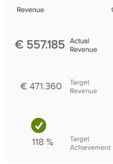
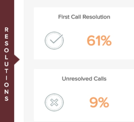
- Operational dashboards
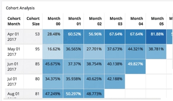
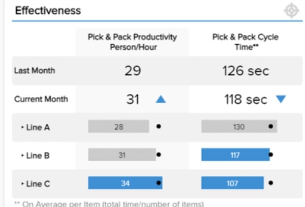
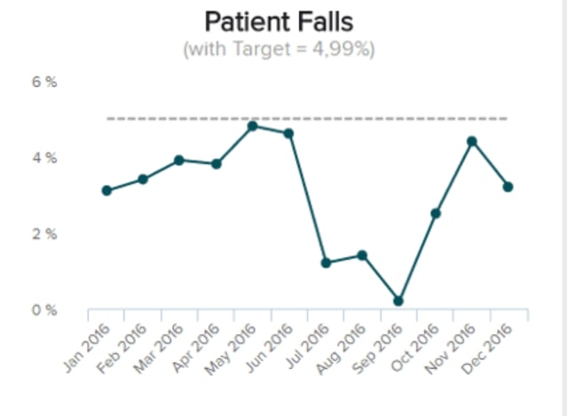
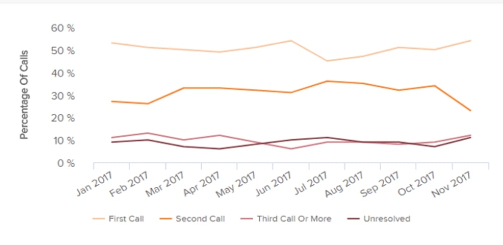
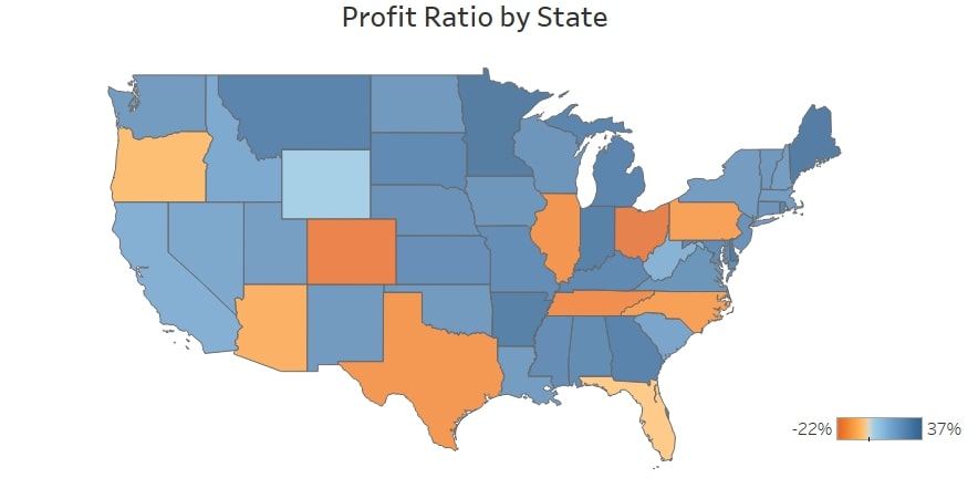
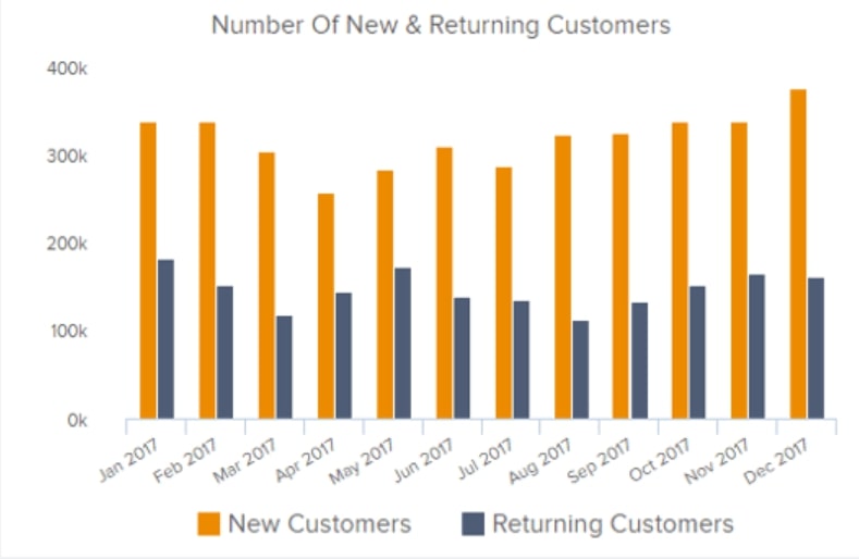
Employees from different departments within an organization use operational dashboards to track a present state of a project, manage their current activities, etc. Such tasks require detailed visualizations that update in near real-time. E.g., a help desk dashboard can contain the number of tickets for the day, the number of resolved issues, and the percentage of requests by type and channel.
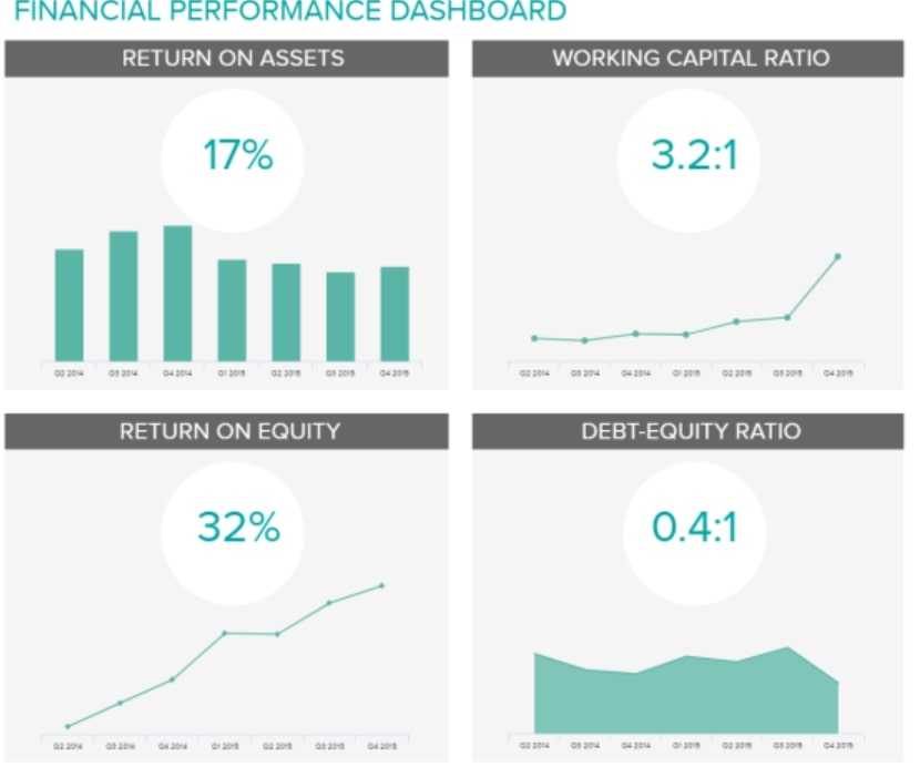
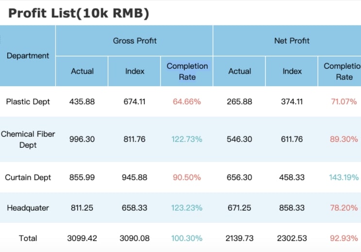
- Analytical dashboards
Analytical dashboards supply a business with a comprehensive overview of crucial data. Without them, the amount of time an analyst wastes on collecting the information grows exponentially. Dmitriy Borovik, a BI analyst at *instinctools, proves the point:
We were approached by a media-services provider about optimizing the speed and flexibility of their report generation. Before deploying self-service BI, an average day in the life of their data analyst was filled with addressing advertisers’ requests for information such as “What types of content are popular and where? How many users came from which countries? When was the viewing peak during a certain period?”
To give proper answers, the analyst needed to assign a task to the programmer to write a new SQL query into the database. It took forever because every additional query might overload the server. When the data finally arrived, the programmer sent it back to the analyst. And this was still not the end of the highway to hell. After receiving the data, the analyst converted it into Excel and added explanations to the numbers. Altogether, these types of tasks used to take a couple of weeks!
With the custom analytical dashboard that the *instinctools’ team created for our client, these processes were automated, and time spent on the report preparation was reduced to a few minutes.
Analytical dashboards provide a comparison of periods and categories, so they are more complicated than operational ones. When department leaders make decisions, they might need more elaborate solutions created with multidimensional data visualization techniques.
Expanding the number of dimensions and transforming the perspective from 2D to 3D allows users to see that reality is more complex than it initially seems, so there’s a small chance of making inaccurate decisions or missing key insights.
- Strategic dashboards
Representatives of senior-level management may be honestly interested in each department’s operational details. Yet, if they run a large enterprise, they are unlikely to have time to delve into them. That’s why C-suites need dashboards that contain only the most important statistics.
Essentially, the higher the decision-making level is, the less cluttered the data visualization should be. Here is an example of an executive dashboard for a bank with the key metrics such as revenue and expenses by branch, and top-5 branches by profit. The CEO can understand the state of an organization in a bat of an eye and decide which branches are worth investing in for the next quarter.
Data visualization techniques
To show you how the basic techniques for data visualization relate to the types of dashboards, we’ve made a table with clickable cells, where each technique is described.
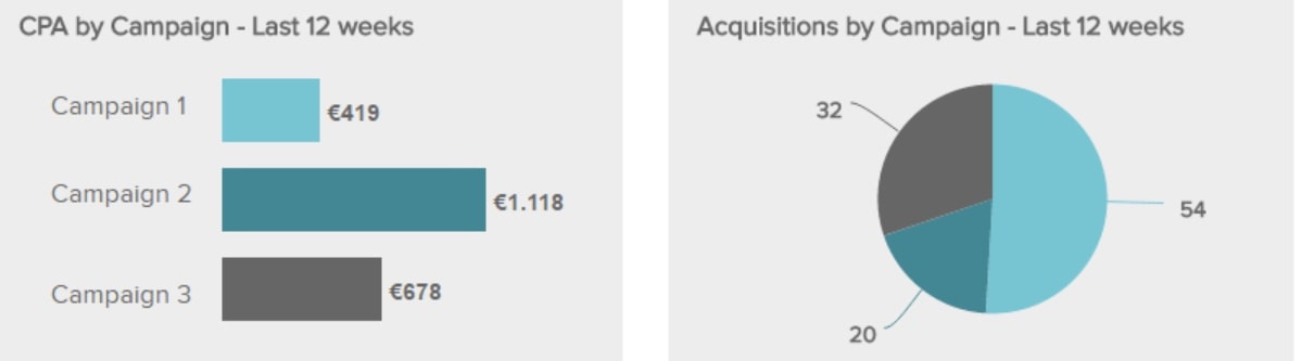
Data visualization is only helpful only when it’s thought-provoking and not just filled with data for data’s sake. Take a look at those two data visualization examples of pie charts.
They are both analytical and illustrate the audience by country. However, the first chart contains the most valuable data, while the second visualization tangles the users up with too many variables. The central concept of data visualization is to illustrate only essential information. There is no need to pack your reports with all the data you have. If visualization is inconvenient, it’s incomprehensible and useless. Make sure not to make these common mistakes in data visualization.
Top-3 data visualization tools. *instinctools version
Three BI platforms have been leading in the last four years (2018, 2019, 2020, 2021), according to the Gartner Magic Quadrant for Analytics and BI platforms — Power BI, Tableau, and Qlik.
- Power BI
Power BI evolved from Excel, which is its fundamental advantage over other data visualization tools. It’s far easier for employees to implement data visualization concepts in their everyday tasks because the Power BI is similar to Excel and integrates with other Microsoft applications. Also, Power BI has a data preparation tool — Power Query, but it is available only inside the Power BI ecosystem. Take into consideration that the maximum amount of data for a premium account is 100 TB, and the maximum number of data points is 3,500 and you’ll see just how powerful it is.
Power BI is a good choice for organizations that are about to start their data-driven journey and need a reliable tool to do the job.
- Tableau
Tableau is a powerful and rapidly growing visualization software in its philosophy and architecture. Tableau also has a data preparation tool — Tableau Prep. With it, even non-technical users can select, prepare and visualize data. The information can be uploaded wherever you need it, to Excel or a separate database.
The tool is unlimited by the number of data points and volume of data but keep in mind that it’s not as intuitive as Power BI. Tableau is a top solution for organizations that regularly work with big data sets and need multidimensional data visualization techniques and tools.
- Qlik
You can combine different Qlik products to deepen the data discovery process. It also integrates with a broad range of data sources such as Amazon Vectorwise, Redshift, Hadoop, etc.
Qlik Sense can be deployed in the cloud or on-premise. The interface is intuitive; you can drag-and-drop items to manipulate dashboards and apply visualizations instead of writing a code.
The Qlik platform offers a data preparation tool — Qlik Replicate. It provides automated, real-time data integration across data lakes and DWH, databases, streaming, and mainframe systems.
There are no rigid limitations about how much data Qlik can handle, except two billion distinct values in each field. The number of fields and data tables is limited only by RAM.
Tips to get started
- Determine what kind of information you want to communicate to choose an appropriate technique for presenting your data. Take into account the stakeholders’ needs as well.
- Understand the data you are going to visualize, including its size and cardinality, and consider (honestly) the data preparation effort that will be required. In the technology stack, data visualization goes after a data warehouse or data lake. So, fast and insightful data visualization is only possible when paired with a solid data infrastructure that supports it.
- Define the goal you are trying to achieve with your data visualization. For example, a complex analysis requires data to be compiled into controlled, dynamic dashboards, while if you just want to highlight a single data insight every now and then, one graph or chart might be enough. But don’t go to extremes and don’t get in the trap of presenting any information as visualization. Sometimes building a chart or diagram for each tiny table in a report is a waste of time and a simple sheet in Excel is enough.
- Figure out how your audience processes visual information and adjust data presentation to their needs. Despite all the principles and theories about effective data visualization, the reality is that the most effective visuals are the ones the audience connects with.
A well-thought-out choice of data visualization techniques and tools support building data-driven decision-making
Choosing the proper data visualization techniques from a wide array of options as well as deciding on a suitable tool for their implementation might turn out to be more tricky than it initially seems. You should consider the decision-making level of employees that will use data visualization models, quality and quantity of data, types of visuals that are the simplest for the company’s audience.
Our designers and data consultants will make an effective contribution to your data visualization project so that you get a high-resolution view of your actual business state.
FAQ:
Data purity is a primary condition for effective data visualization. You can’t appropriately select techniques for data visualization and get actionable insights if data is messy and unstructured. And the proper choice of techniques and tools depends on the type of dashboard according to the decision-making level of a person who will use it — a C-suite, department leader, or an ordinary employee.
You can use data visualization basic techniques and tools in any department of your organization and on any level of decision-making. Businesses of any size, from start-up to enterprise, need BI solutions. After all, data is the future. The only question that remains is how to choose the appropriate type of dashboard and models of data visualization.


