A chart should clarify, not confuse. Yet data visualization errors slip into dashboards and reports more often than most teams realize, quietly steering decisions off course. You’ve seen examples of bad data visualization firsthand: truncated axes that dramatize trivial changes, pie charts with too many slices, or color choices obscuring the very patterns they should reveal.
Most of these blunders are preventable, and our data experts are here to share practice-proven tips on how to avoid common pitfalls of data visualization.
Key highlights
- Real-world data visualization mistakes examples range from the wrong chart type to overloaded graphs to deceptive color schemes and other subtler flaws that are easier to miss but just as damaging.
- GenAI can produce charts fast, but without a human in the loop it only adds to data visualization errors.
- Misleading visualizations quietly erode stakeholder trust and undermine informed decision-making across the organization.
What is bad data visualization?
In short, poor data visualization is any graphic that violates core visualization principles, turning data into noise instead of insight.
- Unclear. Overcrowded visual elements without clear labels make the chart hard to read at a glance.
- Inaccurate or deceptive. Manipulated scales or omitted context mislead viewers and produce invalid conclusions.
- Inconsistent. Shifting baselines or clashing color schemes undermine comparison across data points.
- Overloaded. Trying to cram too much information into a single visualization, overwhelming viewers instead of guiding them to key insights.
What price does your business pay for bad data visualizations?
The thing with bad graphical representation of data is that you can’t say it’s bad until you fail to get anywhere using it. Such a situation is risky: with all these pie charts scattered all over your reports and tons of descriptive text, you may have an illusion that you’ve successfully handled the ever-growing amount of data, whereas, in reality, this data fails to tell the story. Whether you rely on Power BI dashboards or simple spreadsheet charts, the consequences of bad data visualization impact your business routine and decision-making processes in several ways.
Can’t tell a clear story with your data
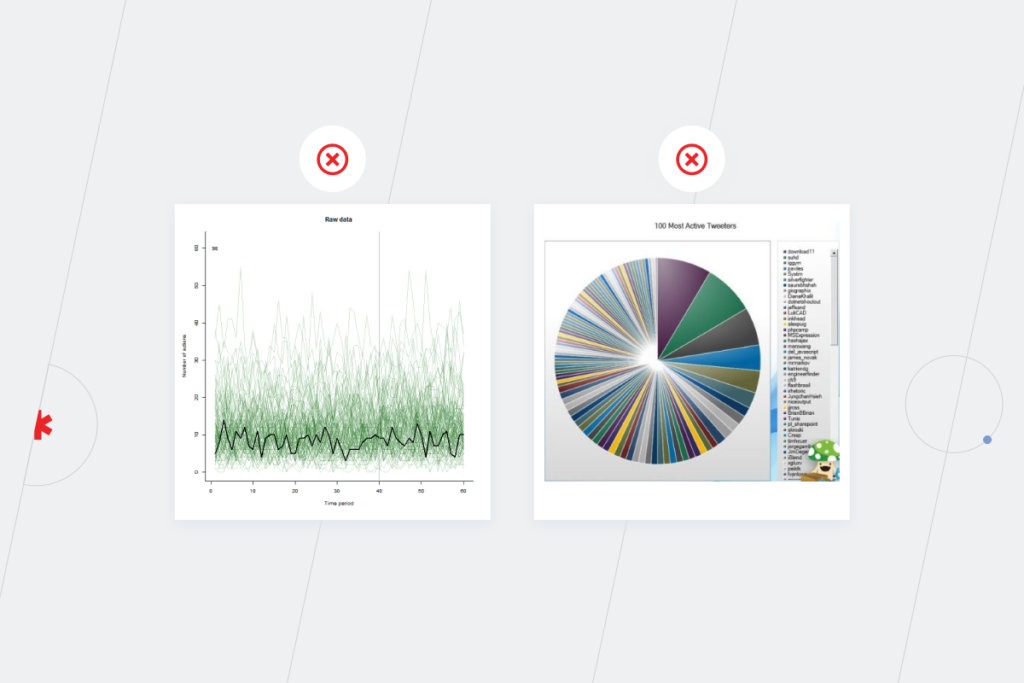
Imagine you’re in a sales meeting, expecting a clear visualization showing revenue across your company’s top five markets so you can decide where to invest. But you get a line chart with all the markets where your company is present instead. It’s virtually impossible to compare data at a glance and quickly get high-level insights when you see 20+ lines. A single chart trying to show everything at once buries the key message instead of revealing it.
You may say that at least some kind of visualization is better than no visualization at all. Not really. Unclear visualization doesn’t carry out its functions, so you still have to dive into the spreadsheets to connect important data points and make sense of your raw data.
Get invalid insights that lead to wrong decisions
Say you’ve tested several new markets and one region’s profits jumped significantly. Does that make it the best pick? Not necessarily. What about advertising costs there — were they the highest too? Did they pay off? Without factoring in ROI, you’re flying blind. How many customers came through ads versus other channels? If your chart shows revenue but ignores advertising costs, the picture is lopsided. You might pour a huge budget into a region that only looks profitable on the surface, while a cheaper market with better returns gets overlooked.
Still, there’re times when a couple of graphs aren’t enough to get a good grasp of a situation. To make a well-informed decision, you might need as much as a custom dashboard to seamlessly track multiple data metrics in one place and understand trendsover time.
— Andrei Haurylau, UI/UX Designer, Instinctools
Fail to uncover hidden correlations between different data sets
Weaknesses to improve, anomalies to correct, unobvious interrelationships won’t be revealed with bad visualizations. For organizations, this means the loss of potential revenue and the inability to change the perspective to see new possibilities for development and growth. With misleading data, you won’t be able to define the room for improvement and notice probable pitfalls. For example, you might overlook ineffective marketing campaigns and keep spending your budget on them. Experienced data analysts know that surfacing these hidden patterns in complex data is one of the core reasons visualization exists in the first place.
Check our list of common misleading data visualization examples that our data visualization specialists have prepared if your relationship with translating data into images is kind of “continually-trying-to-figure-things-out.”
8 examples of common mistakes in data visualization, fixed
It’s unlikely that you’ll make flawless decisions 100% of the time unless you are The Sorting Hat from “Harry Potter”. But it’s possible to minimize the risk of your data being misleading. Below are the worst data visualizations patterns we see again and again, along with practical fixes.
1. Choosing the wrong visualization method
There are two tricky moments here. We’ll show them using pie charts as an example:
- Viewers can’t see the difference between slice sizes and, thus, compare them. When the numbers don’t vary much, it’s better to visualize them in a bar chart.
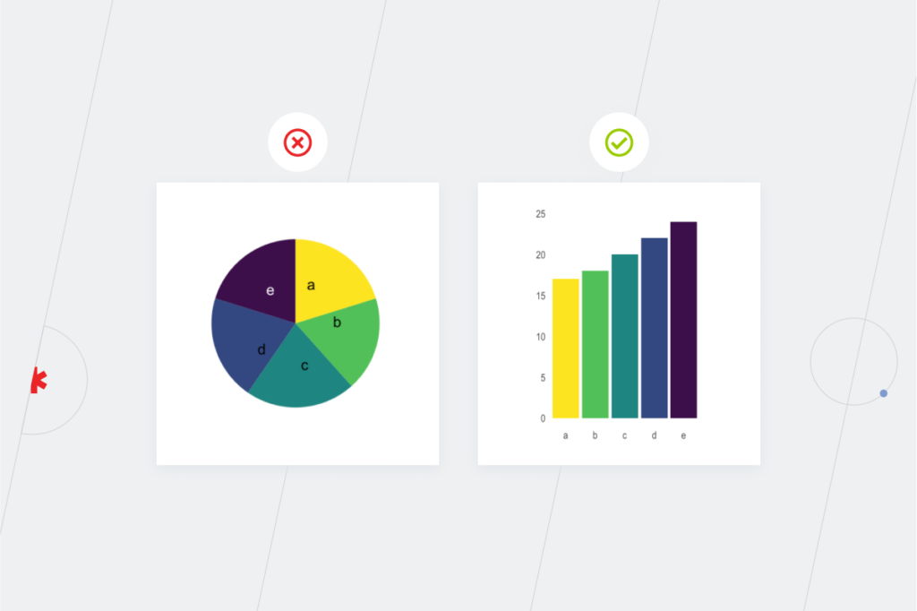
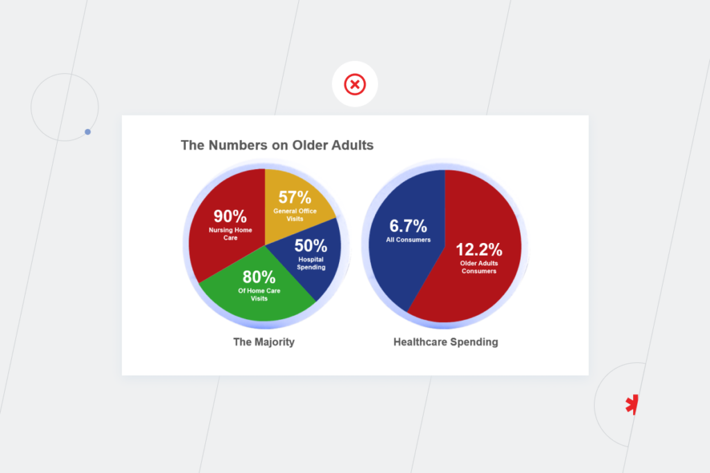
- Viewers can’t get the real dependencies between the objects of correlation. Pie charts are usually used for the comparison of the different parts of a whole. They are suitable for survey results or budget breakdowns (the same pie). But if you use them to compare separate datasets (different pies), you get a bad chart, and data becomes misleading.
For instance, a pie chart isn’t a bright idea for comparing the number of inhabitants in different areas. It’s better to use a bar plot because human perception primarily judges distances and not areas.
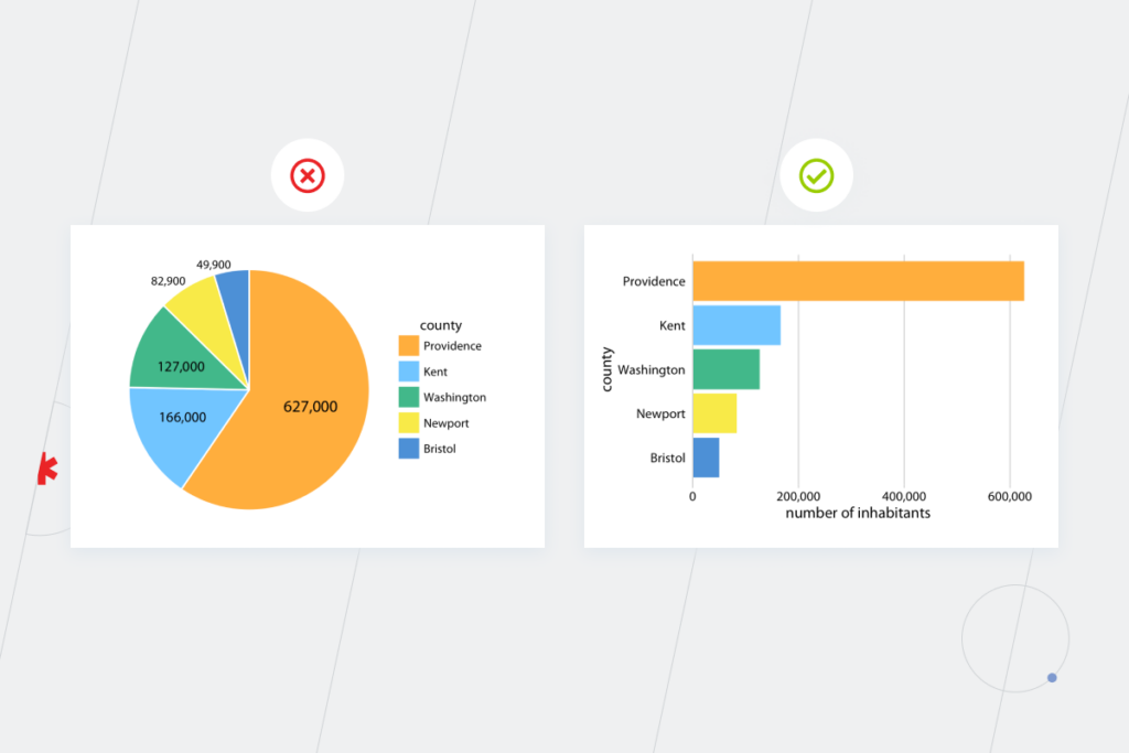
The rule of thumb is to choose a visualization technique according to the data’s nature: quantitative data requires charts or histograms, while qualitative information is better presented in pie charts or bar graphs. And make sure the sectors add up to 100% because otherwise viewers will get a math stroke from your visualization.
— Andrei Haurylau, Lead UI/UX Designer, Instinctools
2. Overloading viewers with data
The human brain processes images 6x-600x faster than words. Given the fact that during the next three years, the amount of human-made information is going to triple, the role of a good visualization is only becoming more important. Presenting data in graphics and charts allows us to process huge amounts of information, understand it better, and get insights faster.
But the processing capacity of our conscious mind is still only 10 bits per second. “And what does it have to do with bad graphs?” you may ask. Such a limit for data traffic means that we can’t properly concentrate on the highly-detailed visualizations for a long time. In the case of charts, if there are too many variables, choose 5-6 more essential ones. Graph views with more than 15 items distract attention and may be as frightening as an Excel table with dozens of rows.
3. Selecting unconventional colors
This mistake comes in three forms.
- Absolute vs. relative coloring
The function of color is to add extra meaning or dimension. Going for absolute colors, you may miss meaningful nuances.
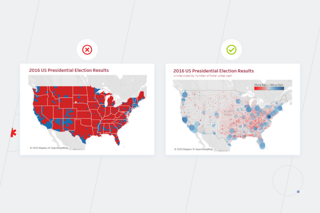
In US presidential elections, maps use red for states won by Republicans and blue for states won by Democrats. Such an approach results in maps like the one on the left. It gives an impression of an unquestionable victory of the Republicans, ignoring the fact that in one state people voted for representatives of both parties.
Relative coloring allows the viewers to see a more detailed picture. Looking at the map on the right you can see the proportion of the counties that voted for the Republicans or Democrats against the total number of votes in each county. That way, the situation no longer seems so straightforward.
- Unusual colors
Green commonly means something positive, while red is used for negative cases. So if you use them in the reverse way, it may become an example of misleading data visualization.
Check out these two flood hazard maps. The one on the left uses a green palette to show risk zones along a river. At a glance, the area looks harmless since green reads as “safe.” The map on the right shows the same data in shades of blue. The danger zones register immediately, and the darker the shade, the higher the risk.
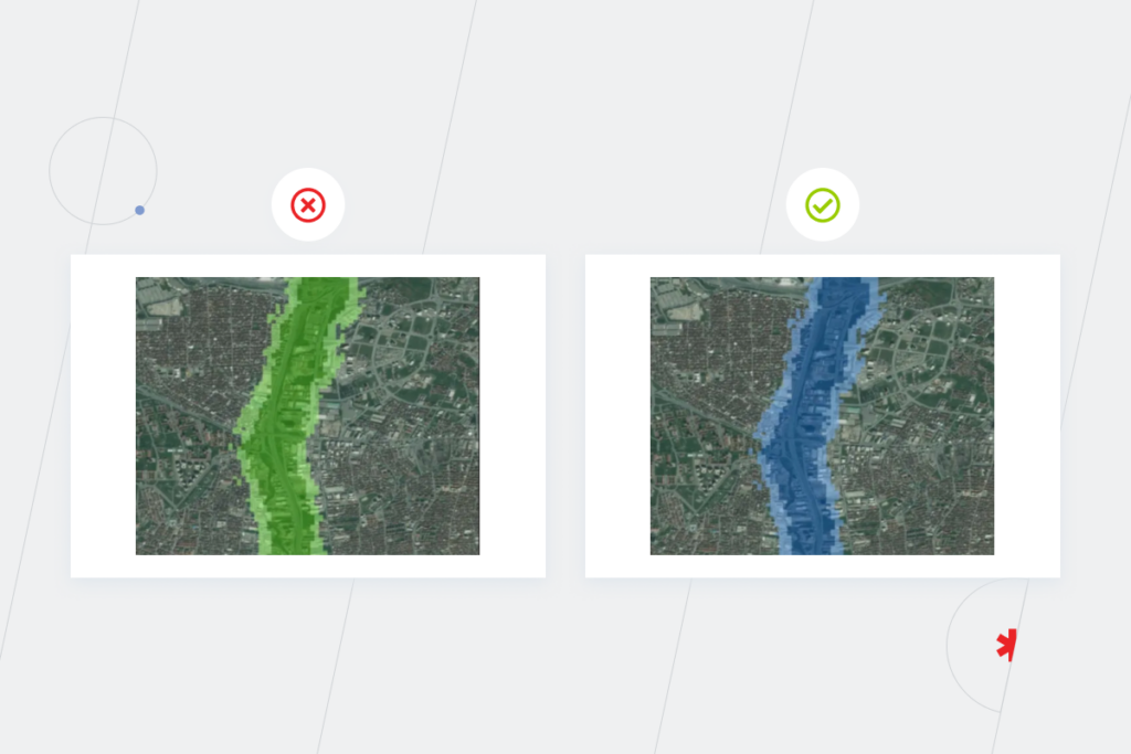
Map charts usually leverage different shades of one color family: the lighter the shade, the smaller the number, and vice-versa. A solution with different colors instead may confuse the viewers. And take into consideration the chance that viewers may be colorblind, so don’t use misleading colors.
— Andrei Haurylau, Lead UI/UX Designer, Instinctools
- Invisible color on a white/black background. Don’t choose yellow for crucial metrics in a line graph, as it’s easy to miss them on a white screen. The same is true for the picture on the right, where you can’t properly see the borders of the black area on the gray background.
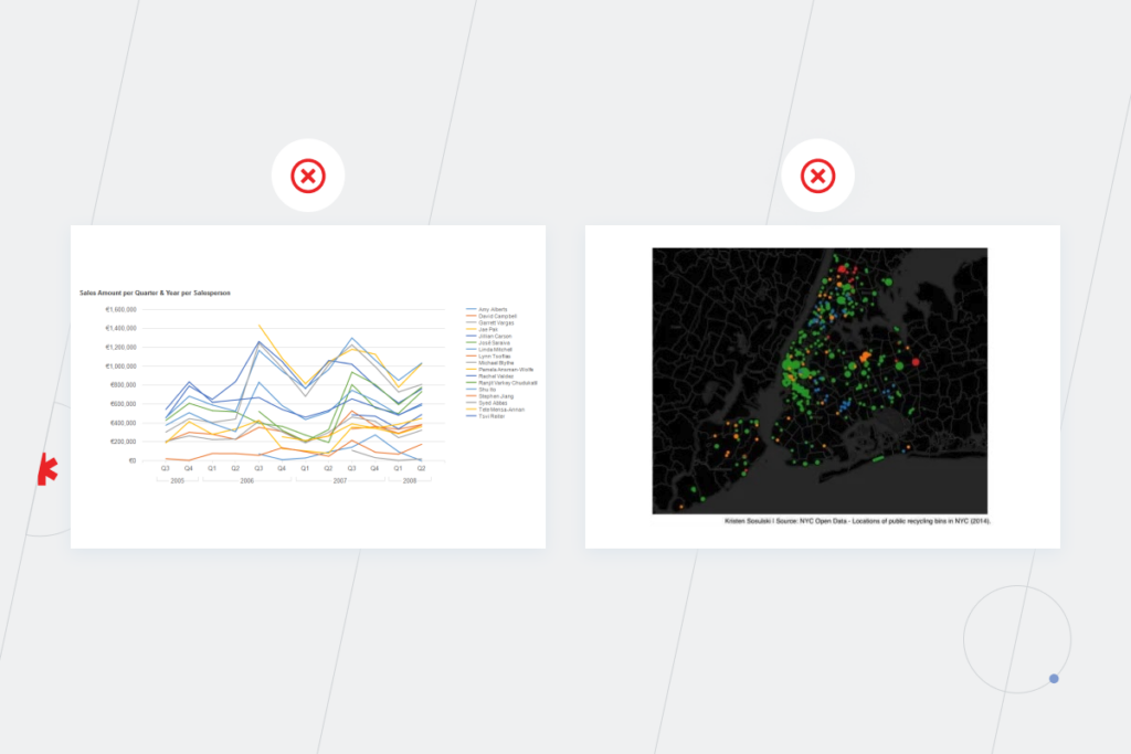
4. Using uncertain scales
It’s challenging to compare figures with different scales straight away. Inconsistent scale can mislead and confuse viewers. For instance, the visualization on the left is an example of a bad graph because with it, you aren’t able to assess the scope, it’s not immediately obvious that one figure is four times bigger than another. You should look at the Y-axis and count, whereas good visualization should exempt you from unnecessary calculations.
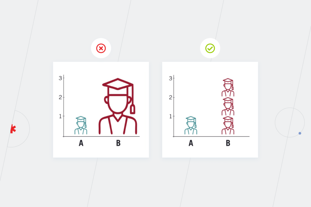
5. Omitting data
Excluding some information, you miss the context. Such an attitude can affect data interpretation. Look at these two graphs: in one case, information is tracked every second year, in another, each year. The left scatter plot is a perfect example of a bad graph because it gives the impression of stable growth, while in reality there’re dips and spikes.
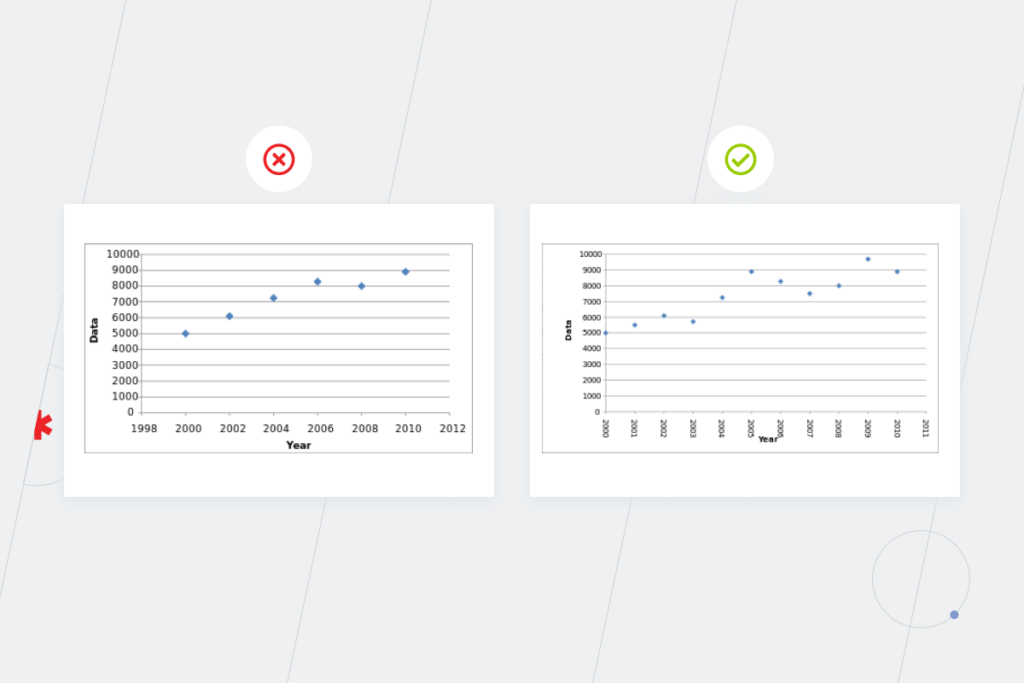
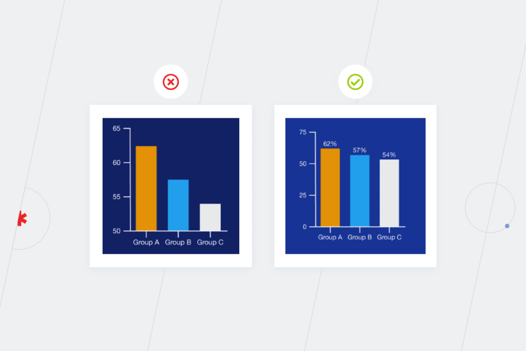
6. Truncating Y-axis
This type of misleading data visualization occurs when the Y-axis doesn’t start from 0. The result of the scale compression is an increasing difference between bars. That way, small variations may look paramount.
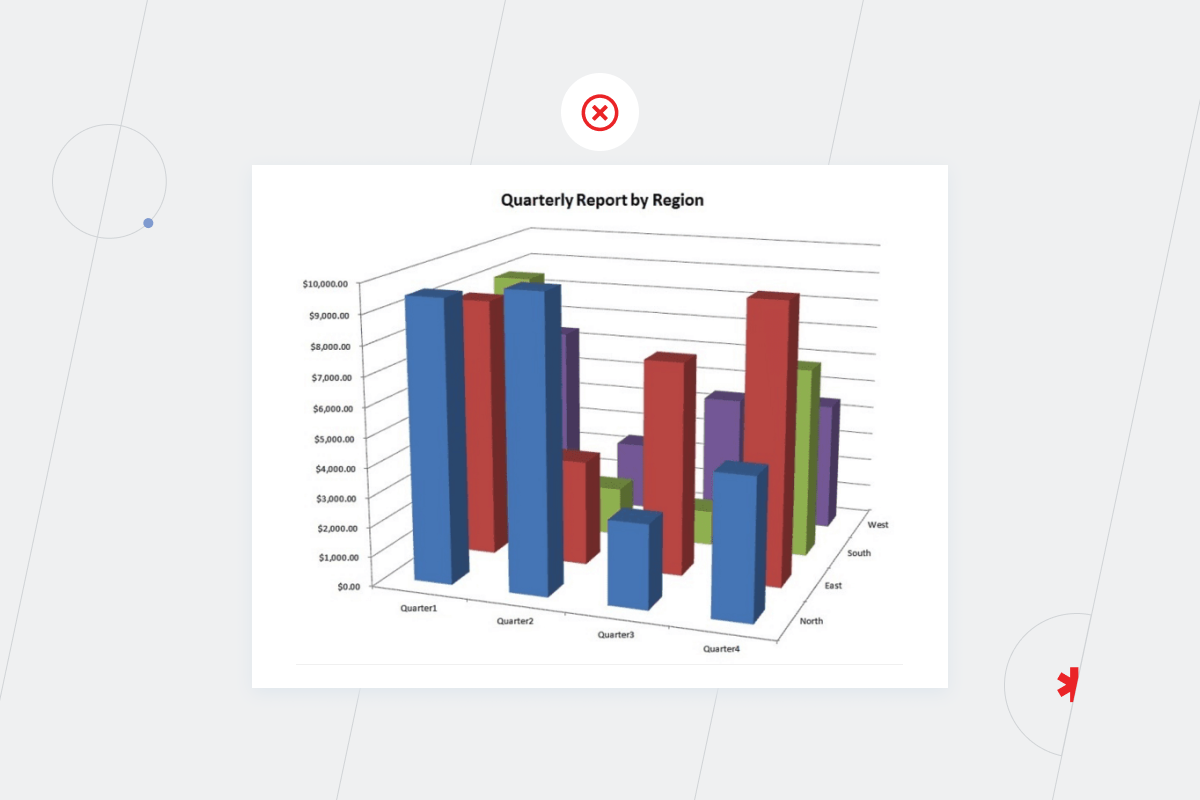
7. Operating 3D graphics in an improper way
3D data visualizations are entertaining and fascinating but the creating them might not be worth the effort. It’s nearly impossible to follow the height of each bar to the correct Y-value on a multidimensional bar chart below. Moreover, you can’t see the values of the bars hidden behind more prominent columns. If these indicators aren’t necessary, exclude them from the data visualization. If they are crucial, use a simple bar chart instead of a 3D one.
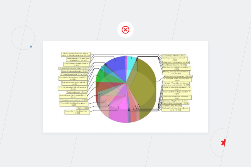
3D donut charts and pie charts are also more like “hmm” than “hooray” solutions for data visualization. Here is an example of a useless pie chart in 3D. Tilting the pie distorts the image of transparent slices. You can’t define the borders of slices and see how each slice relates to the others and the whole. Additionally, you can’t read labels and figure out which one goes with which slice.
Honestly, if Bear Grylls hosted “Running Wild” in the business analytics world, transcribing this pie chart would be in one of the episodes. But you can benefit from the assistance of seasoned BI experts to beat misleading data visualization and create charts that matter.
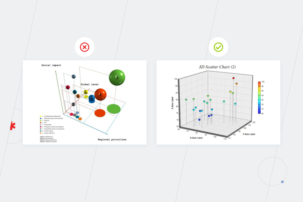
Three-dimensional graphics are rare in visualization since not everyone can easily think in volumes. Such graphs appear mainly in finance, where bubble charts show correlations between funds, stocks, or a stock and the broader market. Financial data often involves more than two data series, calling for a third axis to display additional information.
Since the task is more complex, be especially aware of common data visualization mistakes. Otherwise, you risk ending up with an unreadable bubble chart where it’s difficult to understand if a sphere is larger according to the S-axis or if it seems more prominent because it is closer to the viewers on the Z-axis.
8. Generating visualizations with AI and no human oversight
GenAI’s ability to produce charts in seconds comes with a caveat – low reproducibility, as taming LLM’s probabilistic nature remains one of the top AI adoption challenges. Even identical prompts can yield different colors, label placements, odd cropping, etc., making it tough to standardize visuals across reports and dashboards.
A human-in-the-loop approach is essential to engineer the right context for the model, craft precise prompts to keep outputs consistent, and review every final chart before it reaches stakeholders.
— Pavel Klapatsiuk, AI Lead Engineer, Instinctools
Data visualization best practices checklist
Before publishing any chart or dashboard, run through these questions. They map directly to the mistakes we’ve described and will help you catch problems before your audience does.
- Does the visualization use the right chart type for the data’s nature (for example, bar chart for comparisons, line chart to understand trends)?
- Is the chart focused on one key message, or is it trying to show too many things at once?
- Are the axes consistent, clearly labeled, and starting from an appropriate baseline?
- Do the colors follow conventional meaning (for example, red for negative, green for positive) with enough color contrast for accessibility?
- Have you included all relevant time periods and data points without omitting context?
- Is the visualization free of unnecessary 3D effects that could distort perception?
- Can a viewer grasp the main takeaway within a few seconds, without diving back into raw data?
- Does every element on the chart serve a purpose, or can you remove anything without losing meaning?
- If the chart was generated by AI, has someone reviewed it for reproducibility and visual consistency with your other dashboards?
Fix your charts before they break your decision making
Being aware of widespread mistakes can’t level up your business decision-making power all by itself. But just as good visualization accelerates your organization’s growth, poor charts can quietly derail it. Bad graphs aren’t the kind of failure you learn from; they simply lead to wrong decisions you never see coming. If your calls keep missing the mark, check whether you’re using the right techniques for presenting your data.
With the right data visualized the right way, you can digest large volumes of data fast, track changes in real time, and gain a fresh perspective on growing your business.
Have difficulties with getting actionable insights from your data?
Drop us a lineFAQ
Bad data visualization is usually a consequence of avoidable design choices, such as wrong chart types, cluttered layouts, misleading axes, weak labeling, and colors that hide or distort the pattern the chart is supposed to reveal. Among less obvious issues teams tend to overlook is poor data quality due to the lack of attention to data preparation. In other words, what shows up on the dashboard might only be the visible edge of a deeper data problem.
Whether data gives incorrect insights or is just hard to understand, it results in poor business decisions that affect your company’s revenue. Visualizations are bad if they don’t tell a clear story and don’t give the opportunity to uncover unobvious patterns between data sets.
Choosing the wrong chart type is one of the most common mistakes to avoid in data visualization. Pie charts used for comparisons across separate datasets, line charts packed with 20+ variables, 3D effects that obscure values are the bad chart examples teams run into most often.
Not necessarily. Most examples of misleading data visualization stem from inexperience rather than intent. Someone picks a green palette for negative-coded data or skips a few years on the X-axis without realizing the impression it creates. This results in flawed decisions and eroded trust.
When the Y-axis doesn’t start at zero, small differences between bars look enormous. A 2% variance can appear as a dramatic gap, leading viewers to misread the scale of change. It’s a classic entry in any list of misleading graph examples. If truncation is genuinely needed for detail, call it out with a clear axis break so viewers aren’t deceived.
Start with the basics: check the axis scales, look for omitted time periods, and see if colors follow conventional meanings. If the chart feels dramatic or too clean, dig into the underlying numbers. The common mistakes to avoid in data visualization, like overloaded visuals, inconsistent scales, and missing context, are also the quickest red flags to scan for.