In this article we’ll elaborate on how we use React and the ecosystem around it to enable lean software development. Several options for frontend development are presented. When there is need for a web app framework, businesses usually choose between Angular, Ember and React.
The decision to choose any of these frameworks is usually driven by a simple question: how easy would it be to hire a dedicated team and later gather the maintenance and support team. By easy staffing, we mean the availability and cost of developers.
Cost and availability are the reasons why non-mainstream frameworks are not even considered for a job.
Aurelia, Vue, Polymer and many other frameworks provide great technical ideas and they are good for special cases. However, these frameworks may lead to excessive costs if selected as a base for business. This is because there is shortage of readily available and qualified developers to do the job using these frameworks.
The use of one of the mainstream frameworks will enable businesses to control costs and manage projects predictably.
Why React?
There is no silver bullet or framework to solve all issues. Apart from technology, many other things should be agreed upon and communicated during a project.
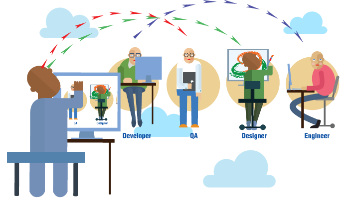
From the prototype to design and implementation, product development requires the use of specialized tools at each production stage. These tools are usually not integrated. There is a person in between, who transforms the output from one tool to an artifact that is useful during later stages. An example is a UX researcher that gives the designs to a frontend engineer, who then manually transforms them into code. This process generates waste and slows down iterations, which is not lean.
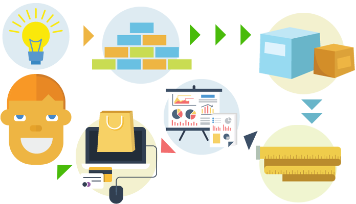
Let’s assume that a proof of a concept confirmed our ability to implement some technology. A standard loop for creation of wireframe, prototyping, UX, design, and development should be iterated until there is confidence that MVP is ready for production.
This is the greatest discriminator of the project path that we are about to travel. Depending on team capabilities and the certainty in the path to be executed, we should make our choice from any point between two polar options:
Employ a multi-talented team, where the product owner, UX researchers and designers would draw sketches, wireframes and interactive prototypes which are then handed over to the development team for implementation in a selected technological stack;
Allow the product owner to iterate with the development team directly, while feedback on an artifact from one iteration is a direct input for the next one.
Option A is recommended when the product owner is certain on what is needed as the end result. This is usually the case for a business that is making an investment and the resulting product is expected to be an integral part of an existing system.
Option B would be more desirable for innovative products, startups, and research projects. This is because it allows for very rapid change in development direction while preserving speed. This is possible thanks to the application of lean software development principles and practices which could be enabled by a unified toolset built around a common framework.
React and the ecosystem around it are always in flux, but they are mature enough to cover a full cycle from the prototype to MVP and to production deployment both for web and mobile applications and soon for virtual reality apps.
There is no need to produce wasteful deliverables outside of the React ecosystem. Proof of concept, wireframes, interactive prototypes and MVP could be built from one another on each consecutive iteration. By reusing code between production stages, waste is eliminated and learning amplified.
Each team member could see the whole since the common stack is used throughout the project. It is all React and JavaScript. This helps them to build in integrity since they could refactor parts of a system as new feedback is collected.
Lean Toolset
Convention
The first thing to do on a new project is leveling the ground. Project time shouldn’t be spent on selecting tools, integrating them to work smoothly together and teaching team members to embrace them.
This is why tools should be ready, team members should have the skills and use these skills properly, and convention should be established by a lead. A convention over configuration approach increases certainty. This allows developers to think more about the product instead of arguing about non-significant details. These details should be resolved in advance. For this reason, tools are collected and integrated in a toolset.
Lean Toolset: create-react-app
create-react-app is a React project generator and toolset which allows bootstrapping a React project without configuring the build tools in advance. The convention over configuration approach used by the create-react-app saves time in most cases, while for advanced cases, it is not limiting.
When advanced setup is needed, we eject configuration using built-in react-scripts and extend it accordingly. However, the rule of thumb is to work with the idiomatic create-react-app since it simplifies the overall system and imposes best practices.
Lean Toolset: redux and common packages
create-react-app is good for bootstrapping, but not suitable for application development.
We always add redux for state management and react-router for routing to our applications. Other than simplifying state management and routing, those commonly known packages bring design patterns which would simplify application testing, allow code reuse and portability between different use cases and platforms.
Lean Toolset: Material-UI
React itself is a major enabler. Applications built on React and redux are composed of components with clear state and lifecycle management. They have capabilities which allow us to change composition, behavior and business rules on the fly, without breaking other parts.
All of these technical capabilities should be accompanied by a solid UI kit, so the system has the look and feel of an integral whole by the customer. We selected Material-UI from a set of readily available UI kits to unify complex interfaces since it integrates with the create-react-app easily and can be customized.
Material-UI is a readily available UI kit that follows Google’s Material design guidelines. It allows for the quick creation of interactive prototypes. The look and feel are customizable, which is only needed in the later stages. For prototypes, we recommend focusing on user flows.
Lean Toolset: Storybook
Storybook is a tool for creating a living style guide comprising of React components. This means that at any point in time, you can change your components and immediately see how they look, feel and behave in different states. This shortens the feedback loop after each change and makes everyone confident that no look and feel regression was made.
In addition to the usual benefits that a living style guide brings, Storybook enforces some useful design patterns, such as differentiation of container and presentational components.
The storybook is composed of presentational components that are shown in different states. Container components, which map presentational components to the rest of the application, are not needed and are not welcomed by a storybook. Therefore, we are forced to separate containers from presentational components.
The separation of concerns principle allows us to decide as late as possible and make architectural decisions on component interconnections, only when uncertainty is eliminated.
With Storybook, we could deliver the interactive look and feel as fast as possible.
Lean Toolset: Jest
While Storybook allows building confidence in the look and feel visually, automated testing empowers every team member to make bold changes with the assurance that no regression is introduced.
There is a long list of benefits of automated testing. The key advantage here is the ability to build a robust continuous integration and delivery pipeline which allows fast and iterative delivery.
We selected Jest as a base tool because of its tight integration with React. The developer experience of testing JavaScript code with Jest is excellent. It enables rapid development by running only specific tests just in time when changes are made to units under test.
Pragmatic Development
There is considerable uncertainty in software development. That uncertainty should not block product development. The tools presented empower our team to deliver the known parts fast and to highlight the unknowns. This allows stakeholders to see and act on them early.
Usability consultant and information architect Steve Krug has been in the usability art since 1989. He has years of experience as a user advocate for major companies as Apple, AOL, and Netscape. On the question of what’s the most important thing to do to make sure a site or app is user-friendly, he answered that it’s not “Nothing important should ever be more than two clicks away” but rather “Don’t make me think” – his first law of usability. This advice is also the name of Steve’s most famous book dedicated to user interfaces.
Steve Krug’s special gift is in his constantly fresh look and the ability to put into practice the experience he acquires from studying human behavior on the Internet. At the beginning of his professional career, Steve would look at the designer’s computer screen over their head while they are working, thus preventing them from being excessively fond of visual ideas that could throw ordinary users into confusion.
Krug’s technique was not to conduct experiments on focus groups, but to study the behavior of ordinary people when using websites.
In this article, I’ll talk about the main empirical observations that Steve formulated in his book, complementing them with my own experiences and opinions of designers who I know. I’ll begin by describing the general principles and problems and then move on to an analysis of particular mistakes, then I’ll give useful tips.
How the user defines simplicity
When assessing something, we use our experience and various coordinate systems. If you ask someone to assess a car, he will pay attention to the speed and driving. When selecting a house, we are likely to be most interested in the land size and location.
While appraising the simplicity of a website, the user will first indicate the time spent on getting what he wants from that site. If it takes a user more than five minutes to order a pizza on your website, then your interface has some problems.
First of all, don’t make the user do what you could do for him. Features such as geolocation, autocomplete forms and authorization via social networks instead of registration form simplify any interface significantly.
The designer is the one that thinks, while the user uses. Another factor that plays a role when assessing a website is the simplicity of thought processes. If you want to obtain the user’s phone number, then don’t make him ponder on which format to enter the number.
Anything we’re used to seems simple. Avoid being too different from competitors. If you’re a sushi seller, just make very delicious sushi – the customer has ordered for them a hundred times in the past and his brain has already developed a particular scenario. Any deviation from the usual scenario has to be reasoned: if your interface throws out the user, he will order the sushi only if they are much cheaper. Otherwise, he’ll return to that site where he has ordered for sushi many times before.
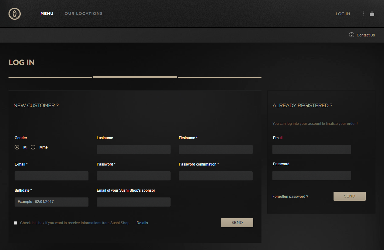
Below is an example of a site, delivering sushi in London. Why do they need the user’s date of birth? Why do I have to register to eat? Why can’t I log in via social networks?
An example of a site, delivering sushi in London.
In studying a site, the user has to think as follows: &quout;This key is for this, if I click this one I will be able to read about that, I can click here to make a call”. You shouldn’t generate questions in his head. A site is difficult, if by looking at it, the user thinks: &quout;What is this thing for? What happens if I click here? Where is this written about?”. All questions must be answered preventively.
From general to specific
I’ve identified and summarized the most important (in my opinion) principles of creating interfaces from the “Don’t Make Me Think” book. I’ve also tried by myself to deduce some specific rules from the philosophy of this book.
Ports of entry
Brion Gysin: – How do you… How do you get into these paintings? William Burroughs: – Usually, I get in by a port of entry, as I call it. It is often a face through whose eyes the picture opens into a landscape and I go literally right through that eye into that landscape. Sometimes it is rather like an archway. … Any number of little details or a special spot of color makes the port of entry and then the entire picture will suddenly become a three-dimensional frieze in a plaster or jade or some other precious material. The Beat Hotel by Barry Miles
You started to read this article from the heading, which is its point of entry. In studying an interface, the user looks for something from where to start. It is the designer’s task to make the entry point clear. Without the heading, you would not understand what the article is all about before starting to read.
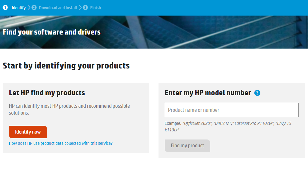
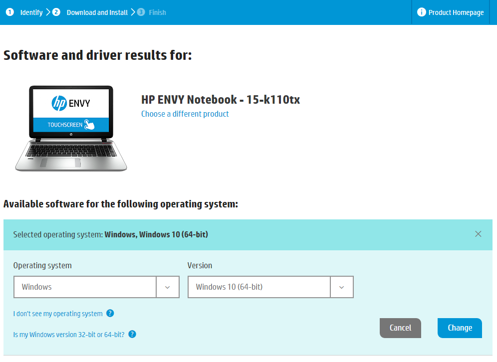
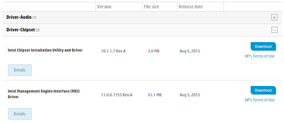
Targeted action is a process consisting of several steps. If you don’t show the user where to start, he most likely will not ever start. Imagine a website of a manufacturer of computer components. For a user who wants to download a motherboard driver, the point of entry must be an element directing the user to the first step of the following process:
1. Selecting or searching for a device;
2. Selecting an operating system version;
3. “Download” button.
You shouldn’t create a page that performs several targeted actions, else it would have to host multiple entry points, which could confuse the user.
Lao Tzu once said that a journey of a thousand miles begins with a single step. But this step – no matter how important it may be – is not the entire journey. When asked about how many moves ahead he is planning, Garry Kasparov answered: “In chess, it is far more important not to calculate dozens of moves ahead, but to have a clear understanding of the situation on the board at that moment”.
Besides, to show the user the way, you have to accompany him along that way so that he doesn’t stray away. In constructing a route, nothing helps as knowing one’s location. A breadcrumb trail does an excellent job in helping users keep track of their locations within programs or website.
Users will not use a site if the navigation isn’t clear.
You can’t write art
Copywriters say that writing texts for a robust interface is an art, but not writing them at all is an even bigger art. Steve Krug says, “Get rid of half the words on each page, then get rid of half of what’s left”.
In the The Elements of Style by Elwyn Brooks White and William Strunk Jr., rule number 17 reads:
“Vigorous writing is concise. A sentence should contain no unnecessary words, a paragraph no unnecessary sentences, for the same reason that a drawing should have no unnecessary lines and a machine no unnecessary parts”.
Most words on any web page just take up space. Removing unnecessary words has three aims:
Reduces noise on the page;
The user’s attention is focused on the remaining words, which make up the truly useful and important content;
Reduces the size of the page, and the user can easily sweep his eyes over it in search of the necessary information.
All sorts of “Welcome to the site…” and “The site has a lot of very interesting things about…” should be removed ruthlessly. Users want to go straight to the point – all kinds of introductions only distract attention and waste time.
If you want to ask the user to fill out a form, instead of unnecessarily telling the user that the form would help improve the service, tell him that it won’t take him more than three minutes to fill the form.
What’s this button for?
Imagine that you visited a friend at his house, took the TV remote, and instead of turning down the sound, you mistakenly changed the channel because the volume buttons are identical to the switchover buttons. This is a clear example where the designer had not thought and made the user to sort out the interface by himself.
Inscribing a text on the button is, of course, the best tool that would explain to the user the function of that button. If this button is used to add an item to the shopping cart, then the phrase “Add to cart” or “To Cart” should be written on it. An experimental “Wishlist” or incomplete and indistinct “Add” will raise questions and make the user lose confidence. Another important rule: verbs on the buttons should always be in an infinitive form so that the user can quickly perceive their functions.
The user should clearly know what’s going to happen once he clicks the button. But that’s not even enough – clicking should give him exactly what he expects.
Harm caused by guidelines
The main sin committed by all guidelines present in any interface is that they shift mental work from the designer to the user. Besides, the presence of guidelines on an interface is often a sign of inefficiency by the designer.
Nobody is going to spend his time reading guidelines present on a site until several attempts to use the site, as it turns out, fails.
Even if the user needed to read the guidelines, he would unlikely do so if it is too cumbersome. In designing an interface, it is the designer’s task to remove any guidelines – all elements and user scenarios should be self-explanatory. If guidelines are really needed, they should be very brief.
Coincidence of interests
That which you want to show a user on a particular page must match with what the user is looking for on that page. Then the design will look simple and clear.
Let’s assume that people buy dishes and other kitchen utensils more and more often than construction tools and repair materials. This doesn’t mean that you should go hang the sign “Dishes at wholesale prices” at the entrance to your hardware store with the hope of attracting buyers.
Firstly, you will not get an inflow of the target audience to your store, and secondly, people will be deceived, which is not good. The same logic should be applied when creating the structure of a website. If your company deals in the repair and sale of computer hardware, share not only the target audience but also the sections of the site.
Don’t try to squeeze everything on a single page (cramming the description of repair services and the product catalog all in one page), else you might confuse potential customers.
Most burning issues of the day
In this article, I’ve shown that every designer can greatly simplify the lives of users through simple reflections. Let’s look at some examples of how this could be implemented on large and well-known websites.
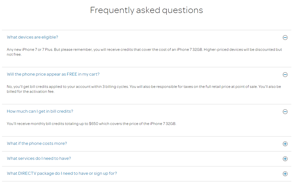
On the FAQs page of the AT&T site, questions and answers are presented in the form of a fashionable accordion. This idea is very good if the concealed information is so large that it will be reasonable not to show everything at once, in order to make things simpler for the user to search for the appropriate question. But here we see that the answers are short and thus could be presented at once without any consequences. The designer should have thought about this and not make the user click on the plus sign.
Page with answers to frequently asked questions on the AT&T website.
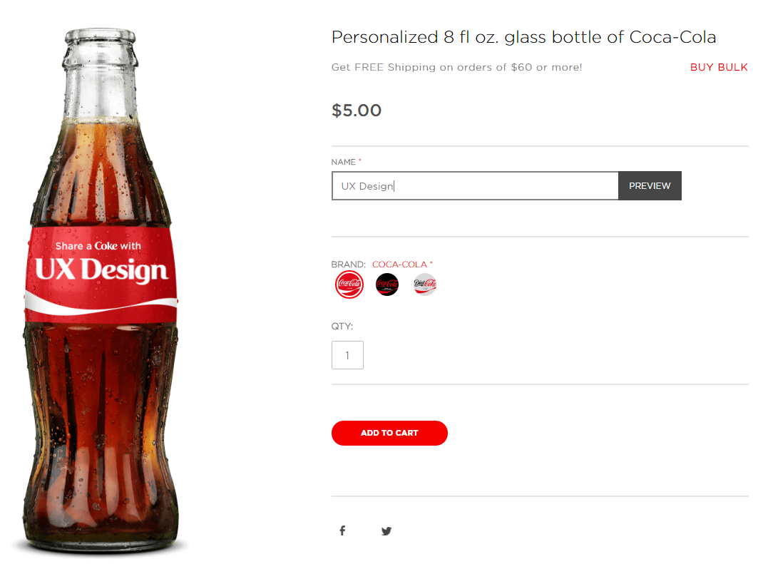
On the Coca-Cola website, you can order a bottle bearing your own name or any inscription. After entering the name you want, you need to click on the “Preview” button. Oh, how nice it would have been without this button. They could, in fact, show the inscription on the bottle at once thus saving a click.
From Coca-Cola site. The user could do without the “Preview” button.
Another example: the screenshot of a site offering tours across China. The phone number is shown as an image, which is a link to the contact page. Why not just make it a text, and in addition – a link that enables the user to (by a click) call from his smartphone?
Screenshot of the site www.chinatravel.com
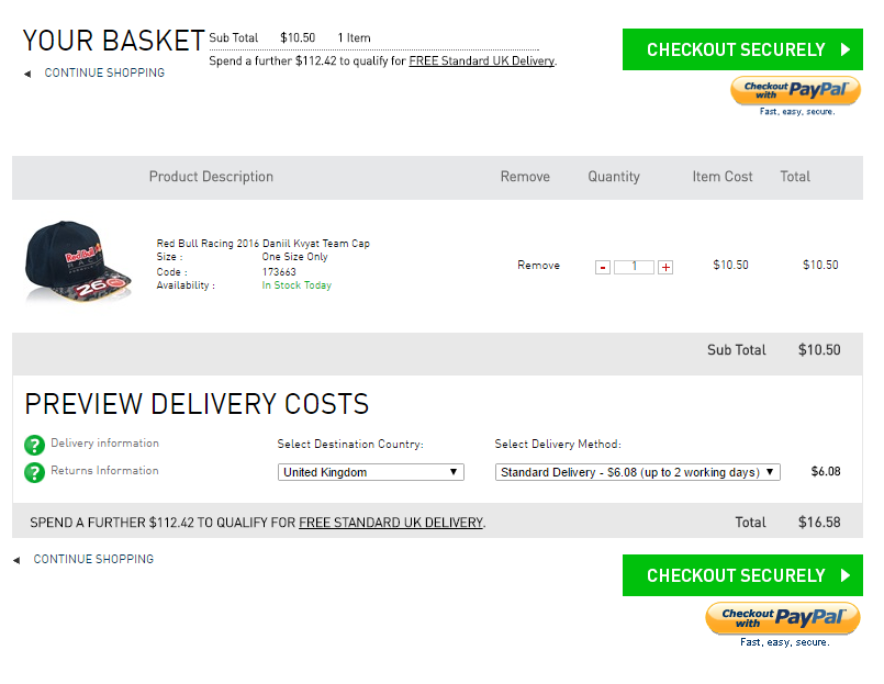
Ok, that’s enough of negative examples. Let me highlight a nice feature in the official online store of auto racing Formula 1. When you go to the checkout page, in the “Destination Country” field, the system automatically detects the user’s location. This is very nice. Keep it up!
Screenshot of the official online store of Formula 1.
Conclusion
“One man likes to push a plow. The other likes to chase a cow. But that’s no reason why they can’t be friends” – Broadway musical “Oklahoma” by Oscar Hammerstein.
The same questions constantly cause irreconcilable arguments and almost religious differences among web developers. In such disputes, you can rarely impose your views on the opponent. On the basis of what web developers do, they have very different views on the same issues.
I want to say that questions such as “Do users like a drop-down menu?” are detached from reality and don’t make any sense at all. Answers to them have no practical application. It is by far more productive and correct to state the question as follows: “Does this particular group of users like this particular drop-down menu on this particular site?”.
Endless arguments yield no result, but only waste your precious time. It’s more effective to test solutions in specific situations. All web development-related issues should be transferred from the “right or wrong” and “like or dislike” planes to the “working or not working” plane.
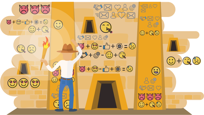
Icons have conquered the world. Mobile applications, web design, prints, motions and sometimes a host of icons, make you feel like you are in an Egyptian pyramid once you enter a site. The only difference is that instead of hieroglyphs, you find yourself surrounded by icons.
When providing an address or a phone number, a location pin and phone icons are given for the only reason “why not”. Sometimes it feels like if we let it run its course, an icon will precede every word.
More and more icons…
Mobile applications naturally borrowed the principles of interface design from desktop applications. Design-related fields then started borrowing these elements and solutions. Sometimes they were completely out of place but were just following the influence of trends.
As a result, mobile applications use icons not only for decorative purposes but also because of the shortage of space. Websites, especially landing pages, openly overuse icons (perhaps to compensate for uninteresting content).
It is important to try to figure out where and why the icon is needed, where it would be inappropriate, how transparent it should be, and why modern interfaces and icons look the way they look.
Sometimes a host of icons, make you feel like you are in an Egyptian pyramid once you enter a site…
Is your icon understandable?
Rule number one for an icon: it has to be transparent and obvious for speakers of different languages. However, how is it possible to determine the understandability? This question always causes many arguments.
In general, this type of a dispute is a fairly useless activity. It is partly a repetition of the historical competition of cultures in the creation of a written language. It is a battle of hieroglyphs vs. alphabets. Given a relatively small vocabulary, the representation of words that are described with these things was obvious.
However, with the concepts becoming increasingly complex, it was getting increasingly difficult to come up with a clear graphical image. As a result, it was understood that the meaning is not always obvious. However, there is a logic of understanding and some rules for reading. The ancient Egyptians and Chinese began to use hieroglyphs for the phonetic recording of words, using them not only as nouns, adjectives, and verbs but also as syllables and individual parts of words.
Fig. 1 – The Chinese character on the left means “man” and visually resembles a physical object. In the middle, there is a character “day” with a less obvious form. On the right, we see “yesterday” which is not transparent either. At least there is a noticeable logic of construction: the concept “day” was supplemented by the prefix “yester”.
How do one create an understandable icon?
It is difficult to create a completely understandable icon (even though it is often required from a designer). However, even easy understanding requires a minimal effort either by an individual (his/her logic, knowledge, outlook, culture) or by the society, which provides that individual with knowledge about the meaning of the image.
It is better to create signs that are based on some information which is already available for the target user of these signs. The icon should, therefore, be clear for a minimally prepared target audience. The wider the audience – the more common and accessible the sign that is required.
Pictograms and target audience
Articles on Wikipedia mark dead military commanders with a cross. For the Christian culture, this sign is clear. However, for readers from other cultures, it is not understandable. Therefore, this sign is not used for them in Wikipedia. Moreover, different language versions provide different versions of this cross. For example, refer to the article on the Battle of Marathon in different languages. The target audience is too broad to create a common sign. Therefore, it was necessary to apply localization.
Fig. 2 – Variations of crosses: on the left – for the English-speaking audience, on the right – for the readers from Spain and Russia.
The true purpose of the use of icons is not for ignorant people to understand the meaning, but for knowledgeable people to notice them faster. A sign is recognized faster than a word, although words are clearer.
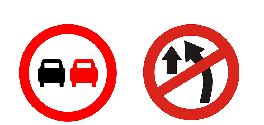
Looking at Figure 3, how clear is this sign for a person that does not know how to drive a car and does not understand traffic regulations? However, for a driver or an informed person, the meaning is clear – no overtaking.
Fig. 3 – Signs. No overtaking
You start driving with the goal of not guessing the meaning of the signs but to quickly identify them. Many prohibitory signs with arrows, used in India (Fig. 3 – on the right), illustrate the meaning better. You will notice black and red cars faster. Let’s say you do not know the meaning of the sign with two cars and cannot guess what it is. I will tell it to you. The image is associative in general: there are two cars. Red means prohibition. A mnemonic chain is formed. You now think that everything is clear, and the sign is understandable to you.
Icons are often used for the labeling of various products. The purpose is to make everything clear after a cursory glance for conditional sorting by an important parameter without reading the text, which is listing these parameters. In these cases, the icons often do not speak for themselves. For example, on any network adapter of any of your devices, you can find several icons that are not quite understandable for a layman.
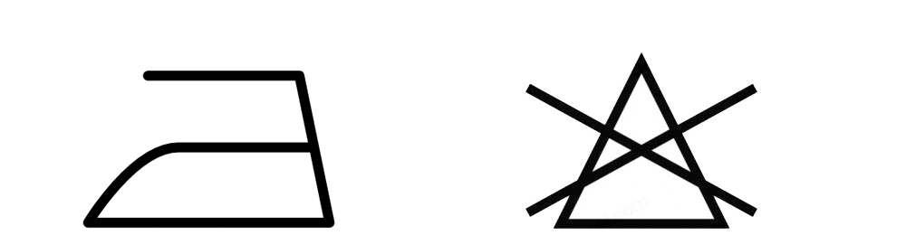
Though the icons on the clothing tags, describing the rules of clothes washing and ironing, still require specific understanding and are addressed to those who will perform these actions. It is important for these individuals to understand the properties of the clothes. Given that the image of an iron tells us that the product can be ironed, a crossed out triangle, most likely, says nothing (Fig. 4). For a housewife who cares about the look of the garment, this sign says that bleaching is not recommended for this piece of clothing. Therefore, since she knows the meaning, she pays attention to it.
Fig.4 – Labeling of clothing. On the left – “can be ironed”. On the right – “do not bleach”.
The icon “non-toxic material” uses the association with food, because the material is often used for food packaging. Military insignias are another kind of icons for quick identification.
Fig. 5 – On the left – a sign indicating non-toxic packaging material; on the right – a sign of a corporal or a sergeant in various armies.
Interface icons: the story of one button
The use of icons in computer interfaces is very similar. One of their main tasks is the fast transfer of information. A user should be able to quickly find the desired item, without grasping it in words. Even in a text-based interface (for example, Adobe products have several menus with drop-down lists), we do not grasp the meaning of options each time. We recognize them by the first letter, general outlines, the order, etc.
In addition to the rapid transmission of information, icons have a role in the interface by saving space. Standard menu (“hamburgers”) and option (dots) icons caused a lively debate just a few years ago. “Hamburger” had a reputation of a button “hated by designers and difficult for users to understand”. Nevertheless, soon there appeared a lot of articles “about the most popular button”. Although it preserves its original view, it attracts the attention of new less sophisticated users, with no problems in understanding it!
The situation mentioned above occurred. People were not born with knowledge about this button. Its meaning was explained to them by society or quickly recognized through their own experience. Nothing terrible happened when the user tried to push it, not knowing what it was. However, he immediately understood the meaning. There is no need to invent a more obvious image. Since this icon is used in products with millions of users, it has become something of a standard. It is unlikely that every user knows that the appearance of this button abstractly depicts three menu bars. However, once they have tasted it or seen others doing this, they memorize the meaning of this “hamburger”.
The interfaces tend to clarify things. There is a saying that if the interface is to be explained, then it is bad. However, though today a person does not have to procure his/her food (including brain food), it is still necessary to chew and digest it. The user should be trained. For serious problems, such as cloud-based industrial facilities management systems, there are special instructions, describing the characters. They suggest various clues such as “click the icon”, unobtrusive animation offering to try the tool in operation and pop-up tooltips on mouse hover. All of these clues help the beginner to quickly learn the ropes.
History repeats itself
Many commonly understandable and familiar icons have lost the associations that they initially had a long time ago. A classic example is a floppy disk icon that is used for saving. For more than 20 years, floppy disks were used for file storage. A modern user who is under 20 years of age may not recognize this symbol. However, he/she can quickly learn its function without delving into the details of its meaning.
In Photoshop, icons depict the actual tools of designers, photographers, and retouch artists of the pre-computer era. Most of the today’s professionals have never used these tools and may not even know that they have ever existed. They also did not know that designers managed to create layouts without computers and modern digital technologies.
Even the telephone handset icon is actually outdated. However, these symbols have been well-established and entrenched in the memory of society. Technical development progresses exponentially, and we just do not have time to get used to the image of new things.
The fact is that cassette recorders, television sets with cathode ray tubes, and rotary dial telephones have been in use for decades. Though their design varied, the overall shape was very similar. These images are forever etched in the memories of several generations. These icons have a certain charisma and they embrace the entire epoch.
There is something interesting to pay attention to while watching a detective or spy movie: if there is a scene showing someone conducting wiretapping, we would see a reel tape recorder with respectable rotating reels. However, at the time referred to in the film, there were already far more advanced devices. In films, they also use old devices because they create a strong artistic image.
A sound wave image on the monitor has recently become the only alternative. Designers have tried to modernize phone icons. As soon as they used the image of a smartphone with buttons, the image ceased to have a prototype and the associative array. Therefore, there is no point in trying to portray a modern view of a device in icon plots. This is because everything is changing too fast. No gadget will have the time to impress three generations of people with its views, like a floppy disk did.
Even though Youtube has successfully modernized its identity and icon plots, at the core there is still a warm pot-bellied cathode ray tube. The resemblance is also seen in the use of the word “tube” itself. To be more precise, almost all the icons are ideograms. They represent some meaning associated with an object or a concept, but not the object itself.
Cryptograms: to caption or not to caption?
Icons can be captioned. In web interfaces, captions were recommended in order to have greater visibility of the active area to click (Figure 6). This is true, but not critical. It is always more convenient to press a clearly defined area than just an icon.
Fig. 6 – The user will more carefully aim for the uncaptioned icon, unconsciously perceiving image dimensions as dimensions of the active area.
However, there is also the aesthetic factor. The interface consisting of buttons is not always pleasing to the eye. The balance between beautiful and convenient always requires effort. It is true that at times, something has to be sacrificed. For example, older versions of iOS offer users clearly defined buttons. The latest versions offer icons without visual boundaries, which means only a sense-bearing sign.
Fig. 7 – Icons to the right are more convenient to push, the area is visible, you can even tap or click somewhere on the edge. However, the icons on the left are more conceptual.
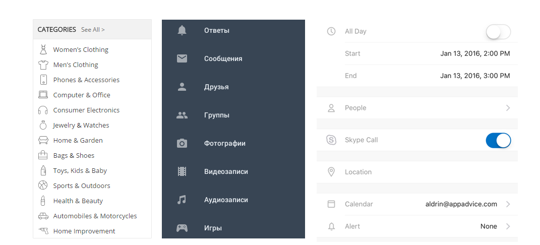
The following is the meaning of captions: a captioned icon is like two in one. On the one hand, the text clearly conveys the meaning and teaches the user. On the other hand, the icon helps the eye to quickly identify the option in the list (without it, an eye would screen the list by the initial letter, word length, and sometimes the user would have to read it carefully). It can actually tell the meaning of the option captioned in a foreign language.
Fig. 8 – Examples of an icon and caption working together. Words convey the exact meaning and the icon helps to find the desired option quickly.
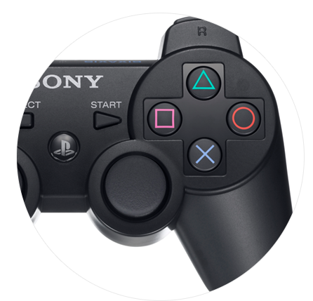
In addition, in this case, it is not required to look for a very precise image for the icon. The icons on the Sony Playstation gamepad are just visually different and easily distinguishable.
Fig. 9 – Gamepad for Sony Playstation
History of cryptograms: how it all began
It is necessary to address the subject of a fancy icon in the interface. It is now usually a conventional image without volume and with thin lines. Although some people would say that it is just a fashion trend, this type of icon is developed primarily because of technical possibilities. It is now used because it has been made possible, and not because an artist-discoverer happened to gain an insight. It is a demonstration of the saying “old is the new new”.
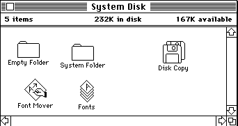
The appearance of icons in the interfaces marked the advent of the graphical interface itself. The graphics drawn pixel by pixel used to have a coarse pixel structure. Screen resolution did not allow for making detailed images with smooth contours. The pixel size was large relative to the icon. Images designed to resemble the graphics of that era are called pixel-art, or anything with the prefix “eight-bit”.
Fig. 10 – Graphical interface of the first Macintosh. Aside from the eye visible pixel structure, such a design is closer to the modern version than much of what has been created for more than 30 years since the appearance of the interface.
The fact that the old Mac interface was black and white, even played into the hands of designers. The closer the framework, the easier it is to find the optimal solution compared to the boundless opportunities. With the growth of computer power, which used to be consumed mainly by graphic performance, icon design has been developing and becoming more complex.
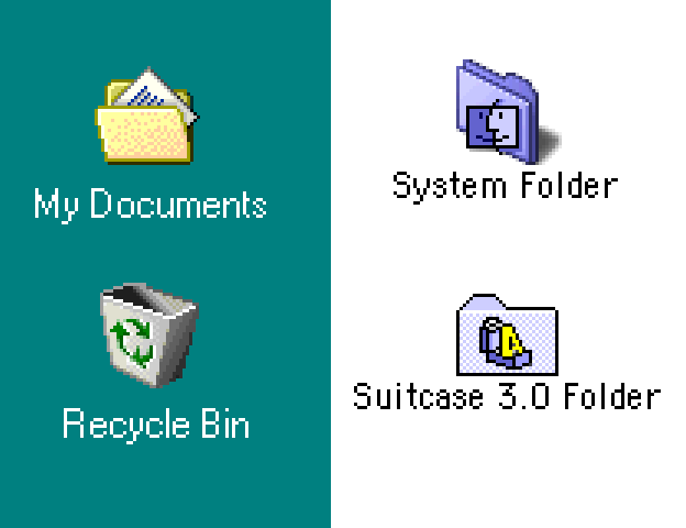
Fig. 11 – Windows 3 icons in color, with simulated shadows
In Fig. 11, we can see the painted icons from Windows 3. However, there is still a screaming pixel structure. We now mostly do not see the pixel structure, since even desktop monitors can have a point density of more than 72 per inch. The modern pixel is 1.5-4 times smaller and almost unseen with the unaided eye. The pixel image in the 1980s was not really so acute. It turned out that another drawback – the blurring of pixels due to the glow of luminophore in cathode ray tubes, slightly offset this sharpness. Therefore, the icons were not as painful to look at as they seem to be now.
The pixel density per inch has not changed for a very long time. This is true up to the present day since monitors served as the output device – first CRT, then LCD. Over time, the number of displayed colors has increased significantly. This has affected the form of the icons. Artistic techniques and tools have also developed.
Fig. 12 shows the Windows 98 and MacOs9 icons. They still have a rugged pixel structure. However, they are able to use more colors. They have also obtained gradient fill, although with visible steps. For colors mixing, there is the use of diffusion (in the yellow folder, there is a shading effect to the bottom that is made pixel by pixel).
Fig. 12 – Windows 98 and MacOS 9 icons
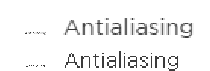
The antialiasing technique has become a revolution. It has allowed the seamless mixing of colors and the smoothing of the pixel edges. The mathematical processing of the image has opened the discussion of concepts such as the fractional parts of a pixel. This seems like a smooth transition from one color to another for a few pixels. It visually seems to be one pixel but with smoothed edges. The process of smoothing pixels is visualized in Fig. 13. It is interesting that there was no efficient font smoothing for a long time, while image smoothing has been used since the 1990s. This is because CRTs, due to the blurring of pixels, has smoothed the pixels of letters. Only after the final transition to LCD monitors, did the problem become acute again and was finally solved. As a result, smoothed fonts are now commonly used.
Fig. 13 – The above picture shows the word typed with a smoothed font in a six-fold increase. The below picture shows the same thing but without antialiasing.
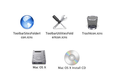
How has antialiasing affected icons? Its effect is almost the same as the effect of the iPhone and iPad release on application development. The design of MacOS 10, Windows XP, Windows 7 icons is not based on pixel-drawn icons anymore. The icons are created with photographic accuracy or modeled in 3D and scaled using antialiasing. It was the start of the skeuomorph era in design that has lasted for almost a decade.
Due to the smooth transition of colors and shades, there was an opportunity to represent glares, reflections, and imitate the surfaces of real materials. The icons used to compete with each other in complexity. They were different: three-dimensional and shining, “made” of glass and aluminum. Many people still remember the glass bubbles of SMS-chat on the first iPhones. Icons were limited due to the use of pixels and designers were quick to embrace the unlimited graphics capabilities. Since this design coincided with the beginning of the creation of sites with user-generated content, which were called Web 2.0 (in the future, social networks and blogs), the design was initially called “Web 2.0 design”.
Fig. 14 – Skeuomorph icons of previous versions of MacOS.
Over time, the term “Web 2.0” fell out of favor. As a result, the design that simulates physical properties grew into a widely used skeuomorphism. However, these effects were overused. As a result, both designers and users flocked to contrast simplicity of flat and concise signs. It was not a random decision but one supported by the relevant technology.
Modern simple icons of mobile interfaces have become possible due to the high pixel density per inch of mobile devices (as well as thin and trendy fonts). The antialiasing mechanism uses two to four neighboring pixels to simulate a “single-pixel” image. When displaying icons with a line thickness of one pixel, a mathematical error occurs, and the lines may look a little broken and uneven. This is evident if the device has a traditional 72 or 96 dpi when each pixel can be seen by an unaided eye. In mobile devices, this is four times smaller, and the errors are completely indistinguishable. The designers are confident in having a beautiful display of icons in thin lines, which conceptually resemble icons on the first Macintosh computers.
The reasons not to be too enthusiastic about icons
Don’t mess with success.
Icons are often used for attention attraction. This is the right decision, but only within reason.
Prior to the era of skeuomorphism and during the first period of its predominance, there were a limited number of icons in stocks and public domains. Some 3D designers and vector illustrators used to specialize exclusively in creating icons for a specific project. This process was very time-consuming and unique.
When mankind satisfied its desire to digitize the world and had enough glass and metal buttons, highlights and reflections, icons returned to their traditional minimalist look, popularized by flat and material design. It has become technically easier to create such icons. The search query in the subject provides many options. As a result, icons are dominated by modern designs. It is a trend and there is a temptation to follow this trend effortlessly.
All trends usually have their explanations and a rational foundation. In mobile applications, icons performed in thin lines in vector format look the best. If your project is a desktop/laptop web interface of an industrial cloud service and you follow the recommendations of the mobile developers to make the icons in thin lines in vector format the end user will see these icons as being ineffective, even if you theoretically did everything right. Conventional rasterized icons are preferable because at least you can definitely capture their view.
In terms of artistic imagery and stylistic performance, icon plots are usually monochromatic and minimalistic. However, the typical image of the object will always look good. You can find these images throughout the era of the active use of icon plots in graphic design.
When viewing pictograms, icons, and signs that were done 30, 50 or even 100 years ago, you can always find some kind of repetition of what has already happened. In our culture, there is always a cyclical nature of decades. Decades later, we see the return of music or fashion preferences from the past but based on new technologies.
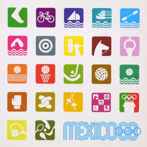
Fig. 15 – Identity of Olympic Games in Mexico in 1968. At first glance, it can be confused with the iOS screen.
The influence of time and mood is inevitable but we will not see pixel art or buttons made of mahogany in mass production anymore. In the future, there may be a renaissance of skeuomorphism. It has partially returned in the form of long shadows with a hint of volume elements in a flat design.
When creating an image of an icon, one should think twice about the target audience and its level of training. Who can be trusted for user training: society, advertising, the interface or is it better for the user to gain experience independently? By trying to create the icons which will tell the users everything about the system you will face a problem – one of the famous Murphy’s laws:
“Build a system that even a fool can use, and only a fool will want to use it”.
Even an encyclopedic description of the concept of icon uses the word “specialized”. To eliminate confusion, you can always caption an icon.
When using icons, you need to remember what we want to convey to the user: a very precise meaning with all the nuances or quick information. If it is necessary to explain all the nuances and avoid misunderstanding, we use words supported by graphics rather than icons. In chatter, meaning can be conveyed by Emoji, stickers, and smiles.
If an icon does not improve the perception, it is not needed there. If you place an icon only for beauty, you should think twice whether it is really necessary. If this design looks like junk jewelry anyway, it might only cheapen your design. It is clear that it is not the author’s work, but stock images that are worth no more than a penny or even received for free.
Fig. 16 – Icons are not used in the menu, as there are too many categories. In this case, alphanumeric sorting is preferable
If an icon is not functional, it is unnecessary. Functionality means assistance in a rapid search of the necessary material, attention attraction, formatting and structuring of information. Mobile interfaces, due to the shortage of space from the physical point of view (screen diagonals are from 5-10 inches), make designers use icons. However, the Web and other areas of graphic design are not burdened by this necessity. Therefore, the excessive use of icons is undesirable.
Remember:
Icons should be understandable for your target audience.
The wider the audience – the more common and accessible the sign that is required.
For mobile applications, it is recommended to use icons with thin lines and in vector format. For desktop/laptop versions, classic rasterized icons are preferable.
If the icon does not improve the perception and does not carry any function, it is better to remove it.
If you need the icon to quickly find the information, it should be accompanied with a caption.
Given any terms and objectives – do not make too many icons! Less is always better.
Today’s web design world has become so innovative. Table-based lists with offset pagination are rapidly falling out of favor, while masonry layouts with infinite scroll are now becoming the new trend. You are not aware of it yet? Think Pinterest, Interview Magazine, Windows’ Metro etc. To describe it in words, it’s an almost crazy paving effect whereby variable sized blocks of content are pieced together in an aesthetically pleasing style and often staggered. Masonry style layouts aren’t something new.
So why look at them now? After all there are some great solutions out there that can give you a masonry effect. This is true. However, can we push a pure CSS solution a little further? Can we leverage Flexbox to achieve a more desired effect and push the capabilities a little further?
Well, in this article, we try to provide an in-depth look at masonry layout and its main perks of usage.
Default Situation
Everyone knows that if you want to display a grid of elements (announcement of blog posts, online store goods, galleries, etc.), you’ll face floating and alignment problems where the height of blocks is unspecified.
E.g., indicating the float:left property – even with the same width for all blocks – would lead to the following mess:
Pic. 1 – Default alignment.
Another option is more pleasant to the eye – when the blocks are arranged line-by-line on a vertical grid (frequently used for the goods catalog) or masonry grid with vertical customization of blocks (used for blogs).
Responsive grid with line-by-line display of blocks of different heights
Well, it may seem that everything is obvious here. But it isn’t.
Let’s assume we have blocks of the same width, displayed on a 4-column grid and have the float:left property. After every 4th block (the last in line), we use the clear:left property or display each line as a separate block. But for a responsive layout, it’s a doubtful decision to make block-lines with block-columns inside because the layout will be reconstructed and the number of columns will be changed. Moreover, one should be careful when clearing context due to column variability.
Therefore, we proceed as follows. Let’s take a sample layout in which we need to display a maximum of 6 columns and a minimum of one. First, we should ensure that starting from the 7th element, every 6th element is displayed from a new line. Then, due to narrowing of the display area, the rule should be dropped, while another one adopted – every 5th element starting from the 6th one will be placed on a new line and so on, till the layout takes a one-column form.
In the article Responsive Web Design Using Breakpoints, we mostly focused on the principle on which properties of screen size ranges are overlapped. And this is precisely the case when it’s really convenient to use media-queries like “from and to” with properties applied to the strictly specific range.
Before writing the code, let’s denote ranges:
Everything that is more than 1600 pixels – 6 columns.
1400-1600 – 5 columns.
1400-1200 – 4 columns.
1200-900 – 3 columns.
900-600 – 2 columns.
Less than 600 – 1 column.
When we transform it into CSS, it will look like this:
For definition above 1600 pixels, we need to set a value such that each 6th element starting from number 7 is placed on a new line.
@mediascreen and (min-width: 1600px) { .column:nth-child(6n+7) {
clear: left
} .column {
width: 16.666%
}
}
Our new command works similar to the range of 1400-1600 where every 5th element starting from number 6 is placed on a new line, and so on in descending order.
@mediascreen and (min-width: 1400px) and (max-width: 1600px) { .column:nth-child(5n+6) {
clear: left
} .column {
width: 20%
}
}
Well, the result is as follows:
Pic. 4 – clear:left on every 4th element, starting from the 5th one, we get a four-column grid. The red frame is the border column; the gray color fill is an imitation of the content with unspecified height..
At the above layout, we see that the height of the column cells is equal to the height of the content. If you want the height of the columns to be the same (equal to the largest column) in one line, then all you need to do is to indicate the following for the wrap block:
Pseudo-classes: nth-child, mentioned above would be unnecessary in this case (see Source 2).
But this is not quite our topic for discussion because we are most interested in display of brick blocks of different heights (pic.3).
If we want the vertical distances between blocks to be equal, we should use jquery plug-ins instead of css.
Jquery plugins for masonry layouts
There are so many different jquery plugins. They have been there for a long time and have been generally performing well. Masonry, Isotope & Freetile are among the most well-known plugins. Historically, the first and foremost duty of these plugins has been to create galleries. Some of them still don’t go beyond this role, while some acquire more optional features (sorting, animations). If you have a gallery and variegated images by size, then this is the perfect solution you’re looking for. As a rule, it is enough to add a class either to a parent block or to the elements located inside it and then launch the plug-in.
But we are mostly interested in displaying grid tiles of both text and images. Well, yes, they allow to do this indeed, but there is one catch…
At least, all the plugins known to the author are based on the same principle:
With Javascript, a new absolute positioning is set for the elements and coordinates are recalculated. As a result, each of them is assigned with the properties left and top in pixels. When you change the size of the browser window, the absolute values are recalculated.
Although these plugins are of high quality but they sometimes witness some failures in their operations.
1st case: sometimes blocks are placed end-to-end to each other without any margins (probably because the plugin has been triggered just right before all the necessary elements were loaded for correct calculation of position). To overcome this, you can activate plug-in initialization once again after the document has been fully loaded:
where pluginStart is the function of plug-in launch.
The second detected trouble stems from the fact that since system resources (all operations occur in the RAM) are required for constant rearrangement of blocks and recalculation of coordinates, the site may hang with high data sufficiency. This almost never happens with desktop versions, but there’s a great chance that it may happen when the site is displayed on an iPhone. Especially if the plugin uses different effects of movement visualizing and block emergence.
Therefore we decided to follow a fundamentally different approach. Although this way is not a universal one but it is less resource-intensive and lightweight in which a simple grid and masonry will be combined. Consequently, positioning issues will be solved by means of CSS instead of JS, which will give additional flexibility to our plugin.
Masonry & Grid Hybrid
As you can see from the title of the chapter, we’ve decided to combine the grid structure of adaptive layout to solve the problems connected with positioning by means of CSS. We’ve also made blocks vertical without changing their coordinates, but placing them in the columns of our layout by using JS.
As in the case with the above-mentioned plugins, we’ve placed tile blocks inside the wrapping block. The parent block is given the the-wall class. Elements which will be further aligned are given another-brick class.
b) Operation principle of the plugin & its main perks
After launching JS, the responsive grid is formed with empty columns.
Depending on the width of the display area, the number of columns varies from 12 to 1 by means of CSS (this can be changed. If you have such a need, please, see source).
The borders for transition to a different column number can be changed in the plugin file anotherbrick.css. The whole logic here is:
For windows with 2900 pixels, it will be 12 columns (100%: 12 = 8.3333%).@mediascreen and (min-width: 2900px) { .brick-col {
width: 8.3333%
}
}
If the area is less than 2900 pixels, then we already have 100%: 11 = 9.09% and then the column number 12 should be disabled..brick-col {
width: 9.09%
} .brick-col:nth-child(12) {
display: none
}
If the area is less than 2600, similarly, we should define a new column width and remove the column 11..brick-col {
width: 10%
} .brick-col:nth-child(11) {
display: none
}
And etc. (please, see css-file).
Therefore, we have fully imposed the task of mutual positioning of blocks on css, which means that no calculation of positions of elements is done and extra cpu resources are not used.
We have a grid of empty columns, but we should enter the content in it. Then the plug-in sorts a list of elements alternately arranging them in columns based on the principle: the 1st element in the 1st column, the 2nd element in the 2nd column, etc. When the plug-in reaches the last column, it keeps on filling the elements starting with the 1st again.
But one should keep in mind that the number of columns varies. Therefore, the plugin monitors the situation and as soon as there is transition from one number of columns to another, it rearranges the content in columns.
But one should keep in mind that the number of columns varies. Therefore, the plugin monitors the situation and as soon as there is transition from one number of columns to another, it rearranges the content in columns.
AnotherBrick(N);
where N stands for the number of columns
Summary
Well, our plugin really has no weak point, but rather a technical feature. Due to its focus on the grid structure of layout, it cannot be used for tasks where “bricks” have different width and the layout has no grid.
Questions of this kind are solved using “classic” masonry-plugins. Also one should be realistic: our plugin have no tile customization mechanism with a priority to fill the space as uniformly as possible. It just sorts them (tiles) out by columns. While masonry, isotop and others customize tiles on the priority of maximum density and sometimes can create more visually balanced layout.
Therefore, it’s better to use them in cases when the height of one block is 600 pixels and another is 100 pixels. If the height of blocks doesn’t vary by more than 3 times and there are more than 20 blocks, then the pattern will be the same in all plugins including ours. Major advantages of Another Brick include the css-mechanics, facility, and ability to adapt to user’s needs.
Moreover, there is a chance that the distribution of blog posts with our plugin will be more readable in terms of chronology. Since masonry plugins are placed close to each other, it often occurs that the dates are a bit mixed.
We brought up an issue of breakpoints for a desktop/laptop responsive site version in the previous article Responsive Web Design Using Breakpoints. Now it is time to talk about the mobile layout. Let us make two features clear for you to take full advantage of the information below. These features are viewport meta tag settings and the DPI. Though simple at first sight, these things cause much confusion.
Viewport Meta Tag
Let us leave lengthy theorizing aside and go straight to the practice.
Viewport Meta Tag is a command telling to the gadget how to scale the website. We would like to make an honest agreement on not trying to squeeze the mock-up evenly into the screen’s size, making the user’s vision blurry.
Pic.1. Viewport is set incorrectly or absentPic.2. The settings are correct, but styles for mobile devices are absentPic.3. A fully functional mobile version of a site with correct settings and styles for mobile devices.
Set any width supported by the device, launch the site in a 1:1 scale and forbid further zooming.
What Happens When You Ignore Viewport:
Devices will scale the mock-up at random, leaving you no way to find out, how many pixels are actually displayed in the browser’s window.
DPI
DPI is a quantity of pixels (dots) per inch.
Modern mobile phones and some PCs have the pixels density of over 72. However, we do not believe their producers: they do not tell us the whole truth about coordinates used to display mockups. The mere size of screens in pixels does not say enough to do the math.
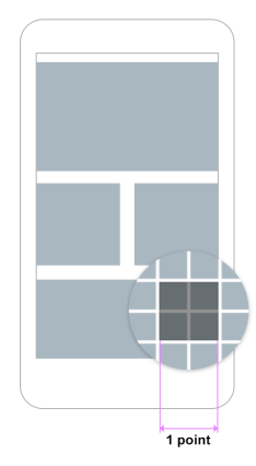
The thing is, mobile browsers use their own points, not equal to the physical pixels of a device. Usually these points are divisible by two in order to make information volumes visually comparable, considering the physical dimensions of devices. For instance, 1000 pixels for a smartphone is the size of a palm, 1000 pixels for a PC is the size of an A4 landscape sheet. That is why a mock-up which looks easy-to-eye on PC will look small and unreadable on the display’s screen.
iPhone 6 Example
iPhone 6 is 750 pixels wide. However, the browser divides this value by two and thinks that the full width mock-up has 375 pixels. A 750 pixels-mock-up will be either displayed only in half or squeezed in, depending on viewport settings.
Our honest agreement, however, keeps us from squeezing. It leaves us only displaying the mock-up correctly in 375 pixels, which are the said points in terms of high DPI mobile devices.
2 pixels of the gadget’s screen horizontally equal 1 pixel (point) for browser. The same in vertical direction.
Mobile Device Detection
We remember from the first part to use an abstract styles.css file with all styles and a responsive.css file containing breakpoints and styles for different statuses of the desktop version of a site.
Now we need 2 additional css files, for tabs and for smartphones. The files are added in this order:
styles.css
responsive.css
phone.css or tab.css
To identify device type, use a server-side method: for example, PHP class mobile detect.
All the CSS styles for mobile devices are written in the phone.css and tab.css files; we also include media queries to avoid a pileup of files. The logic of breakpoints activation is the same as for desktop/laptop versions, namely a cascaded inheritance of properties from the largest scale to the smallest one (see Part 1). Sometimes you only need 2 variants of style to be coded, for landscape and for portrait orientation. The minimal width is 320 pixels, while the said iPhone 6 Plus is 414 px wide: that is why some elements need to be adjusted to the size of the browser’s window.
Server Side Vs CSS & JS Detection
Traditionally gadgets have a high dots density, a higher than 1.5 pixel ratio, and smaller screens than desktops. However, technologies change and limits become more and more blurred. Apple laptops and desktops, for one, already got retina displays with a higher dots density. Resolutions of tablets and laptops have been already comparable for a while.
If you do not have a bulletproof solution for CSS-detection you will google to find a great deal of variants. All else being equal, the service-side device detection method is useful for small and medium web projects (see Part 1), as it:
works easily and reliably
does not require you to make up conditions by searching parameters of devices
enables an easy fine-tuning of interface elements and content design
All CSS files can be divided according to purpose:
Common files for the UI and content + desktop/laptop styles (the latter can be made separately or placed into the 2nd file of this list).
File for supporting the desktop version responsiveness.
Mobile devices only.
File containing only css-animations.
The code will be more readable and less cluttered. While tuning your work with separate files, each having a specific function.
Consider animations: they are, including durations and easings, pretty bulky. Being kept in a separate file, they will not interfere with the adjusting of main styles, and in case of doubt you can turn them off until you find the problem.
JavaScript is another method of device detection. However, if you do not want to reinvent the wheel, you have to install an external script or plugin. You will assign class mobile to tag body according to results and build up styles for devices of the .mobile .element { } type without dividing the styles into separate files.
The server-side device detection method has an advantage. It turns a small chunk of your code within the head tag containing conditions for linking style sheets into a somewhat of a headquarter, where tasks are distributed. This way you can enable not only different style sheets, but JavaScript files and chunks of code for specific devices as well.
It is simple and it works. You need less time to do that than you have already spent on reading this article.
More About CSS for Mobile Device
Media queries in CSS for smartphones are set like in the main site version. Don’t be confused that in css pixels are pointed out. This is css notation. The same points are meant here.
@media screen and (max-width: 640px) {

}

@media screen and (max-width: 480px) {

}

@media screen and (max-width: 375px) {

}
Here are some media queries to detect device orientation:
@media screen and (orientation: landscape) {

}

@media screen and (orientation: portrait) {

}
The combinations with coordinates and orientation may also be useful:
@media screen and (orientation: portrait) {

@media screen and (max-width: 1200px) {

}

@media screen and (max-width: 1024px) {

}

}

@media screen and (orientation: portrait) {

@media screen and (max-width: 1024px) {

}

}
Two Lifehacks
Lifehack # 1
iPhone – to prevent shortsightedness, apparently – enlarges fonts it finds too small without asking. To avoid this, write in the file phone.css:
html {

-ms-text-size-adjust: none;

-webkit-text-size-adjust: none;

}
Lifehack # 2
This inappropriate situation makes iPhones and iPads ignore viewport settings, interfering with fine tuning. There is often a bar navigation element with different buttons, fixed in the upper part of your mock-up and having the following properties:
The property min-width: 990px is necessary only for the main version; you do not need it for the mobile one. You expect the element to spread out of screen boundaries, as its minimal width is too big. Far from it! iPhone decides to ignore viewport and forcefully squeezes whole mockup in such a way so that this element can fully fit into a screen so that entire website content badly decreases (see Pic.1). Stay alert and set the minimal width for fixed elements, as sometimes gadgets work against any logic.
Summary
Detect device type with the server-side method using php class (you can find similar solutions for other languages).
Continue making breakpoints with the size of the browser’s window reducing; the same way as in the main design version (the methods are covered in the previous article). It means your mobile layout inherits properties from the most compact desktop design.
Using the methods described for adding the necessary style sheets and scripts for each specific device as your construction kit, you can separate the CSSs of mobile and desktop versions to make them visually independent.
Remember to set specific viewport parameters.
It is unlikely that you will need additional media queries detecting retina to optimize graphics. Now all smartphones have a high DPI, so the styles in phone.css are completely suitable for them.
“We work under Agile principles”: this is a common phrase to hear from different IT-companies. However, do they really follow the main ideas of this popular technique and enjoy the flexibility of processes? Let us find out, why SCRUM and Agile are not the same things, and why Agile Hybrid approach is becoming even more widespread.
Agile is the philosophy of building up a development approach that is flexible and responsive to change. So it is defined in the Agile Manifesto (https://agilemanifesto.org/). However, a closer look at the working process of a company using Agile reveals that they have just implemented one of the best-selling Agile-frameworks – without trying to enhance company’s responsiveness to the dynamic business environment.
Solid SCRUM for large iterative projects
SCRUM is one of the well-known frameworks or Agile approaches. This methodology is formalized strictly enough by one of its creators, Jeff Sutherland: the details of the formalization are described in The Scrum Guide (http://www.scrumguides.org/docs/scrumguide/v1/scrum-guide-us.pdf). Specific terminology aside, SCRUM is an iterative-incremental software development model with a defined iteration length (1, 2 and more weeks).
Pros:
Cons:
Process cyclicity
High level of interchangeability
Long delivery period
From experience: SCRUM works great for products that are still not in the real use. When you need a highly intensive functionality delivery, introducing SCRUM does not make the process more flexible. Your team may be content with the steady workflow and process formalization, but a slow progress in implementing the necessary functionality compels you to use other methods.
Kanban for small and urgent tasks
This is another well-liked Agile framework, based on handling one high-priority task at a time.
Pros:
Cons:
High work speed
Continuous delivery
No steady workflow
Too difficult to implement within large projects
Besides, Kanban imposes higher requirements on automated testing and continuous integration tools, also making it more difficult to use.
Agile Hybrid – perfect methodology for a specific project
Under close scrutiny, the disadvantages of one of the two above-mentioned techniques (delivering functionality in releases and continuous integration) are compensated by the advantages of the other.
The pros and cons of each method gave way for Agile Hybrids, combining either different Agile methodologies or components of a methodology in one process. The main idea of this approach is to design the process according to the needs of a specific project. What’s important, Agile Hybrid is not imposing. It does not try to squeeze the team into limits, allowing for experiments and flexibility.
SCRUM with Kanban elements is one of such hybrid frameworks that provides for delivering big user stories in releases. Meanwhile, stubbed functionality is being delivered continuously according to the pre-set product’s priorities. Such methodology is more demanding to a team, it’s internal communications and management tools. However, the result speaks for itself: the development process actually responds to change and the team remains highly productive.
An example for creating Agile Hybrid
Consider a team of qualified professionals, including programmers, project managers, operations engineers and quality engineers. They work remotely from each other. The team is about to support several taken over projects remaining under development and at the same time to launch new projects of different scope from scratch.
Due to the lack of direct contact within the team, the different work speed and technical issues classical SCRUM can give many problems in this situation. Indeed, supporting old projects demands immediate implementation, while developing new ones does not mean continuous integration.
In this case, hybrid Agile is the best choice for the team:
give up sprints and go for short releases: this will allow for equal work speed on different projects;
split the whole team into two equally functional sub-teams to organize efficient communications;
abandon the “Scrum of Scrums” practice: the whole cross-team coordination can be carried out by project managers;
implement and use the continuous integration technique actively, with operations engineers being made responsible for its management
This working method is given only as an example. In real life, you need to analyze team skills: mastery of CI-tools by operations engineers, test automation skills of quality engineers etc.
Create your own Agile Hybrids
The values promoted in Agile Manifesto are based on team’s characteristics, the skills of the participants and their specific tasks. Agile is focused on creating a participant-oriented process. Using a specific framework, be it SCRUM or Kanban, does not necessarily bring success. No matter how popular a working method is, bear in mind flexibility, convenience and efficiency.
Do not hesitate to make your own Agile hybrids, introducing the best-proven practices to your work.
“Another article about responsive design. Really?!”, the surprised reader asks. Not quite. There is an infinite stream of posts about relationships: theoretically true, but in fact absolutely useless because of generalizations. We, however, are going to step aside from academicism and tell you how to succeed without generalizing too much. Namely, how to make life easier when working on relatively simple web projects.
Though there is more than enough information on media queries, many people still get confused. They do not understand what the conditions for breakpoints activation are and how to control them. That is why we’d like to tell you in this article how to tackle the responsiveness of mock-ups and how to confidently use breakpoints.
Introduction to Breakpoints
Under the simple projects mentioned above we mean, generally speaking, everything not overloaded with user interface elements. These are corporate and portfolio websites, landing pages, websites for advertising brands and special offers, microsites, blogs and even small eCommerce shops. Along with making such sites mobile friendly, the responsive web design provides for a good presenting of their content and interface on laptops and desktops with various resolutions.
Drawing on the principles of web application development, the task of responsive web design is often solved by using CSS frameworks and CSS preprocessors. However, this approach makes things difficult if you work mostly with the layout, not front-end development. And the fine tuning of responsiveness using framework tools for a non-templated design is problematic and exhausting.
The point of the method is not new; we by no means claim sole authorship. This information has been always on the surface. One of the first books on responsive design, Responsive Web Design by Ethan Marcotte, even used it in its examples.
Although the reader was given the right ingredients, the order of putting them in the dish, though mentioned, was not stressed enough. We would like to tell you about the order that actually matters.
Limited Scale Range Example
Our example is a desktop-first website that can easily take a mobile friendly form. Our first tip is to work with two CSS files. The first file is a common one, let us name it styles.css: you code all the necessary styles in it. It will be added first. The second one, responsive.css, codes responsiveness and contains all media queries. Activate this file second to prioritize it.
Write your HTML code exactly by your sketch. Do not think for now about responsive features and what to do with scaling the browser’s window smaller. For example, your mock-up is designed for 1200 pixels. Most likely, you expect it to be scaled and stretched further. In most cases it means you create the layout setting the width for each block in percents. (Probably not a problem for you: otherwise read the perfectly described solution in the mentioned book by Ethan Marcotte).
Eventually, you create a mock-up that looks well in the plus-minus range of scaling your original sketch. Say your content and control elements stretch correctly in a range from 1150 to 1500 when changing the screen size; then you have the familiar elastic layout.
However, expanding beyond this range results in gaps, and the information starts to look somewhat small. A considerable scaling down causes troubles as well. Parts of content overlap, the interface falls apart, and some elements just do not fit. The latter brings back scrolling and other relics from the “dark ages” before media queries.
Responsive Layout for Any Range
Well, let us type the queries in. The most common mistake web designers and html coders make is coding the styles exceptionally for a specific resolution in the range “from min-width to max-width only”. (Or relying on the conditional classification of screens offered by frameworks).
Range 1
For example, they code a lot of styles for different blocks in the range from 1400 to 1500. For convenience, we name it “Range 1”.
The media query is:
@media (min-width: 1400px) and (max-width: 1500px) {

}
Then “Range 1” is a set of properties that work only within the range of 1400-1500. For any other conditions, >1500 or <1400, these properties will be simply ignored.
Well, it makes sense that scaling the mock-up down 1400 doesn’t meet the condition any more, and the styles do not work. What is wrong?
Range 2
Let us add another condition. It is obligatory, as you need to set parameters of the elements for other resolutions. We name it “Range 2”.
@media (min-width: 1200px) and (max-width: 1400px) {

}
Naturally, the styles are set only in the 1200-1400 range. And here comes the problem. What if you need a part of “Range 2” elements to change, unlike the default styles, but in the exactly the same way the elements did in “Range 1”? And we have not inherited anything going from “Range 1” to “Range 2” as we unequivocally set each range to have its own parameters. In this case, you obviously have to copy some of the style elements changed in “Range 1” to “Range 2”. Then it accumulates like a snowball. Next ranges will have a bunch of duplicates. If the code needs fixing, more duplicating follows with a high chance for you to get absolutely confused. One may think of the pre-processors, keeping in mind that they smooth the situation with duplications. However, we are going to prevent this scenario from happening at all.
That is why styles for groups of elements should NOT be written ONLY for “Range 1”, ONLY for “Range 2”, or ONLY for “Range 3”. It is better to use the following method: for “Range 1” and all following points, for “Range 2” and all following points, for “Range 3” and all subordinate points, etc. They follow as if in a cascade, implementing fixtures as the website layout narrows in the browser.
Using Inheritance for Better Responsiveness
The superior “Range” cannot see the styles of the subordinate one. The styles, however, are inherited by the subordinates, and can be also modified by them or completely replaced and transferred further into the cascade. We get a mathematical description of a physical action. You compress the browser window, and additional modifying styles are applied to the existing ones as specific limits are met. It is more logical, natural and resembles training of muscles. Each change of the condition is caused by the downsized workspace (the increase in the workload on a body). The website’s elements initially were prepared for a slight change, then for a bigger, then for even bigger one. It makes sense to modify a “leveled-up” element which has already experienced an increased workload and become ready for more action.
To begin to “level up” our mock-up for better responsiveness, we set the maximum possible width that does not make the mock-up look too pathetic. Say the mock-up’s width is 1500: it looks stretched but still not bad. This will be the starting point for scaling the mock-up down.
We have already agreed to code all the styles responsible for its current appearance in the default file styles.css. All the rules for media queries will be written in the file responsive.css.
Minimum Range Responsive Layout
Imagine we compress the browser window to 1400 and see an element to be shifted out of place while others still look as planned. We compress it by 10 pixels more and see that one more element will not behave. Well, in this case, you need to write a rule for the group of elements not “feeling comfortable” at the point of 1400. One small tip: do not go for the numbers standing for the standard display resolutions (1480, 1380, 1280, 1024, etc.). Keep in mind the scrolling width that varies in different browsers, so there is no magic in these digits.
Now:
@media (max-width: 1400px) {

}
In this rule we write a new parameter in the condition that became incorrect for this resolution.
For example, the element has a class with a bunch of styles, a 5% left margin and a 100% width. We still like everything about it, except the margin-left parameter: it is too high. So we tell the element to change it:
We deal likewise with every element craving our attention. After this we see that as soon as we reach the 1400 pixels point, the properties of the element are corrected. It is quite obvious that the new properties will not change during the further scaling down.
Say we compress the element down to 1200 pixels to see that this element with the new fixed properties does not look good to us anymore. Add the “When the width is <=1200, it will be like this» rule:
We have again reduced the left margin value and changed the width value. This way the object of our experiments will get these changes on reaching the 1200 pixels limit. These properties will remain as the workspace will shrink.
Let us continue our experiment. We compress the element to 990 pixels and see that the margin does not suit us again, though the width is acceptable. We add the “When the width is<=990, it will be like this” rule:
We correct the required parameter in the rule (in our case, the left margin). The width parameter remains the same after the previous correction (on reaching the 1200 pixels limit).
The order of assigning styles within the CSS lets us use this logic:
from 1400 the margin=5%, the width=100% – our starting point;
from 1200 to 1400 the margin=4% (set), the width=100% (initial) – assign as soon as the 1400 limit is reached;
from 990 to 1200 the margin=3% (set), the width=70% (initial) – assign as soon as the 1420 limit is reached;
from 0 to 990 the margin=2% (set), the width=70% (initial) – assign as soon as the 990 limit is reached.
All this does not mean simply duplicating styles. What works in the range over 1400 pixels, works also in the range from 0 to 1400, unless we change these values for others as we scale mock-up down.
If we wrote only one rule –
@mediascreen and (max-width: 1400px) {
}
– then its content would be applicable to the range from 0 to 1400.
As soon as we add the rule –
@mediascreen and (max-width: 1200px) {
}
– we receive a separate control over the range from 0 to 1200, while the previous rule remains valid.
We enable the rule –
@mediascreen and (max-width: 960px) {
}
– and focus on the range from 0 to 990 without cancelling the rules for ranges 0-1400 and 0-1200.
It is as if we were “guiding” our mock-up as we scale it down, prompting necessary changes, removals and additions. However, we advise against aiming for zero: it is better to set the minimal resolution of a laptop or a desktop (for example, 990) as the limit.
Ethan Marcotte will insist that you should go on and write more new rules until you reach the minimum of 320 pixels on mobile devices. It is possible but exhausting for you to make all these fake-breakpoints, keeping an eye on the properties of your elements pixel by pixel. Besides, Ethan Marcotte simply did not know how to define the device type, so he relied on the identification by size (if it is small, then it is a phone). The more complicated the website is, the more breakpoints are needed.
The trickiest range is 800-960 pixels, not even seen by most users. There is no point in compressing the website browser to less than 990 pixels on a laptop or a desktop. And stretching the browser window to this scale on a phone is physically impossible. The maximum to reach is 600-800 browser pixels in the landscape orientation. It makes more sense to separate the styles for the responsive desktop and for the likewise responsive tablet/smartphone physically. Furthermore, the mock-up for phones usually requires more major changes. We plan to cover displaying the mock-up on mobile devices in a separate article.
To sum it up, we have “banned” our mock-up from compressing down 990 pixels (min-width: 990px, you know).
Maximum Range Responsive Layout
We still have a very wide display problem. As you remember, we started with launching the website in the widest possible quality resolution and then worked on its correct downsizing. Now let us see what happens if we bite from another side of the mushroom.
Most likely, it is not that bad if you have already set the maximum values for the website to stretch in the default style (max-width). There is still a chance, however, that some elements and font sizes need fixing.
Let us add a rule to the very bottom of our list:
@mediascreen and (min-width: 1800px) {
}
making rules for the mock-up in the range from 1800 to infinity.
If something makes us uneasy as we scale the workspace up to 2500, then we can write another rule in addition to the existing one:
@mediascreen and (min-width: 2500px) {
}
Setting Responsive Mock-Up Height
It may be essential to change the styles in your mock-up not only according to its width but also according to its height. The rules for that are written on the same principle.
The styles when the height is from 0 to 600:
@mediascreen and (max-height: 600px) {
}
The styles when the height is from 0 to 500; all styles of the range 0-600 that are not reassigned remain the same:
@mediascreen and (max-height: 500px) {
}
It is important to understand the priorities. You may have the situation when the rules for width values tell the element to be this, while the rules for height values demand it to be that. If you place the rules for defining the height at the end, after the rules for defining the width, the former will be applied in case of doubt. And if you place the height rules in the beginning, they will be canceled out by the identical rules for width.
For finer adjusting of the height rules together with the width values you can add a new query, separate from the common rules:
@mediascreen and (max-width: 1400px) { @mediascreen and (max-height: 600px) {
} @mediascreen and (max-height: 400px) {
}
}
Summary
By clicking this link you can download an example of the file with various rules for responsive design. We also would like to point out that we have nothing against the method we criticized at the beginning. Using specific properties for a certain range has only been completely acceptable if you need the styles of your code to work only within it and not anywhere else.
In general, media queries offer a lot of possibilities for various logical conditions; there are plenty of variants and methods for their use.
How the method works is shown in the following diagram (the margin and width values were chosen randomly, without any particular design in mind and purely for a mathematically visual demonstration):
We have cast a little light upon the independent use of breakpoints in responsive mock-ups with efficiency and confidence. This can be applied both to interface elements and content alignment. We have shown how to stop believing in the miracles of bulky ready-made solutions and start using simple and reliable methods. All this helps to avoid making projects difficult for no reason.
On a daily basis, we talk with clients who have a limited budget for their projects’ development. Almost every time they make the same “beginner’s mistake” – want everything at once. By “everything” they mean a full-time service/product that should immediately work smoothly as it is imagined in their heads. This is a catch that has to be avoided at any cost.
Below you will find a sort of a guide that explains how to protect your new project from the inevitable mistakes that most beginners make. You’ll learn what a Minimum Viable Product is and all development stages that have to be followed for achieving a successful result for your project.
What is your target audience?
While consulting a client, we often notice that most customers when are planning development of their projects don’t take into account the potential target audience and the market where their product has to compete with similar products. Often we have to fix scenarios when projects are already in the launch and their developers fail enormously because before the launch they hadn’t calculated the possible risks in the highly-competitive market.
To avoid such a scenario it is strongly recommended to ask yourself such questions at the stage of pre-development of a new product:
Does your potential target audience understand how to benefit from your product (or even how to use it)? Will people actually need your project/service idea? Should you build your product at all?
Is your target audience ready to pay for a new product?
Measure how much you have to spend per one customer for buying your product? Is it lower/higher than your potential profit received from one customer using your product?
Gather any other available statistical data about a target audience before releasing any new product.
Learn from all this knowledge to get a better idea of how to develop and launch your product.
Ask yourself – can you actually develop product as you planned it?
The majority of customers wants to develop their project with as many features as possible.
However, it is important to understand that not all features implemented into your product will be useful for your target audience and won’t solve their problems/demands causing irritation and negative perception of the whole product.
Most of the startupers believe that the best is to develop an app with a crowd of features that won’t have any analogues. However, in their rush for the “perfect” product, they often forget to think about every feature being accepted by their potential customers.
For example, frequently customers ask us to develop a project so it could be used on all 3 mobile platforms – a “universal” app for iOS, Android, and WP. But in many cases, the launch of a product simply won’t make any sense. It is better to spend some time to find out which platform can deliver to the most of the potential customers and start the launch from a single platform. Besides, you can always expand your product/service and release it later on more platforms.
Minimum Viable Product is our solution to the efficient product development
To minimize risks with project development you can use a special approach. Instead of developing a product with multiple features, it is better to focus on Minimum Valuable Product a.k.a. MVP. Basically it is a simplified version of your project having the most critical features without which the product won’t simply make any sense. An MVP development company in USA can help you streamline this process and ensure that the most essential elements are developed and tested efficiently. Usually, the MVP is developed within 1.5 to 2 months.
The aim of the early launch of MVP is saving time and money on development of a full version of your project, to gather statistical data about its functions from real customers and in case of need to correct the further development process.
MVP: the launch stages
1. You need to figure out your target audience;
2. Define the major problems of your target audience that can be solved by means of your product;
3. Attract the first customers who ready to pay for your product;
4. Constantly seek, research and “sniff” what you can do for improving your service – what your customers want to add, read their reviews, requests, and complaints. Talk with your customers.
Important! MVP should be valuable for your potential customers – you need to value the problem that your full-time product is aimed to solve. You can get the right measurement only with the right early product like MVP.
The implementation of MVP
Start the first marketing research as soon as you release MVP after its development and launch. The research will help to gather the first audience for your product/project.
After getting the feedback from the first (usually the most loyal) customers you can make an assumption about the product’s future functionality development and how to promote your project in future.
Pay attention to the fact that you have invested little time and money and already received the first results from the market. This is the priceless information that you can rely on in your further development. And such data can be much closer to reality than you initial assumption.
Important! The major purpose of MVP is to get information, research it thoroughly in order to save time and money. Many entrepreneurs perceive MVP as a full-time product with a set of features. But it is not like that. MVP’s purpose is research and expansion of the product’s functions with minimal expenses. Also, remember that after the release your product shouldn’t be WOW at once! But it has to be a fully functional one.
Examples
Below you will find the examples of the developers who released the successful product thanks to the above-described scheme:
Dropbox. To explain its publically open data storage for potential customers the developers published a 3-minute video tutorial showing in action Dropbox’ functions. They received the feedback from users at once.
Zappos. The businessman behind this product simply took few photos of shoes offered in a regular street shop and downloaded these pics to his website. He immediately received a few orders, bought these shoes in the shop and sent the pairs to his clients. The value of his service was the ability to buy rare shoes via the Internet. He didn’t spend any money for the promotion of the product. One useful feature made the project successful.
Twitter. Maybe you remember that the fame of this social network started from a small internal SMS-service with the motto “What are you doing?” used in group communication. Hashtags, reposts, lists came much later according to the users’ demands.
Zipcar. is an online service where one can rent a car for a short period with an hourly rate. Its owner figured out that most people don’t drive cars too often and don’t want to spend money on their maintenance, parking, and insurance. It was easier for them to rent a car for a while than to buy one. His business started from one car.
Summary
The launch of MVP is a wise approach for project development. MVP allows saving money on the early stages of development and implementing the product on the market as soon as possible. By means of MVP, you can plan the further course of your project’s development.
If you are on a tight budget and have no money for complete development, then start with MVP. Prevent yourself from unnecessary expenditures and a waste of time. With successful MVP development, you can find more investors for your full-time project.
If you have enough money for the full project development, then MVP is also a good solution to get a successful product for your money receiving response from your target audience.
P.S. We are recognized as a top E-Commerce Design & Development Company on DesignRush.
The age of global economy erases boundaries between countries. People living in different corners of the earth may work on the same project at absolute ease. It’s as if they were in adjacent cubicles, just not going to each other’s workplace. That’s why business people turn more and more to outsourcing, also for their own software product development. This option is slightly discredited, but it remains quite popular in countries of the West.
Why are companies more and more likely to fall back on services provided by third parties? The reason is the economic feasibility.
Imagine a company that needs a mobile app to be developed. It is urgent and has to be done for a reasonable cost. The company has two options:
Hiring local fulltime iOS developers
Assigning a remote employee from another company
Let’s make some calculations.
“Welcome aboard!”
Hi! We are a respectable company and we are looking for two iOS developers for threemonths’ project. For the purpose of finding a good employee, we will spend plenty of time and money on HR. Except for salary, we have some expenses for organization of his workplace: table, chair, PC, telephone. In the absence of communication for wall outlets, we will call a telephone fitter to settle this problem. There will be a part of expenses for an internetchannel, building services and rent for each employee. In case of feeling bad employees are guaranteed the sick leave money for paid hospitals and maternity leave for those, who are expecting a baby.
Being a respectable company, we pay all taxes (social and income tax) for an employee in obligatory order. We guarantee employment benefits as medical insurance etc. (and some companies do not promise, by the way). Welcome to our office!
Let’s look what we have so far.
The annual salary of an iOS developer in San Francisco amounts (up) to 120,000 $. It is 9000 $ and more per month or 27,000 $ for three months. We add the following to it:
450 $ on the employee tax or 1350 $ for three months
70 $ on the additional medicare tax or 210 $ for three months
550 $ on the workplace setup or 1650 $ for three months
300 $ on the on additional expenses (office parties, accounting etc) or 900 $ for three months
Total expenses on 1 iOS developer for three months: 27,000 + 1,350 + 210 + 1,650 + 900 = 31,110 $.
The total amount for two employees makes 62,220 $.
Adding compulsory educational and qualificationbased trainings for employees, as well as the voluntary insurance makes the check grow even larger.
“We are far away, but still close”
Hm… now let’s consider Senior iOS Developer from an outsourcing company in Eastern Europe. This developer’s salary comes to about 5,000 $. Hiring two such developers for three months will cost you 30,000 $. That’s all, no need to pay any extra money: no social and income taxes, no medicare, no paid and maternity leaves etc.
Going for outsourcing will save you:
money: no need to set up a workplace, pay taxes etc.;
time: you don’t spend months to pick a right employee from the locals;
nerves: no urgent need to seek replacement for an employee on a sick or maternity leave or quitting.
The total amount for two developers hits 30,000 $.
Money saved: over 32,000 $, almost twice as cheap. This is anything but a limit, especially for large scale projects!
There is an extra benefit, namely selecting a professional from anywhere in the world. The choice is not limited to your location.
A definitive conclusion: using outsourced professional services can save the customer a significant amount of money. What’s your opinion? Please write to us and let’s discuss it!
P.S. We have deliberately highlighted our theme only from the point of a direct financial gain, leaving other value aspects of outsourced development aside. For instance: communication within the inhouse development is definitely more efficient, benefiting the speed of project delivery. That’s a separate topic, though.
“One” is the worst number for doing business – we all heard that a lot of times. Nevertheless, again and again, we see companies fall into the same trap while working with only 1 customer, 1 employee, 1 product, 1 supplier… It is always just a matter of time before one leg you stand on lets you down. For stability, you should always have more than one leg.
We have been working in the field of information technology for a long time and quite often meet a situation when firms need to take urgent measures because their ITO supplier quit on them at the most inopportune moment. Clients suffer from poor quality of a product, there are even dismissals in management of customer companies. What’s going down? Experience shows that such trouble is almost inevitable to happen to those who deal only with one supplier.
It should be noted that the search of a supplier of IT services, due to a number of reasons, is a tedious and time-consuming task. So inexperienced managers stop torturous searches and focus on other work as soon as they find the first suitable candidate. This is their strategic mistake. After all, diversification is extremely important to ensure stability.
If you have only one supplier, you become inevitably dependent on him. And this gives him an opportunity to raise prices and impose such conditions that may be not only unprofitable for you, but even onerous.
The situation can change
Usually a not very conscientious supplier forces a company to take decisive steps in finding a replacement. But the search for alternatives should be conducted even in case your supplier works perfectly. Unexpected troubles beset everyone, and your ideal supplier at any moment can stop working due to completely objective reasons. And this will immediately result in very painful problems for your company.
A good example of such a situation is a case with Indian service provider Satyam, which was admitted to the falsifying company accounts in 2009. All clients of Satyam who relied exclusively on the services of the provider suffered substantial losses.
We should not forget that any supplier can encounter difficulties with its staff and with conflicts in the management team. And between the jigs and the reels someone of the key top managers may suddenly drop everything and move to Tibet to experience Buddha’s legacy and to open the chakras. In this case it is hard to predict what will happen to motivation and general team support dedicated to help you.
After all it could be better
Even if you believe that you’re okay with one supplier, it means nothing. Even if you think that Honda Civic is a great car, it does not mean that you will not change your mind after driving a Mercedes E class for about three months. In a similar fashion the reason why companies often believe that they have a good outsourcing partner, is because they haven’t tried someone who provides a service or an expertise that is head and shoulders above the one they have.
Of course, you may find that your new ITO supplier is the same, or even worse than the one that you are working with, but that doesn’t mean you have to stop looking for some service supplier that would provide better quality, speed or price.
German IT Outsourcing Intelligence Report 2012 researched outsourcing activities of 764 German companies. When asked if they multisourced, 53.8% of the respondents answered they outsourced to more than 1 vendor. You may see the statistics in the chart below.
An alternative provides a positional advantage and the power
Having multiple suppliers gives you not only stability, but also provides positional advantage and strength. This is the most important postulate, which opens great perspectives for freedom of choice. When you have an alternative, you do not need to convince your only supplier that the quality of his work is not up to standards. You do not depend on the capacity of his team scaling. You don’t need to be some tough negotiator when you set the terms of the contract, the price, etc. You simply do have the freedom of choice.
So, alternatives are one of the main components that underpin a thriving business. Dear managers, keep this in mind and do not neglect this simple and important rule.
AI modified real photo
Anna Vasilevskaya
Account Executive
Get in touch
Drop us a line about your project at [email protected] or via the contact form below, and we will contact you soon.
By continuing to use the site, you agree to the use of cookies