Part 1. Responsive Web Design Using Breakpoints

By the way, I have a few more helpful hints.

One side will make you grow taller…

….and the other side will make you grow shorter.

— Lewis Carroll, Alice’s Adventures in Wonderland

“Another article about responsive design. Really?!”, the surprised reader asks. Not quite. There is an infinite stream of posts about relationships: theoretically true, but in fact absolutely useless because of generalizations. We, however, are going to step aside from academicism and tell you how to succeed without generalizing too much. Namely, how to make life easier when working on relatively simple web projects.

Responsive Web Design Using Breakpoints

Though there is more than enough information on media queries, many people still get confused. They do not understand what the conditions for breakpoints activation are and how to control them. That is why we’d like to tell you in this article how to tackle the responsiveness of mock-ups and how to confidently use breakpoints.

Introduction to Breakpoints

Under the simple projects mentioned above we mean, generally speaking, everything not overloaded with user interface elements. These are corporate and portfolio websites, landing pages, websites for advertising brands and special offers, microsites, blogs and even small eCommerce shops. Along with making such sites mobile friendly, the responsive web design provides for a good presenting of their content and interface on laptops and desktops with various resolutions.

Drawing on the principles of web application development, the task of responsive web design is often solved by using CSS frameworks and CSS preprocessors. However, this approach makes things difficult if you work mostly with the layout, not front-end development. And the fine tuning of responsiveness using framework tools for a non-templated design is problematic and exhausting.

The point of the method is not new; we by no means claim sole authorship. This information has been always on the surface. One of the first books on responsive design, Responsive Web Design by Ethan Marcotte, even used it in its examples.

Although the reader was given the right ingredients, the order of putting them in the dish, though mentioned, was not stressed enough. We would like to tell you about the order that actually matters.

Limited Scale Range Example

Our example is a desktop-first website that can easily take a mobile friendly form. Our first tip is to work with two CSS files. The first file is a common one, let us name it styles.css: you code all the necessary styles in it. It will be added first. The second one, responsive.css, codes responsiveness and contains all media queries. Activate this file second to prioritize it.
Responsive Web Design Using Breakpoints

Write your HTML code exactly by your sketch. Do not think for now about responsive features and what to do with scaling the browser’s window smaller. For example, your mock-up is designed for 1200 pixels. Most likely, you expect it to be scaled and stretched further. In most cases it means you create the layout setting the width for each block in percents. (Probably not a problem for you: otherwise read the perfectly described solution in the mentioned book by Ethan Marcotte).

Eventually, you create a mock-up that looks well in the plus-minus range of scaling your original sketch. Say your content and control elements stretch correctly in a range from 1150 to 1500 when changing the screen size; then you have the familiar elastic layout.

However, expanding beyond this range results in gaps, and the information starts to look somewhat small. A considerable scaling down causes troubles as well. Parts of content overlap, the interface falls apart, and some elements just do not fit. The latter brings back scrolling and other relics from the “dark ages” before media queries.

Responsive Layout for Any Range

Well, let us type the queries in. The most common mistake web designers and html coders make is coding the styles exceptionally for a specific resolution in the range “from min-width to max-width only”. (Or relying on the conditional classification of screens offered by frameworks).

Range 1

For example, they code a lot of styles for different blocks in the range from 1400 to 1500. For convenience, we name it “Range 1”.

The media query is:

@media (min-width: 1400px) and (max-width: 1500px) {
}

Then “Range 1” is a set of properties that work only within the range of 1400-1500. For any other conditions, >1500 or <1400, these properties will be simply ignored.

Well, it makes sense that scaling the mock-up down 1400 doesn’t meet the condition any more, and the styles do not work. What is wrong?

Range 2

Let us add another condition. It is obligatory, as you need to set parameters of the elements for other resolutions. We name it “Range 2”.

@media (min-width: 1200px) and (max-width: 1400px) {
}

Naturally, the styles are set only in the 1200-1400 range. And here comes the problem. What if you need a part of “Range 2” elements to change, unlike the default styles, but in the exactly the same way the elements did in “Range 1”? And we have not inherited anything going from “Range 1” to “Range 2” as we unequivocally set each range to have its own parameters. In this case, you obviously have to copy some of the style elements changed in “Range 1” to “Range 2”. Then it accumulates like a snowball. Next ranges will have a bunch of duplicates. If the code needs fixing, more duplicating follows with a high chance for you to get absolutely confused. One may think of the pre-processors, keeping in mind that they smooth the situation with duplications. However, we are going to prevent this scenario from happening at all.

That is why styles for groups of elements should NOT be written ONLY for “Range 1”, ONLY for “Range 2”, or ONLY for “Range 3”. It is better to use the following method: for “Range 1” and all following points, for “Range 2” and all following points, for “Range 3” and all subordinate points, etc. They follow as if in a cascade, implementing fixtures as the website layout narrows in the browser.

Using Inheritance for Better Responsiveness

The superior “Range” cannot see the styles of the subordinate one. The styles, however, are inherited by the subordinates, and can be also modified by them or completely replaced and transferred further into the cascade. We get a mathematical description of a physical action. You compress the browser window, and additional modifying styles are applied to the existing ones as specific limits are met. It is more logical, natural and resembles training of muscles. Each change of the condition is caused by the downsized workspace (the increase in the workload on a body). The website’s elements initially were prepared for a slight change, then for a bigger, then for even bigger one. It makes sense to modify a “leveled-up” element which has already experienced an increased workload and become ready for more action.

Responsive Web Design Using Breakpoints

To begin to “level up” our mock-up for better responsiveness, we set the maximum possible width that does not make the mock-up look too pathetic. Say the mock-up’s width is 1500: it looks stretched but still not bad. This will be the starting point for scaling the mock-up down.

We have already agreed to code all the styles responsible for its current appearance in the default file styles.css. All the rules for media queries will be written in the file responsive.css.

Minimum Range Responsive Layout

Imagine we compress the browser window to 1400 and see an element to be shifted out of place while others still look as planned. We compress it by 10 pixels more and see that one more element will not behave. Well, in this case, you need to write a rule for the group of elements not “feeling comfortable” at the point of 1400. One small tip: do not go for the numbers standing for the standard display resolutions (1480, 1380, 1280, 1024, etc.). Keep in mind the scrolling width that varies in different browsers, so there is no magic in these digits.

Now:

@media (max-width: 1400px) {
}

In this rule we write a new parameter in the condition that became incorrect for this resolution.

For example, the element has a class with a bunch of styles, a 5% left margin and a 100% width. We still like everything about it, except the margin-left parameter: it is too high. So we tell the element to change it:

@media screen and (max-width: 1400px) {
.element {
margin-left: 4%
}
}

We deal likewise with every element craving our attention. After this we see that as soon as we reach the 1400 pixels point, the properties of the element are corrected. It is quite obvious that the new properties will not change during the further scaling down.

Say we compress the element down to 1200 pixels to see that this element with the new fixed properties does not look good to us anymore. Add the “When the width is <=1200, it will be like this» rule:

@media screen and (max-width: 1200px) {
.element {
margin-left: 4%
width: 70%
}
}

We have again reduced the left margin value and changed the width value. This way the object of our experiments will get these changes on reaching the 1200 pixels limit. These properties will remain as the workspace will shrink.

Let us continue our experiment. We compress the element to 990 pixels and see that the margin does not suit us again, though the width is acceptable. We add the “When the width is<=990, it will be like this” rule:

@media screen and (max-width: 990px) {
.element {
margin-left: 2%
}
}

We correct the required parameter in the rule (in our case, the left margin). The width parameter remains the same after the previous correction (on reaching the 1200 pixels limit).

The order of assigning styles within the CSS lets us use this logic:

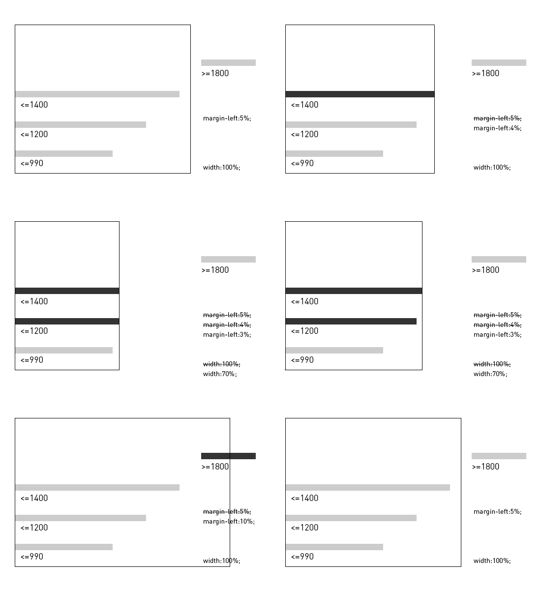
  • from 1400 the margin=5%, the width=100% – our starting point;
  • from 1200 to 1400 the margin=4% (set), the width=100% (initial) – assign as soon as the 1400 limit is reached;
  • from 990 to 1200 the margin=3% (set), the width=70% (initial) – assign as soon as the 1420 limit is reached;
  • from 0 to 990 the margin=2% (set), the width=70% (initial) – assign as soon as the 990 limit is reached.

All this does not mean simply duplicating styles. What works in the range over 1400 pixels, works also in the range from 0 to 1400, unless we change these values for others as we scale mock-up down.

If we wrote only one rule –

@media screen and (max-width: 1400px) {
}

– then its content would be applicable to the range from 0 to 1400.

As soon as we add the rule –

@media screen and (max-width: 1200px) {
}

– we receive a separate control over the range from 0 to 1200, while the previous rule remains valid.

We enable the rule –

@media screen and (max-width: 960px) {
}

– and focus on the range from 0 to 990 without cancelling the rules for ranges 0-1400 and 0-1200.

It is as if we were “guiding” our mock-up as we scale it down, prompting necessary changes, removals and additions. However, we advise against aiming for zero: it is better to set the minimal resolution of a laptop or a desktop (for example, 990) as the limit.

Ethan Marcotte will insist that you should go on and write more new rules until you reach the minimum of 320 pixels on mobile devices. It is possible but exhausting for you to make all these fake-breakpoints, keeping an eye on the properties of your elements pixel by pixel. Besides, Ethan Marcotte simply did not know how to define the device type, so he relied on the identification by size (if it is small, then it is a phone). The more complicated the website is, the more breakpoints are needed.

The trickiest range is 800-960 pixels, not even seen by most users. There is no point in compressing the website browser to less than 990 pixels on a laptop or a desktop. And stretching the browser window to this scale on a phone is physically impossible. The maximum to reach is 600-800 browser pixels in the landscape orientation. It makes more sense to separate the styles for the responsive desktop and for the likewise responsive tablet/smartphone physically. Furthermore, the mock-up for phones usually requires more major changes. We plan to cover displaying the mock-up on mobile devices in a separate article.

To sum it up, we have “banned” our mock-up from compressing down 990 pixels (min-width: 990px, you know).

Maximum Range Responsive Layout

We still have a very wide display problem. As you remember, we started with launching the website in the widest possible quality resolution and then worked on its correct downsizing. Now let us see what happens if we bite from another side of the mushroom.

Most likely, it is not that bad if you have already set the maximum values for the website to stretch in the default style (max-width). There is still a chance, however, that some elements and font sizes need fixing.

Let us add a rule to the very bottom of our list:

@media screen and (min-width: 1800px) {
}

making rules for the mock-up in the range from 1800 to infinity.

If something makes us uneasy as we scale the workspace up to 2500, then we can write another rule in addition to the existing one:

@media screen and (min-width: 2500px) {
}

Setting Responsive Mock-Up Height

It may be essential to change the styles in your mock-up not only according to its width but also according to its height. The rules for that are written on the same principle.

The styles when the height is from 0 to 600:

@media screen and (max-height: 600px) {
}

The styles when the height is from 0 to 500; all styles of the range 0-600 that are not reassigned remain the same:

@media screen and (max-height: 500px) {
}

It is important to understand the priorities. You may have the situation when the rules for width values tell the element to be this, while the rules for height values demand it to be that. If you place the rules for defining the height at the end, after the rules for defining the width, the former will be applied in case of doubt. And if you place the height rules in the beginning, they will be canceled out by the identical rules for width.

For finer adjusting of the height rules together with the width values you can add a new query, separate from the common rules:

@media screen and (max-width: 1400px) {
@media screen and (max-height: 600px) {
}
@media screen and (max-height: 400px) {
}
}

Summary

By clicking this link you can download an example of the file with various rules for responsive design. We also would like to point out that we have nothing against the method we criticized at the beginning. Using specific properties for a certain range has only been completely acceptable if you need the styles of your code to work only within it and not anywhere else.

In general, media queries offer a lot of possibilities for various logical conditions; there are plenty of variants and methods for their use.

How the method works is shown in the following diagram (the margin and width values were chosen randomly, without any particular design in mind and purely for a mathematically visual demonstration):
Responsive Demo

We have cast a little light upon the independent use of breakpoints in responsive mock-ups with efficiency and confidence. This can be applied both to interface elements and content alignment. We have shown how to stop believing in the miracles of bulky ready-made solutions and start using simple and reliable methods. All this helps to avoid making projects difficult for no reason.


The Force Awakens: A Star Cluster of Meteor & Angular

meteor_vs_angular

A long time ago in a galaxy far, far away…the trends of web development inspired more and more developers to write real-time applications.

With the appearance of nodejs front-end, the developers got the possibility to create server & client ends on traditional javascript.

The notion “isomorphism” grew in popularity in 2015. In simple words, isomorphism is a possibility to use one and the same code either on server side or on the client one. Meteorjs has played the major role in the establishment of this approach.

Meteorjs is a framework which helps to create module client-server real-time applications.
Meteor allows to create isomorphic applications which means that your code will work on different platforms (client, server, ios, android).

This framework possesses outstanding tools to work with data thus allowing us to use one and the same interface on client as well as on server side. Meteor uses DDP protocol which supports the dual sided data transfer and works via WebSockets & SockJS.

Some people compare (or try to do it) Meteor & Angular, but it’s ultimately wrong. Frameworks pursue different aims and can (and must) work together.

AngularJS has lots of abstractions which help to make the development of client single-page application faster, easier & what is more important – more fun. All we need is to make AngularJS friends with meteorJs (what was already done by angular-meteor.com).

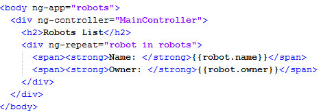
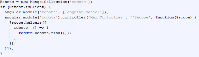
After angular-meteor installation, your simple application can look like:

app.js

Enter “meteor” in command line at your project folder. Meteor will collect your code & launch server.

Then lauhcn meteor mongo at your project folder & insert the string:

One can see that the data has been updated on the fly, though we didn’t use any additional approaches.

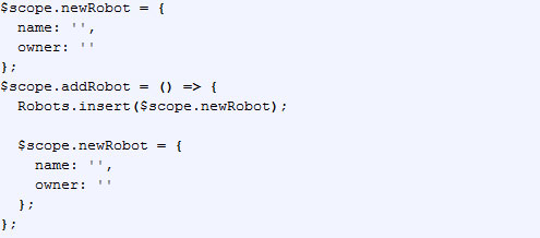
We can extend the existing code by adding a feature of new entity addition. Then add the further code into app.js file:
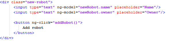
and into index.html this one:

Now we can add a new robot from client end. One should pay attention that a new record will be added not only into client end $scope, but also into server database.
All this happens due to DDP protocol: (https://github.com/meteor/meteor/blob/devel/packages/ddp/DDP.md).
Please, note that we request Robots.insert method, which can also be used on server.

It’s just a simple example showing the perks of combined use of angular & meteor. You should definitely try all the loveliness of both frameworks. Directives, filters, services – are strong points of angular and data binding, userfriendly deploy, isomorphism, build & minification systems are of meteor.

It’s worth noting, that using such binding, the developers have no need for setting up the environment.
It’s Meteor that provides all this from its box. One shouldn’t worry about your favorite build system installation (grunt, gulp, webpack). Meteor has its own tools of packaging & project minification, embedded into autoreload, convenient package management system and many other things.

The indispensible part of any technology is its dark side or drawbacks. Unfortunately, MeteorJs doesn’t support sql databases. The solution is to use additional meteor-packages, but it looks like Chewbacca after a shower of rain – quite a pitiful sight. So, to сreate a really good application, one should examine both frameworks thoroughly which can take long.

The very approach of development on meteor might seem unaccustomed for the fans of API-first approach and this might also take some time to get used to it. Without doubt, both frameworks (meteor & angular) come with auto-magic: it can frighten the developers, used to control all internal processes to the last detail. So, there’s no decisive answer.

In any case, both of them are open & their source codes are available for reading at Github.

In conclusion, it’s worth to point out that meteor & angular binding allows to create isomorphic real-time applications faster & easier than it was ever earlier.

May the Meteor be with you. The Angular is strong with this one.

P.S. So, what do you prefer for full-stack development?

Xamarin: the past and the future of a promising technology

xamarin_title
From an open source initiative to an integral part of Visual Studio 2015.
Although it may seem that Xamarin is still a new kid on the block, it has recently celebrated its 4th birthday (celebrated its 4th birthday), so it is about time that we looked at the history of its evolution from an innovative open-source project to its present state.

Xamarin’s foundation was laid in an attempt to create a .NET implementation for UNIX systems. However, as the development moved on, the project steered away from the initial direction to become an emerging industry standard for enterprise mobile development and eventually turn into an important component of the newest Visual Studio 2015.

Over these years, the people behind Xamarin have been pushing the envelope to sail away from the remnants of the not-so-commercially-successful Monotouch library, but the community is still divided over the question of whether Xamarin has really brought the much needed gulp of fresh air into the realm of enterprise mobile. Some say that it was just a lengthy experiment of renaming standard Monotouch components to create a seemingly new product. The traces of Monotouch are still found in Xamarin, so it may still have a long road ahead before it becomes truly unique. However, its role in today’s enterprise development world cannot be underestimated and the technology is definitely worth giving it a closer look.

Xamarin Forms – a promising, yet controversial product

xamarin_forms


Around a year ago, Xamarin introduced Xamarin.Forms, an all-new and highly promising cross-platform UI technology that was immediately spotted by the market and its key players, and in fact appeared to be so powerful that Microsoft included it into the standard Visual Studio 2015 package. The product is now being advertised and viewed by Microsoft itself as a comprehensive toolkit for building complex cross-platform and enterprise solutions. To gain even more exposure for the Forms, Xamarin went at great lengths to secure the support of the legendary Petsold who is currently involved in the further development and promotion of the product. The global development community has had ample time to study the platform and test-drive it in actual application development, and the reaction to its findings was not 100% positive and unanimously super-enthusiastic.

The first problem that seemed to be apparent was the dreadful performance of applications based on Forms (https://forums.xamarin.com/discussion/20092/critical-performance-issue-in-xamarin-forms-layouts) and the lack of an efficient workaround for this problem. JetBrains reported numerous problems while trying to implement the support of Xamarin.Forms into a new version of Resharper for Visual Studio 2015.

The product seemed to be unstable, slow and begging for optimization. Any non-standard component or element like a gesture or animation required a custom renderer to be created, and it was not an easy task. Development of any renderer with a more or less complex logic in most situations required deep analysis and reverse engineering of the forms that came with no source code. A decompiler in this case was of little to no use, since it didn’t reveal everything and wasn’t particularly convenient.

However, every cloud has a silver lining, and so does Xamarin. While working on various custom renderers, we encountered a great number of elegant and well thought-through architectural solutions that we couldn’t but admire.

A glimpse into the future

Despite the relative immaturity of the platform, we still believe that it’s got a very bright future. It is the only viable alternative for a great variety of projects, especially those that are based on a .NET server backend and shared code for clients, or cross-platform apps, or simply for developers with a .NET background looking to jump-start a new branch of their career in mobile development. It is also a perfect pick for building apps with great-looking animated UI’s. And the best thing about Xamarin is that all these blows and whistles, all this beauty and interactivity can be added fairly quickly and easily in comparison with other platforms or frameworks.

We surely hope that Xamarin’s alliance with the Redmond giant will allow the company to finish their work-in-progress and make the platform as reliable and convenient as it was supposed to be. Moreover, it may give them the leverage for solving problems in a more timely fashion – similar to the way they handled the recent issue with a ban on publishing Xamarin-based apps in the App Store. In a perfect scenario, we would like to never see anything like that happen again.

Developing you apps in Xamarin

xamarin_development


Now, if you’ve heard and read enough about Xamarin, and think that it’s the best pick for your next project, but don’t have this expertise in this area, it’s about time you started looking for a reliable vendor. Xamarin may be a relatively young technology, but there are companies out there that either know all about it or pretend to be know-all-all, universal type of developers. Apparently, we recommend doing business with teams that have been involved with Xamarin since its early days. This technology, with all of its growth issues, is far from being an industry standard adopted by every company and used by millions of developers, so working with a software development partner with a proven track record in developing Xamarin apps is invaluable. Newcomers may not know that, for instance, the choice of Xamarin forms over standard iOS/Android components is extremely important, just like the choice of PCL components that, if picked incorrectly, may cause considerable lags during the start of the app. If your developer does not know the minimum of Xamarin’s tips and hints, you may be facing a possibility of a very disappointing outcome for your project.

To sum up, we believe that Xamarin has humongous potential that is yet to become truly visible. It’s a powerful platform as is, but with all the support from Microsoft and other key players on the market, it has every chance to become a standard solution for cross-platform development very soon.

Who is the Boss in da House? The battle continues: FrontEnd vs BackEnd vs Fullstack

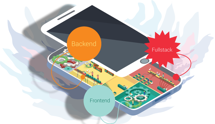
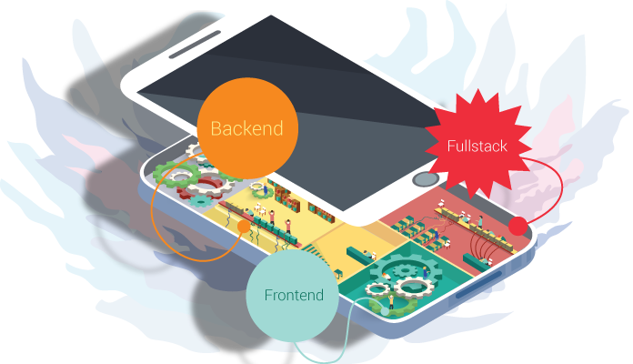
The development of a modern application might be compared with a house construction: one should hire a team of specialists – each master of his trade. As the builders lay foundation, erect the ossature and carry out all the necessary utility systems, so do the team of developers  with your web application. Backend Team think over the main application architecture, choose the necessary technologies and consider the means of communication and data processing. Frontend Team, in their turn, put into life the designer’s mock-up and implement the interaction between end user and backend.

Let’s have a look at each of them.

{ Frontend }

3-1

As it was mentioned earlier, Frontend developers implement the end frontage of an application, hiding the complex processing logic and data transmission of application. Reading this paragraph, one can convey the impression that easiest part of web-app development falls to Frontend developers’ lot: it’s a piece of cake to chuck together buttons and forms and to compose them in accordance to the designer’s mock-up. However, it’s an unsound opinion.

As a Backend developer, Frontend starts from choosing the stack of technologies on which the  client-end portion of architecture will be based. Nowadays, a great number of different frameworks exist, which allow to ease the process of creating the client-end portion and the task of prime importance is to choose the one that will give the best fit to the particular case: AngularJS, jsblock, EmberJS, BackboneJS or even crude Javascript.

One should keep in mind lots of nuances while choosing: whether the user will work with a great data flow at a time, whether the special components will be used: extensibility, modularization, etc.

To make a further step, one should think over the means of time optimization of client end load: to use means of code/ styles/ images and other data compression, because all that is written and used in client-end will be downloaded by end-user web browser and there one should pay attention to the traffic volume.

One more challenging task for a Frontend developer is to turn into reality the idea of the designer and the customer. The question is not about a tricky or flamboyant physical appearance and animation, but how to make it in such a way that it will look good in all browsers and mobile devices with different platforms, screen sizes and its restrictions.

For sure, today we have CSS Frameworks that have a set of ready-to-use styles for creation of responsive and adaptive web apps. However, they are often quite bulky or their usage makes no sense in view of the fact that one should remake them to get the desirable appearance or because of the giant framework that contains lots of styles where just several classes are used.

And finally, the most challenging task is for sure to implement the mediation between end user and backend portion. It’s really very important to application to be intuitive and evident for the user, that’s why a Frontend developer should have top skills and experience in so-called “human” interfaces even if your application is quite complex and have a set of its components which the user hasn’t faced before: every thing should still preserve its intuitivity, one should learn the user to use your application, to steer him and give him tips.

It’s a topical issue to make several things before the user does, i.e. to be like a ghost for him: to fill in the form with predictive data, scroll the page on the necessary blocks, imply why data didn’t passed a validation and to make error messages less frightening and more understandable. After chatting with the user and getting the necessary data, the client end sends it to backend and waits for the results to inform about them and display to the user.

{ Backend }

1

Backend developers work under the hidden part of frontispiece – main application logic, and you know, this problem is a beast: to process and store great volumes of data and to secure them.

To do that one should use a giant stack of technologies, each to a particular task. As an experienced builder, Backend developer should start from foundation placement for an application – it’s really a significant step, because if anything goes wrong, all the application will crash down. One should go over the ground each and every thing: to choose the appropriate framework keeping in mind the possible load on the app, choose the appropriate data base which will comply to app’s data.Though, here we have lots of nuances: different databases have different features either of storage technique or of speed of such parameters as reading, record, search.

One should think over the data transmission on the client end – to optimize the volume of transferred data and choose the most appropriate format. Oftentimes Backend developers face the necessity to bind an application with other external services which cause further hardships and peculiarities. The processing of all the data falls to their share: from importing small piece of excel table, image or video processing to making a complex calculation of flights to air-traffic controllers. All this should work as a duck takes to water as the users don’t get used to waiting.

{ Fullstack }

2

A Fullstack developer, as you’ve already dawned upon, is a jack-of-all-trades. He can materialize the idea of a designer, liven it up using any framework and will take care of its backend. On the one hand, it’s a perfect worker – he knows exactly what he should send and what he should get and return and there’s no ground for the battle between Frontend and Backend developers. Fullstack developer always knows where something might go wrong and fix it whether it might be on client or back end.
From the other side, a Fullstack developer is snowed under with too many things: everything depends on one human being. In such situation one can start to write a code from one’s point of view or to bury oneself under the back end thus not paying enough attention to other end. If you have a whole team of Fullstack developers, sooner or later they will split into Backend and Frontend. If it not happens, the code goes to squash from different approaches and methods of code writing. If one thinks, one person cannot be a know-it-all.

Fullstack developer won’t know so many twists and turns as a narrowly focused specialist does. But if you find such a person, hold onto him.

Clash of the Titans: Angular VS Backbone VS Ember

1. [ Introduction ]

Nowadays a lot of different javascript frameworks have appeared. There’s even a joke that every day it’s a birthday of new framework. The choice of the most suitable for the project framework influences dramatically on your opportunity to perform tasks on time & to support your code in future. You need reliable, battle tested framework, but you don’t want to be bounded? So the question arises: which framework to choose? Let’s have a thorough look at 3 most popular frameworks of today. Please, meet AngularJS, BackboneJS and EmberJS.

AngularJS, BackboneJS and EmberJS

2. [ History ]

All the above mentioned frameworks have common features: their code is open, released under MIT license & they solve tasks of single-page web application creation with the help of MV* designing template. All of them have the concept of scene, event, data models & pathnames.

AngularJS was born in 2009 as part of the great commercial product known as GetAngular. Soon after that, Miško Hevery, one of GetAngular founders, managed to re-create with the help of this product the web application, which was comprised of 17.000 code lines & made in 6 months. Google was impressed by such a fact & started to support the project with an open code. Among its features are: two-way data binding, interaction injection, simple code for testing & extension of HTML possibilities through directives.

Backbone.js is a lightweight MVC-Framework, created in 2010. It has become popular as a good alternative to heavyweight Frameworks such as ExtJS.

Ember is originally from 2007. Its history began as SproutCore MVC Framework: initially it was developed by SproutIt & then by Apple. In 2011 it was forked by Yehuda Katz, one of the main programmers of jQuery & Ruby on Rails projects.

3. [ Communities ]

Community is one of the most important factors when choosing the Framework. Bigger community – more answers on questions and tutorials in Youtube. As we see from the grid, Angular wins by far.

4. [ Framework size ]

Page load time is a crucial thing in website success. The users are behindhand in patience, so it’s necessary to speed up the load as much as possible. There’re two factors influenced on: framework size & time, required for its launch.

AngularJS, BackboneJS and EmberJS

5. [ Templates ]

Angular & Ember include template engine. Backbone though leaves it to the developer’s discretion. The best way to test the templates is to take the code sample. We will take the sample of forming a list in HTML.

 5.1 AngularJS

AngularJS templates are represented by HTML with binded clauses. The clauses are hooped by double brace.

5.2 Backbone.js

Though Backbone.js can be integrated with several template engines, Underscore is used by default. The processing with its help templates are quite primitive & it is necessary to add code on JS.

5.3 Ember.js

Ember uses Handlebars, an extention of the popular Mustache engine. A new version of Handlebars is developing now, named HTMLBars. Handlebars doesn’t understand DOM – it just works with strings. In HTMLBars, DOM will be identified.

6. [ AngularJS ]

Angular

6.1 Advantages

Angular is considered to be quite powerful & more or less self-sufficient framework. It has a huge community and support from Google. GitHub contains a vast number of modules from external developers for all of life’s emergencies.

The main perks of AngularJS:

  • modularization: you can write particular parts of application by uniting them in individual modules & reuse them in your projects.
  • two-way data binding: the data once entered by the user appeared in your objects & vice versa.
html
  • Angular Expressions: expressions which allow to manipulate data directly in your template. You can perform functions inside the element or attribute & output data.
  • Templates support: you can break parts of the page into separate pieces, known as directives & bundle them when necessary. You can describe these pieces as individual HTML tags or attributes. Each template might be bound to a controller.
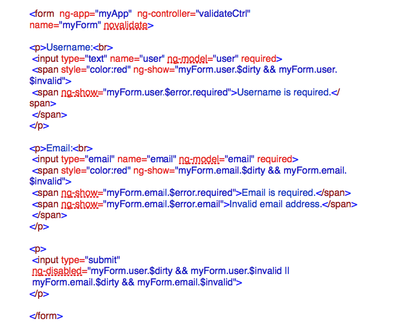
  • On-board forms validation: Angular possesses good & extensible on-board form validation. Without writing a code line, you can report the user about empty fields or wrongly entered email.
  • Single-page web application
  • Filters: An AngularJS Tool that allow to exclude & modify the data on display phase.  It might be selection, a kind of data exclusion, pagination as well as limitation of the text length or its transfer to the upper case. Angular possesses the ready-made useful filters and also allows to create your own.
  • Dependency injection: AngularJS possesses a kind of “include” feature. You can include in your module, controller, service, directive, etc. all the necessary modules, services, filters & even separate data through injector.
  • Interceptor. For purposes of global error handling, authentication, or any kind of synchronous or asynchronous pre-processing of request or post processing of responses, it is desirable to be able to intercept requests before they are handed to the server and responses before they are handed over to the application code that initiated these requests. The interceptors leverage the promise APIs to fulfill this need for both synchronous and asynchronous pre-processing.
  • In-built Support of AJAX
  • Unit tests Support

6.2 Disadvantages

  • Two-way data binding is implemented through digest cycle, which runs through your data, monitor all changes & update the output data. It’s quite comfortable from one side: one needn’t to write any evaluator & care about how to output data. But from the other side when you have a lot of data, they will be checked even by a slightest change. If you add here any complex angular expressions with functions, you understand the problem scale – the performance starts suffering.
  • Everything you do by using Angular, you should do inside Angular. If you use an exterior component on jQuery & try to change the data in view or in object which participates in data binding – nothing will happen. Because Angular doesn’t know that something has been changed until another digest cycle will pass on. In such a case, you should launch it manually.
  • It seems to me, it’s so great when the data and their displaying work independently and you just operate objects and all output Angular takes upon itself. However, that’s life, when such an independence backfires. For example, when you add a new object to the collection displayed as a set of inputs and it’s necessary to focus the insertion point on the appeared input field. One have to get fancy trying to find field using jQuery or built-in feature – angular.element or even to write a separate directive to do that.
  • one of the pain in the ass with which the developer faces is debugging. The thing is that exceptions are not thrown in angular expressions. And if you use a lot of complex expressions, it’s hard to understand where something goes wrong – it becomes a real pain in the ass. One should transform it into a function & then monitor where something goes wrong.

7. [ Backbone.js ]

Backbone.js

7.1 Advantages

Backbone is light & doesn’t take much space in data store: it has great documentation, its code is simple. You even can dip into a framework code & become aware of it in an hour.

On its basis one can build the frameworks. Some samples of ready-made frameworks: Backbone UI, Chaplin, Geppetto, Marionette, LayoutManager, Thorax, Vertebrae.

In case of Angular & Ember, you have to get along with what have been prepared by the developers. They promise to fix it in Angular 2.0, but that day is still far distant.

7.2 Disadvantages

Backbone is unstructured. It is represented by a set of simple tools for creating structure and you should fill in a lot of empty spaces. Of course, many of these spaces are filled with external plugins, but it doesn’t mean that you should make a lot of decisions while choosing them.

There’s no support of two-way data binding, so you will have to write a lot of code-behind to upgrade the scene when modifying the model & to upgrade the model when modifying the scene.

The Scenes in Backbone manipulate DOM directly, that’s why it’s hard to test them & to reuse.

8. [ Ember.js ]

Ember.js

8.1 Advantages

Ember.js works under the principle of “naming conventions instead of configurations”.

Ember doesn’t require the code-behind, it might itself tumble to an idea, for example to automatic determination of pathname & controller when determining the source. It can even create automatically a controller for the source, if you don’t jump ahead of it.

It includes a good evaluator of path names & optional layer for work with data named ember data. Unlike any of the other frameworks, Ember at once has a module for work with data, which integrates with Ruby-on-Rails Backend & other API with RESTful JSON.

While developing Ember, a great attention was payed to the speed of response. Your application more likely will be downloaded & work faster.

8.2 Disadvantages

API was booming that’s why it contains obsolete content & examples, which now don’t work out. Take a look at Ember Data Changelog & you’ll understand what I mean. Lots of questions at StackOverflow are outdated.

Handlebars pollutes DOM with <script> tags which not only add complexity to HTML, but can also break CSS or integration with other frameworks like jQuery UI Sortable.

9. [ Summary ]

We’ve examined advantages & disadvantages of the frameworks. The holistic approach of Ember to MVC installation will be appreciated by those developers, who try it in Ruby, Python, Java, C# & other OOP languages. It also suits for creation of fast working applications & release us from redundant code.

Backbone stands for minimalism. It is fast & simple in teaching & provides a minimal set of the necessary tools.

Angular is an innovator in extending HTML possibilities. It has a huge community & support from Google, it will have a constant growth & development. It suits well for fast and simple way to create a mockup as well as for huge projects.

Top 5 reasons to use Angular.js

Hard times, when we have to deal with the legacy code, that during its long existence in web, moved from developers without documentation, thus bringing with itself a bunch of complicated interfaces & making the code more & more complicated.

AngularJS

It’s a common knowledge, that a developer never built things keeping maintenance and support in mind. But now they are in search of the best way-out to fix these dents & restore the sanity in applications.

Developers who were looking for alternative ways to stack upcoming applications can use AngularJS to bring sanity to apps. AngularJS is a relatively new JavaScript framework from Google, designed to make front-end development a piece of cake. It possesses a wide range of frameworks and plugins.

But one should keep in mind, that while adding AngularJS to the web app, one needs some careful evaluation. It’s connected with the usage of JQuery or JQuery UI & other javaScript libraries in the app, because adding extra lines of code may slow down your own JavaScript execution. Anyway, for all that, we cannot ignore the following long-term benefits.

1. More close to MVVM Architecture:

AngularJS integrates original MVC software design pattern to build client-side web applications. However, AngularJS doesn’t implement MVC in the traditional sense, but rather something closer to MVVM (Model-View-ViewModel), where:

  • Model is the data in the application, a plain old JavaScript object (POJO). Users do not need to inherit from framework classes, wrap it in proxy objects, or use special getter/setter methods.
  • ViewModel – ViewModel helps to maintain specific views. ViewModel is the $scope object that lives within the AngularJS application. $scope is a simple JavaScript object comes with a simple API designed to detect and broadcast changes. Rather it is the specialized controller important to settle augmenting $scope in the initial state. It does not store states and neither interacts with remote services.
  • View – is the HTML that exists after AngularJS has parsed and compiled HTML to include markups and bindings. MVVM is a solid foundation to design applications. $scope shares reference to data, controller defines objects behavior and view handles the layout.

2. Have a Declarative User Interface

To define app’s user interface AngularJS uses HTML. HTML is less likely to break than an interface written in JavaScript. Special attributes in the HTML determine which controllers to use for the elements. With HTML, app development simplifies in a sort of WYSIWYG. So stop spending time on program flows and what loads first, simply define what you want, Angular will take care of the rest.

3. Two-Way Data Binding

Two-way binding is the most awesome concept in AngularJS. Not only visually pleasing feature, but also has a fascinating real-time concept. Data-binding directives provide a seamless projection of models to the application view. Because of its seamless, no efforts needed from developers. With Angular two-way binding, the view and model no longer require fresh cycles as they may be prone to bug or simply need a lot of redundant and tough to maintain the render code – it handles the synchronization between the DOM and the model, and vice versa.

4. Uses POJO Data Models

Data models in Angular are POJOs, so you no longer need the getter/setter functions. add or change properties directly on it and loop over objects and arrays. This makes the code look clean and intuitive.

5. Easy Adjustable Filters

Before any data reaches View, filters help to clean the data and involves in something simple such as formatting decimal places, reversing the order of an array, filtering an array based on certain parameter or making changes in pagination. Filters are similar to directives as it works as standalone functions that are separate from your app, but it only bothers about data transformations.

Conclusion

In this article, we’ve covered 5 features of AngularJS that our developers consider to be the most winning. These 5 features can help you to get an idea why nowadays AngularJS is trending. For sure, AngularJS is not a panacea for all web apps, but it can stand the generic apps in good stead.

Why is Node.js so popular for REST API?

Quick & easy development

You can construct REST API with Node.js really quickly.

Node.js has large and active community that contribute many useful and mature modules which can be easily included and used. For example, to construct REST API such known modules as express, restify and hapi fit perfectly. They provide easy way to declare API, handle incoming parameters, errors, transformation to JSON, streaming and sending response.

High performance

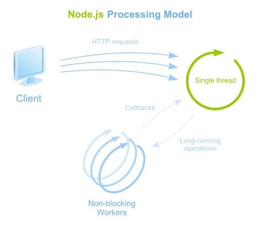
Traditional handling of requests is based on threads and blocking operations leading to CPU and memory consuming. For example, if API code reads something from a database, the code stands at that place and waits for operation to finish. In order to handle other requests while that thread is busy, server spawns more threads using more memory and processing time.

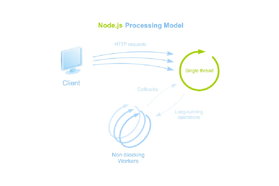
Node.js is different. It operates on a single-thread, uses an event-driven and a non-blocking I/O approach.

Node.js Processing Model

Advantages:

  • Single thread is used to handle multiple concurrent requests
  • All long-running tasks (data access, input/output) are always executed asynchronously on top of worker threads
  • Node.js makes this type of concurrent programming easier to utilize

This model is highly efficient and scalable as Node.js is basically always accepting requests because it’s not waiting for any read or write operations. That makes it lightweight and efficient to support hundreds of thousands of concurrent requests.

Great approach to construct API for existing applications

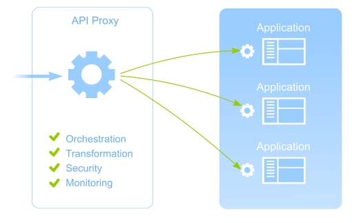
Often there is a need to construct a modern, well-structured API for existing application or a set of applications. To implement that it is better to use dedicated API Proxy that can provide:

  • orchestration of incoming requests to appropriate services
  • transformation of obtained results to result format
  • security applying authentication protocols
  • API usage monitoring

Also it is very important that API Proxy should comply with performance requirements:

  • minimal overhead on the interaction with existing applications
  • API Proxy should not be affected if one of the services of existing applications may work too slow or even get stuck
  • API Proxy should be lightweight and easy scalable if required
API Proxy

So why Node.js?

Node.js is a perfect approach to implement such REST API Proxy and to comply with all performance requirements:

Easy to write API and interaction code

There are a lot of ready and useful modules to work with pure HTTP(s), REST API, Web Services, Sockets, etc that can be used both to construct API and to implement interaction with existing applications.

Streaming support

Using event-driven and non-blocking I/O approach of Node.js it is easy to stream results back to the client of API as they are getting from existing applications.

Monitoring possibilities

It is easy to get events on request/connection life cycle and collect metrics on API usage in Node.js.

Authentication support

Authentication strategies like OAuth, OpenID, Basic and others are available through passport.js, everyauth and other modules and can be applied easily to API.

Node.js is lightweight, fast and scalable

Node.js allows you to build fast, scalable API Proxy capable of handling a huge number of simultaneous requests with high throughput.

Node.js is mature

Node.js is mature and it powers services for some huge companies like LinkedIn, Walmart, eBay, PayPal, Yahoo and others.

Finally, I’d like to say that our experience also proves that Node.js is a great choice to construct REST API. Also it would be great to hear your opinion and practical experience. What approach do you use to construct REST API and why?

To Node or not to Node?

The Internet nowadays is bursting with hundreds of opinions, cases and tips concerning node.js. Node.js community is growing rapidly. Amount of node.js applications is getting higher and higher. Names of companies using this software platform cannot be more convincing – LinkedIn, Walmart, eBay, PayPal, Yahoo. So why?

There are some perks both for developers and for management. There is no need in learning new language – JavaScript is always here for you. So as an employer you don’t have to search for and hire new professionals. Node.js is perfect for creating fast and scalable apps. I mean really fast. What if I tell you that more than a half of all traffic on Black Friday in Walmart went to Node servers?

Our partners as Trimet Aluminium AG, ThyssenKrupp AG and Initiativkreis Ruhr already appreciated advantages of software built on Node.js.

Your client can enjoy agile and easy to launch backend for mobile applications. No one needs heavyweight apps that get in your nerves by braking all the time and inability to deal with all the data.

Node.js allows creating cool streaming data applications. We know about this feature a lot – *instinctools’ product utrail.me is built using Node.js. It enables you to perform your own broadcasts directly to your social network accounts. Videos are saved on server and available 24h a day. You can also get live mobile TV channel or use utrail.me for covering events. As time has shown Node.js based tools carry out their mission in streaming big amounts of data, treating http requests and responses on really high level.

One more feature that can catch your interest. Node.js is worth your attention, if it comes to making a prototype. Creating a prototype is a good way to convince your boss of using exactly this software platform. It doesn’t need much time. You can make a prototype to a certain part of the application, to see yourself how it’s going on and to show your boss or/and your client, what you can do with Node.js.

Sure, it’s up to you, to use Node.js or not. Anyway the platform is really easy and at the same time it helps performing complex and essential tasks.

What is your Node.js experience? Or why haven’t you tried it yet?

Preventing user from annoying Java Applet messages, or Operation “Rescuing your user” vol.1.

Java applets and warnings: do you want both? I’m sure you don’t.

We have extensive experience in using java applets. They really help to speed up your system significantly, still at the same time they may cause issues for the client and their users such as annoying warning messages. Actually it can be easily solved if you know how to do that.

We would like to share a piece of advice with you about how to avoid security problems with java applets. You are always welcome to leave your comments.

Problem definition:

As a WYSIWYG XML editor in our application we use java applet Oxygen Author Component. Java shouldn’t throw out any scaring warnings about dangerous code while loading this applet on the client. It should calmly and silently load this applet without stressing the user and making him take responsibility. We have a serious application after all.

How the applet works in layman’s terms

When a tag <applet> in HTML page is detected, browser passes the applet load control to the corresponding java-plug-in, that in its turn passes the control to the JRE installed on the client’s computer. There are two ways of applet loading (under applet we understand some java application, that represents a set of jars, where there is a main jar with main class implementing class Applet):

  • Applet’s jar files, that need to be loaded and from where they need to be loaded, are listed in the tag Applet;
  • With a jnlp file, where this information and a lot of other options and arguments are indicated.

In our case we use jnlp. The jnlp approach has the advantage, that if you change some applet loading parameters (e.g. codebase), you don’t have to change HTML or JavaScript code responsible for the applet loading. It’s enough to change just jnlp. Codebase change (codebase is a url address, that points, where the applet’s jars are) is quite an unpleasant problem, because you have to give the absolute URL, what means, that depending on what server the applet is launched, so has to be the codebase. On the local computer it is one address, on the QA stand the other one, in production – the third one. That’s why while assembling the application you definitely need to give the Context Path, in other words the absolute address of the web-application, where it’s going to work. Using jnlp file solves this problem in following way: there is a special servlet that on-the-fly changes the codebase to the current one when the jnlp file is loaded by the client’s java.

Let’s go

So, the applet loading begins with the jnlp file loading, there are there not only the list of necessary jar files and their codebase, but also java arguments (it is very important, I’ll tell you later why), that java has to start on the client’s computer with. Java starts loading jars and checking their safety. Here java security tool takes effect, which starts checking the loading jar, before the classes will be loaded from it. This tool is rather complicated and multisided: general safety level adjustment while loading applets and java security policy on the client (permission grants), safety parameters in the manifests of the jars, jar’s digital signature verification checking etc. I don’t want to go deep into this and I’m going to touch only the aspects, that are really important in the described task.

for information: applet signing means jar files signing. Jar signing is a performance of java-operation signjar, as a result of which in the jar the information about the key appears, that was used for signing in encrypted form. And also each resource, packed by jar, is associated with some code, encrypted by this key, that contains the information about the content of this resource. So, if you’re trying to change the signed jar giving it e.g. some class or changing the old one, such a jar is getting invalid and it’s not going to pass a security test and to be loaded.

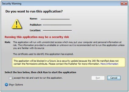
So, the applet can be not signed, self-signed and signed by the trusted certificate. Depending on the client’s java version, where the applet loads, the signing level of the applet has an effect on whether the applet will be loaded at all or blocked, loaded with lots of warnings and messages like “If you start this applet, the global disaster comes and everything disappears, so start it on your own risk”.

java_1

It could be also loaded with a nice and not scaring message that can be not repeated in the future, if you tick it. And finally we’ve come to the task itself. At the moment of solving this problem our Oxygen applet was self-signed. It means that there was a signature. But it was fake – we made up a private key and generated a public key for it.

Of course during the loading of such an applet java expressed extreme dissatisfaction, but as the final result it loaded the applet. Actually we needed to get rid of these messages, that’s why we needed a certificate from Trusted Certificate Authority.

How do we get it? It’s easy, but not very cheap. A certificate for a year costs about $500. We used the services of www.verisign.com. You have to create a keystore with your alias and other information about the publisher (with a utility keytool) and form a special request (and pay, of course). In reply CA sent the keys. We got three of them: Code Signing certificate, intermediate CA certificate and certificate in pkcs7 format. For JKS type certificate we’re going to need intermediate and Code Signing certificate. First we add intermediate certificate into the earlier created keystore, and then – the main Code Signing certificate. Received keystore is going to be used for jar signing.
If your jars were signed earlier (in my case they were self-signed), you have to delete old signatures, before signing them again. If you don’t do this, java will drown during the applet loading on the first jar and stop working. You can delete the signatures manually – delete files .RSA (or .DSA) and .SF from the folder META-INF and delete all the Digest resources’ signatures from the manifest file.

Almost forgot: before jar signing you have to add security attributes into the manifest:

Permissions: all-permissions
Codebase: *
Caller-Allowable-Codebase: *
Application-Library-Allowable-Codebase: *

Starting from the 51st update of the 7th java all jars without security attributes will be automatically blocked.

Here is an ant script for that:

<target name="addSecurityProperty">
    <jar file="${jarFile}" update="true">
        <manifest>
            <attribute name="Permissions" value="all-permissions"/>
            <attribute name="Codebase" value="*"/>
            <attribute name="Application-Library-Allowable-Codebase" value="*"/>
            <attribute name="Caller-Allowable-Codebase" value="*"/>
        </manifest>
    </jar>
</target>
<target name="addSecurityProperties" if="hasForEach">
<foreach target="addSecurityProperty" param="jarFile">
    <path>
        <fileset dir="lib" includes="**/*.jar, **/*.zip"/>
    </path>
</foreach>
</target>

Important: you are going to need antcontrib for using foreach in this script.

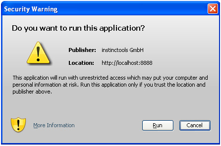
So, we clean jars, add necessary attributes to manifests, sign, start and… Warning again!

java_2

Again? It turns out that you have to sign not only jars, but also jnlp file. How to sign it? Like this. Jnlp file has to be put into your main jar in the directory. JNLP-INF and the file name has to be exactly APPLICATION.JNLP. so, we add into our ant script, that builds main jar and signs jars, a simple code that copies the initial jnlp into the signed jnlp.

<target name="compile">
    <mkdir dir="classes"/>
    <javac srcdir="src" destdir="classes" includeantruntime="false" debug="on">
        <classpath>
            <fileset dir="lib">
                <include name="*.jar"/>
            </fileset>
        </classpath>            
    </javac>

    <mkdir dir="classes/JNLP-INF"/>
    <copy file="author-component-dita.jnlp" tofile="classes/JNLP-INF/APPLICATION.JNLP" overwrite="true"/>
</target>

I’ll explain what happens in this ant’s target. Everything is clear in the part one – we create directory classes and compile the code of our applet in it. Please, notice, that during the compilation a folder lib will be added into the classpath. In this folder there are a lot of jars necessary for the applet and all of them have to be signed. Then in the same place a folder JNLP-INF will be created and our initial author-component-dita.jnlp will be copied in it.
Then we pack everything into the jar (this is our main jar) and put it into the folder lib to the rest of the jars.

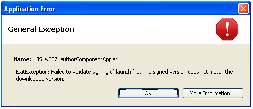
Now we have two jnlp files: initial author-component-dita.jnlp and APPLICATION.JNLP packed into the jar. Something wrong… We start the applet – error!

java_3

What now? These jnlp files don’t match, but they have to. The initial jnlp is used for loading the applet, and the packed one is used to check the signature, they should not be different. But why are they different? They are copies! Now remember our servlet (JnlpDownloadServlet), that is used to simplify the deploy of our web application. Using it we can use the variable $$CODEBASE and don’t write into jnlp a certain codebase (e.g. localhost:8888/oxygen-editor/). The servlet changes jnlp during runtime substituting in it necessary values of variables. That’s why the jnlp to be loaded doesn’t match with the signed one. What do we have to do? It’s simple: we have to use APPLICATION-TEMPLATE.JNLP instead of APPLICATION.JNLP. Using APPLICATION-TEMPLATE.JNLP pattern has such an aspect, that it can be different from the initial jnlp, if you give “*” instead of certain parameters, for example, codebase=”*”. Let’s change the ant’s build.xml:

<target name="compile">
    <mkdir dir="classes"/>
    <javac srcdir="src" destdir="classes" includeantruntime="false" debug="on">
        <classpath>
            <fileset dir="lib">
                <include name="*.jar"/>
            </fileset>
        </classpath>            
    </javac>

    <mkdir dir="classes/JNLP-INF"/>
    <copy file="author-component-dita.jnlp" tofile="classes/JNLP-INF/APPLICATION-TEMPLATE.JNLP" overwrite="true"/>
    <replace file="classes/JNLP-INF/APPLICATION-TEMPLATE.JNLP" token="@@CODEBASE@@" value="*"/>
    <replace file="classes/JNLP-INF/APPLICATION-TEMPLATE.JNLP" token="@@HREF@@" value="*"/>
</target>

So, is that all? Will I see during the applet loading a long-expected user-friendly message with a blue shield saying that the applet is trusted, safe and doesn’t raise any suspicions? I’m very excited and I finally launch the application, load the applet and…

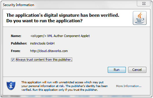
java_4

Yes! I did it! There is the message with the blue shield! Extremely happy I tick “Always trust content from this publisher”, it closes, the applet starts loading and now we get this:

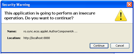
java_5

What the hell – what’s insecure there again? It took me two days to find this line in jnlp file:

<j2se java-vm-args="-Xmx512m -XX:MaxPermSize=80m -Xss4m -Xdebug -Xrunjdwp:transport=dt_socket,server=y,suspend=n,address=5021" version="1.6+" />

There are java arguments the applet starts with. Well, debug arguments are insecure. And if your applet is signed by the trusted certificate, these arguments are forbidden. It is interesting, that if your applet is self-signed, you can launch the applet with everything you want, because the client is warned, that the running application is unknown and initially dangerous.

Here is the full list of forbidden arguments:

// note: this list MUST correspond to native secure.c file

private static String[] secureVmArgs = {

"-d32",                         /* use 32-bit data model if available */

"-client",                      /* to select the "client" VM */

"-server",                      /* to select the "server" VM */

"-verbose",                     /* enable verbose output */

"-version",                     /* print product version and exit */

"-showversion",                 /* print product version and continue */

"-help",                        /* print this help message */

"-X",                           /* print help on non-standard options */

"-ea",                          /* enable assertions */

"-enableassertions",            /* enable assertions */

"-da",                          /* disable assertions */

"-disableassertions",           /* disable assertions */

"-esa",                         /* enable system assertions */

"-enablesystemassertions",      /* enable system assertions */

"-dsa",                         /* disable system assertione */

"-disablesystemassertions",     /* disable system assertione */

"-Xmixed",                      /* mixed mode execution (default) */

"-Xint",                        /* interpreted mode execution only */

"-Xnoclassgc",                  /* disable class garbage collection */

"-Xincgc",                      /* enable incremental gc. */

"-Xbatch",                      /* disable background compilation */

"-Xprof",                       /* output cpu profiling data */

"-Xdebug",                      /* enable remote debugging */

"-Xfuture",                     /* enable strictest checks */

"-Xrs",                         /* reduce use of OS signals */

"-XX:+ForceTimeHighResolution", /* use high resolution timer */

"-XX:-ForceTimeHighResolution", /* use low resolution (default) */

"-XX:+PrintGCDetails",          /* Gives some details about the GCs */

"-XX:+PrintGCTimeStamps",       /* Prints GCs times happen to the start of the application */

"-XX:+PrintHeapAtGC",           /* Prints detailed GC info including heap occupancy */

"-XX:PrintCMSStatistics",       /* If > 0, Print statistics about the concurrent collections */

"-XX:+PrintTenuringDistribution",  /* Gives the aging distribution of the allocated objects */

"-XX:+TraceClassUnloading",     /* Display classes as they are unloaded */

"-XX:SurvivorRatio",            /* Sets the ratio of the survivor spaces */

"-XX:MaxTenuringThreshol",      /* Determines how much the objects may age */

"-XX:CMSMarkStackSize",

"-XX:CMSMarkStackSizeMax",

"-XX:+CMSClassUnloadingEnabled",/* It needs to be combined with -XX:+CMSPermGenSweepingEnabled */

"-XX:+CMSIncrementalMode",      /* Enables the incremental mode */

"-XX:CMSIncrementalDutyCycleMin",  /* The percentage which is the lower bound on the duty cycle */

"-XX:+CMSIncrementalPacing",    /* Automatic adjustment of the incremental mode duty cycle */

"-XX:CMSInitiatingOccupancyFraction",  /* Sets the threshold percentage of the used heap */

"-XX:+UseConcMarkSweepGC",      /* Turns on concurrent garbage collection */

"-XX:-ParallelRefProcEnabled",

"-XX:ParallelGCThreads",        /* Sets the number of parallel GC threads */

"-XX:ParallelCMSThreads",

"-XX:+DisableExplicitGC",       /* Disable calls to System.gc() */

"-XX:+UseCompressedOops",       /* Enables compressed references in 64-bit JVMs */

"-XX:+UseG1GC",

"-XX:GCPauseIntervalMillis",

"-XX:MaxGCPauseMillis"          /* A hint to the virtual machine to pause times */

};

Thank you for attention. I hope, the article will be helpful.

Do you know another ways of realisation of this task?

Anna Vasilevskaya
AI modified real photo
Anna Vasilevskaya
Account Executive

Get in touch

Drop us a line about your project at
[email protected] or via the contact
form below, and we will contact you soon.