Usability consultant and information architect Steve Krug has been in the usability art since 1989. He has years of experience as a user advocate for major companies as Apple, AOL, and Netscape. On the question of what’s the most important thing to do to make sure a site or app is user-friendly, he answered that it’s not “Nothing important should ever be more than two clicks away” but rather “Don’t make me think” – his first law of usability. This advice is also the name of Steve’s most famous book dedicated to user interfaces.
Steve Krug’s special gift is in his constantly fresh look and the ability to put into practice the experience he acquires from studying human behavior on the Internet. At the beginning of his professional career, Steve would look at the designer’s computer screen over their head while they are working, thus preventing them from being excessively fond of visual ideas that could throw ordinary users into confusion.
Krug’s technique was not to conduct experiments on focus groups, but to study the behavior of ordinary people when using websites.
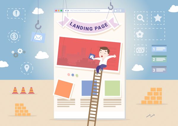
In this article, I’ll talk about the main empirical observations that Steve formulated in his book, complementing them with my own experiences and opinions of designers who I know. I’ll begin by describing the general principles and problems and then move on to an analysis of particular mistakes, then I’ll give useful tips.
How the user defines simplicity
When assessing something, we use our experience and various coordinate systems. If you ask someone to assess a car, he will pay attention to the speed and driving. When selecting a house, we are likely to be most interested in the land size and location.
While appraising the simplicity of a website, the user will first indicate the time spent on getting what he wants from that site. If it takes a user more than five minutes to order a pizza on your website, then your interface has some problems.
First of all, don’t make the user do what you could do for him. Features such as geolocation, autocomplete forms and authorization via social networks instead of registration form simplify any interface significantly.
The designer is the one that thinks, while the user uses. Another factor that plays a role when assessing a website is the simplicity of thought processes. If you want to obtain the user’s phone number, then don’t make him ponder on which format to enter the number.
Anything we’re used to seems simple. Avoid being too different from competitors. If you’re a sushi seller, just make very delicious sushi – the customer has ordered for them a hundred times in the past and his brain has already developed a particular scenario. Any deviation from the usual scenario has to be reasoned: if your interface throws out the user, he will order the sushi only if they are much cheaper. Otherwise, he’ll return to that site where he has ordered for sushi many times before.
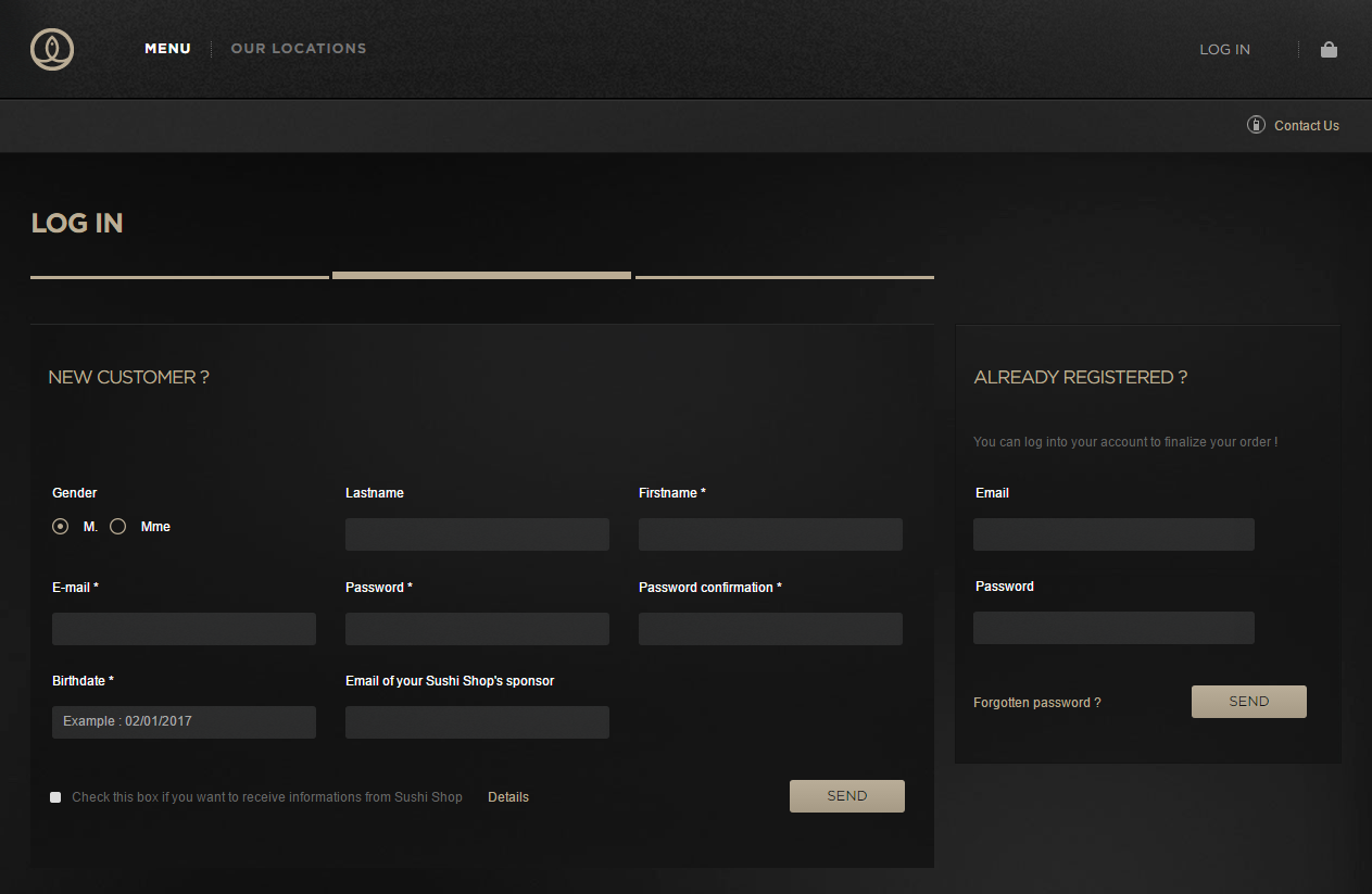
Below is an example of a site, delivering sushi in London. Why do they need the user’s date of birth? Why do I have to register to eat? Why can’t I log in via social networks?
In studying a site, the user has to think as follows: &quout;This key is for this, if I click this one I will be able to read about that, I can click here to make a call”. You shouldn’t generate questions in his head. A site is difficult, if by looking at it, the user thinks: &quout;What is this thing for? What happens if I click here? Where is this written about?”. All questions must be answered preventively.
From general to specific
I’ve identified and summarized the most important (in my opinion) principles of creating interfaces from the “Don’t Make Me Think” book. I’ve also tried by myself to deduce some specific rules from the philosophy of this book.
Ports of entry
Brion Gysin:
– How do you… How do you get into these paintings?
William Burroughs:
– Usually, I get in by a port of entry, as I call it. It is often a face through whose eyes the picture opens into a landscape and I go literally right through that eye into that landscape. Sometimes it is rather like an archway. … Any number of little details or a special spot of color makes the port of entry and then the entire picture will suddenly become a three-dimensional frieze in a plaster or jade or some other precious material.
The Beat Hotel by Barry Miles
You started to read this article from the heading, which is its point of entry. In studying an interface, the user looks for something from where to start. It is the designer’s task to make the entry point clear. Without the heading, you would not understand what the article is all about before starting to read.
Targeted action is a process consisting of several steps. If you don’t show the user where to start, he most likely will not ever start. Imagine a website of a manufacturer of computer components. For a user who wants to download a motherboard driver, the point of entry must be an element directing the user to the first step of the following process:
1. Selecting or searching for a device;
2. Selecting an operating system version;
3. “Download” button.
You shouldn’t create a page that performs several targeted actions, else it would have to host multiple entry points, which could confuse the user.
Lao Tzu once said that a journey of a thousand miles begins with a single step. But this step – no matter how important it may be – is not the entire journey. When asked about how many moves ahead he is planning, Garry Kasparov answered: “In chess, it is far more important not to calculate dozens of moves ahead, but to have a clear understanding of the situation on the board at that moment”.
Besides, to show the user the way, you have to accompany him along that way so that he doesn’t stray away. In constructing a route, nothing helps as knowing one’s location. A breadcrumb trail does an excellent job in helping users keep track of their locations within programs or website.
Users will not use a site if the navigation isn’t clear.
You can’t write art
Copywriters say that writing texts for a robust interface is an art, but not writing them at all is an even bigger art. Steve Krug says, “Get rid of half the words on each page, then get rid of half of what’s left”.
In the The Elements of Style by Elwyn Brooks White and William Strunk Jr., rule number 17 reads:
“Vigorous writing is concise. A sentence should contain no unnecessary words, a paragraph no unnecessary sentences, for the same reason that a drawing should have no unnecessary lines and a machine no unnecessary parts”.
Most words on any web page just take up space. Removing unnecessary words has three aims:
- Reduces noise on the page;
- The user’s attention is focused on the remaining words, which make up the truly useful and important content;
- Reduces the size of the page, and the user can easily sweep his eyes over it in search of the necessary information.
All sorts of “Welcome to the site…” and “The site has a lot of very interesting things about…” should be removed ruthlessly. Users want to go straight to the point – all kinds of introductions only distract attention and waste time.
If you want to ask the user to fill out a form, instead of unnecessarily telling the user that the form would help improve the service, tell him that it won’t take him more than three minutes to fill the form.
What’s this button for?
Imagine that you visited a friend at his house, took the TV remote, and instead of turning down the sound, you mistakenly changed the channel because the volume buttons are identical to the switchover buttons. This is a clear example where the designer had not thought and made the user to sort out the interface by himself.
Inscribing a text on the button is, of course, the best tool that would explain to the user the function of that button. If this button is used to add an item to the shopping cart, then the phrase “Add to cart” or “To Cart” should be written on it. An experimental “Wishlist” or incomplete and indistinct “Add” will raise questions and make the user lose confidence. Another important rule: verbs on the buttons should always be in an infinitive form so that the user can quickly perceive their functions.
The user should clearly know what’s going to happen once he clicks the button. But that’s not even enough – clicking should give him exactly what he expects.
Harm caused by guidelines
The main sin committed by all guidelines present in any interface is that they shift mental work from the designer to the user. Besides, the presence of guidelines on an interface is often a sign of inefficiency by the designer.
Nobody is going to spend his time reading guidelines present on a site until several attempts to use the site, as it turns out, fails.
Even if the user needed to read the guidelines, he would unlikely do so if it is too cumbersome. In designing an interface, it is the designer’s task to remove any guidelines – all elements and user scenarios should be self-explanatory. If guidelines are really needed, they should be very brief.
Coincidence of interests
That which you want to show a user on a particular page must match with what the user is looking for on that page. Then the design will look simple and clear.
Let’s assume that people buy dishes and other kitchen utensils more and more often than construction tools and repair materials. This doesn’t mean that you should go hang the sign “Dishes at wholesale prices” at the entrance to your hardware store with the hope of attracting buyers.
Firstly, you will not get an inflow of the target audience to your store, and secondly, people will be deceived, which is not good. The same logic should be applied when creating the structure of a website. If your company deals in the repair and sale of computer hardware, share not only the target audience but also the sections of the site.
Don’t try to squeeze everything on a single page (cramming the description of repair services and the product catalog all in one page), else you might confuse potential customers.
Most burning issues of the day
In this article, I’ve shown that every designer can greatly simplify the lives of users through simple reflections. Let’s look at some examples of how this could be implemented on large and well-known websites.
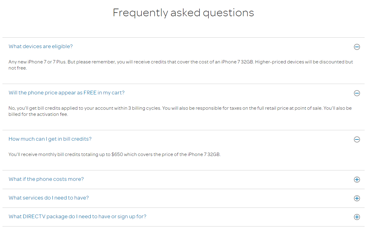
On the FAQs page of the AT&T site, questions and answers are presented in the form of a fashionable accordion. This idea is very good if the concealed information is so large that it will be reasonable not to show everything at once, in order to make things simpler for the user to search for the appropriate question. But here we see that the answers are short and thus could be presented at once without any consequences. The designer should have thought about this and not make the user click on the plus sign.
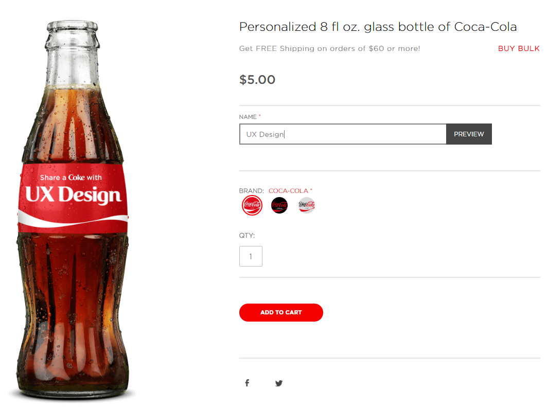
On the Coca-Cola website, you can order a bottle bearing your own name or any inscription. After entering the name you want, you need to click on the “Preview” button. Oh, how nice it would have been without this button. They could, in fact, show the inscription on the bottle at once thus saving a click.
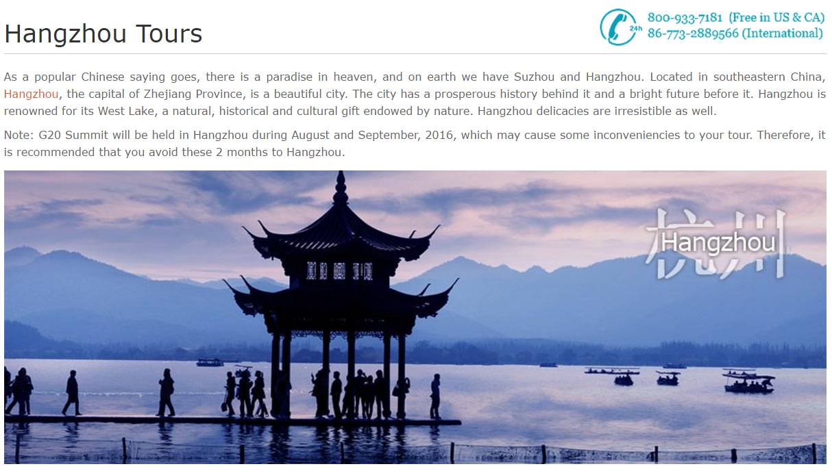
Another example: the screenshot of a site offering tours across China. The phone number is shown as an image, which is a link to the contact page. Why not just make it a text, and in addition – a link that enables the user to (by a click) call from his smartphone?
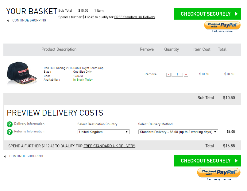
Ok, that’s enough of negative examples. Let me highlight a nice feature in the official online store of auto racing Formula 1. When you go to the checkout page, in the “Destination Country” field, the system automatically detects the user’s location. This is very nice. Keep it up!
Conclusion
“One man likes to push a plow. The other likes to chase a cow. But that’s no reason why they can’t be friends” – Broadway musical “Oklahoma” by Oscar Hammerstein.
The same questions constantly cause irreconcilable arguments and almost religious differences among web developers. In such disputes, you can rarely impose your views on the opponent. On the basis of what web developers do, they have very different views on the same issues.
I want to say that questions such as “Do users like a drop-down menu?” are detached from reality and don’t make any sense at all. Answers to them have no practical application. It is by far more productive and correct to state the question as follows: “Does this particular group of users like this particular drop-down menu on this particular site?”.
Endless arguments yield no result, but only waste your precious time. It’s more effective to test solutions in specific situations. All web development-related issues should be transferred from the “right or wrong” and “like or dislike” planes to the “working or not working” plane.